


Initial Style Illustrations
Initial turns letters and numbers into tactile 3D objects that feel carved from real materials. Use them when flat type is not enough and typography needs to carry the visual focus.

What is Initial Style?
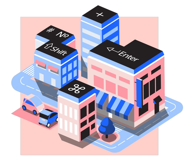
Each illustration in Initial shows a single letter or number with sculpted volume and realistic texture. Surfaces suggest wood grain or stone and lighting adds gentle shadows that anchor forms on clean backgrounds.
Whether you're designing alphabet flashcards or a homepage hero, Initial supplies ready 3D characters. Educators and product marketers and branding teams drop these into layouts when strong typographic icons must communicate messages quickly.
For type-led projects


What Initial artists arrange
Alphabet letters appear again and again alongside standalone numerals and short words. Many pieces highlight single initials for monograms and badges. Browse tags to jump straight to your topic.
Which textured type look fits
Comparing styles helps you decide whether your typography feels playful or restrained or very realistic for products and learning content.

3D Plastilina shapes letters like clay toys with rounded edges, while Initial keeps cleaner typography and distinct wood surfaces.

Conifer focuses on minimal flat plants and simple scenes, whereas Initial centers everything around chunky 3D letters and numbers.

Doobry delivers sketchy characters and loose line work, while Initial offers polished volumetric type with realistic material hints.

Dots builds images from tiny circles and geometric groupings. Initial instead presents solid letter blocks with depth and tangible surfaces.
Editorial leans on flat shapes and refined storytelling scenes, whereas Initial uses single letters as the main narrative device.

Floral fills compositions with illustrated leaves and petals. Initial only borrows flower textures occasionally and still prioritizes legible characters.

Framework constructs wireframe shapes and structural diagrams. Initial focuses on solid typographic forms that already feel finished and ready for headlines.

Gleam emphasizes glossy gradients and futuristic objects. Initial has more tactile textures that resemble wood or stone rather than glassy surfaces.

Memphis celebrates bold patterns and abstract geometry. Initial instead keeps the silhouette simple and pushes variation through material and depth.

Moments captures people in everyday situations with softer storytelling. Initial skips characters entirely and lets dimensioned letters communicate emphasis.

Neat offers tidy flat icons with sharp outlines. Initial trades outlines for solid 3D volumes and textured material finishes.

Pablo focuses on flat vector scenes with people and objects. Initial strips away environments and spotlights sculpted type as the hero element.
Frequently asked questions


Start using Initial illustrations today
Download PNG letters for quick headlines or switch to SVG on a paid plan for deeper tweaks. Drop Initial into Figma or Sketch and build memorable type-focused layouts in minutes.