


The Illustration Spectrum
Illustration style tells people how to feel about your product before they read a word. Nine techniques, 332+ styles. Browse the techniques below and land on yours.


Browse by technique
Each technique has its own visual language. Choose the one your project calls for.

Volume and tactile materials that make interfaces feel like you can reach into the screen.

Big outlines and exaggerated proportions that make products feel approachable and genuinely fun.

The most-used technique in digital product design. Crisp shapes and solid color blocks that explain ideas without friction.

A little imperfect and immediately human. Doodle style is what you reach for when an interface needs personality instead of polish.

Clear structure built from basic shapes. Logical and scalable for tech products and data-heavy layouts.
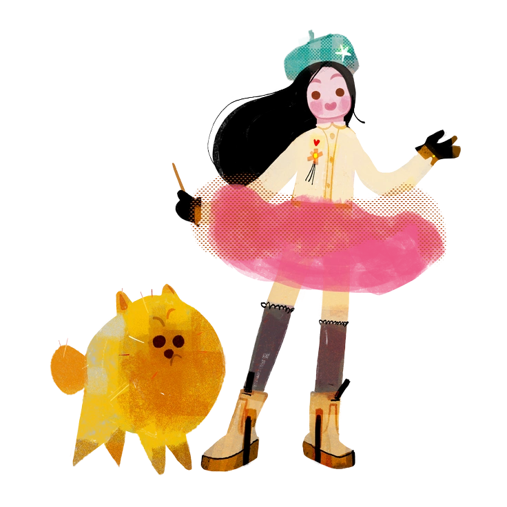
Textured strokes and imperfect edges that give digital products the warmth of something made by hand.

Negative space does the work here. Clean lines and focused details for interfaces where less is genuinely more.

Accurate proportions and believable lighting for brands that need visuals as trustworthy as photography.

Grainy gradients and tactile surfaces. The technique designers reach for when a product shouldn't look too polished.
Frequently asked questions


Visual style isn't decoration.
It's communication.
Wrong style makes interfaces feel generic. The right one makes them memorable. Each technique here has its own character. Browse until the right one clicks, then download and ship.