


Dots Style Illustrations
Dots illustrations channel bold comic energy with halftone shading and bright color blocks. They add playful texture to campaigns, onboarding flows, and social graphics without overwhelming text or data.

What is Dots Style?
Clean geometry and thick outlines meet dense halftone dots that fade into open space. Bright saturated hues and high contrast pairings give each object a graphic look rooted in vintage comics.
UI designers reach for Dots when they need bold spot illustrations for onboarding screens and dashboards. Marketing teams and educators use the style for worksheets and explainers and social templates.
For retro pop projects


Dots illustration packs


What Dots artists draw
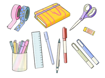
Everyday gadgets and candy snacks and decorative objects appear again and again in Dots scenes. Browse by tag to jump straight into the subjects you need.
Choosing between dotted pop moods
Comparing styles helps you pick a halftone look or softer texture or clean vector line for your product.

Fuchsia trades Dots' comic halftones for smooth neon gradients and abstract blobs, better suited to futuristic dashboards and tech brands.

Mystery leans into dark palettes and surreal scenes, whereas Dots stays bright and object focused for more straightforward messaging.

Scenes emphasizes narrative settings with characters and environments, while Dots centers on isolated objects with graphic pop treatments.
Sleepy uses muted colors and soft shading that suggest calm, in contrast to Dots' sharp outlines and high energy contrast.

Textures focuses on backgrounds and surface patterns as main subjects, whereas Dots applies halftone grain directly onto recognizable objects.

Scrapbooking combines cut paper edges and taped elements, giving a collage vibe that feels softer than Dots' pop art punch.

Crafty leans on stitched details and fabric textures, so compositions feel homemade compared with Dots' crisp comic print sensibility.

Gleam brings glossy highlights and soft 3D volume, while Dots stays flatter with graphic halftone shading and strong line work.

Floral focuses on plants and botanical arrangements, whereas Dots leans toward products and snacks and gadgets with a retro spirit.

Quirky exaggerates characters and faces with odd proportions, whereas Dots usually depicts inanimate objects with simple expressive details.

Initial keeps a minimal monoline look with clean strokes, so it feels quieter than Dots' loud comic shading.

Biro mimics ballpoint pen sketches with crosshatching and scribbles, while Dots relies on controlled halftone density and thicker contour lines.
Frequently asked questions


Start using Dots illustrations today
Browse all 40 Dots pieces and grab PNGs for quick drafts. Switch to SVG for production work. Drop them into Figma and Sketch and Mega Creator, or drag from Pichon.