


Doobry Style Illustrations
Doobry throws sketchy lines over grainy textures and loud color, giving interfaces and campaigns a raw and handmade feel that still reads clean on screens and printed layouts.

What is Doobry Style?
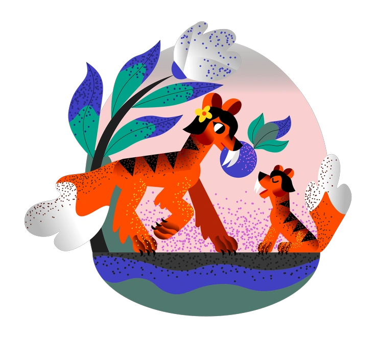
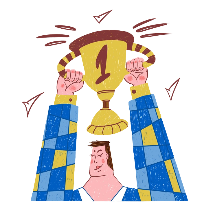
The defining quality of Doobry is its rough pencil lines over grainy raster textures. Bright saturated blocks of color sit against muted grounds and create a nostalgic poster mood.
Most commonly used in indie app branding and experimental websites, Doobry attracts teams building youth culture campaigns and zines. Alternative event promotions benefit when visuals feel tactile and slightly offbeat.
Grainy fills and speckled shading add depth without fighting simple line work.
For bold digital storytelling


What Doobry artists draw
Scenes often focus on quirky people at work and messy studio desks with scattered tools. Abstract decorative blobs appear as fillers and accents. Browse tags to jump straight into themes.
Finding your textured doodle fit
Comparing styles highlights how much texture and character detail you need. That choice shapes brand voice and user mood.
Fauna stays cute and rounded with clean fills, while Doobry embraces rough pencil lines and visible raster grain.

Conifer focuses on minimal outdoor scenes and muted greens, whereas Doobry pushes saturated palettes and chaotic studio vibes.
Sleepy feels slow and dreamy with pastel shading, while Doobry hits harder through rough marks and stronger contrast.

Warp bends shapes into surreal diagrams and warped grids. Doobry stays closer to sketchbook pages with characters and props.

Transistor fits dashboards with clean angles and subtle texture, while Doobry feels more analog and suited to expressive pieces.

3D Crystex brings geometric 3D forms and glassy lighting. Doobry stays flat and gritty with unapologetically hand-drawn lines.

Quirky shares playful characters yet keeps smoother edges and cleaner fills, while Doobry leans into scratchy marks and visible noise.

Glam focuses on polished figures and shiny gradients suited to fashion work. Doobry feels rougher and indie with unapologetic grain.

Initial sticks to structured layouts and restrained shading. Doobry throws proportion off slightly and invites happy accidents on every canvas.
Frequently asked questions


Start using Doobry illustrations today
Download a few Doobry pieces and drop them straight into Figma or the Pichon app. Test them beside your typography and refine colors. Then ship campaigns that lean into grainy personality instead of generic stock illustration.