


Strict Style Illustrations
Strict uses clean linework, monochrome surfaces and a single orange accent to map complex business workflows. It keeps dashboards, fintech flows and corporate pages clear without pulling focus from data.

What is Strict Style?
Flat planes and tight strokes define Strict. Neutral grays form the base. Orange accents signal clicks and actions. Scenes feel ordered because objects align with invisible grids and simple geometry.
Product teams at SaaS companies reach for Strict when interfaces must look serious. UX writers mark up flows, and technical marketers illustrate processes and integration diagrams for sales decks and support docs.
Where Strict works best


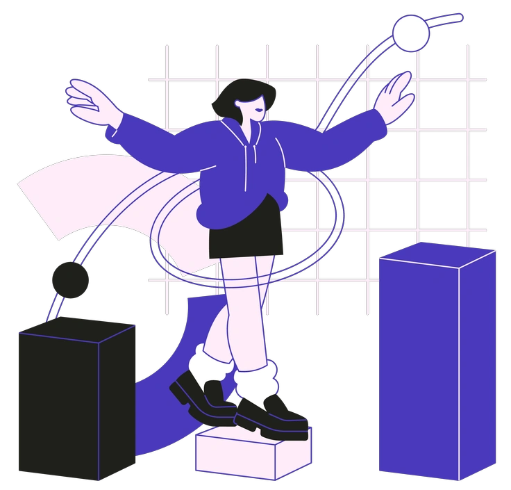
What Strict artists draw
Business environments and digital devices appear often, with many abstract process diagrams in Strict. Many scenes cover dashboards and office teams. Browse tags to narrow subjects quickly.
Finding your precise line look
Comparing linear and 3D styles shows how much weight and mood your product UI or brand storytelling really needs.

3D Blueprint uses volumetric wireframes and technical shading, while Strict stays completely flat with simple outlines and sparse orange accents.

3D Pro feels photo-real with soft lighting and depth. Strict removes volume so complex business diagrams remain abstract and schematic.

3D Techny shows playful gadgets and rounded characters in plastic. Strict replaces them with linear devices and faceless professionals.
Blueberry leans on bright color fills and friendly faces. Strict keeps monochrome structures and avoids expressive characters for corporate contexts.

Indigo introduces soft gradients and atmospheric lighting around figures. Strict relies on hard-edged linework and flat backgrounds without atmospheric effects.

Lounge illustrations feel relaxed with curvy shapes and casual poses. Strict favors rigid geometry and upright stances for business communication.

Midnight runs dark with deep backgrounds and neon accents. Strict uses light canvases and a single orange highlight for emphasis.

Pablita is flat and colorful with simplified humans in quirky poses. Strict switches to monochrome outlines and avoids playful gestures.

Plain uses minimal flat shapes and softer curves with colors. Strict focuses on sharp geometry and a single accent tone.

Taxi feels bright with naive drawing and yellows. Strict replaces sketchiness with controlled linework and gray plus orange.

Icy holds a cool blue palette and subtle gradients. Strict trades color richness for monochrome layouts with sparing orange notes.

Concept focuses on abstract symbolism and surreal compositions. Strict stays grounded in interfaces and concrete office scenes for straightforward communication.
Frequently asked questions


Start using Strict illustrations today
Sign in and download Strict scenes in PNG or SVG, then paste them straight into Figma. Use them in decks and docs to explain dashboards and flows plus critical integrations consistently.