


Pablita Style Illustrations
Pablita illustrations keep empty states and onboarding screens clear without shouting. Simple outlines and single-color fills blend into modern layouts and preserve focus on interface copy and actions.

What is Pablita Style?
The collection leans on uniform outlines and monochrome fills with flat shapes. Curved corners soften geometric forms. Sparse detail and high contrast keep screens readable and reduce noise around important content.
Teams working on dashboards and settings panels or help centers lean on Pablita for clarity. Product designers reuse scenes across platforms and maintain consistent visuals in documentation and product marketing.
For product UI and docs


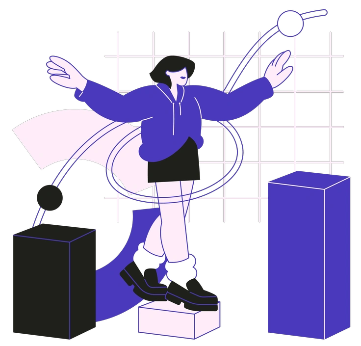
Scenes Pablita artists draw
Workday interactions and device mockups with abstract workflow metaphors appear often in Pablita. Find teammates collaborating or interfaces reacting and simple symbols explaining processes, then browse by tag to narrow themes.
Narrowing down your outline look
Comparing outline and flat styles helps you match illustration weight to interface density and choose the right communication tone.

Graphite feels hand-drawn with textured strokes and rough shading, whereas Pablita relies on crisp outlines and single-weight lines.

Icy introduces soft gradients and volumetric forms so scenes look dimensional, while Pablita sticks to flat monochrome outlines.

Natty uses filled shapes and playful palettes for branding or marketing, whereas Pablita keeps linear silhouettes and subdued single-color treatments.

Strict shares an outline approach yet feels more rigid and technical. Pablita softens geometry with casual curves and friendly proportions.

Concept leans into abstract storytelling with shapes and expressive compositions, while Pablita focuses on straightforward UI situations and simple metaphors.

Plain delivers flat filled icons with no outlines, so surfaces feel solid. Pablita emphasizes contours and hollow interior space.

Shade introduces soft shadows and depth cues that suggest volume, whereas Pablita avoids lighting and stays purely line-based.

Taxi centers around bold accent color blocks and urban motifs, while Pablita remains neutral and broadly applicable across product categories.

Midnight often sits on dark canvases with luminous accents, whereas Pablita is optimized for light interfaces and documentation layouts.

Bloom leans into organic florals and soft color fills for editorial pieces. Pablita keeps utilitarian forms that foreground interface actions.
Blueberry uses a cool chromatic palette and fuller shapes for branding, while Pablita works as neutral scaffolding around UI content.

Indigo pairs deep blues with subtle gradients for expressive scenes, whereas Pablita removes shading and color variation for maximum simplicity.
Frequently asked questions


Start using Pablita illustrations today
Download PNGs for quick mockups or grab SVGs for full control in Figma. Drop Pablita into onboarding and dashboards or docs today so you can ship cohesive product visuals out faster.