


Concept Style Illustrations
Concept illustrations bring structured geometry to digital products. Clean cubes with gentle gradients suggest technology and systems. Use them when you need abstract explanations instead of literal characters.

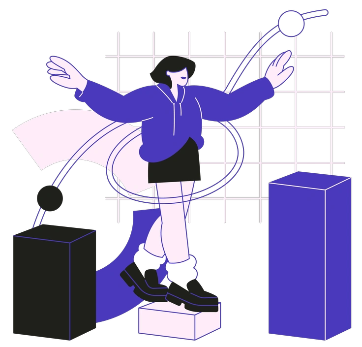
What is Concept Style?
Each illustration in Concept builds from cubes and prisms with smooth gradient fills. Flat rendering keeps edges crisp. Monochrome schemes focus attention on structure and depth instead of surface detail.
It fits especially well in B2B SaaS marketing sites and dashboards. Product marketers and UX writers use Concept with founders to describe data flows and systems without distracting characters or literal hardware.
For tech products and decks


Concept collections


What Concept artists draw
Scenes orbit around data flows and network diagrams with abstract office architecture used as geometric metaphor. Browse tags to jump straight to the subjects you need.
Comparing abstract tech illustration moods
Comparing styles helps you pick visuals that match your product’s tone, from schematic abstractions to friendly character scenes.

3D Blueprint uses wireframe constructions and technical lines, while Concept stays flat with filled geometry and simplified gradients.

3D Pro feels photographic and realistic with lighting. Concept instead offers stylized geometry that reads cleaner beside dense product interfaces.

3D Techny focuses on friendly devices with full depth. Concept reduces them to angular symbols and restrained gradients.
Blueberry leans into soft blobs and playful characters. Concept instead relies on strict geometry and feels more architectural and technical.

Indigo favors hand-drawn outlines and irregular shapes. Concept keeps everything precise with sharp edges and a controlled corporate technology mood.

Knotty illustrations twist ribbons and tubes into tangles. Concept stays rigid, using straight edges and cubes to visualize data.

Lounge feels casual with rounded furniture and characters. Concept removes people and focuses on abstract systems built from geometry.

Midnight uses dark palettes with figurative narratives. Concept favors light backgrounds and diagram-like compositions for dashboards and enterprise sites.

Pablita leans on flat characters and everyday objects. Concept replaces people with symbolic blocks that describe infrastructure and business concepts.

Plain offers flat shapes with solid fills and no depth. Concept adds gradients and subtle perspective while keeping geometry strict.

Taxi illustrations feel editorial with bold colors and narrative scenes. Concept shifts toward cooler tones and abstract diagrams for technology.

Icy uses sharp 3D shards and strong highlights. Concept flattens similar geometry into vector scenes that fit strict grids.
Frequently asked questions


Start using Concept illustrations today
Grab Concept illustrations, import them into Figma or Sketch, and tweak colors to match your system. Quickly ship dashboards and presentations that explain complex products with clean abstract geometry for stakeholders.