


Like Style Illustrations
Like illustrations mix clean flat geometry with bright speckled textures that feel lively yet controlled. Product teams drop them into dashboards and flows when they need clear and friendly storytelling.
What is Like Style?
Flat planes and crisp outlines carry flecked textures that look slightly grainy on close view. Vivid greens contrast with soft blues and pink accents, while negative space keeps every layout breathable.
It fits especially well in fintech dashboards and onboarding flows that must feel trustworthy. Course platforms and internal training teams also use Like to illustrate lessons and achievements in light data stories.
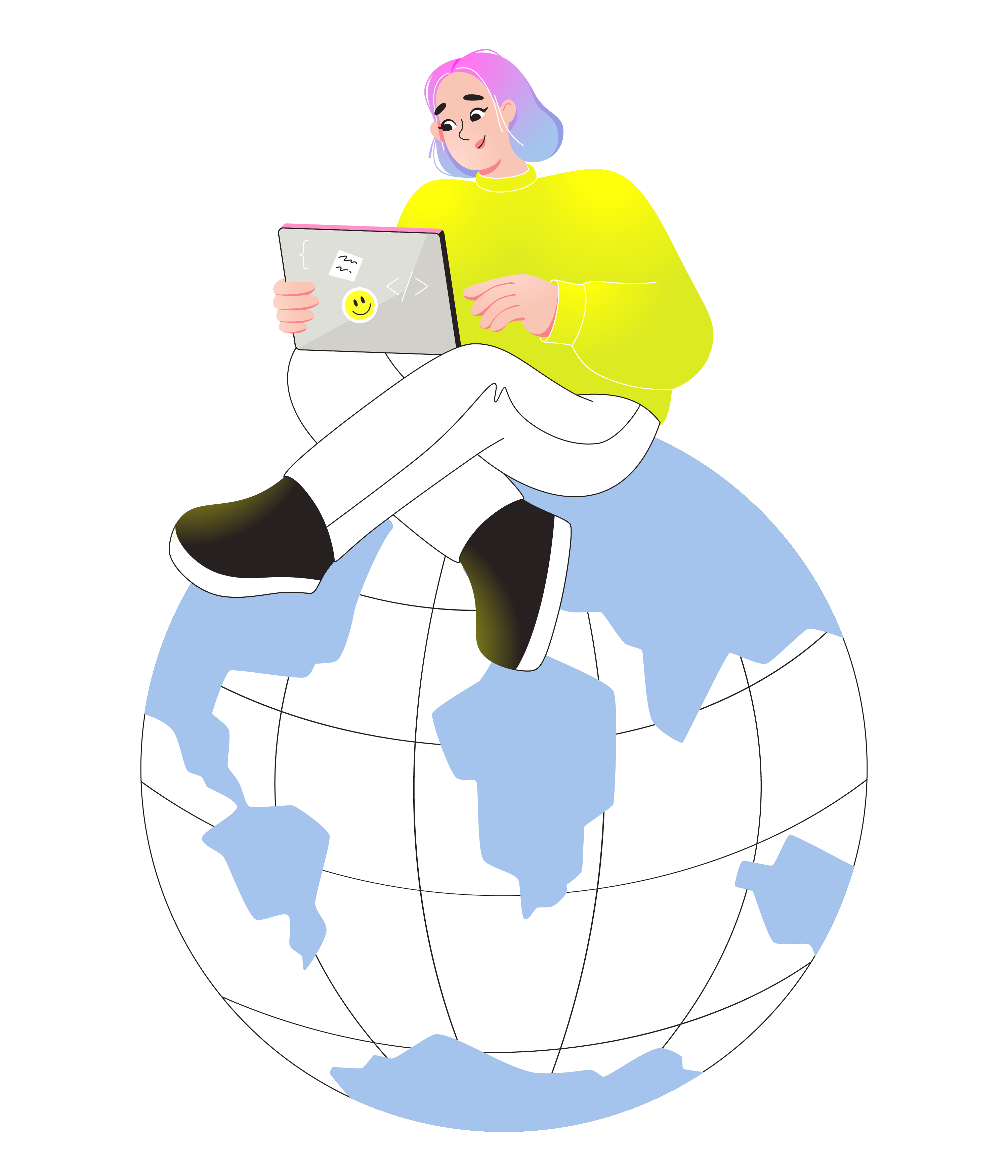
For apps and dashboards


What Like artists draw
Scenes often focus on office collaboration and digital payments with abstract data tiles that hint at dashboards. You can browse tags to jump straight into the subjects you need.
Between bright flats and neon
Comparing styles helps you judge how much texture and color intensity plus character detail your product story actually needs.

Blossom leans into organic curves and softer pastels, while Like stays sharper with bolder contrasts suited to structured business layouts.

Boba feels more playful with rounded characters and candy tones, whereas Like keeps geometry cleaner for professional dashboards and flows.

Burst pushes intensity with explosive shapes and heavier gradients, while Like prefers limited flats and light speckling for calmer interfaces.

Cyborg introduces metallic surfaces and futuristic tech motifs, whereas Like focuses on human figures and simple devices for everyday products.

Dizzy exaggerates motion with tilted compositions and bold distortions, while Like offers gentle angles that read easily inside grid-based layouts.

Flexy bends limbs and objects into elastic poses, whereas Like uses restrained movement better suited to straightforward onboarding or explanation screens.

Flow emphasizes continuous lines and smooth gradients, but Like sticks to crisp edges and flat fills with grainy texture accents.

Glow surrounds elements with light halos and deep shadows, while Like stays mostly shadow-free for cleaner integration into minimal UI.

Holidays focuses on seasonal icons and festive scenes, whereas Like concentrates on ongoing business workflows and product interactions.

Holographic relies on iridescent surfaces and shifting color overlays, but Like relies on flat tones with small textured details.

Kindy skews toward childlike characters and classroom moments, while Like targets adult professionals in work and finance focused training environments.

Neon blasts saturated highlights against dark grounds, whereas Like brightens light canvases with positive color blocks and subtle speckles.
Frequently asked questions


Start using Like illustrations today
Grab a few Like scenes and drop them into Figma or your design tool. Then adjust colors to match branding and ship cleaner dashboards plus helpful onboarding and upbeat landing pages.