


Grainy Style Illustrations
Grainy illustrations bring warm gradients and subtle grain to rounded isometric scenes. They help teams explain tech concepts and lifestyle ideas inside onboarding flows and campaign visuals.
What is Grainy Style?
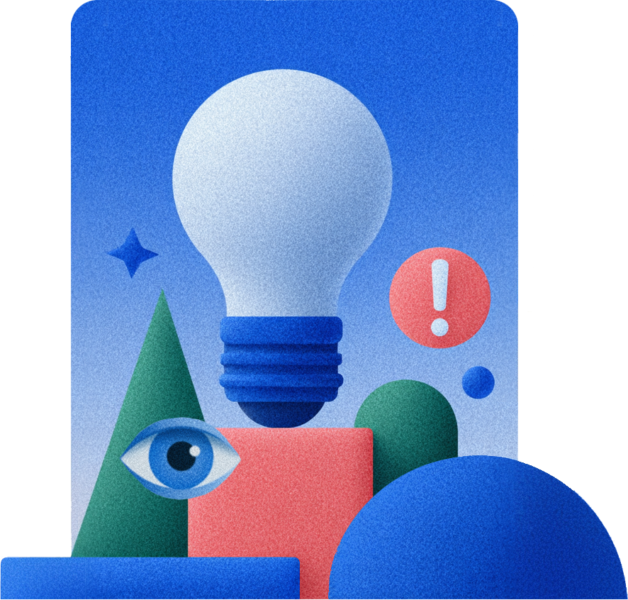
Rounded forms and isometric angles sit under warm gradient fills with soft grain. Bright oranges and magentas blend into purples and yellows, giving each scene gentle depth without heavy shadows.
It fits especially well in mobile onboarding flows and creative marketing sites. Agencies and SaaS teams choose Grainy when lifestyle brands expect conceptual metaphors that still feel friendly.
For upbeat digital products


Grainy illustration packs


Common Grainy illustration themes
Abstract geometric objects and playful technology metaphors appear often alongside casual people scenes. Expect creative workflows and digital tools too. Browse by tag.
Finding your Grainy look
Comparing illustration moods helps you match visuals to product tone and pick artwork that supports interface clarity.

Blossom leans into pastel palettes and delicate line work. Grainy stays bolder with saturated gradients and tactile texture.
Boba feels chunkier and more toy‑like with bubbly shapes. Grainy uses flatter geometry and focuses on conceptual metaphors.

Burst pushes dynamic angles and strong contrast. Grainy prefers smoother transitions and friendlier compositions for product storytelling.

Cyborg sits in a sci‑fi universe with metallic surfaces. Grainy feels warmer and closer to everyday digital life.

Dizzy plays with warped proportions and surreal energy. Grainy keeps isometric structure while still delivering imaginative, metaphor‑driven scenes.

Eastwood favors cinematic lighting and more realistic character proportions. Grainy focuses on simplified geometry and brighter color stories for interfaces.

Flexy exaggerates limbs and uses flexible character poses. Grainy keeps figures contained inside structured isometric spaces with clear object relationships.

Flow drifts toward organic curves and lighting. Grainy leans on geometric isometrics and grainy gradients that suit dashboards and apps.

Glow emphasizes luminous edges and darker scenes. Grainy typically stays lighter with warm gradients that pair nicely with white backgrounds.

Holidays centers on seasonal motifs and decorative details. Grainy remains more general, focusing on tech products and lifestyle metaphors year‑round.

Holographic brings reflective surfaces and iridescent color shifts. Grainy uses matte gradients with grain, which read clearly in UI layouts.

Kindy feels like classroom doodles with simple flat shapes. Grainy appears polished with gradients and isometric depth for grown‑up products.
Frequently asked questions


Start using Grainy illustrations today
Download PNGs for quick mockups or grab SVGs for deeper tweaks. Drop Grainy scenes into Figma and ship onboarding flows plus marketing pages without waiting on custom illustration work today.