


Biomorphic Style Illustrations
Biomorphic illustrations bring sculpted plant-like forms and neutral earth tones into your layouts. Use them to suggest sustainability and calm around organic technology without distracting from product copy or interface elements.

What is Biomorphic Style?
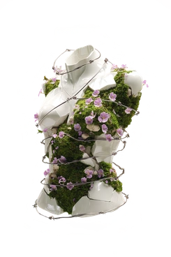
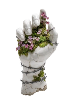
Clean geometry and soft organic curves meet in Biomorphic. Neutral earth tones and muted greens wrap smooth 3D surfaces. Gentle gradients add depth while sculptural silhouettes reference leaves and stones and hint at cellular structures.
Product teams for wellness apps reach for Biomorphic when they need nature-led visuals. Environmental organizations and organic food brands use it for campaigns. Spa marketers add it to onboarding screens and presentation covers.
For wellness and eco brands


What Biomorphic artists draw
Abstract plant-inspired forms and pebble stacks appear often in Biomorphic scenes. Gentle human poses and simplified leaves fit wellness and mindfulness projects. Browse tags to move through subjects that match your product.
Choosing between organic 3D moods
Comparing Biomorphic with nearby styles shows whether your project needs abstract shapes or expressive characters and what detail level fits.

3D Buddy centers on friendly characters with playful props, whereas Biomorphic emphasizes abstract organic shapes and muted earth tones.

3D Glare features glossy plastic surfaces and strong highlights, whereas Biomorphic keeps lighting soft with matte, stone-like organic volumes.

3D Hands Fun&Wild focuses on expressive hands and bold gestures, while Biomorphic abstracts movement into calmer plant-like curves.

3D Kindy leans into childlike characters and toys, whereas Biomorphic removes faces and highlights anonymous, sculpted nature forms.

3D Luxe uses metallic reflections and fashion props for glamour, while Biomorphic prefers stone-like shapes and leaf or cell-inspired forms.

3D Pack is built around realistic product boxes and bottles, whereas Biomorphic stays abstract with object-free organic sculptures.

3D Stripy wraps simple shapes in bold stripes and saturated colors; Biomorphic instead favors smooth monochrome gradients and earth-toned palettes.

Fuzzy looks like tactile felt toys with soft fibers, while Biomorphic reads like polished clay and stone with subtle grain.

Knotty twists ribbons into knots that feel playful, whereas Biomorphic keeps forms broader and slower, closer to stones or leaves.

Lucent leans on transparent glassy objects and light beams; Biomorphic focuses on opaque, grounded shapes with hints of plant structure.

Paper Cut simulates layered paper edges and shadows, while Biomorphic uses smooth volumetric modeling that feels grown rather than assembled.

3D Rooms builds full interiors with furniture and walls, whereas Biomorphic removes architecture and concentrates on floating sculptural nature forms.
Frequently asked questions


Start using Biomorphic illustrations today
Download Biomorphic illustrations as PNG for quick mocks or SVG for brand systems. Drag them into Figma or Pichon, recolor to match your palette and ship interfaces that feel calmly nature-led.