


Rocky Style Illustrations
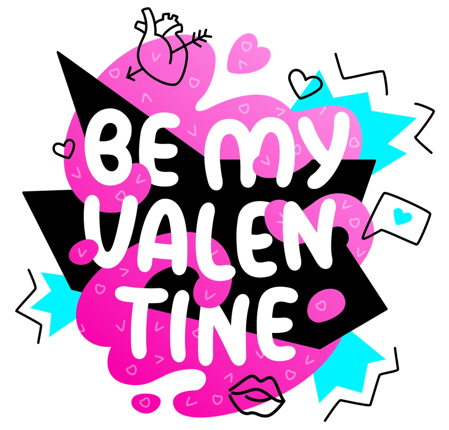
Rocky puts bold vector words front and center so messages read loud and clear. Use its bright color blocks and doodle accents to frame headlines and quick product stories.


What is Rocky Style?
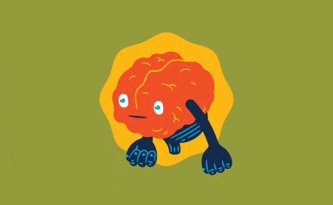
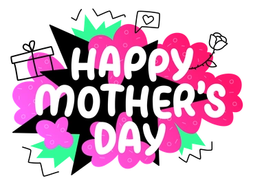
What makes Rocky stand out is chunky vector lettering with thick outlines and sharp corners. Bright saturated fills push against clean backgrounds and small doodle icons drift around the words.
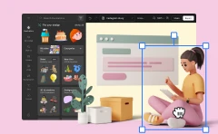
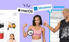
These illustrations show up in app onboarding flows and social quote cards where typography leads. Creative educators and agencies use Rocky panels for course titles and expressive section breaks.
For loud, typographic UI


What Rocky artists draw
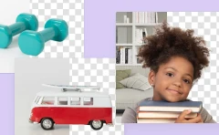
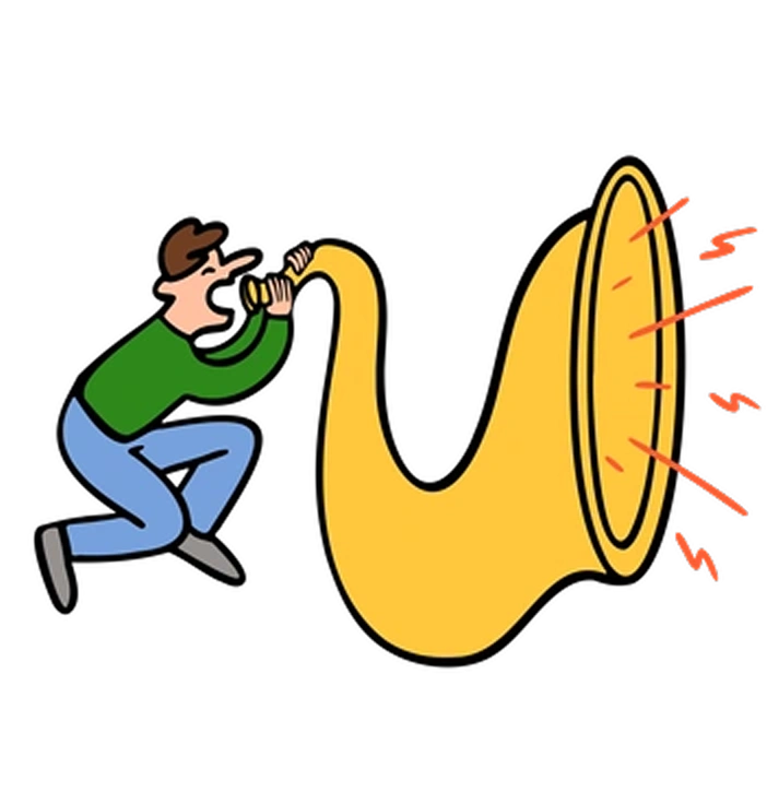
Letter-heavy phrases sit beside abstract shapes and pattern fields. You will also find creative desks and art tools. Browse the Rocky gallery by subject tags.
Between lettering moods and lines
Comparing lettering styles helps you match illustration mood to brand tone and choose visuals that support your typography-first layouts.

3D Fluency uses rounded 3D objects and soft lighting, while Rocky stays flat with bold outlines and typography-led compositions.

Clap focuses on character scenes and minimal shading, whereas Rocky pushes large letterforms and graphic slogans over simple decorative shapes.

Clipart feels more generic and pictogram-based, while Rocky channels poster lettering with bolder colors and stronger word-centric layouts.
Comic brings narrative panels and expressive characters, whereas Rocky emphasizes typographic punchlines and abstract supporting doodles instead of full stories.

Cubes builds structured 3D grids and blocks with perspective, while Rocky keeps everything flat and lettering-driven with playful embellishments.

Doodle leans into loose sketching and irregular lines, whereas Rocky refines doodles around bold, clearly readable vector words.

Framework focuses on interface wireframes and layout scaffolds, while Rocky contributes headline treatments and decorative typography for finished marketing screens.
Giggle centers on rounded characters and cute props, whereas Rocky foregrounds chunky lettering with only small supporting icons.

Inky uses textured strokes and irregular fills that mimic markers, while Rocky keeps edges crisp with solid digital color blocks.

Lime relies on thin outlines and light tones, whereas Rocky turns up saturation and stroke weight for louder graphic impact.

Outline strips illustrations to strokes with almost no fills, while Rocky balances heavy fills and outlines inside each letterform.

Pocus plays with whimsical characters and magical objects, while Rocky focuses on slogans and type-forward layouts for branding.
Frequently asked questions


Start using Rocky illustrations today
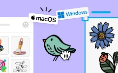
Download PNGs for quick social posts, or grab SVGs with a subscription for crisp scaling. Drop Rocky panels into Figma or Pichon and ship typography-led designs faster across presentations and product screens.