
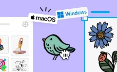


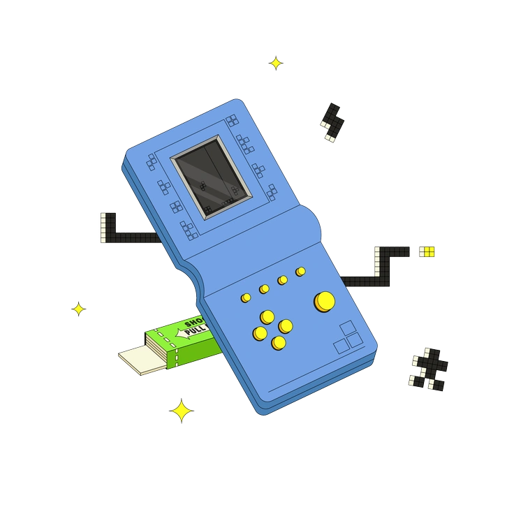
Sammy Line Style Illustrations
Sammy Line keeps digital products readable with crisp outlines and muted fills. Use it when icons feel too small yet full illustrations overwhelm content structure.

What is Sammy Line Style?
Clean geometry and steady line weight define Sammy Line scenes. Muted flat colors sit on quiet backgrounds. Details describe only key actions so layouts stay understandable on busy dashboards or guides.
Most commonly used in SaaS onboarding and education platforms and also internal tools, Sammy Line helps product writers and UX designers illustrate flows and support step based explanations beside interface screenshots.
For products and content


Everyday Sammy Line scenes
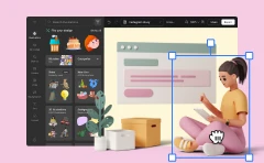
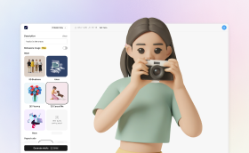
Scenes often show coworkers at laptops and simple interface mockups and everyday tools on desks. Technology and workplace life and casual communication appear most. Browse the collection by tag to narrow your search.
Between line styles for product
Comparing line and color approaches helps you choose a tone that matches brand personality and keeps product narratives consistent.

Sitcom uses chunky outlines and expressive characters with brighter palettes. Sammy Line stays muted with everyday actions and calmer framing.

Eastwood scenes look cinematic with strong shadows. Sammy Line uses flatter lighting and direct compositions for instructional content.

Scandi leans into soft geometric blocks and interior layouts. Sammy Line centers on outlined characters and devices matching product screens.
Retro pushes bold shapes with nostalgic palettes. Sammy Line stays neutral with simplified objects and avoids overt period references.

Graphite mimics pencil shading with textured strokes. Sammy Line uses clean digital lines and flat color for sharper interfaces.

Hue relies on vibrant gradients and soft lighting. Sammy Line keeps shading minimal and prefers muted palettes behind product content.

Pure uses minimal strokes and often monochrome layouts. Sammy Line adds muted fills and scenes around people and devices.

Grainy introduces noise textures and rough edges. Sammy Line stays smooth with crisp vectors suited to polished UI and documentation.

Bright favors saturated palettes and playful shapes. Sammy Line uses desaturated colors and forms that support serious content and dashboards.

Pop goes bold with graphic shapes and high contrast palettes. Sammy Line stays muted with uncomplicated outlines for business contexts.

Tiny focuses on small elements and compact scenes. Sammy Line offers larger compositions that anchor interface or document sections.

Like leans toward social media motifs with bright icons. Sammy Line focuses on neutral business situations and functional device scenes.
Frequently asked questions


Start using Sammy Line illustrations today
Browse all 964 Sammy Line scenes and grab PNGs or SVGs for real projects. Drop illustrations straight into Figma or slides with Pichon and tweak layouts inside Mega Creator before developer handoff.