


Sitcom Style Illustrations
Sitcom illustrations drop cartoon office workers into everyday corporate scenes with a sly wink. Use them to lighten training decks and HR campaigns while keeping culture updates clear.

What is Sitcom Style?
Each illustration in Sitcom shows rounded characters with bubble limbs and simple faces in flat muted colors. Thick outlines and empty backgrounds keep attention on gags and office props.
It fits especially well in internal trainings and all-hands presentations where humor softens heavy topics. HR teams and internal comms managers use Sitcom to humanize policies and everyday process explanations.
For light corporate storytelling


What Sitcom artists draw
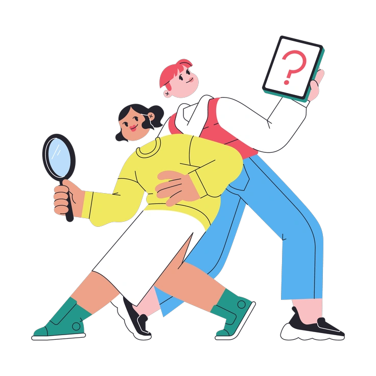
Office workers in awkward meetings and casual coffee breaks appear again and again. Remote calls share space with business gadgets and simple charts that explain processes. Browse by tag to jump into specific scenes.
Pick your comic business tone
Comparing illustration moods helps you decide how silly or serious workplace stories should feel beside your content.

Burgundy leans into dramatic lighting and strong contrasts, while Sitcom keeps colors dull and jokes gentle for safer corporate humor.

Papery adds grainy textures and cutout edges that feel tactile. Sitcom stays smooth and clean for distraction free slides.
Polar uses icy tones and geometric characters. Sitcom favors warmer moods with exaggerated expressions that highlight goofy behavior instead.

Retro taps nostalgia with vintage hues and props. Sitcom feels like modern workplace cartoons for present day teams.

Sammy Line focuses on thin outlines and minimal fills. Sitcom uses color blocks and thicker strokes for bolder comedic silhouettes.

Eastwood leans cinematic with detailed scenes and dramatic framing. Sitcom stays simple and gag driven for reading in business documents.

Glossy introduces reflections and depth with shiny surfaces. Sitcom remains flat so slides print clean and stay consistent across screens.

Flexy exaggerates motion and stretchy limbs for dynamic compositions. Sitcom keeps poses simpler to support comedic beats in structured layouts.
Boba looks rounder and more toy like with bright palettes. Sitcom tones colors down and leans on situational office jokes.

Breeze favors space and softer gradients for calm scenes. Sitcom packs more character gags into frames while keeping shapes flat.

Scandi leans into minimalism with tidy geometry and cool hues. Sitcom feels more narrative with expressive coworkers filling scenes.

Atomic pushes bold shapes and higher contrast color blocks. Sitcom softens everything for friendlier humor that suits policy explainers.
Frequently asked questions


Start using Sitcom illustrations today
Download Sitcom scenes and drop them straight into your slides or product screens. Use SVG on paid plans or Mega Creator to tweak colors and layouts for each message you send.