


Azure Style Illustrations
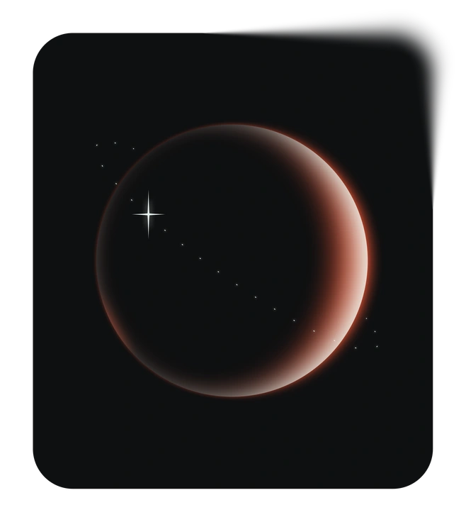
Azure illustrations mix crisp black outlines with vivid blue gradients and tiny star details, giving product teams clear visuals for data-heavy dashboards and onboarding flows. Training content benefits too.

What is Azure Style?
Each illustration in Azure builds on simple geometric shapes with a strong black stroke. Blue gradients shift from pale tints to deep azure and tiny stars add quiet highlights.
You'll find them in product walkthroughs and investor updates where clarity matters. Fintech designers and edtech teams pick Azure when icons must look professional yet still approachable.
For data and product teams


Azure illustration packs


What Azure artists draw
Scenes focus on office collaboration and digital devices that visualize software workflows. Financial charts and money symbols appear often, so browse by tag to jump straight to relevant topics.
Between clean lines and color
Comparing Azure to nearby styles clarifies whether you need flat gradients or more volume in shapes and lighting.

Icy uses frosted textures and soft cyan tones, while Azure sticks to flat blue gradients and crisp black strokes.

Isotech builds isometric device scenes with depth and perspective. Azure stays flat and icon-like for overlays on dense interfaces.

Dimension introduces solid 3D forms and soft shadows, whereas Azure emphasizes outlined symbols with no lighting effects.
Void leans into stark monochrome shapes on dark space-like backgrounds. Azure prefers bright blue fills on light layouts.

Node focuses on connected networks and flow diagrams with intricate linking lines. Azure keeps compositions simpler for dashboards and slide icons.

Breeze features rounded characters and muted pastels, while Azure skips figures and concentrates on symbolic blue interface elements.

Holographic brings iridescent surfaces and multi-color light refractions. Azure limits the palette to controlled blue gradients and clear outlines.

Marginalia uses hand-drawn lines and playful annotations around text. Azure relies on strict geometry and consistent stroke weights.

Quantum leans into futuristic neon glows and complex sci-fi panels. Azure stays grounded in everyday business and education iconography.

Glare emphasizes glossy highlights and depth on devices. Azure removes reflections and opts for flat fills with minimal decorative stars.

Pure sticks to outline-only graphics with almost no fills. Azure combines bold strokes with strong blue areas to guide attention.

Type integrates lettering and typographic layouts as core elements. Azure instead supports existing text blocks with neutral, repeatable icon imagery.
Frequently asked questions


Start using Azure illustrations today
Download Azure icons in seconds and drop PNGs straight into slides or product screens. Then grab SVGs for Figma components and adjust colors in Mega Creator before shipping consistent layouts.