


Type Style Illustrations
Type letters and numbers turn gradient-rich letterforms into focal graphics for headers and logos. They keep typography playful while staying readable in branding layouts and product screens.

What is Type Style?
Clean geometry and soft gradients shape each letterform into a small sculpture. Textured surfaces add depth while subtle lighting keeps the characters floating above neutral or monochrome backgrounds.
Whether you're designing portfolio headlines or teaching typography, Type becomes a flexible alphabet. Brand teams and creative studios use the set for expressive initials. Educators apply it in lessons and student projects.
For expressive typographic layouts


What Type artists draw
Expect standalone letters and numbers turned into graphic objects. Many scenes highlight alphabet posters or challenge entries. Browse tags to jump straight to characters you need.
Choosing between experimental type moods
Comparing styles helps you match typography energy to brand tone and select characters that complement existing fonts.

Icy focuses on frosted surfaces and cool palettes, while Type pushes warm gradients and structured letterforms for expressive headlines.

3D Glassy exaggerates transparency and reflections, whereas Type keeps opacity higher and emphasizes readable character silhouettes.

Isotech leans into technical shapes and interface elements, while Type concentrates on standalone letters designed as graphic symbols.

Dimension treats letters as heavy architectural blocks, while Type explores lighter gradients and playful proportions around each character.

Forms abstracts shapes into non-letter compositions, whereas Type anchors experimentation in recognizable alphabet and number structures.
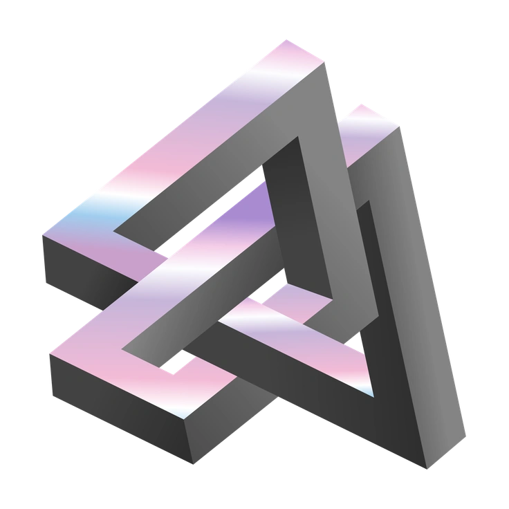
Illusion explores perspective tricks and spatial puzzles, while Type keeps the focus on legible glyphs with subtle depth.
Void feels darker and moodier with deep shadows, while Type usually favors brighter gradients and approachable character forms.

Node builds networks of connected elements, whereas Type presents isolated letters and digits as individual design objects.

Joy celebrates rounded, character-like figures, while Type stays closer to typographic anatomy for headers and wordmarks.

3D Illusion intensifies perspective distortions and maze-like shapes, while Type balances depth with clean, readable letter outlines.

Experimental ranges across many abstract concepts, while Type narrows that spirit into a cohesive alphabet and number set.
Holostickers mimics shiny sticker surfaces and holographic sheen, whereas Type focuses on matte gradients and consistent texturing.
Frequently asked questions


Start using Type illustrations today
Download PNG files for quick mockups or grab SVG with a paid plan for deeper editing. Drop Type characters into Figma, Keynote or your codebase and ship distinctive typography fast.