


Void Style Illustrations
Void illustrations bring soft gradients and quiet glow to tech products. Futuristic forms feel precise yet calm, so AI dashboards and SaaS landing pages gain depth. Pitch decks inherit the same measured atmosphere.
What is Void Style?
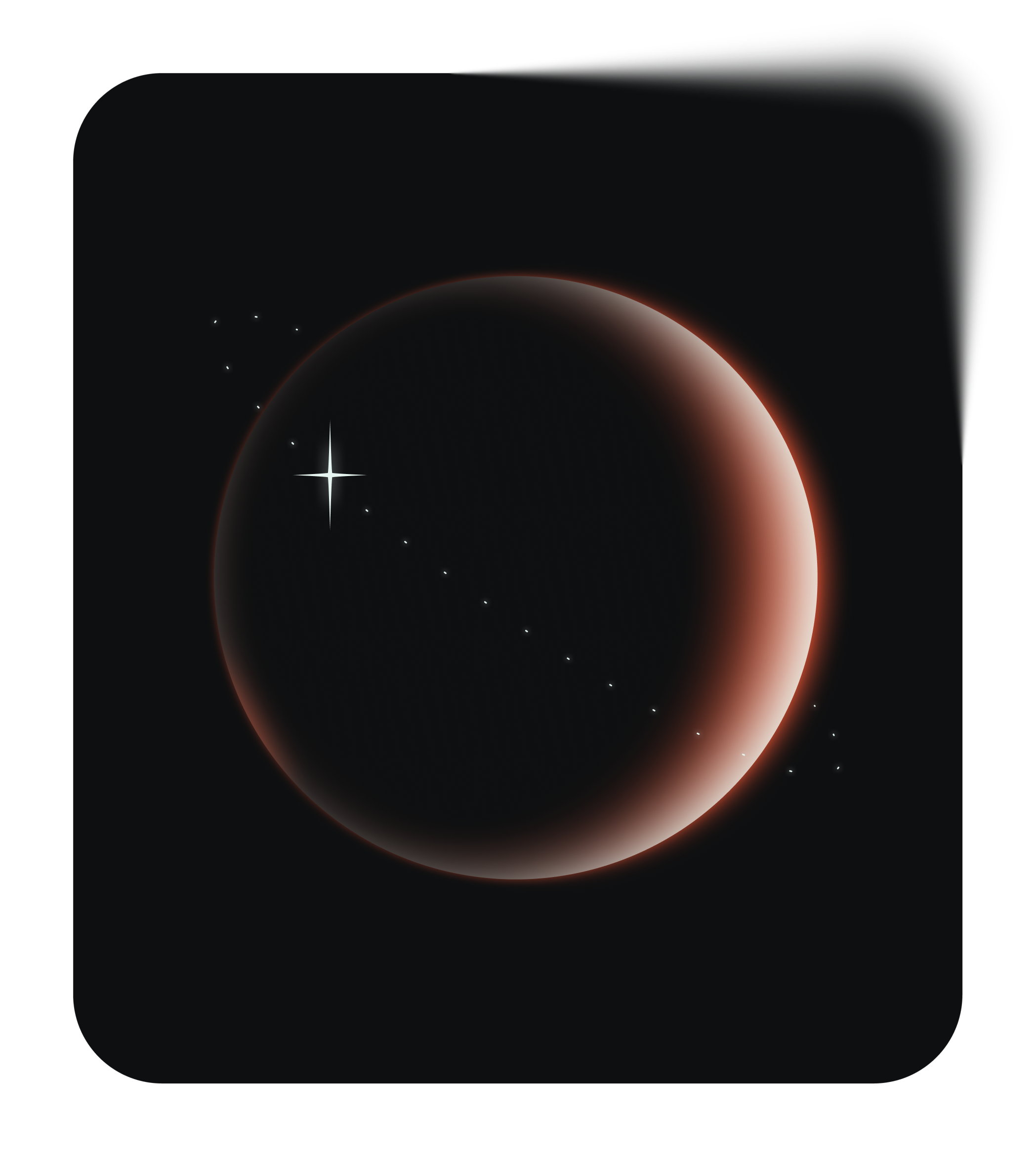
Flat planes and curved shapes fade into soft gradients of gray and deep purple. Teal highlights glow at the edges and suggest digital screens without heavy outlines.
Teams working on AI tools and SaaS products pick Void for premium marketing pages. Enterprise designers drop it into onboarding flows and tech conference decks when photography feels too busy.
For calm tech visuals


Themes in Void


What Void artists draw
Many Void pieces show AI dashboards and abstract data flows. Others picture focused office scenes with simplified figures. Check tags to jump straight to the subjects you need.
Which futuristic mood fits
Comparing Void with nearby styles reveals how glow behaves and how much character you want driving your product story.

Glare leans into brighter neon beams and stronger reflections, while Void stays muted and controlled for sober tech brands.
Illusion introduces surreal distortions and bolder shapes. Void keeps geometry minimal so concepts read clearly inside product layouts.

Journal looks hand-drawn with sketchy outlines and paper textures, whereas Void feels digital and polished with pure gradients.

Lettering focuses on custom type compositions and expressive phrases. Void instead centers on abstract tech panels and interface metaphors.

Office shows detailed workplaces with characters and props. Void removes clutter and hints at activity through simplified silhouettes and glowing panels.

Pure sticks to flat color blocks and no glow. Void relies on gradients for soft light and subtle atmosphere.

Type illustrations build around big letters and logos, while Void builds mood with ambient shapes that frame interface content.

Urban captures city life and architecture with sharper angles. Void feels more abstract and focuses on screens and conceptual devices.

Icy emphasizes cold blues and crystal textures. Void balances neutral grays with gentle color accents for quieter, less thematic tech visuals.

Isotech looks more technical with outlined devices and diagrams. Void abstracts technology into floating panels and hazy data shapes.

Dimension pushes 3D depth and strong perspective. Void stays flatter, which helps interface mockups and dashboards remain clean.

Node connects elements with visible lines and network motifs. Void suggests connections through lighting transitions and overlapping gradients instead.
Frequently asked questions


Start using Void illustrations today
Create an Icons8 account, grab PNGs for quick mockups or SVGs on a paid plan, and place Void scenes into Figma and Sketch projects. Pichon-powered workflows benefit too, so you ship calmer tech visuals without commissioning custom artwork first.