


Marginalia Style Illustrations
Marginalia illustrations sit quietly beside your UI, using pastel gradients and simplified forms to hint at narratives. They guide users without pulling focus from content or controls.

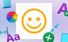
What is Marginalia Style?
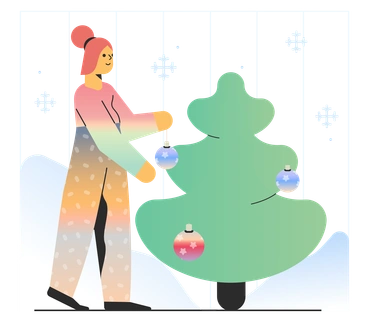
Soft gradients and pale pastels wash over minimal geometric shapes and organic curves. Marginalia keeps edges clean and contrast low so interface text and buttons stay readable beside these illustrations.
Teams working on SaaS dashboards and productivity tools pick Marginalia for empty states and onboarding flows. Documentation writers and support teams also use it to soften error screens and maintenance notices.
Subtle helpers for product UI


Browse Marginalia packs
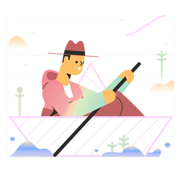


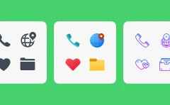
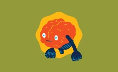
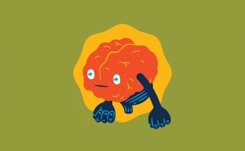
Common Marginalia subjects
Abstract gradient compositions mix with relaxed human figures and simple interface metaphors like folders or charts. Many scenes support everyday product tasks, so it is easy to browse by tag.
Between gradient styles for UX
Comparing Marginalia with nearby sets highlights which gradient mood or detail level fits your product interface best.

Azure uses brighter gradients and stronger contrast, so scenes feel bolder and more central than Marginalia's quiet background supports.

Delight leans into expressive characters and lively gestures, whereas Marginalia focuses on simplified figures and abstract shapes beside UI.

Dimension introduces volumetric lighting and depth cues. Marginalia stays completely flat with gentle gradients that hug interface layouts.

Isotech emphasizes technical diagrams and device details, while Marginalia keeps forms minimal and symbolic for general product stories.
Jumble combines dense collage elements and energetic overlaps. Marginalia prefers open compositions and low detail that breathe around content.

Lettering centers hand‑drawn words and phrases as art. Marginalia instead supports existing copy blocks with quiet pictorial cues.

Node focuses on technical networks and data flows with sharper geometry. Marginalia drifts toward softer curves and everyday productivity metaphors.

Pure strips illustrations to almost monochrome strokes, while Marginalia relies on pastel gradients and filled shapes for gentle emphasis.

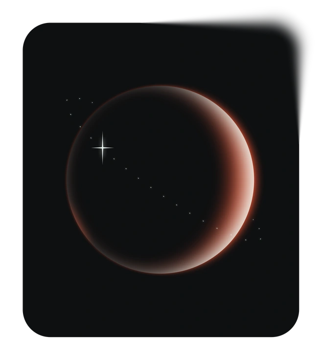
Space explores planets and cosmic scenes with darker palettes. Marginalia stays grounded in product moments and abstract interface references.
Void uses dramatic negative space and stark contrast so compositions feel experimental. Marginalia offers quieter backdrops that blend into structured layouts.

Work Hard depicts busy office characters and detailed props. Marginalia hints at work scenarios with fewer elements and softer shapes.

Hue pushes color saturation and playful gradients. Marginalia keeps tones muted so illustrations hug the background near critical UI.
Frequently asked questions


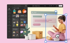
Start using Marginalia illustrations today
Grab Marginalia from Icons8, drop SVGs or PNGs into Figma or your design tool, and ship interfaces where gradients support the story rather than steal the screen. Teams can iterate quickly without custom illustration briefs.