


Pixeltrue Style Illustrations
Bright flat illustrations with doodle accents keep product interfaces friendly and clear. Pixeltrue scenes drop into empty states or onboarding flows without overpowering typography or layout.


What is Pixeltrue Style?
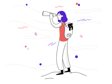
Clean geometry and rounded shapes define Pixeltrue. Bright saturated colors and minimal shading ride on smooth strokes to build crisp scenes where casual doodle lines gently interrupt the precision.
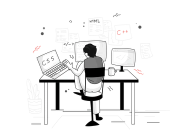
The style works across SaaS dashboards and landing pages that need approachable tech visuals. Product designers and growth teams drop Pixeltrue into empty states and onboarding flows. They also use it for lightweight feature explanations.
For product UI and marketing


Pixeltrue illustration packs


What Pixeltrue artists draw
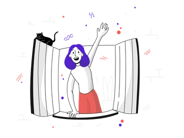
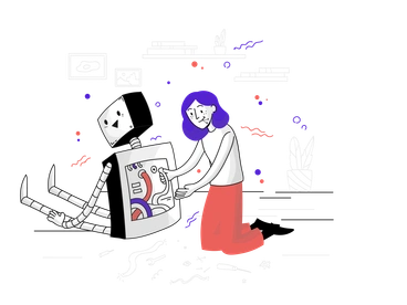
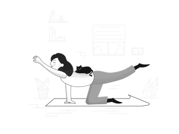
Scenes often show people using laptops or phones and abstract shapes representing data or connections. You will also see cloud services and interface elements. Browse tags to jump into specific themes.
Choosing between Pixeltrue and others
Comparing styles helps you decide how playful, technical or neutral your visuals should feel for each product surface.

Quirky pushes proportions and facial expressions further, while Pixeltrue keeps characters simpler for everyday product flows and restrained interfaces.

Glam leans into gradients and glossy lighting, whereas Pixeltrue stays flat with bold fills and clean outlines for UI compatibility.

Rocky introduces chunky shading and heavier outlines. Pixeltrue uses lighter strokes and minimal depth so screens feel less dense.

Blobby focuses on amorphous shapes and fluid characters. Pixeltrue prefers clear geometry and recognizable tech objects that support interface clarity.

Vibrant exaggerates color contrast and dynamic poses for storytelling. Pixeltrue moderates motion and saturation so UI copy remains primary.

Lime uses softer pastels and more whitespace. Pixeltrue favors bolder hues that pop on dashboards and marketing hero sections.

Comic introduces panel-like framing and stronger action poses. Pixeltrue centers on work scenes that sit quietly beside forms and charts.

Puzzle builds illustrations from interlocking pieces and distinct segments. Pixeltrue keeps shapes simpler for readability in small interface spaces.

Inky leans on textured strokes and ink-like edges. Pixeltrue relies on smooth vectors that align neatly with crisp digital layouts.

Doodle pushes the hand-drawn look further with loose scribbles. Pixeltrue uses doodle elements sparingly around structured characters and interface objects.

Giggle embraces playful exaggeration and cartoon humor. Pixeltrue stays more neutral so product messaging feels professional yet friendly.

Incut combines sharp cutout shapes and heavier shadows. Pixeltrue avoids depth and keeps elements flat for integration with UI layouts.
Frequently asked questions


Start using Pixeltrue illustrations today
Grab a few scenes and drop them into Figma or your design tool. Adjust SVG colors and resize as needed to match your palette. Then reuse characters across onboarding flows and dashboards to keep marketing and product visuals aligned.