


Token Style Illustrations
Token brings a monochrome, tech-forward aesthetic to dashboards and decks. Metallic gradients and glass effects convey security and modern infrastructure while staying neutral enough for serious financial and enterprise interfaces.

What is Token Style?
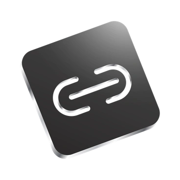
Each illustration in Token uses monochrome gray tones with controlled metallic gradients. Glass-like panels float above clean backgrounds. Geometric shapes and crisp edges keep every element precise and firmly digital.
Whether you're designing SaaS dashboards or fintech landing pages, Token delivers a focused tech language. Product marketers and enterprise teams use it for diagrams and process visuals. Architecture overviews stay consistent too.
Best for serious tech UI


Token collections


What Token depicts
Expect servers and networks plus abstract data flows rendered with precise geometry and metallic depth. Business charts and finance symbols appear often as anchors. Browse by tag to focus specific themes.
Pick your tech-forward mood
Comparing styles clarifies the right balance between color and seriousness for your interface, and helps match tone to audience expectations.

Amethyst uses purple gradients and softer shading, while Token stays strictly gray and metallic for sober fintech dashboards.

Festicon leans into vivid colors and playful characters. Token focuses on abstract tech objects and restrained corporate communication.

Ruby introduces warm reds and expressive scenes where Token maintains cool neutrality and minimal storytelling for analytical products.

Social centers on everyday communication moments and UI mockups. Token shifts attention toward infrastructure and data plus enterprise finance concepts.

Weekday emphasizes friendly office characters and loose line work. Token replaces people with devices and abstract systems.

Cut features sharp paper-like slices and bold contrast. Token prefers smooth metallic gradients and glass panels for digital hardware metaphors.

Line sticks to minimal strokes without shading. Token adds dimensional gradients and transparency, creating depth suited to complex product diagrams.

3D Techny Line delivers isometric depth and bright tints. Token stays flatter and monochrome for quieter, documentation-heavy applications.

Bonbon Line looks hand-drawn and whimsical. Token contrasts with strict geometry and metallic precision for serious enterprise dashboards.

Company focuses on friendly business scenes with characters and offices. Token instead highlights infrastructure and analytics plus abstract operations.

3D Isometric adds full color and strong perspective. Token removes perspective and keeps everything front-facing for clarity in dense layouts.

Icy uses frosty gradients and subtle blues, suggesting cold surfaces. Token avoids color entirely and supports more conservative corporate branding.
Frequently asked questions


Start using Token illustrations today
Download a few Token scenes, drop them into Figma or your slide deck, and adjust sizes or layouts. Build a consistent tech language today without waiting on custom illustration work.