


Illusion Style Illustrations
Illusion brings geometric optical tricks into clean interfaces, using muted bases and metallic flashes to suggest depth. Use it when you want abstract tech visuals without literal scenes.

What is Illusion Style?
Drawn with a strict geometric grid, Illusion layers precise shapes and gradients to imitate depth. Muted grounds meet bright metallic accents so structures appear to fold and tunnel then twist into receding space.
The style works across tech product sites and modern app interfaces where abstract imagery feels appropriate. Product designers and UX teams as well as digital agencies use Illusion for onboarding flows and feature explanations plus conceptual technology visuals.
For tech sites and apps


Themes in Illusion


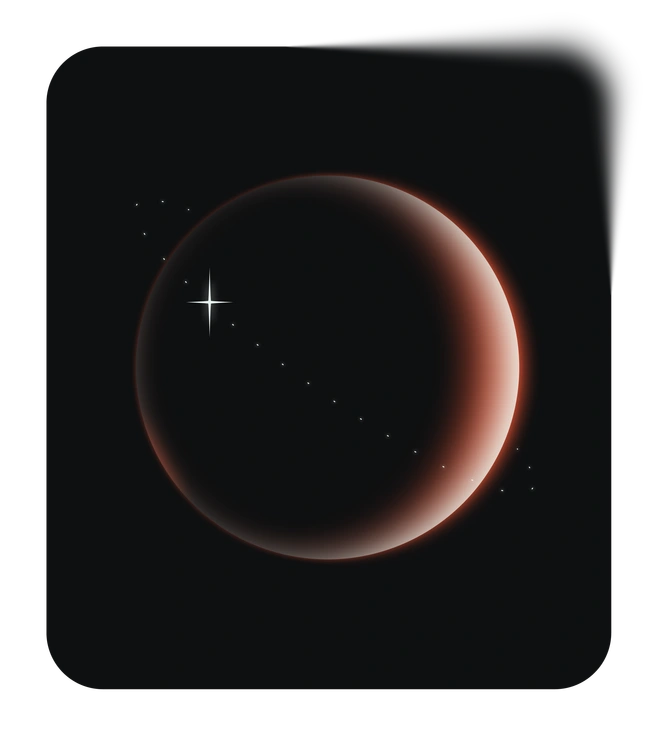
What Illusion artists draw
Abstract solids with warped grids and architectural frames suggest data flows and networks within digital spaces. Conceptual chips and circuits appear too. Browse by tag to narrow scenes for your project.
Finding your Illusion lookalike
Comparing Illusion with nearby styles helps you judge whether your final visuals should feel abstract or more character‑driven.

Icy leans toward crystalline 3D shapes and frosted textures, while Illusion stays flat and geometric with purely optical effects without material surfaces.

Isotech focuses on isometric devices and UI mockups, whereas Illusion shows technology through abstract tunnels and lattices with layered geometry.

Type centers visuals on bold letterforms and typographic layouts, while Illusion builds meaning from pure geometry and optical depth cues.

Bright uses saturated cheerful colors and simple icons, while Illusion favors muted bases and metallic flashes with stricter geometric illusions.

Dimension leans on full 3D rendering with volume and shadows, whereas Illusion simulates depth through vector gradients and overlapping planes.

Silky focuses on flowing organic curves and soft gradients, while Illusion prefers angular constructions and more architectural and mathematically defined forms.
Void embraces dark backgrounds and wide negative spaces. Illusion usually prefers mid‑tone grounds filled with intricate geometric illusions.

Node illustrates network diagrams and connected nodes directly, while Illusion hints at data flow through twisting corridors and stacked planes.

Hugo features character‑driven 3D scenes with props, while Illusion removes people and focuses on abstract structural and technology concepts.

Rooms depicts recognizable interiors and furniture, while Illusion replaces rooms with abstract labyrinths and shafts with folded planes.

Spicy trades in bold hues and playful iconography, while Illusion keeps color restrained and emphasizes controlled optical puzzles.

Azure leans into bright blues and airy gradients, while Illusion uses a muted palette with metallics and stronger structural emphasis.
Frequently asked questions


Start using Illusion illustrations today
Download a few Illusion scenes, drop SVGs straight into Figma or your code‑ready design system, and adjust colors in Mega Creator. Save hours compared with commissioning fresh abstract artwork today.