


Rush Style Illustrations
Rush throws bright gradients and sharp geometric figures at UX states so users notice feedback instantly. Drop ready scenes into error pages and onboarding steps in modern products.

What is Rush Style?
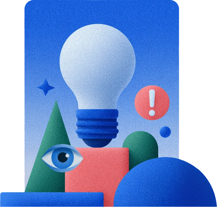
Built around electric gradients and flat geometry, Rush uses saturated neons and strong color blocking. Clean silhouettes and minimal detail keep every scene focused on action and interface context.
Whether you're designing empty states or onboarding tours, UX teams reach for Rush when interfaces feel too static. Marketing designers also use it for promos and startup landing hero sections.
For UX and product flows


What Rush artists draw
Everyday gadgets and household objects appear as stylized geometric icons with bright gradients. Simplified characters and bold food scenes repeat across packs, so you can browse by tag.
Which bold flat look fits
Seeing Rush beside other flat styles helps you choose the right intensity and texture for each project.
Grainy adds soft noise and slightly muted colors, while Rush stays ultra clean with solid fills and neon gradients.

Bright focuses on playful flat scenes with gentler tones, whereas Rush pushes saturation and contrast for stronger UX attention.

Like keeps compositions friendly and rounded for general content, while Rush leans harder into experimental shapes for interface states.

Active centers on dynamic sports and motion themes, but Rush targets digital actions such as loading states and error confirmations.

Glossy introduces reflective highlights and soft depth, whereas Rush remains purely flat with no sheen and very hard edges.

Chromed mimics metallic surfaces with gradients and shine, while Rush uses gradients mainly for color drama inside flat forms.

Mellow softens everything with calm palettes and relaxed poses. Rush turns up brightness and angles for louder UX messaging.

Everyday focuses on relatable daily tasks with balanced tones, while Rush exaggerates hue and geometry for tech-centric UI moments.

Folks emphasizes character storytelling and warm scenes, whereas Rush often reduces people to simple figures supporting interface states.

Pictorial leans toward detailed compositions and richer environments. Rush strips backgrounds down and highlights the core UX action instead.

Flexy uses flexible, flowing shapes for expressive branding. Rush sticks to sharper geometry that fits systematized product design libraries.
Boba draws chunky characters and cute objects with soft curves, while Rush feels more angular and focused on UX conditions.
Frequently asked questions


Start using Rush illustrations today
Download Rush scenes as PNG for quick mocks or grab SVG with a paid plan. Drop them into Figma and other tools to light up UX states within minutes easily.