


Open Doodles Style Illustrations
Open Doodles keeps interfaces light with loose monochrome sketches. Use these casual line characters and objects to explain flows, soften technical screens, or fill empty states without heavy illustration work.


What is Open Doodles Style?
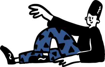
Rendered with simple black strokes on white space, Open Doodles shows wobbly outlines and flat shapes. Characters bend, stretch, sit, or wave with exaggerated poses and almost no interior detail.
You'll find them in SaaS onboarding flows and friendly error pages. Product managers and UX writers use them. Indie founders drop these doodles into prototypes or shipped interfaces when budget or time blocks custom art.
For calm product experiences


What doodle illustrators draw
Scenes follow everyday people with laptops or phones and simple furniture in sparse rooms. Abstract symbols for collaboration or creativity appear often too. Browse tags to jump into specific themes.
Finding your sketchy line fit
Comparing sketch styles helps you pick scenes that match your tone, from playful placeholders to more structured diagrams.

Beam adds soft color fills and smoother geometry, so layouts look more polished and less like quick notebook sketches.

Cole uses heavier outlines and fuller characters with faces, which suits narrative scenes rather than lightweight placeholders.

Crayon introduces textured strokes and color blocks that feel childlike, while Open Doodles stays strictly monochrome and minimal.

Eyeful focuses on detailed compositions and stronger perspective, so scenes feel structured instead of loose and sketchy.

Hand-drawn animation brings frame-by-frame motion sequences, whereas Open Doodles works as static snapshots for still layouts.

Kit combines clean flat shapes and subtle color, giving interfaces a more designed look than bare black doodles.

Marks centers around abstract strokes and shapes without characters, while Open Doodles leans on people and everyday objects.

Mochi has rounded pastel figures and soft shading, so it feels chunkier and more tactile than single-line sketches.

Scandi balances muted color palettes with geometric scenes, which can match editorial layouts better than very rough doodles.

Scribbles pushes abstraction and random strokes further, while Open Doodles maintains recognizable characters and props for product copy.

Bonbon Line adds neat strokes and cute details, so it reads more polished than intentionally messy Open Doodles.

Company focuses on business scenes and seating charts with clearer structure, where Open Doodles stays looser and less corporate.
Frequently asked questions


Start using Open Doodles illustrations today
Sign in, grab PNGs for quick mockups, or download SVGs for deeper edits. Drag assets into Figma, Sketch, or Pichon and ship friendlier interfaces without commissioning custom drawings for your next sprint.