


Crayon Style Illustrations
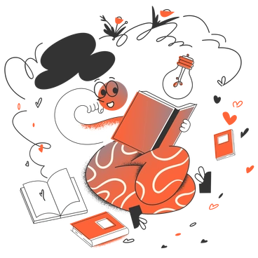
Crayon illustrations bring rough wax textures and loose lines to digital products. Abstract figures feel human and imperfect, so interfaces read as kind, accessible places instead of rigid systems.

What is Crayon Style?
At its core, Crayon leans on single-color drawings with visible wax grain and paper specks. Loose outlines wobble slightly and simple shapes suggest people and everyday objects. Movement appears without literal detail.
Most commonly used in children’s apps and community sites, Crayon helps brands feel patient and approachable. Creative studios also grab it for workshop promos and art classes. Onboarding flows gain extra warmth.
For friendly digital products


What Crayon artists draw
Scenes often center on abstract people making art with friends or learning alongside simple geometric props. Everyday objects and classroom tools appear in many compositions too. Browse by tag to find matching themes.
Comparing crayon-inspired illustration moods
Comparing Crayon with nearby styles helps you judge how much texture and abstraction your product story really needs.

Dazzle Line stays cleaner with sharp strokes and no wax grain, while Crayon feels rougher and more tactile overall.

Ginger Cat focuses on cute animals and storytelling scenes, whereas Crayon leans toward abstract human figures and simplified objects.

Grapy uses smoother fills and bolder shapes with less visible grit, so it reads cleaner than textured Crayon illustrations.

Pluto leans into geometric minimalism and flat color blocks, while Crayon embraces sketchy outlines and organic imperfections.

Sketchbook mimics pencil drawing with softer shading and quieter strokes. Crayon, in contrast, shows wax texture and bolder, chunkier marks.

Purr feels more polished and character-driven, with clean curves and cute faces, whereas Crayon keeps figures abstract and deliberately unfinished.
Blink runs with brighter colors and smoother vector lines, so it fits modern tech brands more than textured Crayon sketches.

Cole keeps outlines neat and proportioned, giving a calmer business tone, while Crayon feels rougher and more playful by design.

Open Doodles shares a loose feeling but uses flatter fills and fewer textures, so Crayon looks grittier and more tactile.

Bonbon Line focuses on delicate monoline strokes without wax grain, giving a lighter look than heavily textured Crayon drawings.

Company aims at corporate scenes with cleaner geometry and muted palettes. Crayon instead supports friendly brands that want childlike energy.

Sky brings soft gradients and dreamy volume, whereas Crayon stays flat with strong grain and clear hand-drawn marks.
Frequently asked questions


Start using Crayon illustrations today
Download a few Crayon scenes, drop them into your next onboarding flow or landing page, and adjust colors via SVG. You can test how the texture feels alongside your current branding.