


Pale Style Illustrations
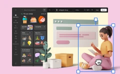
Pale illustrations bring quiet structure to UX projects with muted colors and neat geometry. They support data-heavy layouts and explain flows and keep product stories readable across websites and dashboards.

What is Pale Style?
Light and space define Pale style. Neutral beiges and soft grays pair with pale pastels. Flat shapes and consistent strokes with faint texture create calm compositions that sit easily beside dense interface content.
UI designers reach for Pale when hero areas must feel professional without shouting. Product marketers and SaaS founders and content teams use these scenes for dashboards and onboarding flows and long-form documentation.
For calm product visuals


Explore Pale packs


Common Pale subjects
Business meetings and dashboards and workstation setups appear often, along with abstract screens that hint at data and collaboration. Browse tags to quickly find office work or product tours or simple device scenes.
Which muted style fits best
Comparing styles side by side helps you match illustration weight and texture and mood with each product surface.

Bloom uses brighter gradients and playful compositions with expressive characters, while Pale keeps flat geometry and neutral business scenes.

Clip feels more cartoonish with bold outlines and saturated accents, whereas Pale favors delicate strokes and softly muted UX environments.

Office leans into detailed props and fuller scenes. Pale simplifies desks and devices to avoid crowding dashboards and text.

Vector has sharper edges and higher contrast between shapes, while Pale softens corners and keeps tone low for serious products.

Shine introduces glossy highlights and depth hints, compared to Pale's strictly flat surfaces and gently textured panels.

Mushy pushes rounded, almost squishy characters and props. Pale prefers precise geometry and thinner strokes that mirror interface components.

Fogg feels more conceptual with dreamy gradients and abstract blobs, while Pale stays concrete with recognisable offices and product screens.

Nordic uses cooler blues and stronger contrast, creating crisper scenes. Pale leans into warmer grays and softer transitions between elements.

Grain puts textured surfaces front and center, whereas Pale keeps grain faint so text and UI elements remain dominant.

Teko feels more editorial with stylized characters and bolder storytelling. Pale focuses on clear workflows, screens and straightforward workplace actions.

Martina introduces hand-drawn quirks and irregular outlines, while Pale stays precise with even strokes and consistent geometric layouts.

Daily covers casual everyday life and informal objects. Pale concentrates on structured office scenes, digital products and focused work situations.
Frequently asked questions


Start using Pale illustrations today
Sign in to Icons8, grab muted Pale scenes in PNG or SVG, and drop them into Figma or Pichon. Build dashboards and landing pages and documentation that feel organised without extra illustration effort.