


Fogg Style Illustrations
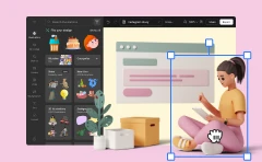
Fogg keeps product interfaces clear with flat geometry and gentle gradients. Designers get Google-inspired scenes that sit quietly beside UI components yet still explain complex product concepts.

What is Fogg Style?
The palette stays neutral with soft blues and grays against open white space. Simple rectangles and circles define characters and interface surfaces with subtle gradients that echo familiar Material-style cards.
The style works across SaaS onboarding and corporate sites where illustration must feel native to the layout. UX teams use Fogg to explain workflows and highlight key actions without heavy detail.
For web products and docs


Fogg illustration packs


Common Fogg interface scenes
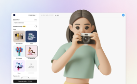
Scenes often show professionals working inside apps and browsers, plus abstracted dashboards with charts and cards. You will also find meetings and collaboration moments. Browse tags to jump straight to each theme.
Comparing clean illustration systems
Looking across neighboring styles helps you decide whether your interface illustration system should feel more playful or more restrained.

Catchy uses bolder colors and stronger depth, while Fogg stays flatter with muted tones that match serious web apps.

Cherry emphasizes rounded characters and playful proportions, whereas Fogg focuses on straightforward geometry and understated workplace scenes.

Gummy feels soft and toy-like with thick outlines, while Fogg integrates better into professional dashboards and dense layouts.

Jaconda looks hand-drawn with sketchy strokes and looser anatomy. Fogg keeps strokes clean and proportions closer to interface guidelines.

Simplistic leans into ultra-minimal shapes and almost no detail, while Fogg retains clearer props and recognizable UI components.

Vivid pushes high contrast and bright accent areas. Fogg uses gentler tones that sit quietly beside typography and data.

Shine introduces glossy reflections and stronger gradients, whereas Fogg keeps shading minimal for a flatter, more document-friendly appearance.

Nordic combines geometric bodies with colder palettes and more abstraction. Fogg includes clearer screens and device frames for product storytelling.

Teko looks more editorial with thinner lines and stylized figures. Fogg stays closer to product UI with blocky devices and panels.

Martina favors softer edges and friendly characters in casual scenes. Fogg shifts toward structured office environments and interface-driven compositions.

Daily feels like quick editorial sketches for blogs and news. Fogg aligns more tightly with product flows and user journeys.

Lagom balances simplicity and warmth with more organic scenes. Fogg is stricter, leaning into grids and recognizable interface widgets.
Frequently asked questions


Start using Fogg illustrations today
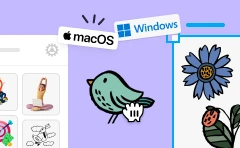
Grab PNGs for quick mockups or export SVGs straight into your favorite design software. Build onboarding flows and dashboards faster by placing Fogg scenes beside interface screenshots and key callouts.