


Halftone Style Illustrations
Halftone illustrations mix punchy color and dotted shading for layouts that feel printed yet crisp. Drop them into posters and campaigns where retro references matter.

What is Halftone Style?
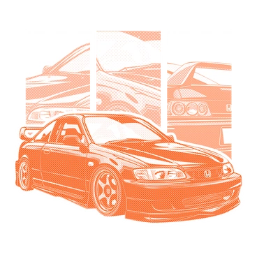
Dot patterns of shifting size build gradients and texture across each scene. Bold CMYK-inspired hues and clean vector edges keep every composition sharp on print and screen.
Teams working on posters and album covers also use Halftone for social campaigns that need vintage print flavor. Brand designers and illustrators reach for it when planning comic-inspired key visuals.
For bold retro layouts


What halftone artists draw
Pop culture icon riffs sit alongside retro gadgets and bold abstract compositions in Halftone scenes. Many resemble comic panels. Browse tags to find themes you need.
Comparing halftone print moods
Seeing styles side by side helps you decide how much texture and nostalgia your project should carry.

Orange favors flat geometric forms and muted oranges while Halftone focuses on dotted shading and brighter CMYK-style contrasts.

Arabica leans into warm coffee tones and subtle grain. Halftone instead pushes contrast with crisp dots and pop energy.

3D Modern adds depth and realistic lighting, whereas Halftone stays flat and graphic with emphasis on print-inspired texture.

Isometric builds structured pseudo-3D scenes with precise angles. Halftone focuses more on surface pattern and poster-style pop graphics.

Lush emphasizes painterly gradients and organic shapes. Halftone replaces soft transitions with dotted shading and sharper comic-inspired silhouettes.

Kitekat brings playful characters and minimal shading. Halftone feels louder, with stronger dot texture and bolder print poster references.
Frequently asked questions


Start using Halftone illustrations today
Download a few Halftone scenes, drop them straight into Figma or your slide deck and adjust colors in SVG. Build retro-inspired campaigns without waiting for custom illustration work from artists.