


Discover the science behind visual weight and optical balance that design tools can’t do—and why your eyes are smarter than your machines.
Have you ever perfectly aligned elements in your design tool only to feel something still looks ‘off’? You’re not imagining things. The mathematical precision of design software often conflicts with how our brains actually perceive visual information.
The difference between technically correct and visually harmonious design often comes down to a single pixel—a subtle shift that your users will feel without knowing why. Master these principles, and you’ll create interfaces that not only look balanced but feel intuitively right.
Visual weight
Visual weight is the perceived “heaviness” or “importance” of an element in a composition. It depends on such factors as:
Shape
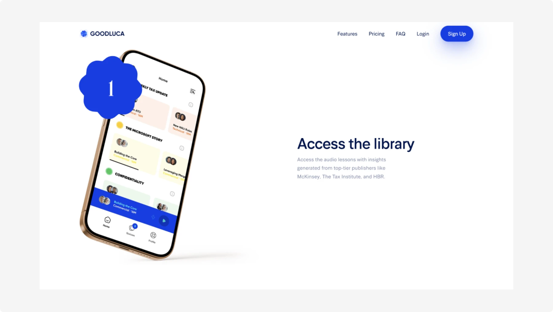
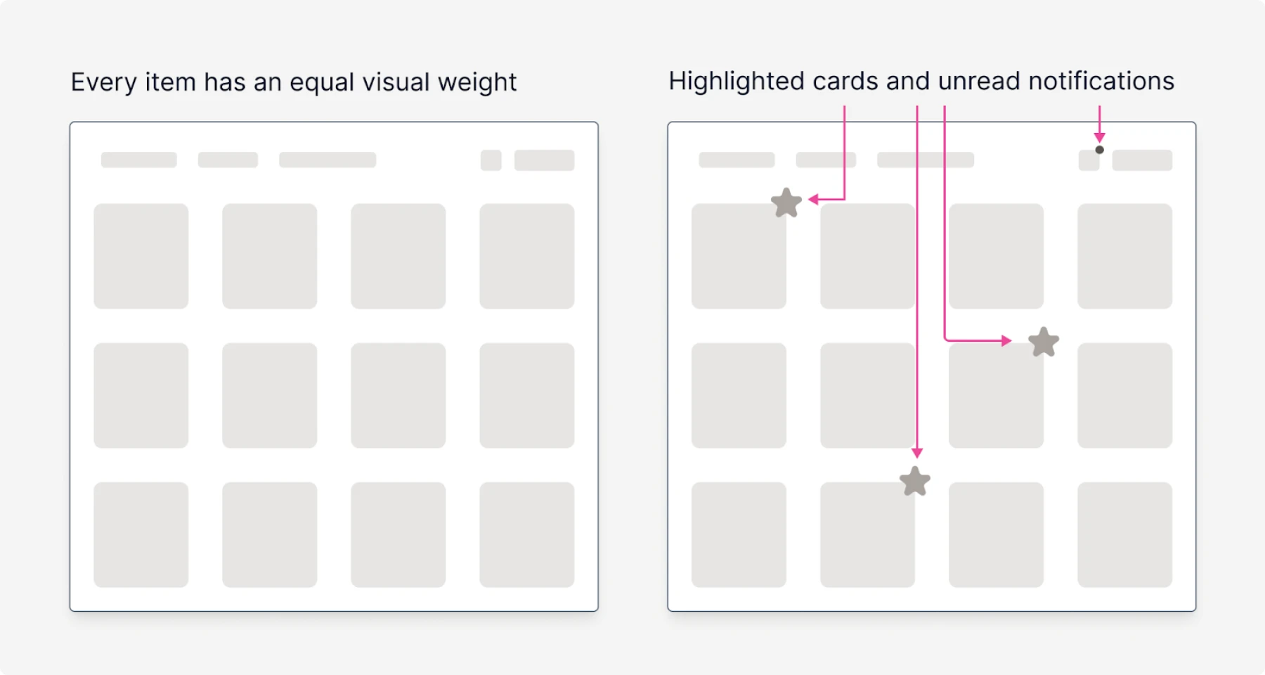
Dense, compact shapes (such as squares and circles) appear heavier than irregular, loose shapes. Goodluca used a nice badge on top of the phone that certainly draws attention.
Some examples of using shape and density are:
- Marking certain items with a badge or a star (for example, if you want to highlight the best goods in your catalog)
- We are placing a small, yet saturated dot next to the notification icon to inform users that there are new unread notifications.
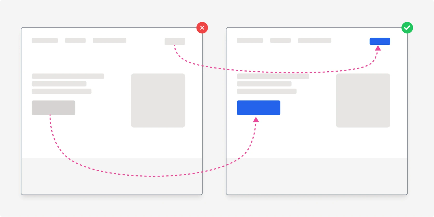
Size
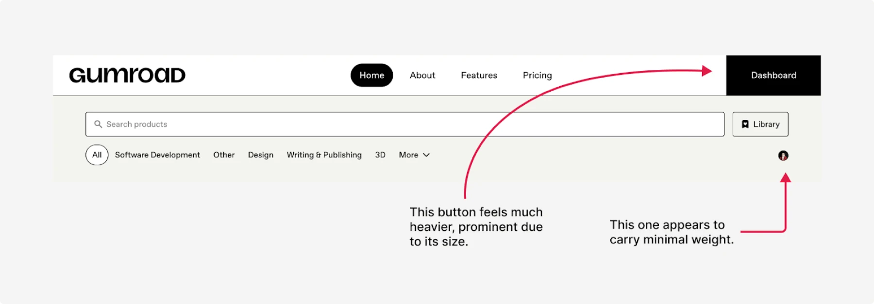
Larger elements tend to appear “heavier.” On Gumroad, the avatar is tiny, but the dashboard button is huge (plus has a solid background), indicating its heavy weight.
This is the most trivial way to make an element more prominent—just increase its size.
One of the most common mistakes is not utilizing whitespace for text and CTA buttons. As they say:
“Use space, it’s free”.
Color
Saturated or darker colors have more weight than light, de-saturated colors.
For example, on ConvertKit’s landing page it’s obvious which buttons stand out more (= are heavier).
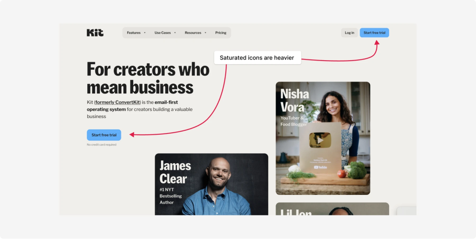
This method works fine, but keep in mind that every such element takes some attention, and don’t overuse it. Otherwise all elements will be “heavy”, and no one of them will stand out.
Actually, when we talk about visual weight, the word “weight” is a bit misleading, since we talk about what makes an element stand out amongst others. Which can be color but this is only one of the options.
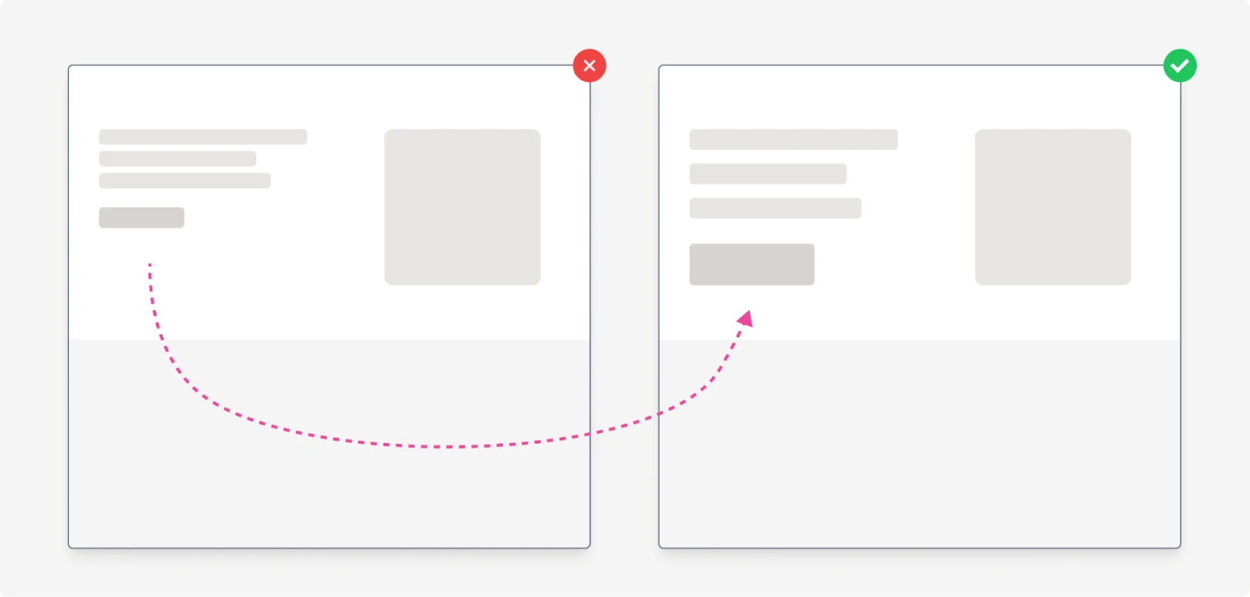
Position
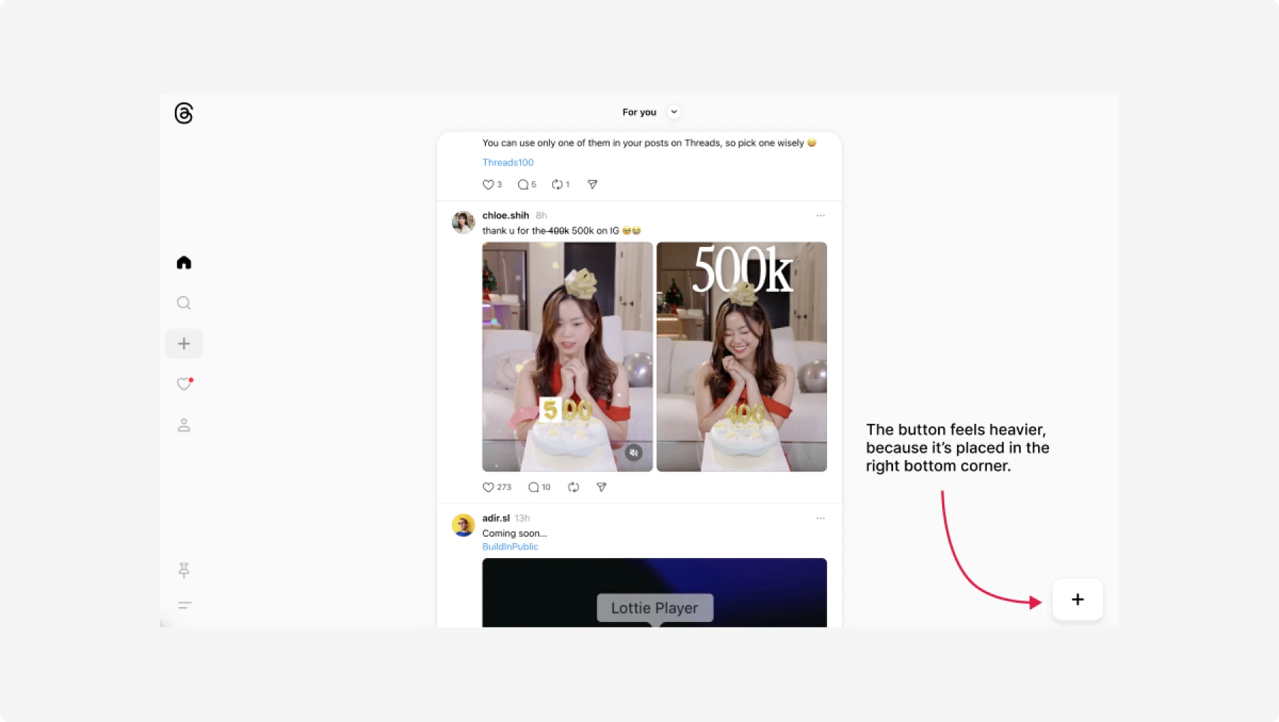
Elements near the design’s edges or corners feel heavier than those in the center. A common example is the scroll-to-top button placed at the bottom-right corner.
However, be careful with these points. Even though they are indeed considered to be so-called “anchor points”, due to their distance, users might not notice the element if it doesn’t have additional contrast.
For example, on the Threads web app, they have the add new post button in the bottom-right corner, but since it has a white background color, it doesn’t stand out enough and might not be noticed by users.
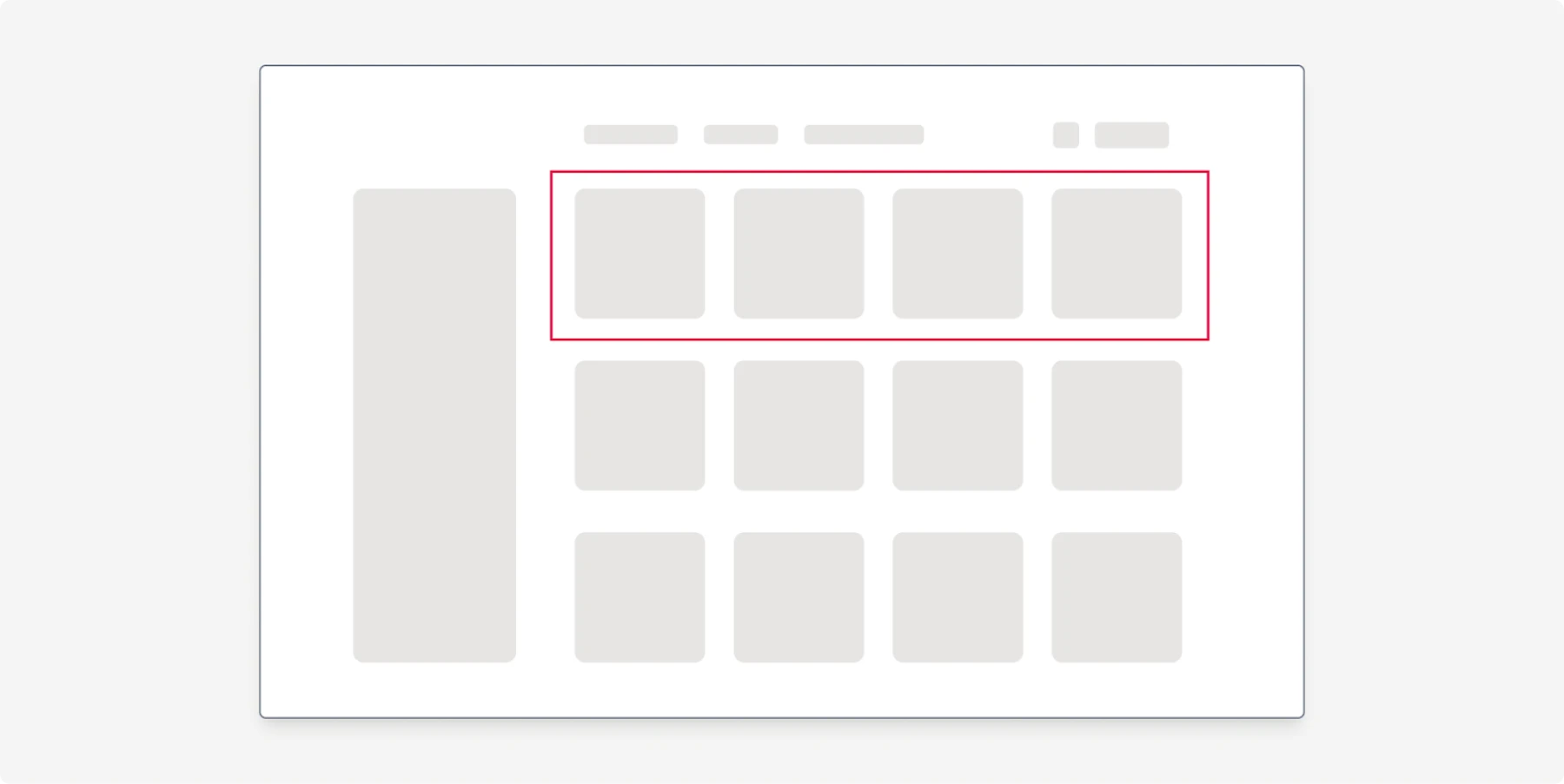
Another example of using position is moving elements at the top. In the example below, the first four cards will be more noticeable than others.
You can make it even more prominent by adding some white space between the first row and others.
Contrast
High-contrast elements draw more attention and carry more weight.
For icons accompanied by labels, the combination of saturation, contrast, and size is crucial, as we will see further in the article.
Contrast and color are a little bit different tricks. It’s easier to demonstrate usage of contrast in the following example.
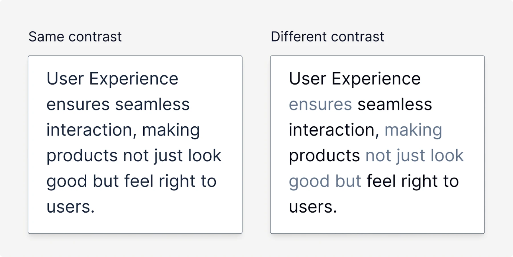
This idea is often used on landing pages relying on typography, when the secondary text is grayed out, while the key words have bigger saturation and thus they become “heavy” and easy to scan.
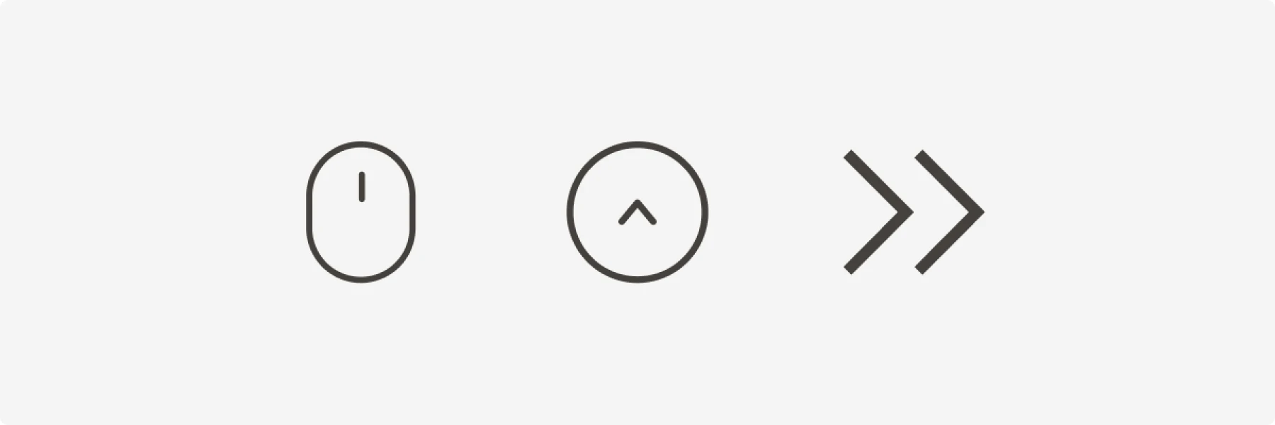
Direction
Elements that imply movement or direction (such as arrows) can affect weight perception.
Some examples:
- The scroll-down animated icon implies that there is something below. So it feels a little bit like it pushes you down when it’s animated
- Scroll up does the contrary
- Right arrows (often called chevrons) in buttons convey the direction and work as a signifier. Additionally, they provide a slight visual weight.
The squint test
There is a related thing called a squint test that may sometimes come in handy to check your whole interface. In order to do that, you should take a screenshot of a page and blur it.
You will see that some elements stand out more than others. For example, let’s take X’s home page and blur it.
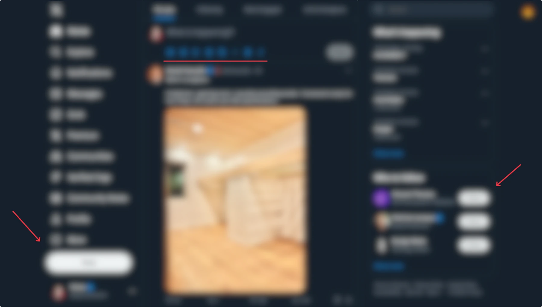
We can obviously see white buttons, and they stand out. In this case, they are “heavier” due to their size. Also, there is a menu of post actions that slightly stand out due to their color.
Now, let’s do the same with Bluesky.
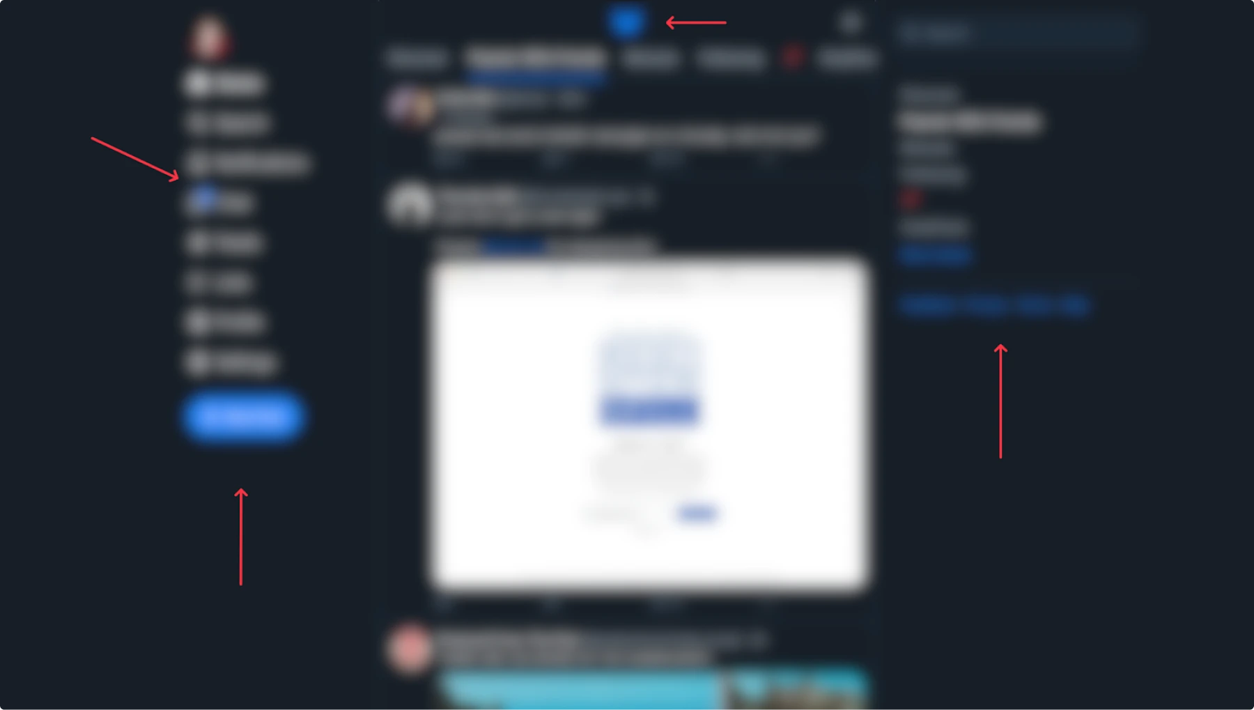
Note the difference. They use not only size but color as well, which is more common.
This technique may help you to quickly identify what stands out more on your page.
Of course, in both cases, I didn’t take into account the feed because it takes up most of the space and apparently draws the most attention. However, the focus might shift if the feed solely consists of text messages, as it occasionally does.
In different types of applications, the test might be more useful than in others, so use it wisely when needed.
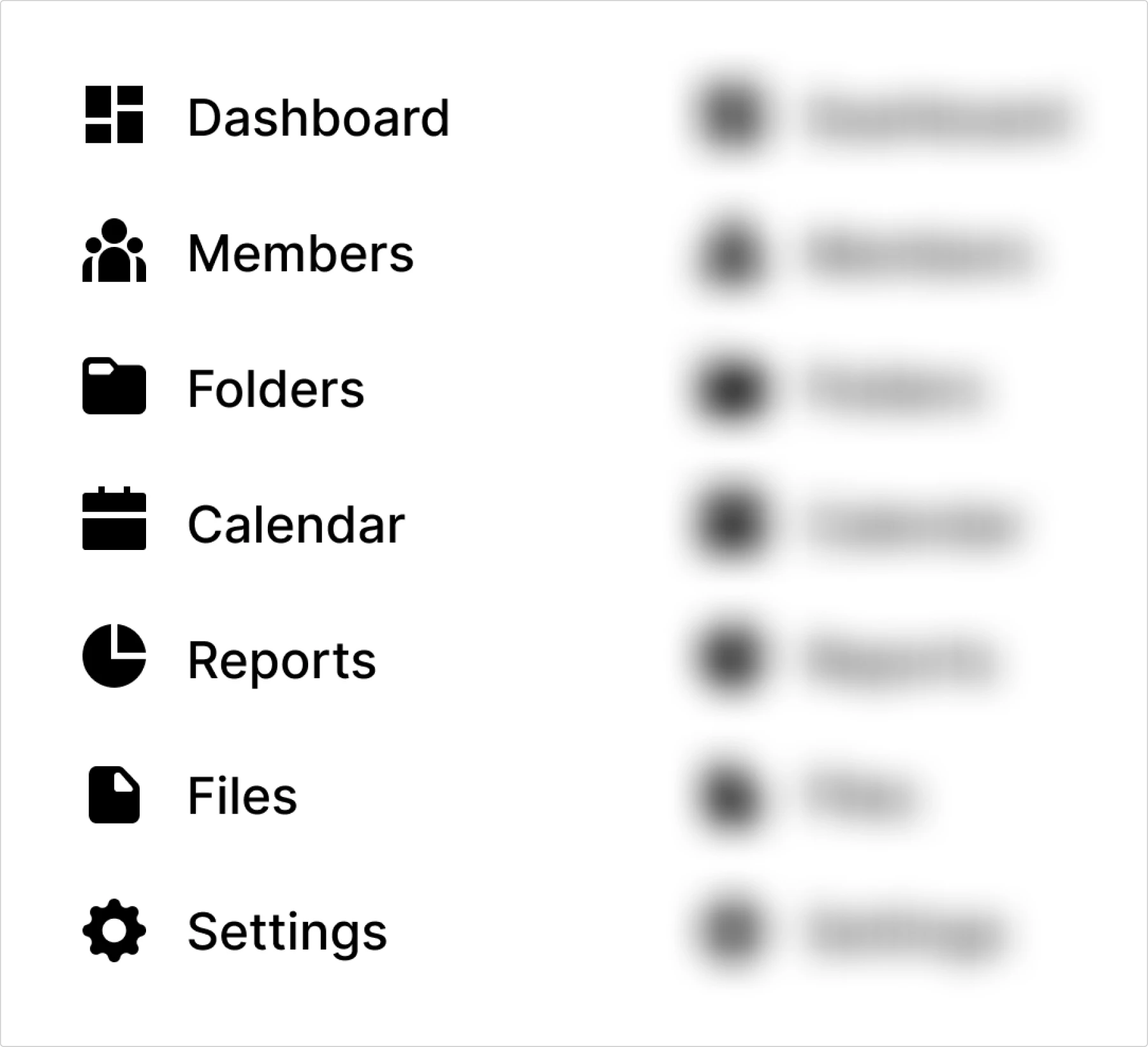
Icons and labels
There is a crucial thing that every designer should be aware of, since it is directly related to visual weight.
Consider the following example.
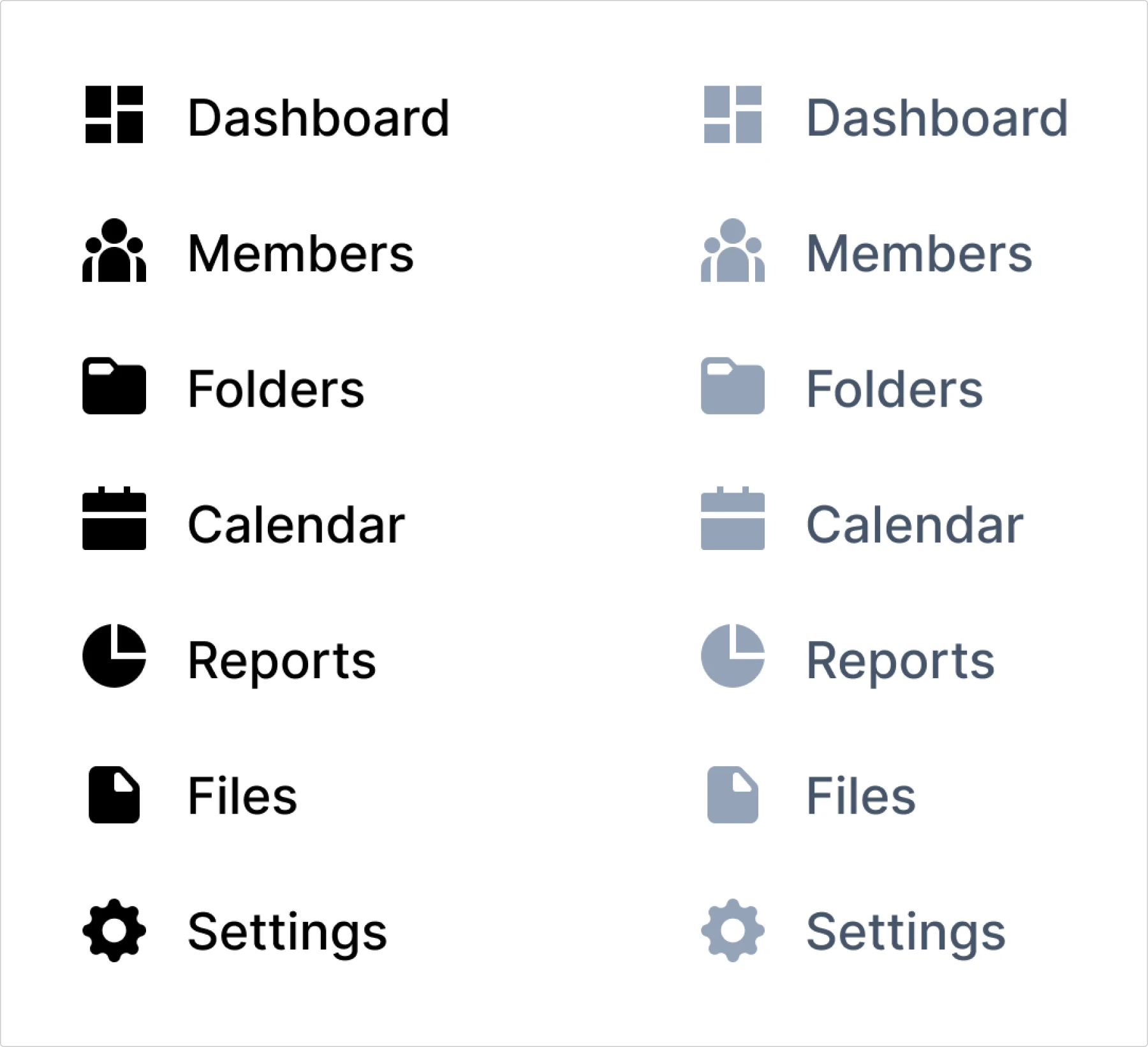
The color of text and icons is pure black. If we blur the menu, we’ll see black spots that carry more weight than the labels. This fact creates imbalance.
This happens because filled (not outlined) icons, in particular, have a higher pixel density than a stretched, wide label.
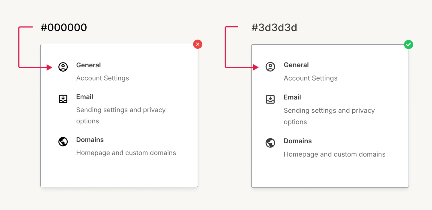
To compensate the balance, the icons should be lighter. In the example below, we made the labels lighter because the pure black color can be a bit harsh on our eyes.
When you hover over the items, you can increase the saturation of both the text and icons. But for icons, you need to increase it less than for text, since they are already dense and “heavy”.
Let’s take a look at a real application and see what it would look like if the balance between labels and icons color were wrong. Note that in the example before, I made it too obvious for demonstration purposes. But this is how the subtle difference would look in a real app.
While visual weight affects how elements compete for attention, optical balance addresses how our eyes perceive alignment and proportions, often in ways that contradict what our design tools tell us.
Optical balance
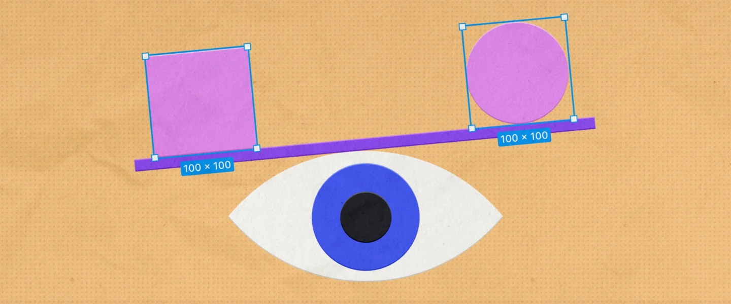
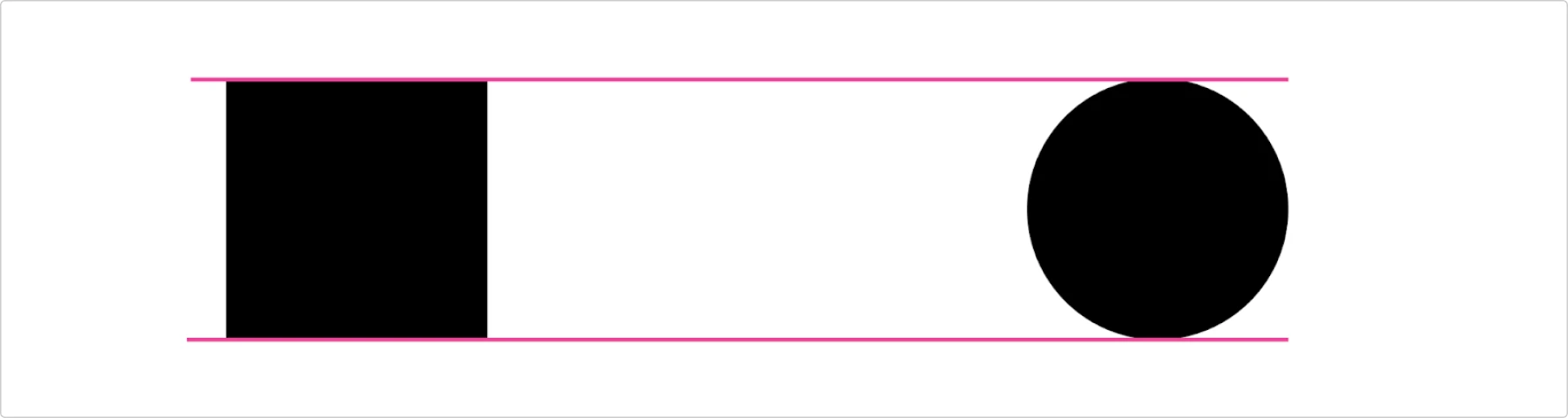
There are numerous examples of visual illusions that happen when our eyes perceive information inaccurately. The most common one is comparing a square with a circle.
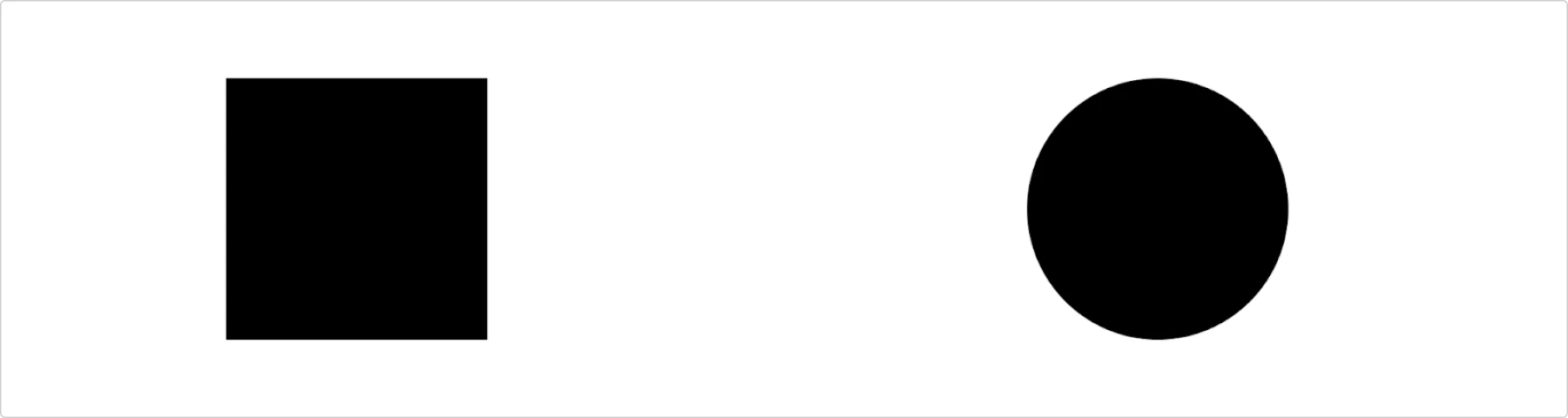
In this example, the circle seems smaller, but it is exactly the same height.
This is important because we always work with rectangles. Even if you have a sophisticated curve in Figma, when you try to align it, it will have some width and height. Occasionally, a technically aligned curve may appear visually odd.
Physics and what it has to do with alignment
In physics, there is such a concept called the center of mass:
The center of mass of a distribution of mass in space (sometimes referred to as the barycenter or balance point) is the unique point at any given time where the weighted relative position of the distributed mass sums to zero.
Sounds scary, but here is a helpful illustration of how it works with icons. Consider this triangle. Imagine it has some physical weight. On the left side, there is more weight than on the right side.
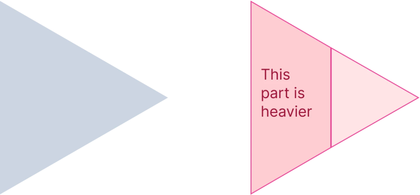
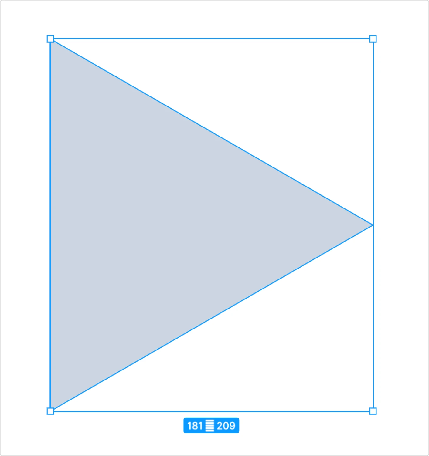
But in Figma or any other tool, the triangle boundaries will be a square:
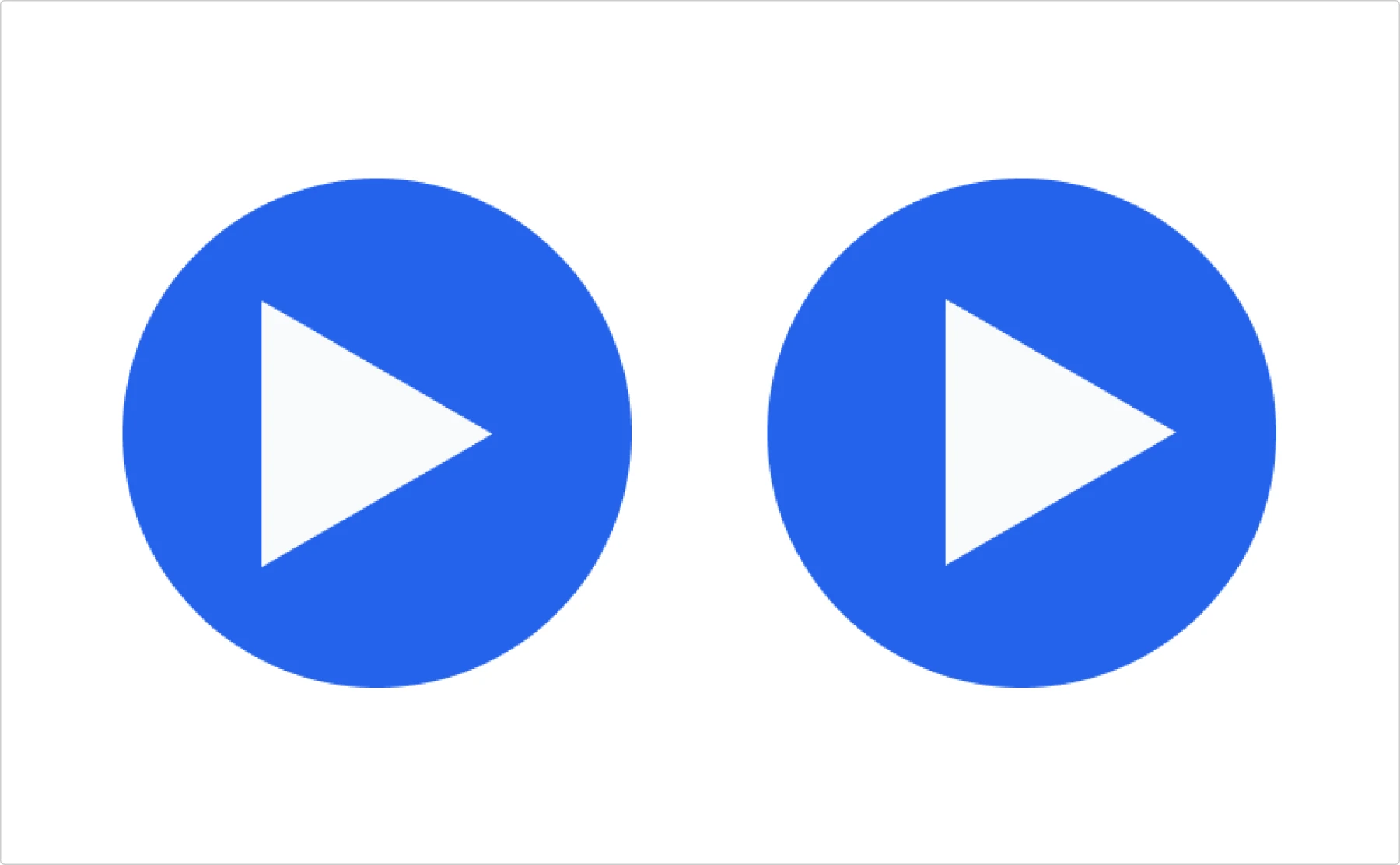
Now, imagine we need to make a play button. So we make a circle and a triangle and align them vertically and horizontally:

The alignment is correct since the boundaries of the icon are aligned. However, there is an optical shift of the triangle to the left side.
That’s when physics and geometry come into play. In our case we need to find the centroid of the triangle, which is the geometric center.
In the case of a triangle, the process is pretty straightforward:
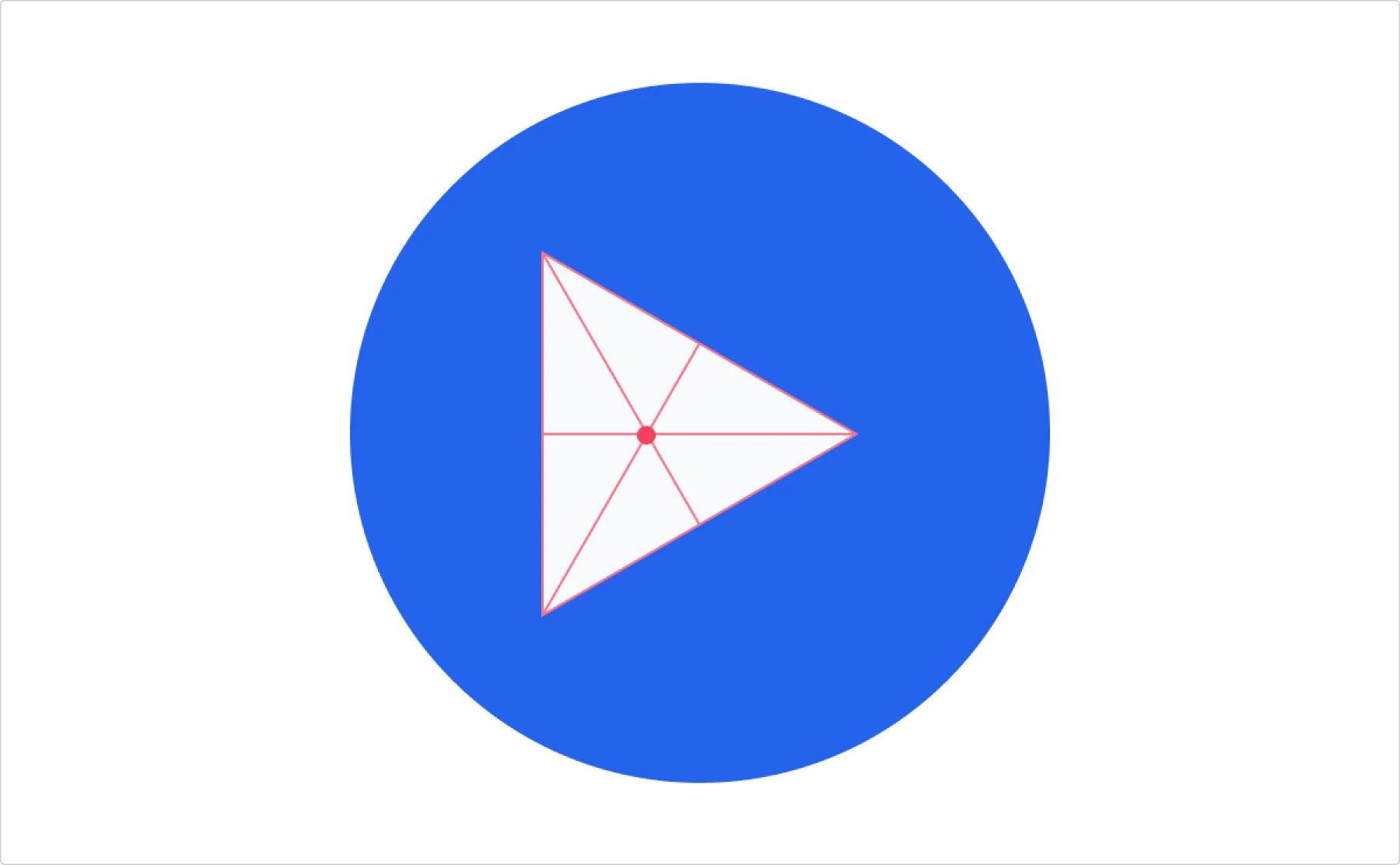
Now let’s compare the geometrical center (which can also be the center of mass if the triangle is homogeneous, which means that the mass is distributed evenly) and the center of the circle.
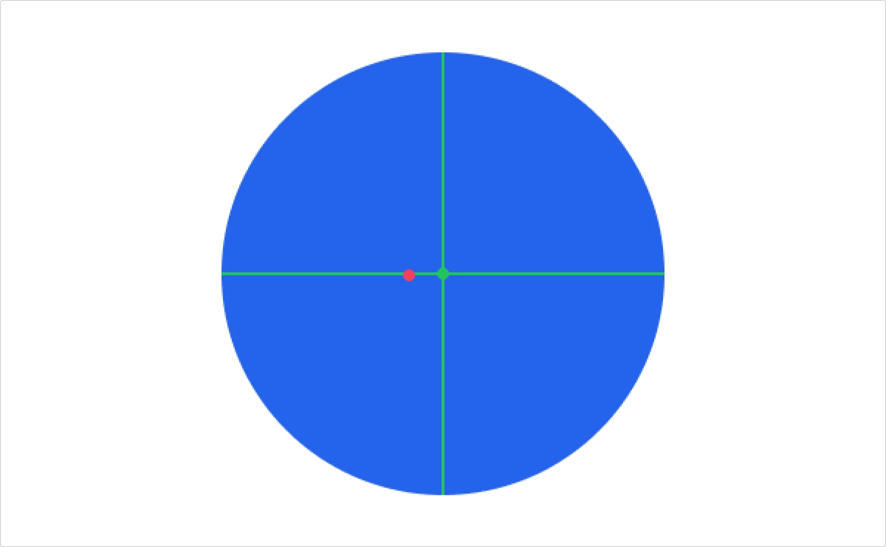
As you can see, they are not the same. That’s why the triangle looks slightly off. In order to fix it, we need to center these two dots.
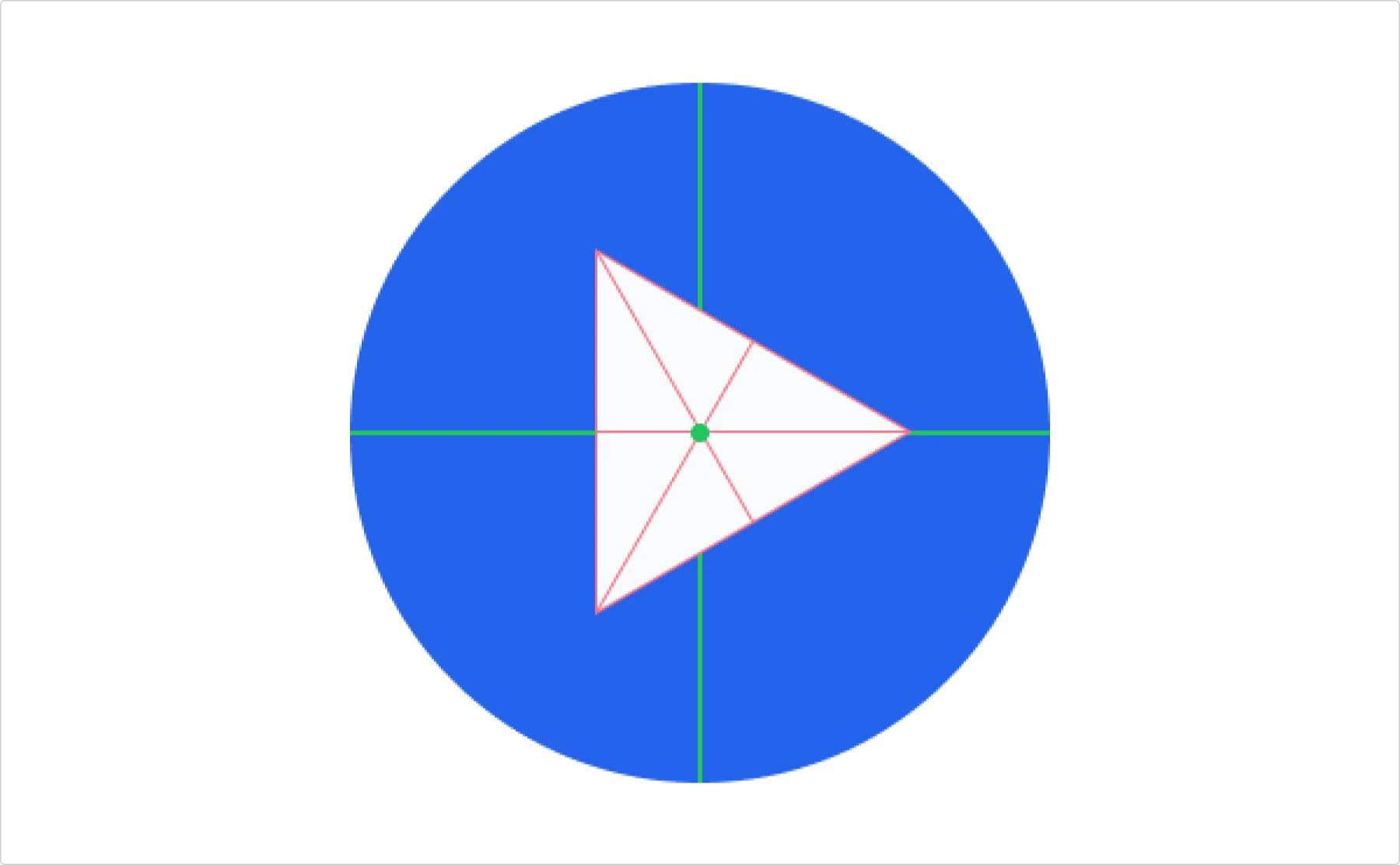
And now we have a properly centered triangle. Compare the first one (centered technically) and the second one (centered optically).
When one pixel makes a difference
When you use icons, they always have rectangular boundaries. However, sometimes optical alignment is not correct, e.g., when the icon is not symmetrical.
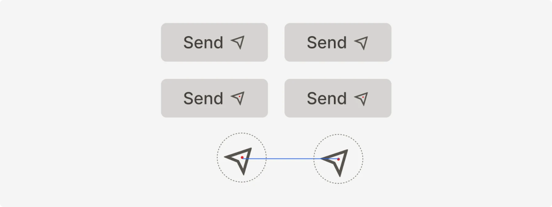
In this example, the left icon is a little bit misaligned; literally one pixel makes a difference.
Trust your eyes
Simply aligning items in Figma does not guarantee that they are indeed aligned. And even if they are aligned, our eyes may perceive visual information incorrectly. For example, one figure may seem to be larger than another one, while in fact they are equal.
The gap between technical precision and visual harmony is where great design happens. While your tools might tell you everything is perfectly aligned, your eyes may reveal a different truth.
Remember these principles when crafting your next interface:
- Visual weight determines what commands attention, through size, color, contrast, and position
- Optical balance requires adjusting beyond mathematical center points
- A single pixel shift can transform a design from awkward to harmonious
- The squint test quickly reveals your true visual hierarchy
Even the most sophisticated design tools can’t replace your trained perception. Trust your eyes and design for how humans see, not how computers measure. Your users will never articulate why your interface feels so right, but they’ll certainly notice the difference.
About the author
Victor Ponamariov, a web developer fell in love with user interfaces. He published a book with 100 practical UI/UX tips where he shares his experience.


