
Monochromatic color = one hue, many values. Learn what it is, why it works, examples, pitfalls, and how to build palettes that convert.
Monochromatic color isn’t just a Pinterest mood. It’s one of the most reliable ways to make designs look intentional, readable, and brand-tight—without playing roulette on the color wheel. Below is the clear, practical explainer you can hand to designers, marketers, and clients who ask, “what does monochromatic mean?” and “what’s the opposite of that?”
TL;DR
Monochromatic colors are all the tints, tones, and shades of a single hue.—e.g., a monochromatic green palette running from pale mint to deep forest green. A monochromatic color scheme works by holding hue constant and varying value (light/dark) and saturation (intensity). It’s called monochromatic from Greek mono (one) + chroma (color). In simple terms: pick one color; make it lighter, darker, or duller. The natural opposite is polychromatic (many hues). Designers also contrast monochrome with complementary, triadic, or analogous schemes.
Explaining monochromatic colors
Monochromatic colors are all the tints, tones, and shades of a single hue. Take green: pale mint, seafoam, jade, emerald, forest—same hue, different lightness and saturation. That family becomes your monochromatic color palette. When people ask what does monochromatic mean, they’re not asking for poetry; they want to know if they can pick one hue and still get variety. Yes. You vary value (light/dark) and chroma (muted/vivid) instead of hopping around the color wheel like a toddler on a sugar high.

Monochrome vs. monochromatic vs. monotone (stop mixing them up)
The internet likes to mash these together. Let’s untangle them.
| Term | Correct meaning | Common misuse (and fix) |
|---|---|---|
| Monochrome | One hue (or grayscale). In photography, is black and white monochromatic? Yes—grayscale is a monochrome color scheme. | People use “monochrome” to mean “minimal.” It’s about hue count, not minimalism. |
| Monochromatic | Design with one hue’s tints, tones, shades (what we’re teaching here). | Treated as a fancy synonym for “black and white.” Black/white is a monochrome case, not the only one. |
| Monotone | In imaging, one base value mapped uniformly (narrow range). In design blogs, it’s used loosely to mean “very limited palette.” | Folks say “monotone colors” when they actually mean monochromatic. If hue varies, it’s not monotone. |
Spelling variants people search: monocromatic, monocramatic, mono chromatic, monotone colour. Use the correct forms in your copy; include the common misspells once (as we just did) to capture intent without looking illiterate.
How a monochromatic color scheme works
A monochromatic color scheme locks the hue and varies two sliders:
- Value (lightness):
- Tint = hue + white (lighter)
- Shade = hue + black (darker)
- Saturation (chroma):
- Tone = hue + gray (softer/muted)
Because everything shares a hue, you create contrast with light vs. dark (value) and vivid vs. muted (saturation), not hue oppositions. This is why a well-built monochromatic color wheel diagram shows a single spoke (your hue) with a ladder of lighter/darker, more/less saturated steps.
When to use:
- You need cohesion (brand, UI, editorial).
- You want the content or type to be the star, not a rainbow.
- You must guarantee harmony fast (tight deadlines, stakeholder disagreements).

Building a monochromatic color palette (step-by-step + HEX)
Here’s a practical method anyone can follow to create monochromatic color schemes.
- Pick the base hue.
Choose a hue that matches the mood (e.g., blue for trust, green for freshness, red for energy). - Generate a 5–7 step ramp.
You’ll want at least: 2 light tints (backgrounds), 1–2 mids (UI surfaces), 2 dark shades (text/overlays). - Mind the medium.
Export for web in sRGB. Keep contrast high for text/background pairs (meet WCAG 4.5:1 for normal text). - Name your tokens.
Predictable names beat guesswork:brand-50, 100, 200… 900orblue-100… blue-900. - Test on real components.
Buttons, links, charts, cards, overlays—if it works there, it’ll work everywhere.
Blue monochromatic color scheme (example HEX):
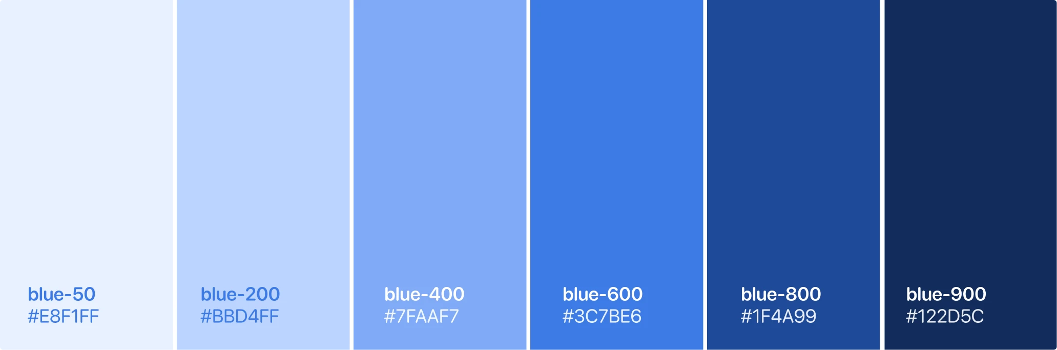
blue-50#E8F1FF (very light tint – backgrounds)blue-200#BBD4FF (light tint – secondary fills)blue-400#7FAAF7 (mid – default UI)blue-600#3C7BE6 (brand primary)blue-800#1F4A99 (deep shade – headings)blue-900#122D5C (near-navy – body text on light)
Green monochrome color palette (second example):
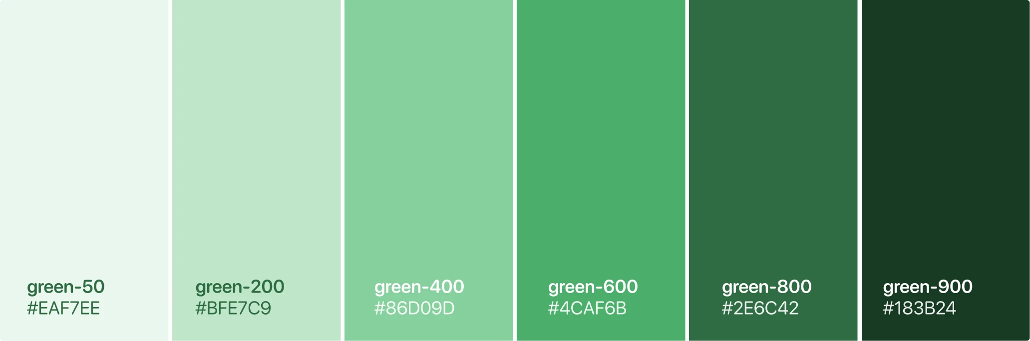
green-50#EAF7EEgreen-200#BFE7C9green-400#86D09Dgreen-600#4CAF6Bgreen-800#2E6C42green-900#183B24
These function as a monotone color palette in the colloquial sense (very limited range) while remaining monochromatic in the strict sense (one hue family).
Monochromatic colors examples (five easy wins)
Here are 5 examples of monochromatic colors in action—each is a monochromatic example you can adapt today.
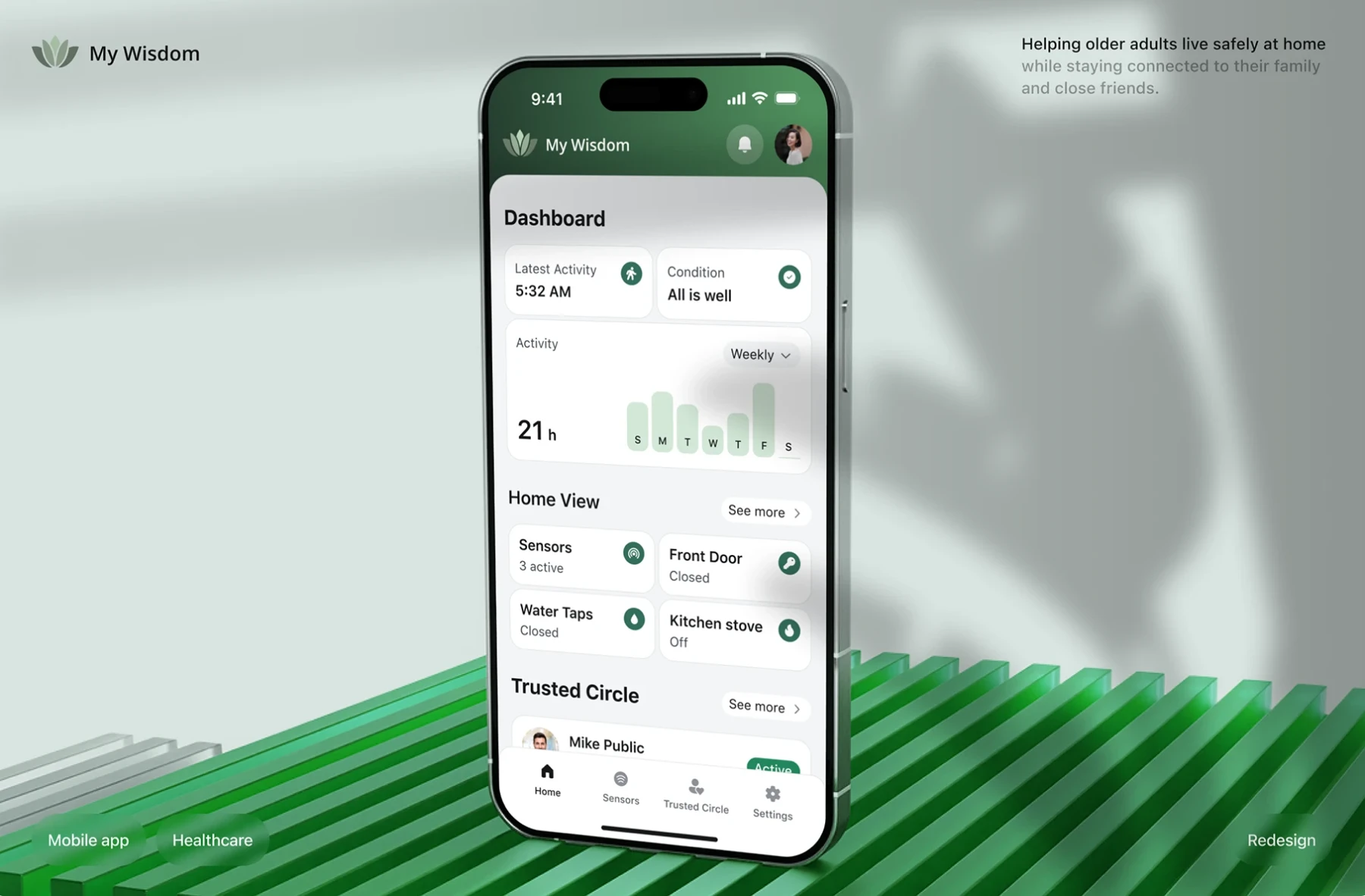
Finance app (blue monochromatic)
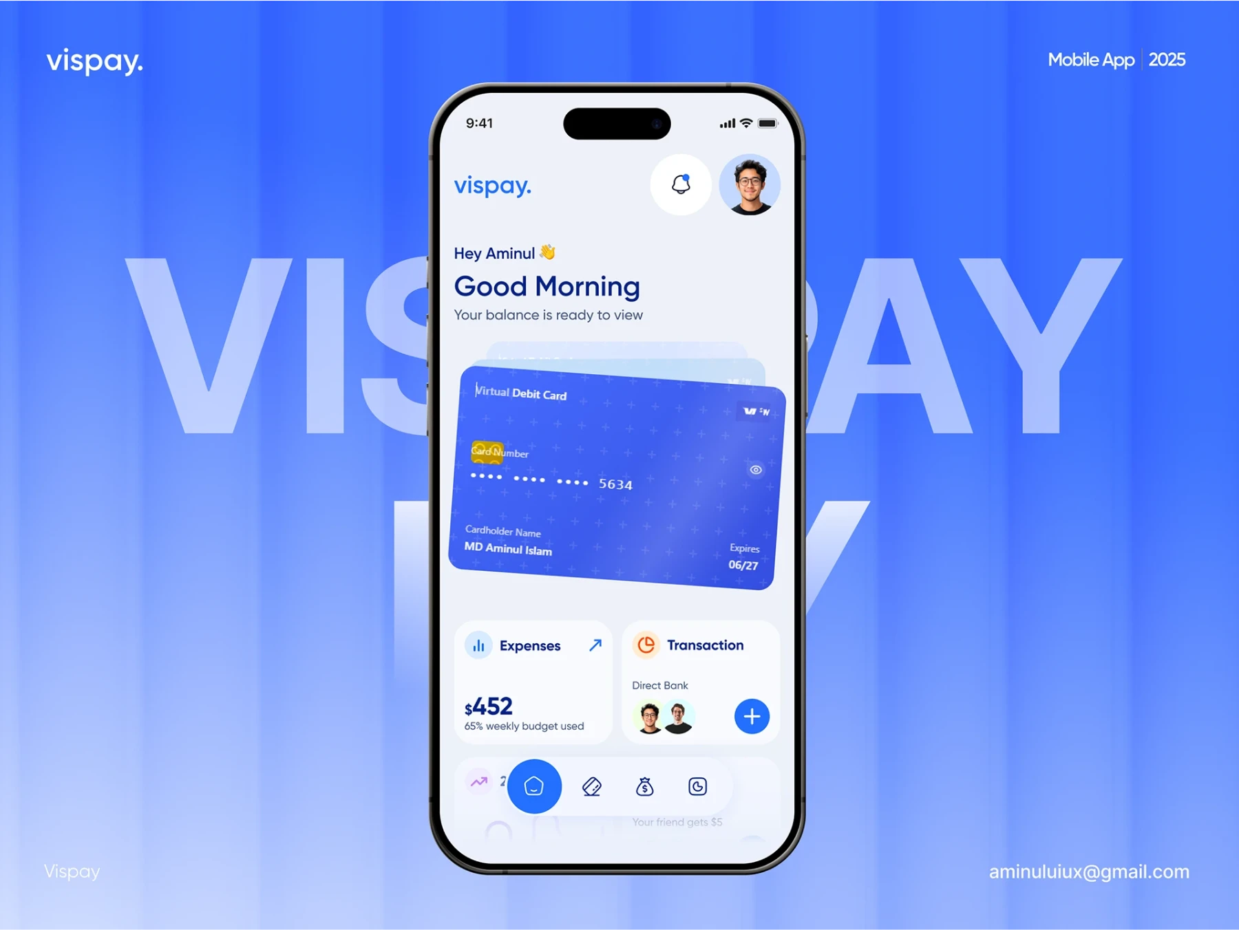
Why it works. Blue suggests trust; indigo anchor headings; light tints keep dashboards airy.
Swap. Accent links use mid-blue; charts use tints/tones of the same hue to avoid legend overwhelm.
Wellness brand (green monochromatic)
Why it works. Soft greens feel restorative; muted tones prevent “radioactive” vibes; dark olive for body text.
Editorial site (grayscale monochrome)

Why it works. Text-first experience; images pop naturally; is black and white monochromatic? Yes—grayscale counts.
Add one accent hue (small) if needed for links.
SaaS dashboard (purple monochromatic)
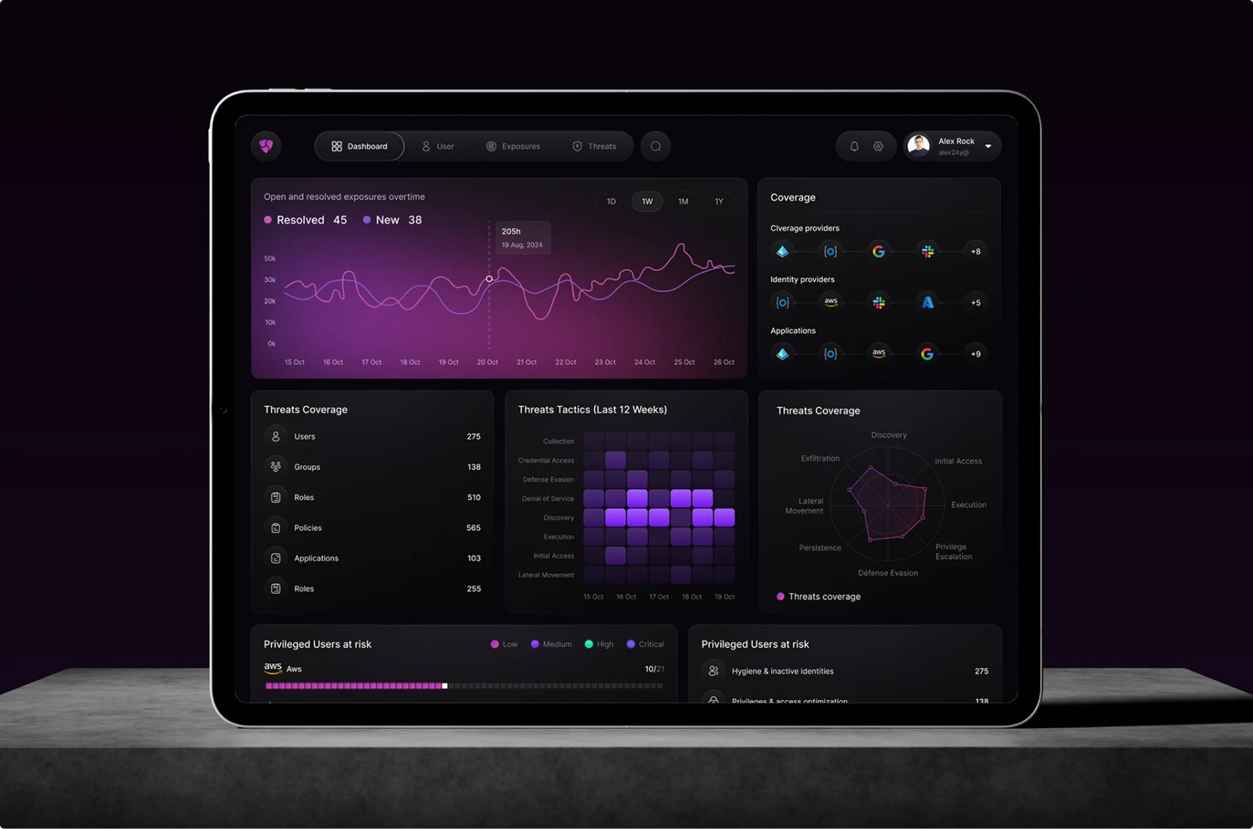
Why it works. Modern, focused; tones keep complex charts legible; deep aubergine for nav, lilac surfaces for cards.
UI, branding & the monochromatic logo
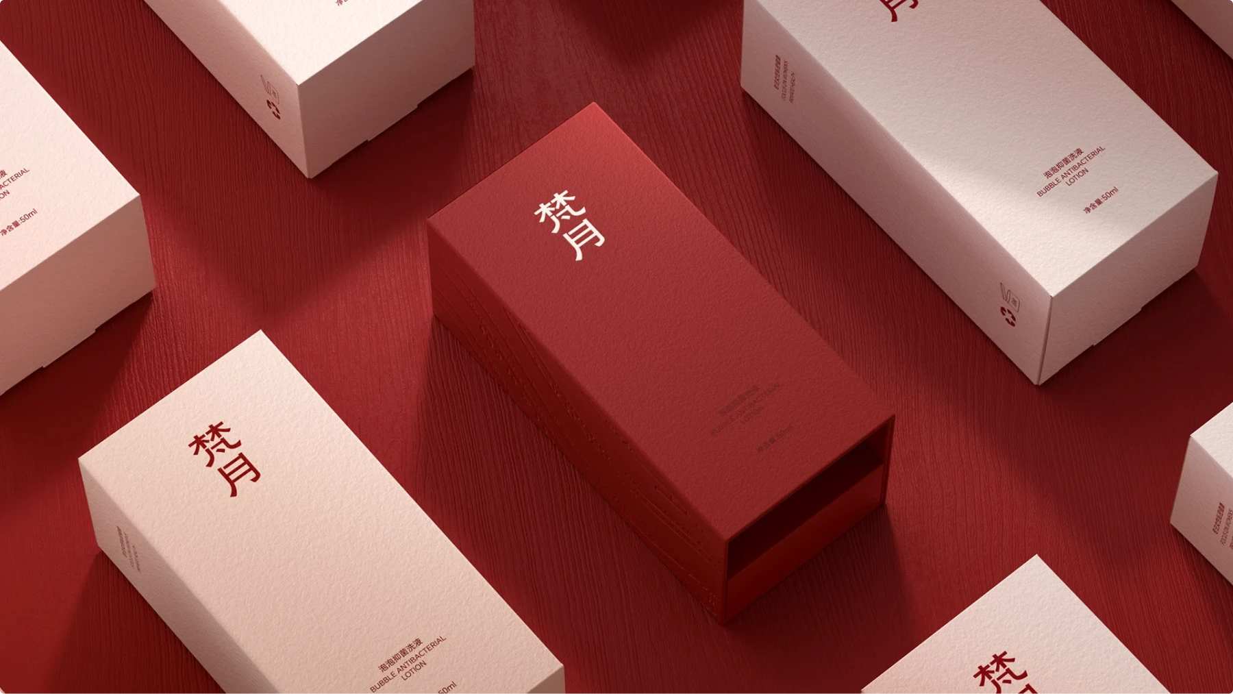
A monochromatic logo and system creates instant cohesion: site, slide decks, social, packaging—the same hue family binds it together. It’s a smart default when a brand is new or needs discipline. Don’t let it go flat: maintain strong value contrast, typographic hierarchy, and iconography. A well-governed monochrome color scheme is memorable without being loud.
Interior design
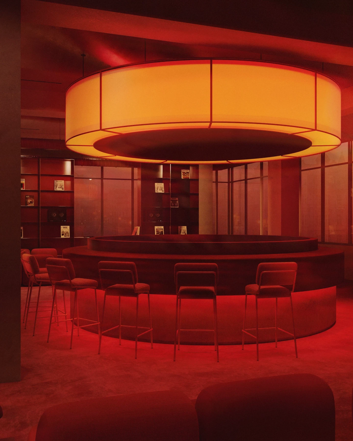
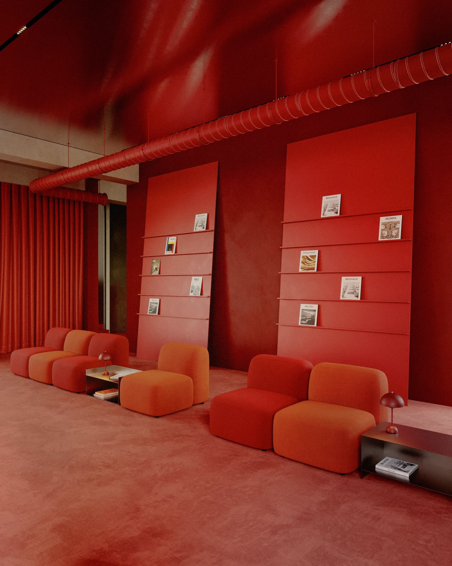
A monochromatic color scheme interior design can make small rooms feel larger (fewer abrupt hue breaks) and large rooms feel unified. Designers add drama with texture and light: matte paint vs. glossy tile, boucle vs. linen, warm vs. cool lighting. Keep enough contrast so edges, text (if any), and wayfinding remain clear.
Accessibility & pitfalls (contrast, color vision, printing)
Contrast. Monochrome isn’t a license to go all mid-tones. Ensure body text vs. background meets WCAG 2.1 AA (≥4.5:1); large text can target 3:1. Put critical text on solid fills—not busy photos—and avoid baking text inside images (inaccessible and untranslatable).
Color-vision differences. People with CVD rely on value and pattern. In charts, don’t differentiate series by hue alone; vary light/dark, line style, or use symbols. In UI, ensure state changes aren’t only color-coded.
Screen vs. print. Screen uses additive light; sRGB is your safe space online. Print shifts because of paper white and ink; test key monochrome color palette swatches on stock before committing. Your perfect monochrome theme on screen can look dull in print if you don’t adjust.
Performance (bonus for web). Fewer hues simplifies design tokens and often reduces asset sprawl. But don’t ship giant hero images because the palette is “simple.”
What is the opposite of monochromatic?
Conceptually. Polychromatic—a palette with many hues. In practical color-scheme terms, designers often pick controlled multi-hue harmonies:
- Complementary. two opposing hues on the wheel (maximum hue contrast).
- Split-complementary. base hue + two neighbors of its complement (contrast with more flexibility).
- Triadic. three evenly spaced hues (balanced energy).
- Tetradic. two complementary pairs (powerful, harder to control).
Use monochromatic for cohesion and calm; use multi-hue schemes when you need distinct categories, energy, or strong brand contrast.
FAQ
What are monochromatic colors?
All the tints, tones, and shades of a single hue—e.g., a blue monochromatic color scheme from pale sky to navy.
Why is it called monochromatic?
From Greek mono (one) + chroma (color). A monochromatic scheme uses one hue with varied lightness and saturation.
What is monochromatic in simple terms?
Pick one color and make it lighter, darker, or duller to create a coordinated, monochromatic design.
What is the opposite of monochromatic?
Polychromatic (many hues). Designers also use complementary/triadic/tetradic schemes for hue contrast.
Is black and white monochromatic?
Yes. Black & white (grayscale) is a special case of monochrome colors—all values of one “hue” (no hue, just value).
What is a monochromatic color scheme?
A palette built from one hue’s tints, tones, and shades. It’s simple, harmonious, and easy to read.
What is a monochromatic color?
Any color that belongs to that single-hue family (e.g., navy, cornflower, and steel blue are all one monochromatic color family).
What is a monochrome color palette?
A set of swatches from one hue (or grayscale), typically arranged light→dark and muted→vivid.
Monochromatic color scheme examples?
Blue fintech UI, green wellness brand, red sale campaign, grayscale editorial, purple SaaS dashboard (see the five examples above).