


Small design touches that create loyal users and word-of-mouth marketing—secrets that will make people love using your products.
Many entrepreneurs strive for revenue and focus on core features, often neglecting tiny little things in UX that might be essential for an app being successful in the long run.
These small details aren’t just pretty decorations—they’re what makes users remember and share your product. They’re what turns “just another app” into something people actually enjoy using.
In this digest we’ll go through such things, from small to huge apps, that spent time to make their interfaces pleasant to use.
Power of tooltips
Not only did sketchplanations make the underlining a little bit curvy, but they also showed a popup with a preview of what to expect from the next page.
This might be quite engaging if done properly, since this trick can increase the probability that users will click on the link. It’s like a sneak peek of what you will see if you click.
Another amazing example is done by Christopher Kindl:
In this case it serves as an extra help when you need to choose the right option.
So the difference between these two examples is piquing curiosity versus providing help.
The downside of this idea is that it will not work on touch screens, since there is no hover event. But on the other hand, nothing will be broken too.
Showing care through details
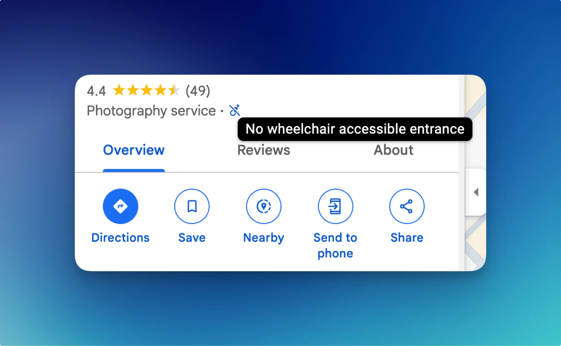
Google Maps highlight if the place is owned by a woman by showing a nice heart icon.

Apart from that, they also show such things as whether the place is suitable for people with disabilities or not.
Actually, we often don’t pay attention to small improvements that add up very quickly. Out of interest, you may check some sites via https://web.archive.org/ to see how they looked 5-10 years ago and how they look now.
Error prevention tips
It’s not a secret that people make mistakes, and that’s okay. However, it’s always better to prevent making mistakes, and there are a lot of ways to do so.
For example, in ConvertKit they show you an alert if you forgot to change the email subject. Sounds reasonable, since you don’t want to send a newsletter with the default subject, right?
Also, you may indirectly help users, which means that you may have a feature that helps working with your app, and this lowers the number of mistakes.
For example, when you paste text in markdown format, it’ll ask whether it should be formatted like markdown or not. Which is helpful: you might write your content in a markdown editor and then copy it to different apps, and if they recognize the markdown and automatically format text accordingly, fewer actions are needed from users. Fewer actions might lower the number of potential mistakes.

Another example. When you write a newsletter issue, you can enter into the focus mode, which becomes a must-have for text editors. Then, it’s possible to preview the text on different resolutions and, most importantly, preview the text as a subscriber. It comes in handy to check how it looks if you have some conditional logic.
Advanced validation tooltips
Most of the time the validation does not end with a couple of required words. A good example where validation rules might be complicated is Typefully.
For those who are not familiar with it, it is a social scheduling tool. There is a typical problem for such apps: each social network has its own rules, such as message length restrictions. But users typically want to make a post for all social networks at once.
For example, if you make a long thread, on X and Bluesky the limit for posts is different. If it turns out that your thread is correct for X but some of your posts are too long for Bluesky, Typefully handles this case in a user-friendly way, properly showing a validation message.

Daring to try new patterns
There is a Jakob’s law in UX:
Users spend most of their time on other sites. This means that users prefer your site to work the same way as all the other sites they already know.
And sometimes it’s hard to deviate from common practices, since they are well established and proven over time. But nothing stays in the same state forever, and UX is not an exception.
Sometimes you may try something new. It might not be new, though, but rarely used. An example of trying an unconventional pattern again comes from Typefully.
The idea is that for non-critical destructive actions, instead of showing the confirmation popup, they suggest you click once again to confirm the action.
While there might be downsides to such an approach, it certainly deserves consideration, since it may turn out that pros outweigh cons in your particular case.
Unexpected effects that matter
Mercury has the hidden mask effect, which only reveals when you hover over certain areas.
Combining it with an overall clean design and a plethora of nice UX solutions, we can expect that users will share it. And they do; there are tweets where people posted photos of the Mercury physical credit card, since it also looks good.
That’s the case when quality turns into word of mouth and people share your product. There is even a law related to this fact called the “Aesthetic-Usability Effect”.
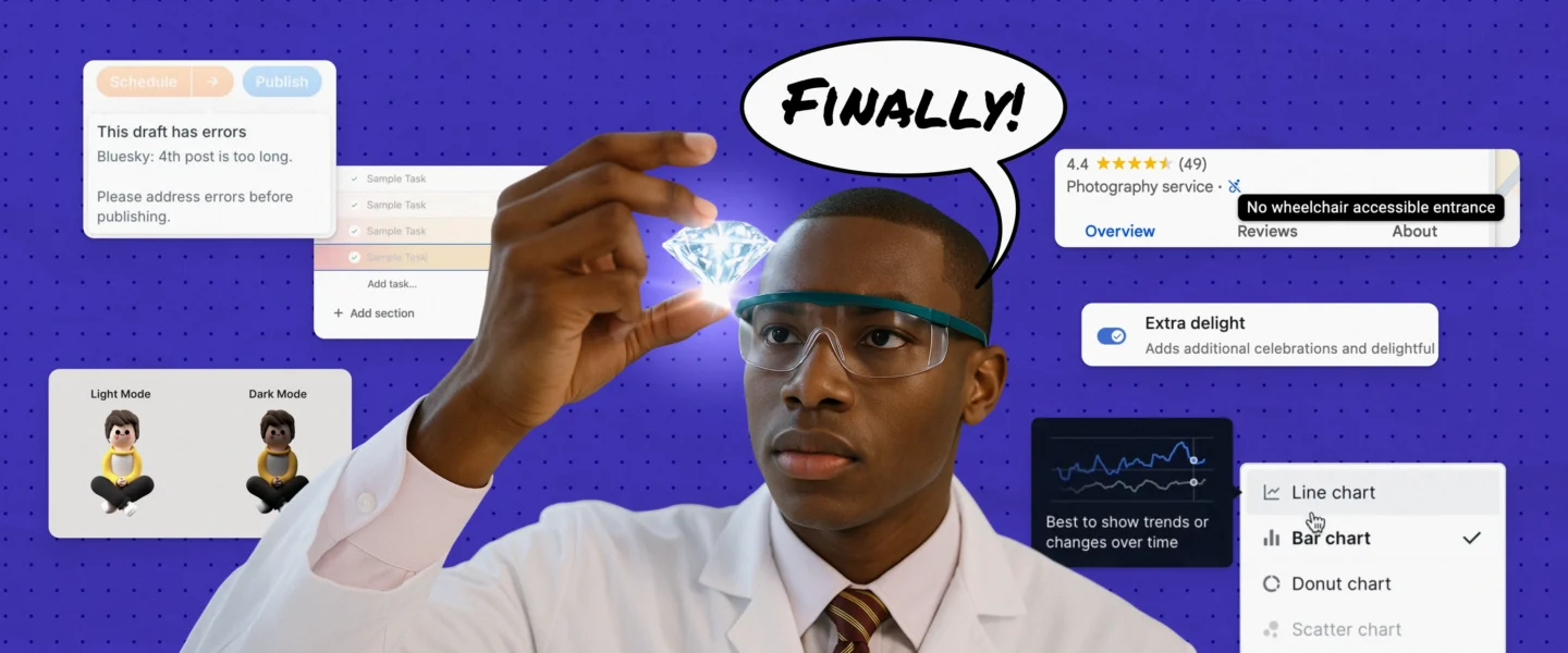
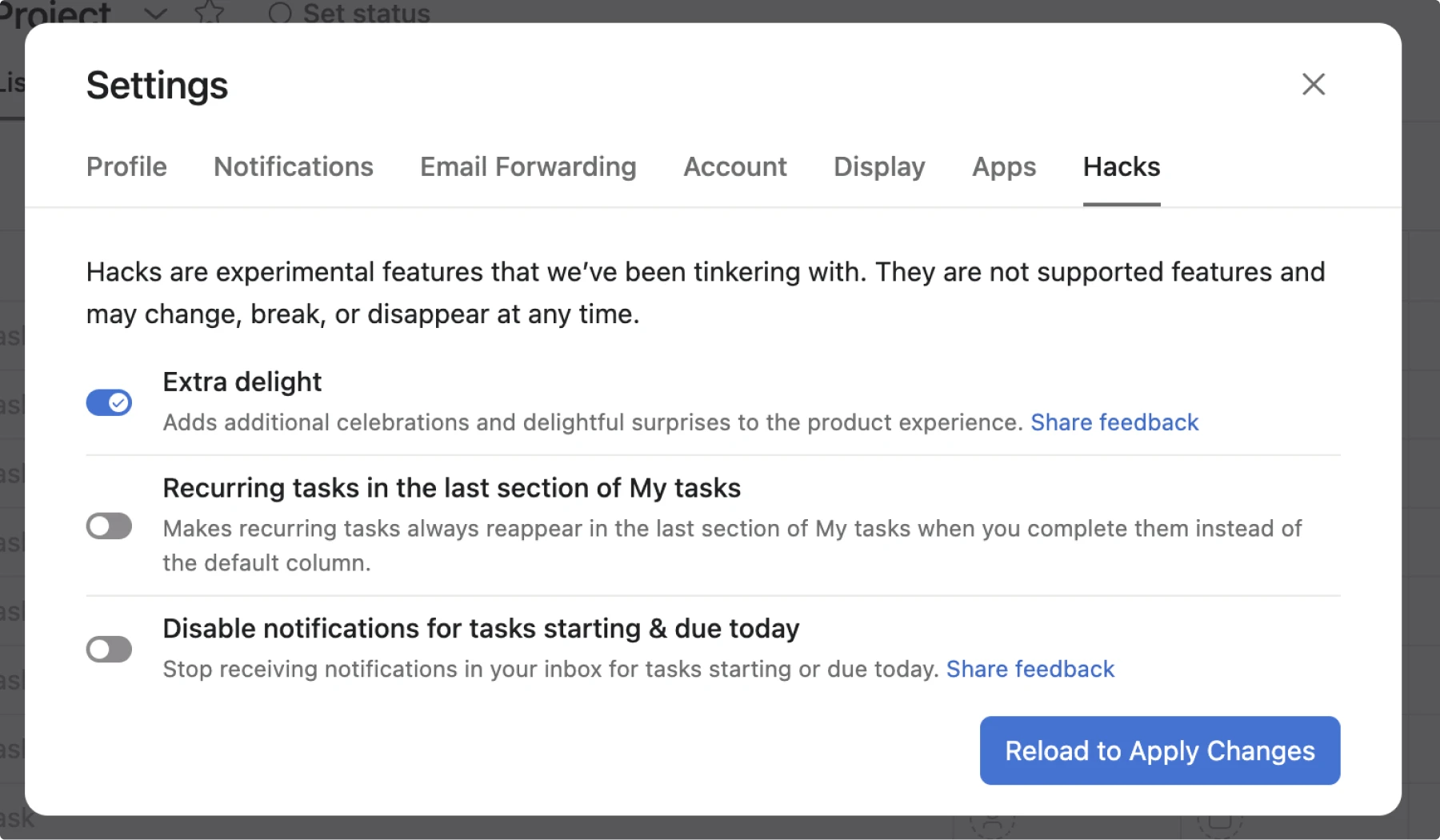
Asana allows you to set up two whimsical settings.
The first one is “Extra delight”, which makes nice gradient animations even nicer (they become colorful).
So when you complete a task, the gradient animation becomes colorful.

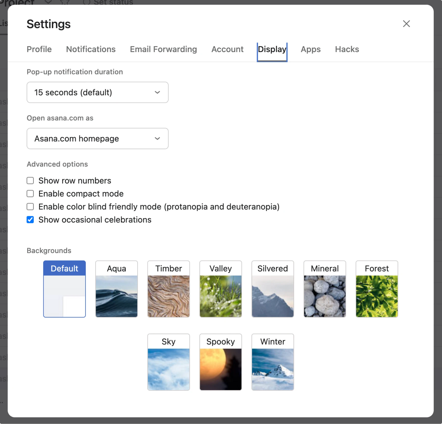
The second one is showing occasional celebrations, which in fact are flying unicorns and other creatures when you complete a task.
Sounds crazy? Well, apparently people loved that, because the feature has been there for quite a while and became even more flexible.
It all started with flying unicorns; now there are more creatures. Here is how it looks.
Inspiration for your own micro-interactions
While we’ve looked at small UX gems in products, sometimes the best inspiration comes from creative individuals. Josh Comeau‘s blog showcases numerous micro-interactions that could be adapted for product interfaces. And you can be sure that it’s something doable, not just your fantasy.It would take a few hours to show all the different non-standard features, but let’s look at a few micro-interactions that could inspire your next product gem.
Rainbow generator
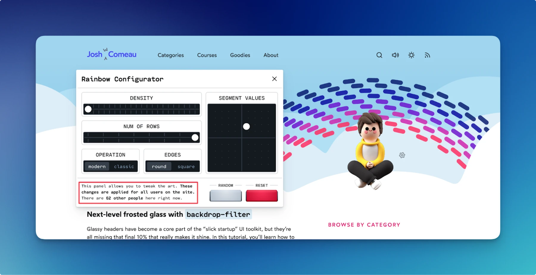
Not only is it an animated, nicely designed component. It is also configurable, and notice that the settings show how many users are on the site, and the changes you made will be reflected to every visitor.
Let’s see it in action.
Now, the thing is, every element is custom (e.g., sliders or buttons). And of course, it correctly changes when turning on the dark mode. Note that even Josh’s figure changes when the mode is switched!

Micro animations
The whole site is full of micro animations. It’s quite uncommon to see them in most apps, starting from small ones and ending with operating systems.
But that definitely makes an impression.
All skills together – the “about me” page
Now, imagine you’re looking for a skilled React developer. We’ll leave alone the biography of Josh, but look at his “about me” page.
- Usage of maps, detecting how far you are from Josh
- An interactive tutorial on drawing the Pride flag
- Animated figure of his height
- Drawn and interactive generative art machine
- Cat, reacting to clicks
- List of conferences
- Number of students
- An article about how he managed to code without a keyboard and mouse for 6 months
- Name pronunciation
And most of the interactive elements have sound effects.
This is how a CV should look.
Small things, big impact
All these diverse examples are meant to convey one simple idea. People are not fools; they can see when a product has high quality and when it doesn’t. So adding nice transitions in a to-do app or having the dark mode for a reading application is not a bad idea. In the long term it will pay off.
These small UX gems often become the signature elements that users remember and share. Whether it’s Asana’s flying unicorns that bring unexpected joy, or Mercury’s subtle mask effects that feel magical, – these details transform functional products into memorable ones.
Next time you’re tempted to skip that “extra” animation or helpful tooltip because it’s not “essential,” remember that the line between a product people use and a product people love is often drawn with these seemingly small details. The best part? You don’t need to implement everything at once. Start with one delightful element and watch how users respond.
For more UX tips and tricks check out these articles:
About the author
Victor Ponamariov, a web developer turned UI/UX enthusiast who shares design insights through his blog. He published a book with 100 practical UI/UX tips where he shares his experience.


