Because first impressions matter more than your dating profile.
Your mobile app onboarding probably sucks harder than a Dyson on steroids, and I’m here to fix that mess. While everyone’s out there pretending their onboarding flow is revolutionary, users are hitting that delete button faster than they unmatch on dating apps.
Time for some brutal honesty about user onboarding that actually converts instead of just looking pretty in your Figma files.
Why most app onboarding absolutely sucks (and yours probably does too)
25% of users abandon apps after ONE use. That’s not a statistic—that’s a massacre. Your onboarding app isn’t just failing; it’s actively repelling the people you spent thousands acquiring.
Common onboarding crimes that make users hit delete
Feature tour from Hell

Nothing screams “we don’t understand our users” like a 12-screen onboarding tutorial showing every single button. It’s like giving someone a car manual when they just want to drive to Starbucks.
Permission harassment
![Example of 'Permission Harassment' in mobile app onboarding: Three phone screens showing consecutive permission requests for location access, call permissions, and storage access. Each screen displays an icon, generic explanation text like 'We will need your [permission] to give better experience,' and prominent 'Sure, I'd Like That!' buttons with smaller 'Not now' options. Demonstrates the aggressive permission-requesting pattern that overwhelms users before they've experienced any app value](https://icons8.com/blog/wp-content/uploads/2018/09/app_permissions.webp)
Apps that ask for camera, microphone, location, contacts, and your firstborn child before showing any value? That’s not mobile user onboarding—that’s digital stalking with extra steps.
Sign-up wall of shame

Making users create an account before they’ve seen literally anything valuable is like asking someone to marry you on the first date. Bold strategy, Cotton. Let’s see how it plays out.
Generic copywriting that says nothing

“Welcome to our app! We’re excited to have you!” Cool story, bro. What does your app actually DO for me?
Here’s the thing nobody wants to admit: users don’t care about your onboarding screens until they care about your product. They’re not here for a guided tour—they’re here to solve a problem or kill time.
Psychology behind app ghosting:
- Users make decisions in 3 seconds (shorter than a TikTok)
- First-time user experience creates permanent impressions
- Cognitive overload triggers immediate escape responses
- Value needs to be obvious, not explained
Your onboarding process should feel like a red carpet, not a DMV line.
Science behind user onboarding
Time to get nerdy (but like, cool nerdy).
Cognitive load theory
Your brain has limited processing power—think iPhone battery at 5%. Every unnecessary element in your onboarding UI drains that battery faster. Mobile onboarding best practices aren’t just design trends; they’re psychology in action.
3-tap rule: If users can’t accomplish something meaningful within 3 taps, they’re gone. Not 4 taps. Not “just one more screen.” THREE.
Behavioral psychology hack
Ikea effect: Users value things more when they’ve contributed to creating them. Personalized onboarding isn’t just nice-to-have—it’s conversion psychology.
Zeigarnik effect: People remember interrupted tasks better than completed ones. Strategic friction in the user onboarding flow can actually increase engagement.
Social proof on steroids: Showing how many people use your app matters less than showing how people LIKE YOU use it successfully.
Onboarding anatomy: breaking down what actually matters
Pre-boarding: App Store screenshots that seal the deal

Your onboarding journey starts before download. App store screenshots are your movie trailer—they need to show the good stuff without spoiling the plot.
What converts:
- Actual app screens (not marketing fluff)
- Clear value propositions per screenshot
- Social proof embedded in visuals
- Platform-specific design language
Welcome experience: making that first tap count

The onboarding screen users see first sets the entire tone. This isn’t about “Hello!” messages—it’s about immediately demonstrating value.
Winning welcome patterns:
- Value preview: Show don’t tell what your app does
- Quick wins: Let users accomplish something immediately
- Context awareness: Acknowledge where they came from
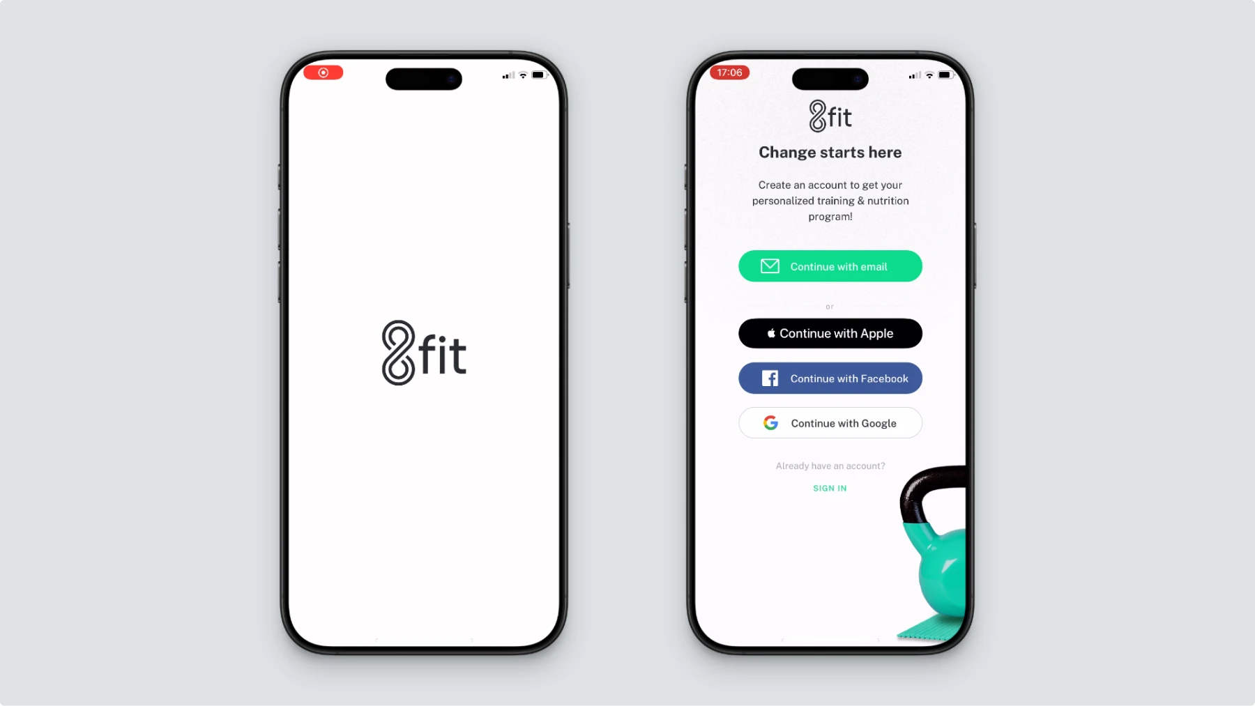
Account creation: making sign-up less painful

Nobody wakes up excited to create another account. Your user onboarding best practices should make this process invisible or irresistible—never irritating.
Smart signup strategies:
- Social login optimization (but done right)
- Guest mode mastery for immediate value
- Progressive profiling over time
- Clear value exchange for the information requested
First success moment: that dopamine hit that creates addiction

The aha moment in your onboarding process examples should feel inevitable, not accidental. Users need to experience your core value within minutes, not days.
Success patterns across categories:
- Social apps: First connection or content consumption
- Productivity apps: First task completed or organized
- Entertainment apps: First piece of engaging content
- Financial apps: First successful transaction or insight
15 onboarding patterns
Value preview: TikTok’s feed preview (genius or evil?)

TikTok’s mobile app onboarding is basically digital crack. They show you the good stuff immediately—no signup required. Users get hooked on content before they even realize they’re in an onboarding app.
Why it works: Instant gratification beats delayed promises every time.
Social proof integration: how Clubhouse used FOMO to dominate

Clubhouse turned exclusivity into the ultimate user onboarding strategy. The invite-only model made signing up feel like winning the lottery, not filling out forms.
The psychology: Scarcity creates demand, and demand creates perceived value.
Gamification hooks: Duolingo’s streak psychology manipulation

Duolingo’s onboarding flow turns language learning into a mobile game. Progress bars, streak counters, and gentle guilt trips keep users coming back like digital addicts.
Implementation tip: Gamification only works when the game enhances the core experience, not replaces it.
Smart personalization: Spotify’s music taste detective work

Spotify’s personalized onboarding feels like having a friend curate your playlist. They ask smart questions, then deliver immediate value based on answers.
Key insight: Personalization questions should feel like conversations, not surveys.
Progressive profiling: LinkedIn’s sneaky data collection strategy
LinkedIn masters the art of application onboarding by spreading information collection across multiple sessions. They never ask for everything at once—just what’s needed for the next step.
The strategy: Build value before asking for value.
Contextual tutorials: only when users actually need help
The best in-app onboarding is invisible until it’s needed. Smart apps detect user confusion and offer help proactively, not preemptively.
Social login optimization: the good, bad, and ugly of OAuth
The Good: One-tap signup with pre-filled information
Bad: Privacy concerns that scare users
The Ugly: Broken OAuth flows that trap users in authorization hell
Best practice: Offer social login as an option, never a requirement.
Guest mode mastery: let users test drive before committing

Apps like Mojo and Medium let users browse without accounts. This user onboarding software approach reduces friction while building a desire for premium features.

Mobile onboarding design must accommodate one-handed use. Bottom navigation, large touch targets, and swipeable content aren’t nice-to-haves—they’re necessities.
The thumb zone: Elements within 3-4 inches of the bottom screen edge get 80% more interaction.
Gesture-based tutorials: Teaching swipes without being annoying

The best app onboarding screens teach gestures through guided interaction, not static instructions. Show users how to swipe by making them swipe.
Screen real estate optimization: Every pixel counts
Onboarding screen design on mobile requires surgical precision. White space isn’t wasted space—it’s breathing room for overwhelmed users.
Inclusive design patterns: onboarding UX for everyone
Onboarding UX design that only works for able-bodied users isn’t good design—it’s discriminatory design disguised as aesthetics.
Non-negotiable elements:
- Screen reader compatibility
- High contrast options
- Large touch targets
- Alternative input methods
Voice-over friendly flows: making Siri actually helpful
iOS onboarding should work seamlessly with VoiceOver. If your onboarding tutorial breaks with assistive technology, you’re excluding millions of potential users.
Color-blind considerations: when your onboarding UI excludes millions
Relying solely on color to convey information in onboarding screens examples excludes 8% of men and 0.5% of women. Use icons, patterns, and text alongside color coding.
Platform-specific onboarding: iOS vs Android vs PWA
iOS onboarding patterns: Apple’s HIG compliance without selling your soul
iOS onboarding patterns feel native when they respect platform conventions while maintaining brand personality.
Apple’s unspoken rules:
- Navigation feels predictable
- Animations respect system preferences
- Typography uses San Francisco font family
- Color schemes adapt to light/dark mode
Android Material You: Google’s design system decoded
Mobile app onboarding on Android should embrace Material Design principles without looking like every other Google app.
Material You implementation:
- Dynamic color theming
- Large, accessible touch targets
- Predictable motion patterns
- System-level personalization respect
PWA considerations: web app onboarding that doesn’t feel like a compromise
Progressive Web Apps need onboarding applications that bridge web and native experiences seamlessly.
PWA-specific challenges:
- App installation education
- Offline functionality explanation
- Push notification permissions
- Home screen addition guidance
The dark side: what not to do
Permission request fails that make users rage quit
Nothing kills the user onboarding experience faster than apps that immediately ask for everything. Looking at you, apps that request contacts access before showing any value.
Hall of shame patterns:
- Location requests for non-location apps
- Camera access for text-based apps
- Contact syncing before demonstrating social features
- Push notification opt-ins on app launch
Tutorial overload syndrome
Some onboarding screens examples feel like reading software manuals from the 90s. If your tutorial has more screens than TikTok, you’ve already lost.
Red flags:
- More than 5 tutorial screens
- Text-heavy explanations of obvious UI elements
- Features that require tutorials to understand
- No skip option for returning users
When personalization becomes creepy stalking
Personalized onboarding crosses the line when it feels invasive rather than helpful. Asking for birth dates, relationship status, or income during app onboarding screams data harvesting.
Creepy vs. helpful personalization:
✅ “What topics interest you?”
❌ “What’s your relationship status?”
✅ “How often do you work out?”
❌ “What’s your annual income?”
Measuring success: metrics that you actually need
Completion rates: a metric that pays bills
User onboarding analytics should focus on completion rates, not start rates. 90% of users starting your onboarding flow means nothing if only 15% finish it.
Key completion metrics:
- Full onboarding completion rate (end-to-end)
- Step-by-step drop-off analysis (where people bail)
- Time to completion (how long it takes)
- Retry rates (how many people come back)
Time to first value: how fast users get their “Aha!” moment
The best mobile app onboarding best practices minimize the time between app launch and first value delivery.
Benchmark times by app category:
- Social apps: Under 60 seconds
- Productivity apps: Under 2 minutes
- Gaming apps: Under 30 seconds
- Financial apps: Under 5 minutes
Day 1, 7, 30 retention: retention curve of truth
User onboarding strategies mean nothing if users don’t stick around. Retention curves reveal onboarding effectiveness better than any other metric.
Healthy retention benchmarks:
- Day 1: 70-80%
- Day 7: 35-45%
- Day 30: 15-25%
Advanced tactics: onboarding for retention & revenue
Paywall integration: when and how to ask for money

App onboarding flow should establish value before revealing cost. Users need to experience benefits, not just hear about them.
Effective paywall timing:
- After users complete at least one full workflow
- Following the demonstration of premium features
- When users hit artificial limitations
- During natural upgrade moments
Subscription psychology: Netflix model decoded
Netflix’s user onboarding platform approach creates subscription inevitability through content preview and personalized recommendations.
Psychological triggers:
- Free trial with immediate premium access
- Personalization that improves over time
- Content discovery that creates FOMO
- Seamless transition from trial to paid
Freemium conversion: turning free users into paying customers
Onboarding products with freemium models needs clear value ladders—obvious benefits that justify upgrade costs.
Conversion optimization:
- Feature limitations that encourage upgrade
- Usage limits that demonstrate value
- Premium user showcases and social proof
- Upgrade prompts at high-engagement moments
Technical side: implementation without the headache
Analytics integration: tracking that actually helps
User onboarding workflow analytics should capture user behavior, not just completion statistics.
Essential tracking events:
- Screen entry and exit times
- User interaction patterns
- Error occurrences and recovery
- Feature discovery and usage
- Drop-off points and reasons
Performance optimization: fast loading = higher conversion
Mobile app onboarding screens that load slowly kill conversion before users see your value proposition.
Performance priorities:
- Critical path resource loading
- Image optimization and lazy loading
- Animation performance on low-end devices
- Offline functionality for basic onboarding
Accessibility implementation: code that works for everyone
Onboarding UX design accessibility isn’t a nice-to-have feature—it’s a legal and moral requirement.
Technical requirements:
- Semantic HTML for screen readers
- Keyboard navigation support
- Focus management during transitions
- Alternative text for all images and icons
Design tools & resources: your onboarding toolkit
Wireframing templates
Onboarding screen UI templates should inspire, not constrain creativity.
Essential template categories:
- Welcome screen examples with clear value props
- Sign-up flow examples with minimal friction
- Onboarding tutorial patterns for different app types
- Permission request flows with proper context
Icon libraries: visual elements that actually communicate
Onboarding pages need icons that communicate universally, not just look pretty.
Icon selection criteria:
- Universal recognition across cultures
- Scalability across device sizes
- Consistency with brand personality
- Accessibility compliance
Animation resources: micro-interactions that delight
Onboarding walkthrough animations should guide attention and provide feedback, not just add visual flair.
Animation purposes:
- State change communication
- Loading and progress indication
- Error prevention and correction
- Delight without distraction
Industry-specific onboarding patterns
Financial app onboarding: making money apps feel trustworthy
Financial app onboarding faces unique challenges around security, trust, and regulatory compliance.
Trust-building elements:
- Security badge prominence
- Regulatory compliance explanation
- Bank-level encryption messaging
- Customer testimonials and reviews
Employee onboarding app: corporate tools that don’t make workers hate life
Employee onboarding mobile app design should reduce workplace friction, not add to it.
Corporate-friendly patterns:
- Single sign-on integration
- Role-based personalization
- Company culture integration
- Productivity tool connections
E-commerce onboarding: getting users to their first purchase
App onboarding examples in e-commerce focus on product discovery and purchase confidence.
Commerce-specific elements:
- Product recommendation engines
- Shipping and return policy clarity
- Payment method setup
- Wishlist and comparison features
Quick wins: 10 changes you can make today
Copy improvements: words that convert vs. words that confuse
Onboarding guide examples succeed through clear, action-oriented copy that eliminates ambiguity.
Copy optimization checklist:
- Replace jargon with plain language
- Use active voice over passive voice
- Provide specific benefits, not generic features
- Include clear next steps
Visual hierarchy fixes: making important stuff obvious
Welcome screen examples should guide user attention through deliberate design choices.
Hierarchy improvements:
- Size and contrast for primary actions
- White space to separate sections
- Color coding for different information types
- Typography scales that make sense
Button optimization: CTAs that actually Call to Action
Sign up flow best practices depend on buttons that communicate purpose and create urgency.
Button optimization:
- Action-oriented text (“Start Creating” vs “Submit”)
- High contrast colors for visibility
- Appropriate sizing for touch interaction
- Loading states for user feedback
Form simplification: fewer fields = more conversions
Best signup flows minimize information requests while maximizing conversion potential.
Form reduction strategies:
- Progressive disclosure of form fields
- Smart defaults and auto-completion
- Single sign-on options
- Clear error messaging
Mobile-specific tweaks: small changes, big impact
Best mobile app onboarding optimizes for device-specific behaviors and constraints.
Mobile optimizations:
- Thumb-friendly navigation placement
- Swipe gestures for progression
- Vertical scrolling over horizontal
- Loading optimization for cellular connections
Your onboarding action plan
The 30-60-90 day roadmap: prioritizing improvements
User onboarding tips work best when implemented systematically, not randomly.
30-day quick wins:
- Copy improvements and clarity fixes
- Button and CTA optimization
- Basic analytics implementation
- Mobile responsiveness issues
60-day improvements:
- User onboarding workflow restructuring
- A/B testing implementation
- Personalized onboarding features
- Performance optimization
90-day transformations:
- Complete onboarding journey redesign
- Advanced personalization systems
- Interactive onboarding features
- Comprehensive accessibility improvements
Success measurement: KPIs that align with business goals
Best onboarding practices require measurement frameworks that connect user experience to business outcomes.
Essential KPIs:
- Onboarding completion rates
- Time to first value
- User retention curves
- Feature adoption rates
- Customer lifetime value correlation
Continuous optimization: because good mobile app onboarding examples are never “done”
Onboarding best practices UX evolves with user behavior, technology capabilities, and business needs.
Optimization processes:
- Regular user feedback collection
- Competitive analysis and benchmarking
- A/B testing of critical flows
- Performance monitoring and improvement
Wrapping up
Look, I’ve roasted your onboarding app pretty hard, but here’s the thing—every app that’s killing it today started with trash onboarding flows. The difference between winners and losers isn’t perfection; it’s iteration.
The apps dominating 2025 didn’t get there by following best practices blindly. They got there by understanding their users, testing relentlessly, and optimizing for actual human behavior instead of design awards.
Your mobile app onboarding can be the difference between another forgotten download and a daily-use addiction. But only if you’re willing to kill your darlings, question your assumptions, and build something that actually serves users instead of just looking good in screenshots.
The choice is yours: Keep designing onboarding experiences for other designers, or start building user onboarding that transforms strangers into superfans.
Time to turn that trash into cash.
Check the most hated UI and UX patterns, learn the practical definition of usability, and review 7 basic types of UI animation.