Your cover may hook them, but the contents page keeps them. Learn how to design TOCs that are clear, stylish, and worth a second look.
Your cover might look like a Vogue spread, but if your table of contents page screams “Microsoft Word 2003,” you have just sabotaged your own project. The table of contents (TOC) is one of the most overlooked parts of books, magazines, portfolios, and reports. It is also your first chance to prove you know what you are doing as a designer.
Here’s 15 creative table of contents examples with design analysis and pro tips for a clear, beautiful, and functional TOC.
What is a table of contents?
Before we jump into the cool layouts, let us get the fundamentals straight.
- Definition. A table of contents is a roadmap of your document. It lists chapters, sections, or articles in order with page numbers or links so readers can jump to what they need.
- Book vs. Magazine TOC. In books, the TOC is usually a simple list with clean typography, left-aligned text, dotted leaders, and page numbers. In magazines, the contents page design often turns into a full-blown layout with photography, grids, creative typography, and sometimes entire spreads.
- Other formats. Yearbooks, ebooks, kids’ books, architecture portfolios, and reports all have their own table of contents layout styles. Some prioritize clarity such as reports and textbooks. Others go wild with visuals such as yearbooks and zines.
- Names and variations. People call it the contents page, content table, table contents, or even the wrong table of context. The proper term is table of contents in plural form. Unless you are designing a geography workbook, in which case “table of continents” might actually make sense.
Quick takeaway. The TOC is not just a utility page. It is a design opportunity. Treat it as both a functional guide and a brand statement.
Example 1. Bold numbering with minimalist grid
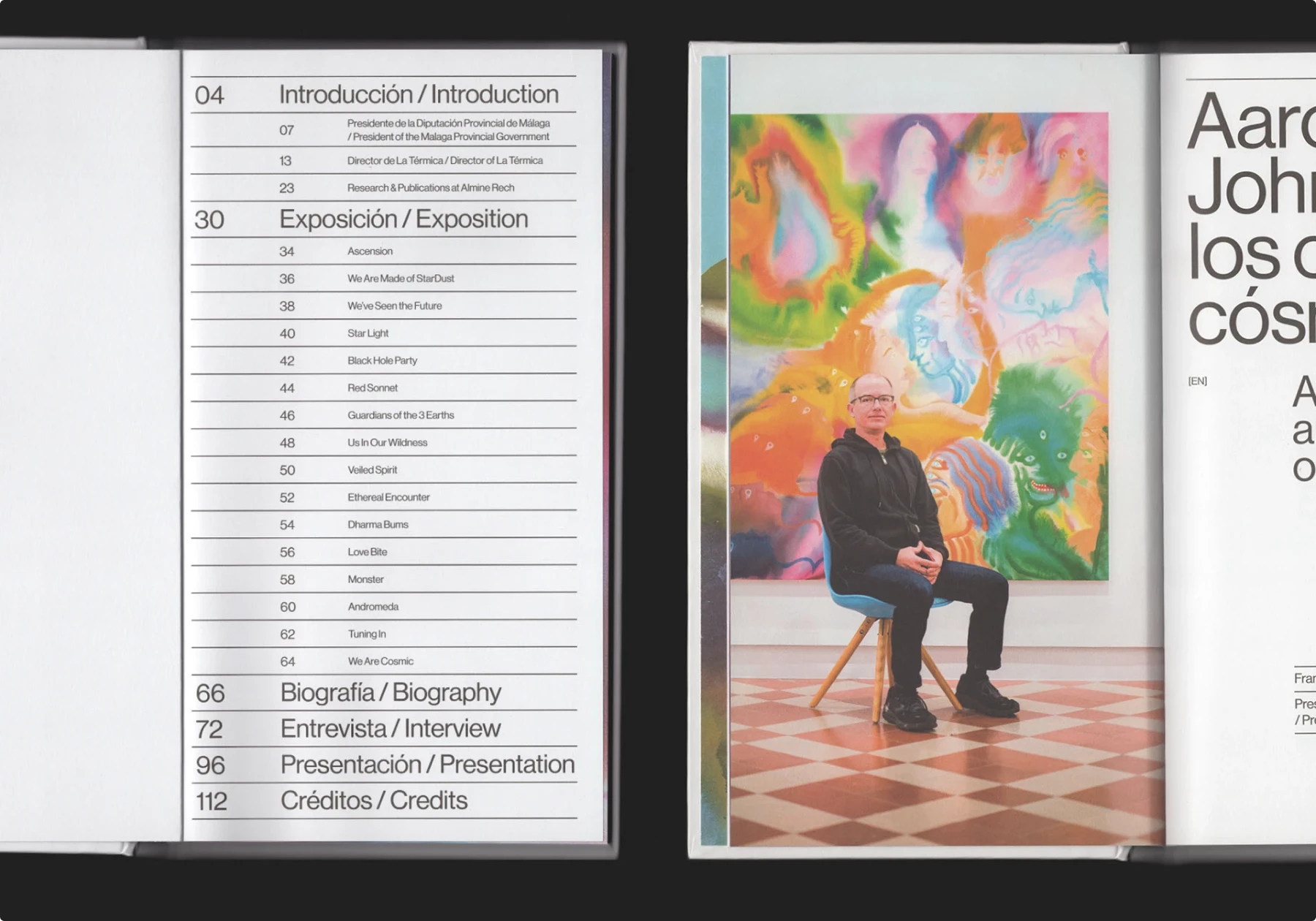
This magazine table of contents uses oversized numbers as anchors. Each section number is set in a large, heavy font, while the text that follows sits neatly in a two-column grid. The bilingual labels (Spanish and English) give it a clean yet international feel.
Why it works:
- The bold numbers create instant hierarchy, guiding the eye without clutter.
- The grid lines keep everything aligned, so even with lots of entries the page looks organized instead of overwhelming.
- The bilingual approach proves that clarity can survive extra text if spacing and structure are tight.
Pitfalls to avoid. If you shrink the numbers too much, the design loses its rhythm. On the other hand, if the typeface is too decorative, the page risks looking like a poster instead of a navigational tool.
Pro tip. Use strong typographic contrast to build structure in your table of contents layout. Big numbers or bold chapter titles can do the heavy lifting, while smaller body text keeps the details readable. This trick works just as well for a book table of contents or a portfolio contents page.
Example 2. Image-driven grid with playful flow
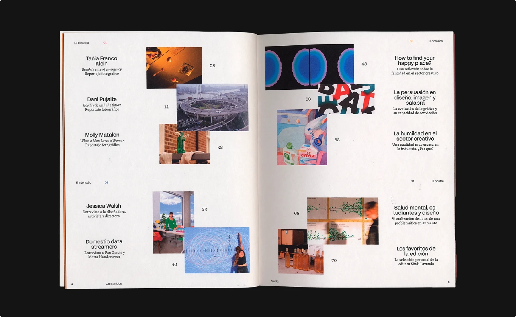
This magazine contents page from Cruda takes a bold step away from rigid order. Instead of a straight column of entries, it scatters images across the spread and pairs them with short blocks of text. The result feels playful, almost like a gallery wall where your eyes wander until something grabs your attention.
Why it works:
- The images act as visual anchors, turning the TOC into a preview of the magazine’s mood and themes.
- The irregular placement breaks monotony and makes each entry feel like its own story.
- Minimal text styling balances the busyness of the imagery, so the page stays legible.
Pitfalls to avoid. If the images are too busy or if captions are hard to spot, the reader may struggle to connect text with page numbers. In functional publications like reports or yearbooks, this style can frustrate users who need quick reference.
Pro tip. For a creative table of contents design, let images preview the content while type provides clarity. Use this approach in art books, photography magazines, or even a portfolio table of contents where visuals are as important as text.
Example 3. Icon-based contents with technical precision
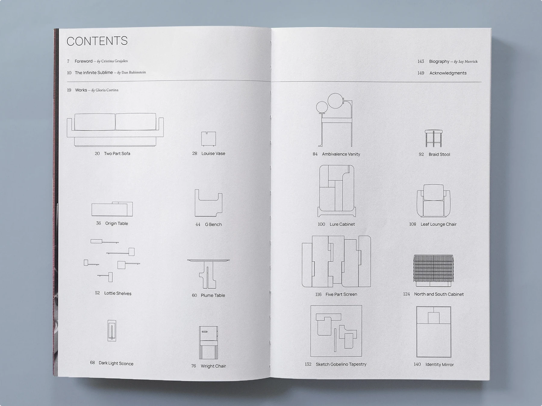
This book table of contents takes a product catalog approach. Instead of plain text entries, each chapter is represented by a line drawing of the featured furniture piece. The combination of schematic icons and sparse typography turns the TOC into both a navigation tool and a design statement.
Why it works:
- The drawings double as visual cues, making it immediately clear what each section covers.
- The consistent line weight and grid give the page a technical, modern aesthetic.
- Readers can scan by image as well as text, which enhances usability.
Pitfalls to avoid. This style depends heavily on the quality and clarity of the drawings. Poorly executed icons could confuse rather than guide. It also requires more space than a standard text-only TOC, so it may not suit shorter publications.
Pro tip. Use iconography or simple illustrations to make your table of contents page design more memorable. This works especially well for architecture portfolios, product catalogs, or yearbooks where visuals are just as important as words.
Example 4. Hierarchical outline with modern minimalism
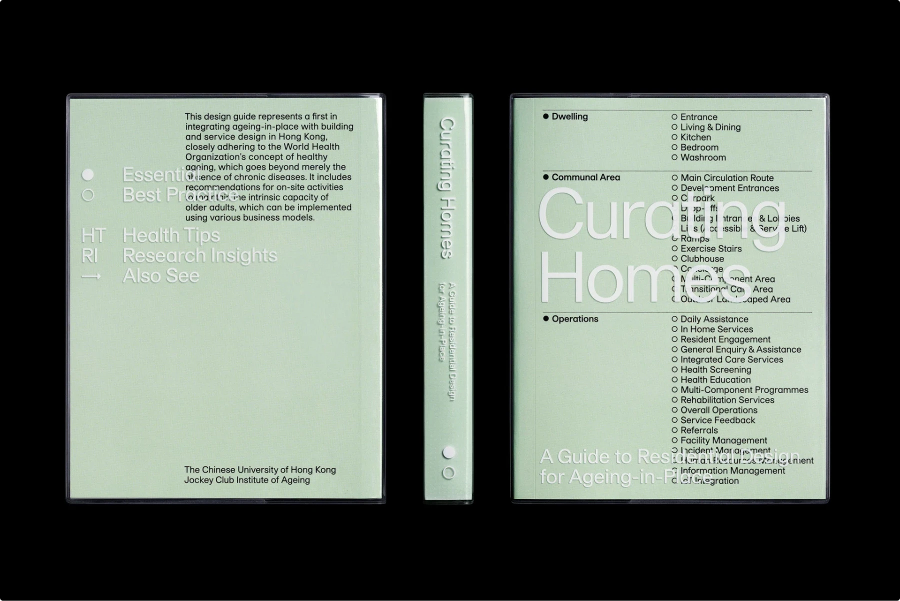
This table of contents uses a clear outline structure to organize a dense subject. The categories are separated into sections, each with bullet-pointed subtopics that make navigation straightforward. The minimalist design, paired with soft color and clean type, keeps the heavy content approachable.
Why it works:
- Hierarchical organization makes complex information digestible.
- Consistent use of bullet points creates rhythm and predictability.
- Minimalist aesthetic softens what could otherwise feel like a technical manual.
Pitfalls to avoid. If the typography lacks contrast or spacing, an outline TOC can quickly collapse into a wall of text. It risks looking bureaucratic instead of designed.
Pro tip. When working with information-heavy projects like reports, guides, or research publications, structure the table of contents page as an outline. Readers will appreciate clarity, and designers can still add personality with typography, color, or subtle graphic elements.
Example 5. Gradient contents with visual rhythm
This book table of contents transforms a plain list into something eye-catching with a gradient of color. The page numbers and section titles fade from warm hues at the top into cool tones at the bottom, giving the design both motion and depth.
Why it works:
- The gradient creates a sense of flow, guiding the reader’s eye smoothly down the page.
- It adds visual energy without disrupting readability.
- The shift in hue acts as a natural divider, suggesting progression through the content.
Pitfalls to avoid. If the gradient is too subtle, it looks accidental. If it is too bold, it can overwhelm the text. Striking the right balance is key.
Pro tip. Experiment with gradients to add vibrancy to your table of contents design. This approach works especially well in art books, creative portfolios, or experimental magazines where the TOC can act as both a functional page and a design statement.
Example 6. Grid-based contents with album vibes
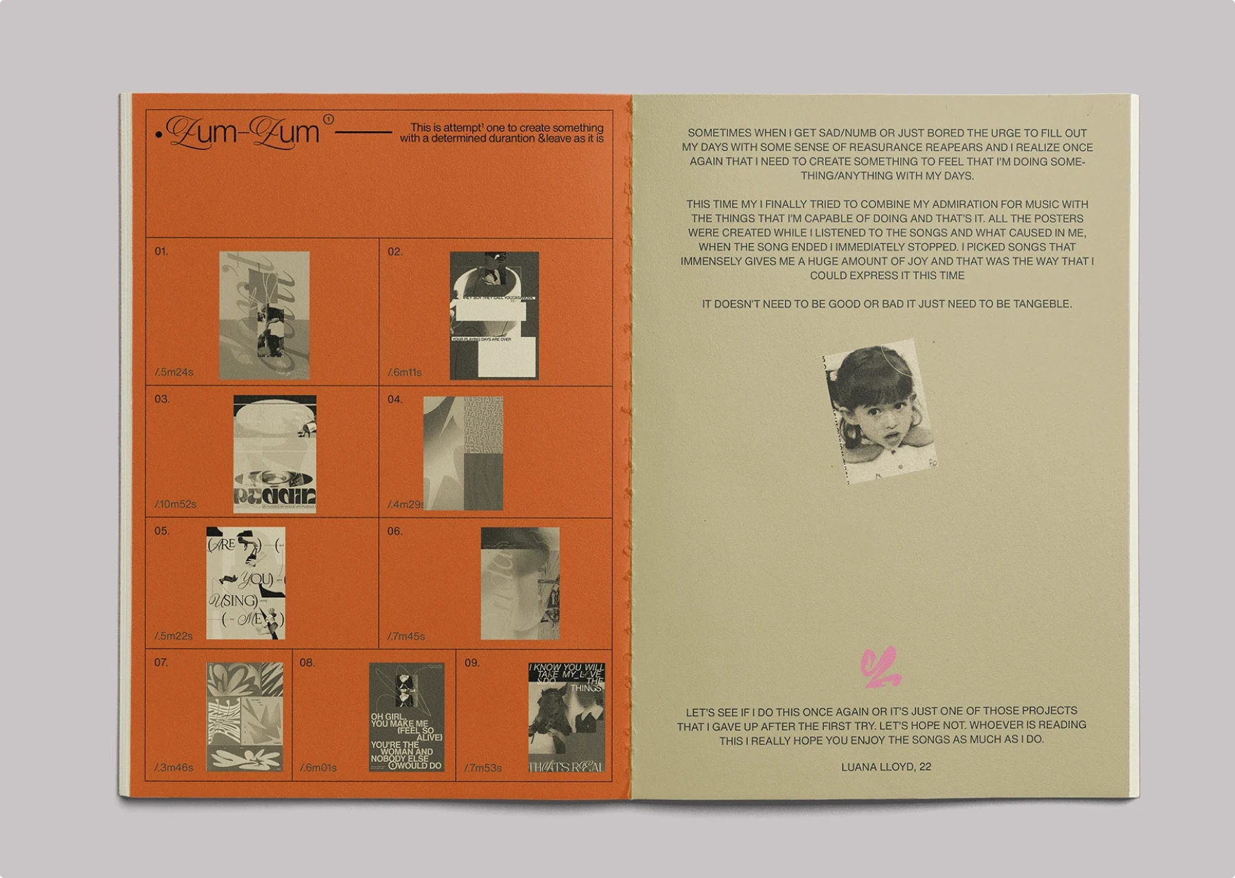
This TOC borrows its style from album artwork and playlists. Instead of a linear list, each entry is placed inside a square of a grid, paired with a small image and a time stamp. It feels more like flipping through tracks on a mixtape than reading a traditional contents page.
Why it works:
- The grid structure keeps order while still allowing playful variation with images.
- The time stamps add personality, giving it a conceptual link to music and rhythm.
- The strong orange background creates instant visual impact.
Pitfalls to avoid. Grid-heavy layouts can feel rigid if all entries look too similar. Without enough contrast between images, the page may blur together.
Pro tip. If your project has a theme like music, photography, or film, reflect that in your table of contents design. Borrowing visual language from playlists, film stills, or moodboards can make a TOC feel like an extension of the creative concept.
Example 7. Oversized typography with loud impact
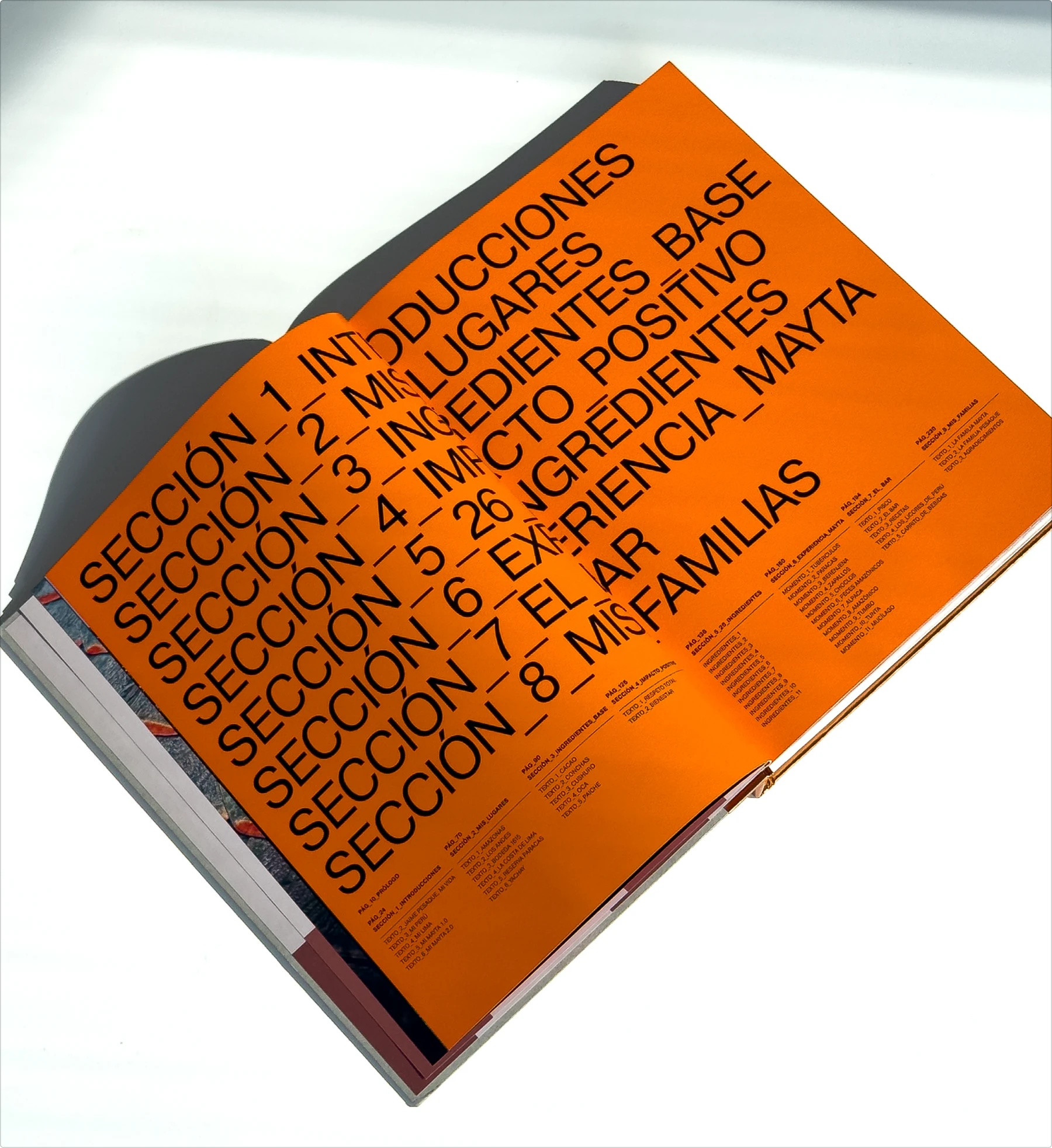
This TOC abandons subtlety and goes full volume. The oversized typography takes over the spread, leaving no doubt about hierarchy or section breaks. It reads almost like a poster rather than a contents page, blurring the line between functional design and bold statement piece.
Why it works:
- Huge typography creates immediate visual drama and commands attention.
- The repetition of “Sección” plus numbering adds rhythm and structure.
- The orange background amplifies the energy and reinforces the loud, unapologetic tone.
Pitfalls to avoid. Readability can suffer if oversized type bleeds into margins or if the spacing between lines is too tight. This style is best for expressive projects, not technical manuals.
Pro tip. Go big when you want your table of contents layout to double as a design feature. This approach works in magazines, cookbooks, or brand books where energy and personality matter more than quiet elegance.
Example 8. Elegant collage with editorial flair
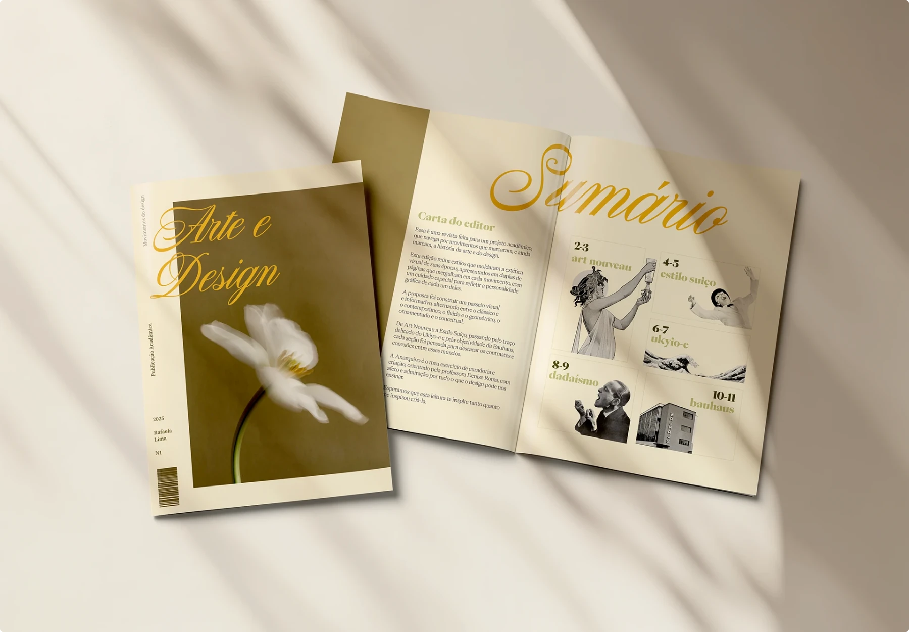
This magazine table of contents leans into editorial sophistication. A graceful script heading paired with collage-style photography creates a balance between classic elegance and playful storytelling. Each entry is supported by an image that hints at the article’s theme, turning the TOC into a visual preview of the magazine’s content.
Why it works:
- The mix of serif body text and script headings adds hierarchy and personality.
- Black and white collage elements contrast nicely with the warm cream background, giving it a timeless feel.
- Readers can engage visually and textually at the same time, which enhances curiosity.
Pitfalls to avoid. If the images are too abstract or unrelated to the articles, the TOC risks becoming confusing. Script typography should also be used sparingly, as too much can hurt readability.
Pro tip. Collage-inspired contents page design is a great fit for art magazines, design journals, and yearbooks. Pair curated imagery with thoughtful typography to strike a balance between creativity and readability.
Example 9. Split layout with bold accent color
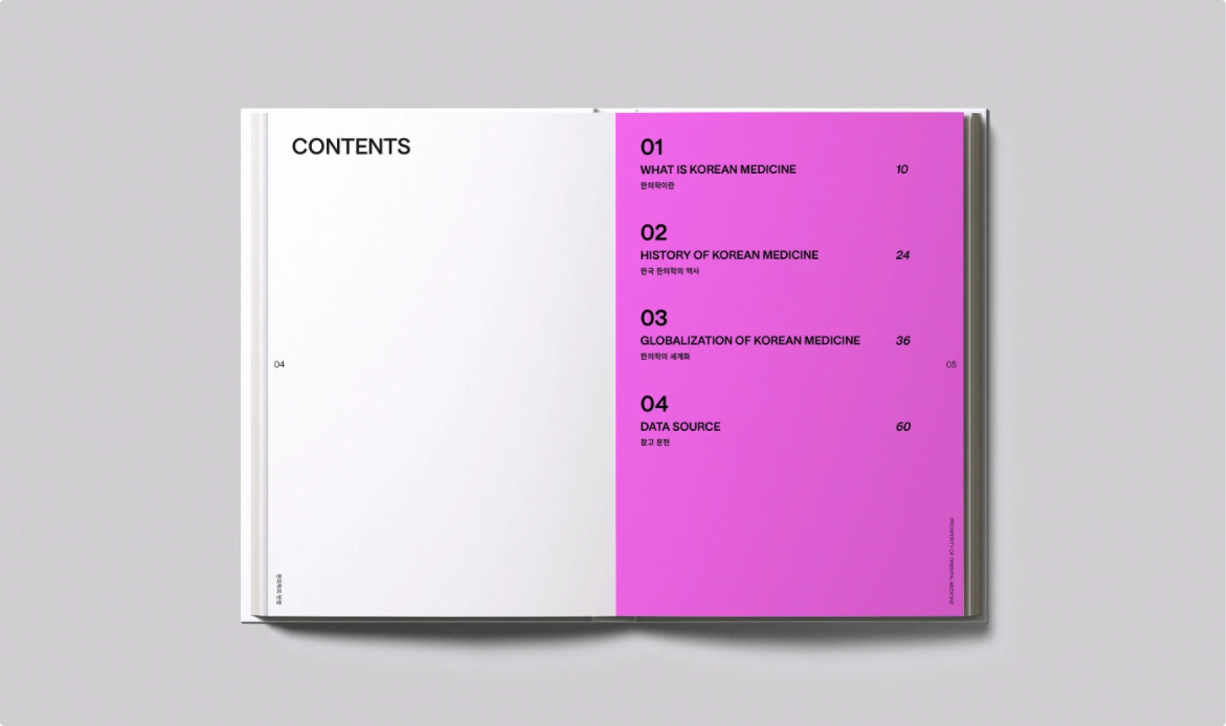
This book table of contents shows how simplicity can shine when paired with a bold accent. The left page is nearly empty, while the right explodes with magenta, setting the stage for oversized numbering and bilingual text. It feels modern, sharp, and confident.
Why it works:
- The stark color block creates instant visual contrast and drama.
- Bilingual text is handled cleanly, keeping both English and Korean readable without clutter.
- Large numbers dominate the layout, ensuring clear hierarchy.
Pitfalls to avoid. Too much color on both pages could overwhelm the reader. The impact comes from contrast, so restraint is key. Also, if the accent color is poorly chosen, it can feel trendy rather than timeless.
Pro tip. A split-page TOC with bold color is perfect for contemporary reports, design portfolios, or cultural publications. Use color not just decoratively but strategically to guide attention and define tone.
Example 10. Playful retro vibes with layered typography
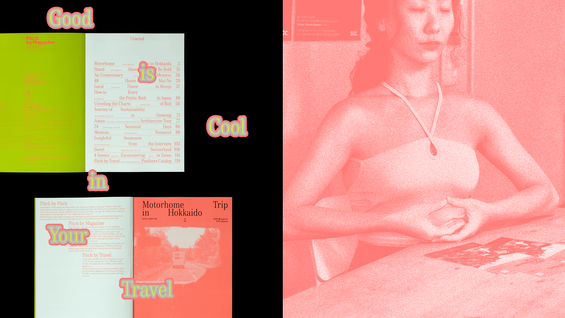
This magazine contents page refuses to take itself too seriously. It leans into playful retro styling with bold outlined text, bright neon backgrounds, and halftone photography. The layered mix of minimalist listings and pop-art typography makes the TOC feel like part of the magazine’s overall storytelling rather than just a directory.
Why it works:
- The retro color palette and drop-shadowed text inject personality and humor.
- Mixing minimalist TOC entries with loud decorative words creates visual tension in a good way.
- The halftone photo adds texture and connects the design to print culture.
Pitfalls to avoid. Too many decorative fonts can overwhelm function. If hierarchy is unclear, the TOC risks looking like a poster rather than a navigation tool.
Pro tip. When designing a creative table of contents, you can channel retro styles or cultural references. Just make sure the playful typography does not bury the actual navigation. Readers should smile and still find what they need.
Example 11. Modular columns with brutalist influence
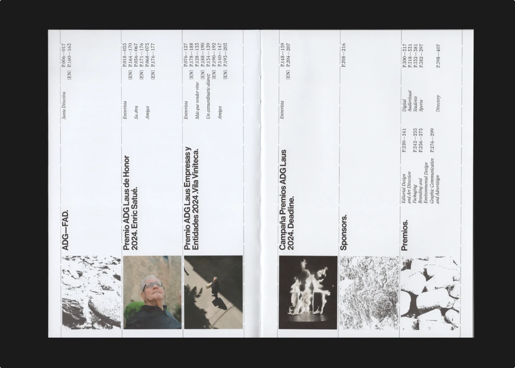
This contents page design breaks away from the classic horizontal flow and embraces a modular vertical column system. Each column acts almost like its own page strip, complete with bold rotated headings and small imagery at the bottom. The result is unapologetically brutalist and highly structured.
Why it works:
- The vertical modular system provides clarity while challenging expectations.
- Strong typographic contrast with rotated text creates visual tension.
- Small photographic inserts balance the rigid grid with texture and humanity.
Pitfalls to avoid. Such a rigid system can feel cold or overly technical if not balanced with human elements. It may also be less intuitive for quick scanning compared to traditional layouts.
Pro tip. Use a modular, brutalist-inspired table of contents layout when you want to emphasize structure and hierarchy. This works well in design annuals, architecture portfolios, or experimental magazines where the TOC itself becomes a design showcase.
Example 12. Object-based contents with vintage charm
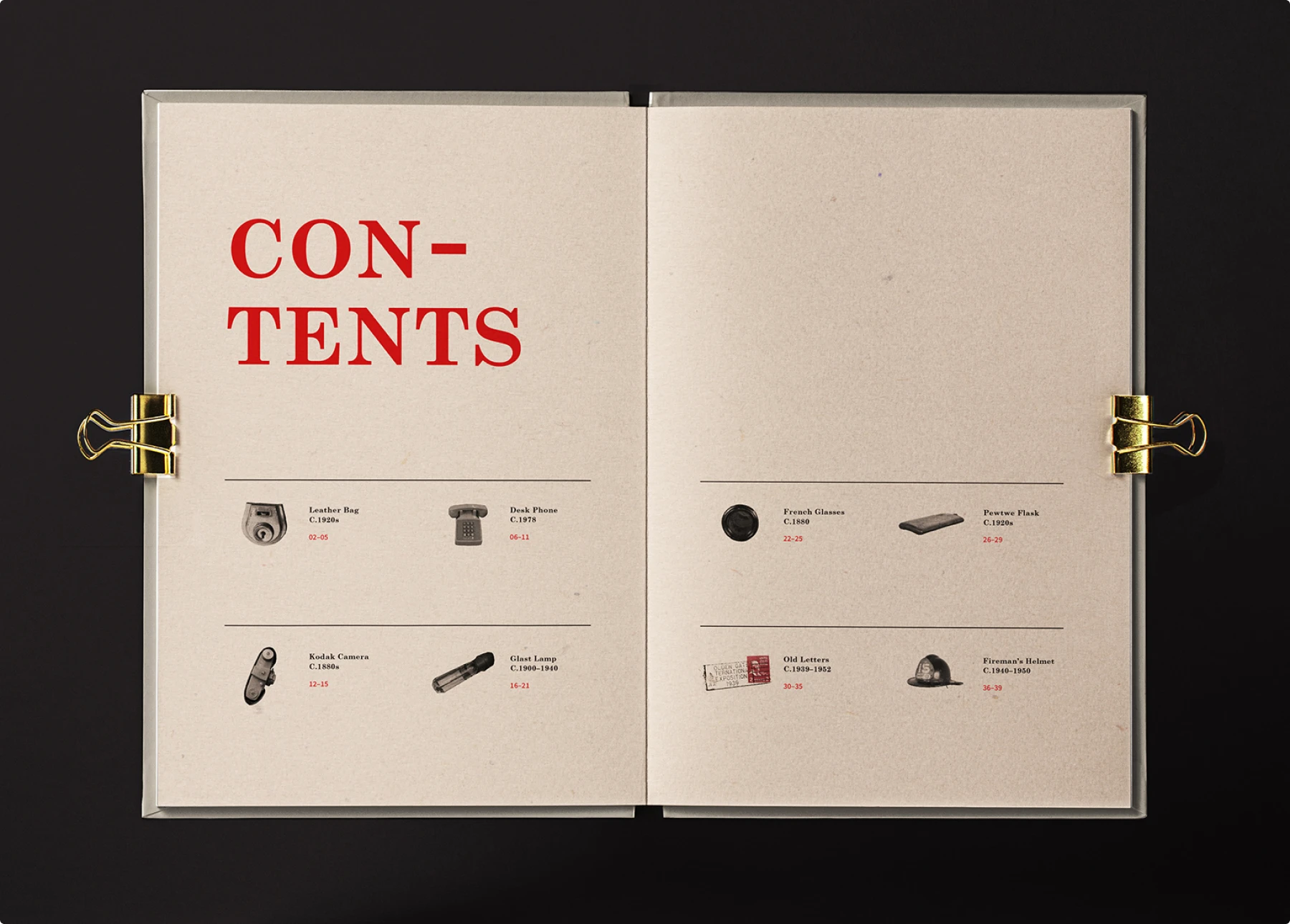
This table of contents turns navigation into a small exhibition. Instead of a plain list, each section is represented by a vintage object illustration. The combination of serif typography, red highlights, and muted paper tone creates an archival, museum-like feel.
Why it works:
- Object illustrations give the TOC a tactile, story-driven quality.
- The restrained grid keeps it organized and easy to scan.
- Red type highlights page numbers, guiding the eye to the essential information.
Pitfalls to avoid. If the objects are too abstract or poorly chosen, the connection to the content may be unclear. Overloading the page with too many icons could also make the design feel cluttered.
Pro tip. Pair illustrations or object images with entries to make your contents page design feel more like a curated display. This is ideal for history books, museum catalogs, or yearbooks where the TOC can extend the narrative beyond text.
Example 13. Minimalist typewriter aesthetic
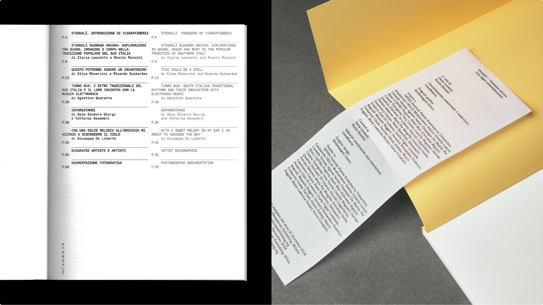
This book table of contents channels the look of old typewritten documents. Using a monospaced font, evenly spaced lines, and plain black on white, it strips the TOC back to its essentials. The addition of a folded insert extends the design concept into a physical artifact, blurring the line between navigation and archival document.
Why it works:
- Monospaced type creates a retro, utilitarian charm.
- The strict alignment makes the dense content easy to scan.
- The insert shows how a TOC can move beyond the page into physical storytelling.
Pitfalls to avoid. Too much minimalism can look sterile or unfinished. Without thoughtful spacing, monospaced layouts may become monotonous.
Pro tip. Try a typewriter-inspired contents design when working on historical books, conceptual projects, or zines. The utilitarian style communicates authenticity and restraint while letting the content take center stage.
Example 14. Split columns with Roman numeral anchors
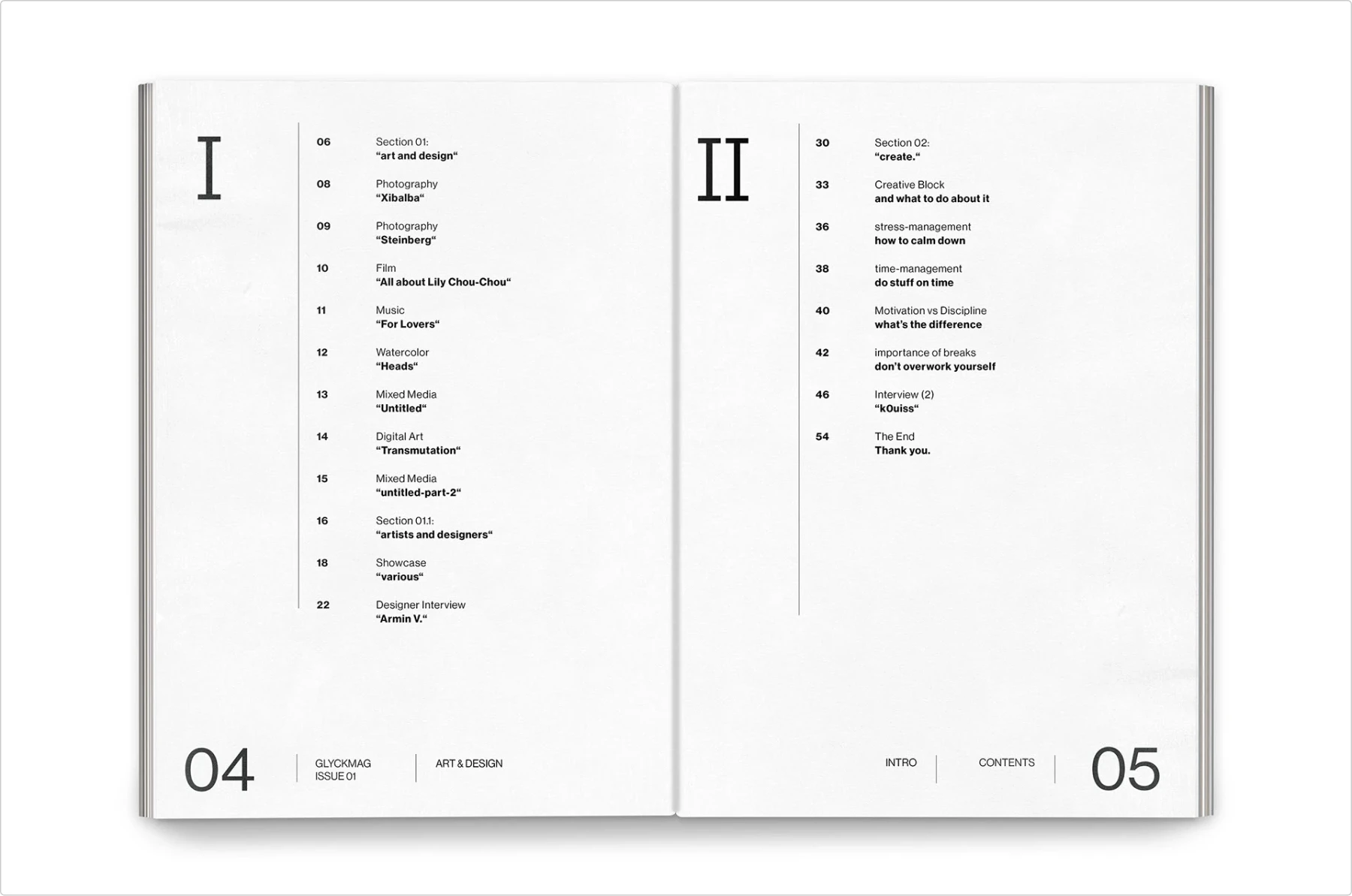
This magazine contents page organizes its material into two distinct columns, anchored by oversized Roman numerals. Each section is clearly separated, with simple typography and subtle emphasis on key words. The layout feels structured but still dynamic thanks to the oversized numerals acting as visual anchors.
Why it works:
- Roman numerals give the TOC a sense of formality and hierarchy.
- Split columns improve readability by breaking long lists into manageable chunks.
- Subtle typographic emphasis guides the eye without overwhelming the design.
Pitfalls to avoid. Roman numerals can look heavy-handed if overused. Designers also need to watch spacing to keep columns from feeling cramped or unbalanced.
Pro tip. When you have a mid-sized publication, consider dividing your contents page design into clear sections. Roman numerals, bold headings, or color blocks can make the split intuitive. This approach is especially effective for editorial magazines and portfolios.
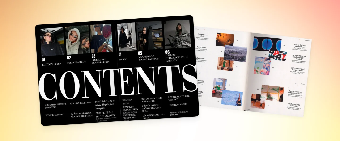
Example 15. Photography-Driven Spread with Oversized Title
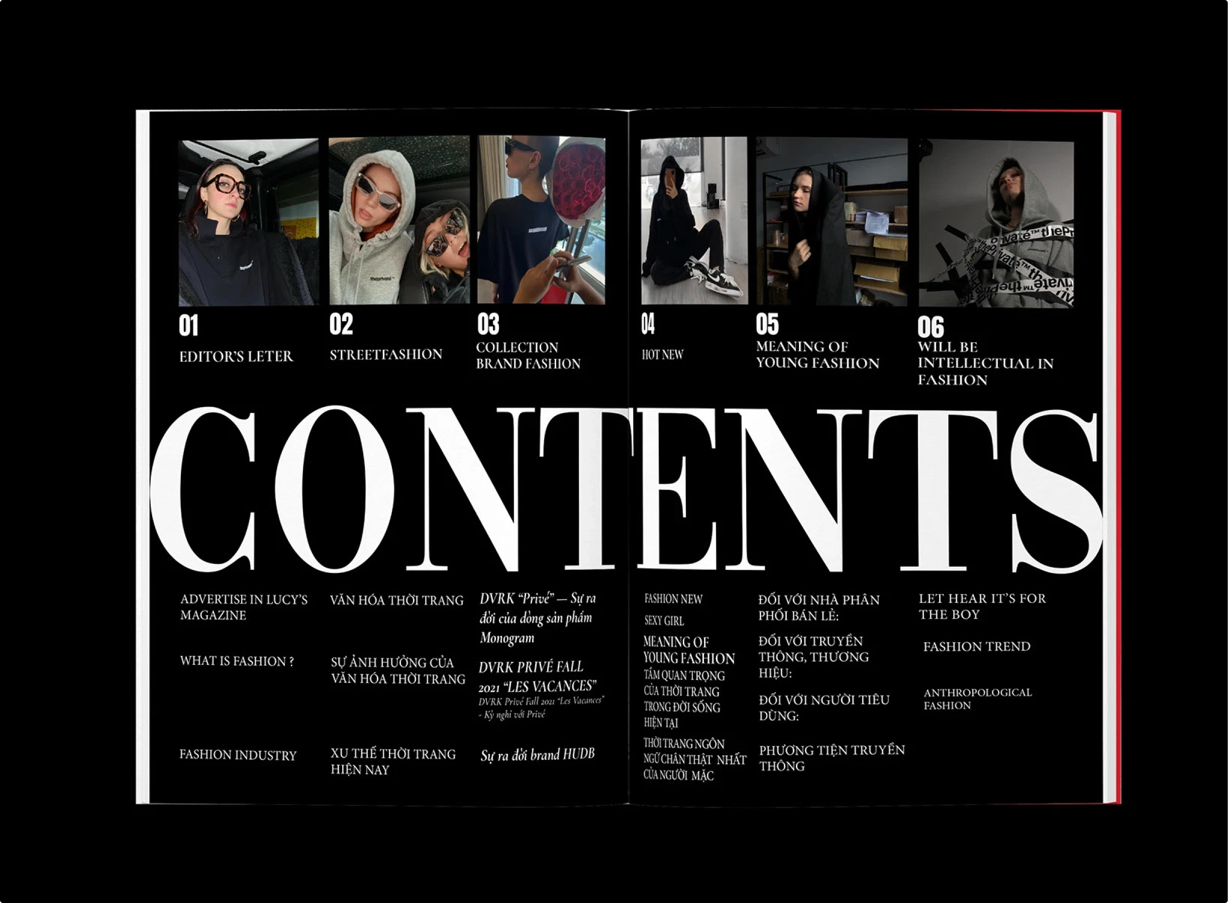
This magazine table of contents fuses editorial photography with bold typographic drama. The oversized “CONTENTS” dominates the bottom half of the spread, while a row of fashion portraits introduces the featured sections above. The bilingual layout adds depth, making the page feel both international and stylishly modern.
Why it works:
- The massive serif “CONTENTS” acts as a strong visual anchor, leaving no doubt about the page’s function.
- Photography previews add personality and context, enticing readers to dive into each feature.
- The bilingual layout reflects global culture and makes the magazine accessible to multiple audiences.
Pitfalls to avoid. Oversized type can overshadow the functional listings if not balanced carefully. Too many photos without clear numbering could create clutter.
Pro tip. Combine photography and bold typography to turn a magazine contents page into a statement spread. This style works best for fashion magazines, lifestyle publications, or visual culture journals where the TOC doubles as an extension of the brand’s editorial voice.
Design principles behind a strong TOC
A table of contents should never feel like an afterthought. The best ones balance clarity with personality. Here are the principles that separate a forgettable list from a design statement.
1. Clarity comes first
Readers must find their way without squinting or guessing. Page numbers should be easy to spot. Hierarchy in type should make sense. If someone has to pause and decode your TOC, you failed at the basics.
2. Typography is your best weapon
Font choice, size, and weight can create instant structure. Use scale to emphasize sections, italics or bold for nuance, and spacing to let everything breathe. A TOC is the perfect playground for typographic hierarchy.
3. Grids and alignment keep order
A chaotic TOC feels sloppy. Whether you are using strict Swiss grids or playful broken ones, consistency matters. Alignment ties the whole spread together and makes even experimental designs feel intentional.
4. Imagery adds personality
Icons, illustrations, or photos can bring context and energy. Done right, images act as previews or hints, not distractions. If images overpower the text, you have turned a navigation tool into a scrapbook.
5. White space is your secret weapon
Crowding every inch with text makes the page unreadable. White space helps readers breathe and directs focus. Minimalism is not about doing less, it is about making what remains count.
6. Accessibility is not optional
High contrast, legible fonts, and careful color choices matter. That beautiful light gray text might look chic on your Retina display but becomes unreadable in print or for readers with impaired vision.
7. Creativity should serve the content
Experimental layouts, gradients, or oversized type are fantastic — as long as they do not bury usability. The best TOCs are memorable and functional. Think of it like fashion: bold design works only if you can still walk in it.
Every decision in your table of contents design should help readers navigate while reinforcing your project’s identity. If it is confusing, you made art. If it is clear and beautiful, you made design.
FAQs about table of contents design
What is a table of contents?
A table of contents is a roadmap of your book, magazine, or report. It lists sections or chapters in order with page numbers or links. Think of it as the GPS of your publication.
Where is the table of contents in a book?
Usually near the beginning, right after the title page and copyright page. If your readers have to flip halfway through the book to find it, you are doing it wrong.
What does a table of contents look like?
It can be as simple as a plain list or as complex as a double-page spread with images, icons, and grids. In books, it is often a text-only list. In magazines, it is closer to a mini-layout or poster.
What is the rule for table of contents?
Keep navigation clear. Use consistent typography. Make page numbers easy to find. Add enough spacing to avoid a wall of text. And if you want to get creative, make sure function still wins.
Is it table of content or table of contents?
It is always table of contents with an “s.” You are listing multiple things, not just one. The phrase “table of content” is a common mistake unless you are literally designing a table made of content.
How to write a table of contents?
First, list your chapters or sections in order. Add page numbers. Group them logically if needed. Then decide how to style it. If it is for a report, keep it simple and clean. If it is for a magazine or creative book, play with grids, type, and imagery.
What should a table of contents look like?
Readable, consistent, and on-brand. The best TOCs are functional guides that also express the tone of the publication. It should look like it belongs to the project, not like a Word export pasted in at the last second.
What are table of contents used for?
To help readers navigate quickly. That is the obvious answer. But in design-driven projects, they are also used to set mood, showcase creativity, and preview content.
Wrapping up
A table of contents is more than a list of chapters. It is a design handshake. It tells your readers if you care about the details, if your publication is worth their time, and if you know how to guide them through the story.
The worst TOCs are lazy. They are default Word exports with dotted leaders that scream “I gave up.” The best TOCs are unforgettable. They mix clarity with creativity. They make navigation feel like part of the brand experience, not an obstacle course.
So the next time you design a book, magazine, or portfolio, give your contents page the love it deserves. Use typography with intent. Play with grids. Add imagery when it enhances, not distracts. Keep it accessible. And remember: if your TOC is boring, your readers will assume the rest is too.