


Google, Tesla, Netflix – their fonts are doing psychological warfare on your brain, and you don’t even know it. Here’s how they do it.
While everyone’s obsessing over Apple’s bite mark, the real legends are font logos hiding in plain sight. These typography logo designs are so clean, they’ll make you question everything.
Text-based logos are actually harder than symbols. No metaphors to hide behind—your brand name is completely exposed. Either it works or it doesn’t.
Your brain processes logo typography while reading AND recognizing simultaneously. That’s why Coca-Cola feels different than Pepsi, why Netflix seems premium, and why Google’s friendly fonts somehow work for a trillion-dollar company.
We’re breaking down 50+ typography logo examples that absolutely crushed it. Tech giants, luxury brands, food companies—all masters of brand typography.
After this, you’ll become that person who judges every restaurant sign. But honestly? Worth it.
Let’s see how the pros really do it.
Brand breakdown sections
Meta
The text-based logo typography is doing heavy psychological lifting while everyone focuses on that infinity symbol drama. Those letterforms use custom optical scaling where the ‘e’ and ‘a’ get slightly larger x-heights to prevent looking weak next to the chunky ‘M’ and ‘t’. The kerning between ‘M’ and ‘e’ is tighter than mathematically perfect because they knew this would live at tiny social media sizes. Brand typography that says “trust us with your data” while you’re literally giving them your entire digital life. The gap between friendly and manipulative is measured in pixels.
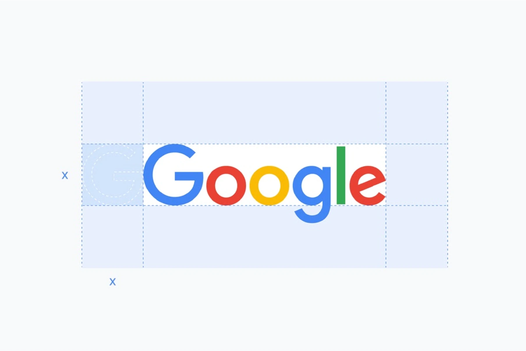
This typography logo design somehow made a surveillance capitalism empire feel like your friendly neighborhood library through genius letterform manipulation. The custom Product Sans uses optical corrections where the ‘o’s are 2% larger than perfect circles because geometric perfection reads as cold and robotic. The ‘g’ descender length is precisely calculated to feel playful without looking unprofessional. Those color breaks aren’t random—they’re strategically placed to make your brain process each letter individually while maintaining word recognition. Font logo that trained humanity to love data harvesting through superior typography psychology. The manipulation is so clean, we’re all still falling for it.
Tesla
Elon definitely overthought this typography logo, but accidentally created something that screams “engineered by perfectionists.” The custom letterforms use mathematical precision where each letter width follows golden ratio proportions because normal spacing apparently wasn’t futuristic enough. That ‘T’ uses a perfectly horizontal crossbar while the ‘e’ terminals curve at identical angles—the kind of obsessive detail that appeals to people who spend $100K on cars. Brand typography that feels like it was designed by robots, which is probably the point. The kerning is so tight it almost touches because space efficiency = engineering excellence in tech bro psychology.
Samsung
This font logo is giving “your reliable tech dad” energy through systematically boring letterform choices, and honestly? That’s exactly what they needed. The weight distribution is perfectly balanced between “we’re serious about technology” and “we won’t confuse your grandma.” Custom optical adjustments where the ‘S’ curves use slightly more contrast to prevent looking like a squished circle. Typography logo design that says “we make things that work and don’t randomly explode,” which is apparently a competitive advantage. The tracking is wide enough for global manufacturing labels but tight enough not to waste packaging space. Corporate typography that actually understands its assignment.
Coca-Cola
This typography logo is literally the typography equivalent of a perfect drug—designed for maximum psychological addiction through letterform engineering that most people don’t even consciously process. Those Spencerian script flourishes aren’t just “decorative”—they’re mathematically calibrated to trigger nostalgic dopamine responses. The baseline rhythm creates visual movement that mimics excitement, while the stroke weight variations prevent visual fatigue during extended viewing. Logo typography that’s been psychologically manipulating humans for 130+ years through pure calligraphic genius. The kerning between letters creates this sense of flow and celebration that makes drinking sugar water feel like a cultural experience. Peak typography logo design that turned carbonated caffeine into a lifestyle religion. No notes, just respect for the psychological warfare.
Netflix
This typography logo design said, “we’re confident enough to just be our name in red,” and somehow convinced the world to abandon physical media. Custom condensed letterforms where the ‘N’ uses slightly wider stems to prevent looking weak next to the chunky ‘E’ and ‘T’. The letter spacing is tight enough to feel cinematic but loose enough for subtitle legibility. That red isn’t just “attention-grabbing”—it’s psychologically calibrated to trigger binge-watching dopamine responses. Font logo that trained humanity to associate entertainment with monthly subscriptions. The manipulation is so effective that we’re all still paying for content we’ll never watch.
Spotify
The text-based logo carries the “premium but accessible” load, while that icon does the recognition work. Custom letterform engineering where the ‘p’ uses a slightly shorter descender to prevent awkward spacing when paired with the icon. The ‘f’ crossbar is positioned higher than standard because they knew this would appear next to circular elements constantly. Logo typography weight is calibrated for music industry credibility, heavy enough to compete with record labels, light enough not to intimidate indie artists. Typography that convinced us paying for music was cool again after years of piracy. The psychological manipulation is measured in font weights.
Airbnb
The wordmark is doing the “your mom would approve of this website” energy through careful typographic psychology. Custom letterform adjustments where the ‘b’s use slightly more rounded terminals because sharp edges subconsciously trigger “unsafe stranger” alerts. The tracking is loose enough to feel welcoming but controlled enough to maintain professionalism. Typography logo design that convinced millions of people to sleep in random strangers’ houses through pure font trust. The gap between “reliable platform” and “potential horror movie setup” is literally measured in kerning units.
IKEA
This typography logo cracked the code on “approachable authority” through pure letterform psychology. That custom sans-serif weight is calibrated to feel sturdy enough for furniture but friendly enough that you won’t cry during assembly. The letter spacing is wide enough for global legibility (because Swedish instructions already confuse everyone) but tight enough to fit on tiny screws and instruction booklets. The contrast ratio against that yellow is accessibility perfection. It works for colorblind customers and terrible lighting. Logo typography that literally built a furniture empire through systematic design thinking.
Visa
This brand’s font strategy is pure global domination disguised as simple typography. The italic slant suggests forward movement and progress, which is exactly what financial psychology needs to feel trustworthy. Custom optical adjustments where each letter gets individually tuned because when you process trillions in transactions, every pixel matters. Letter spacing is calibrated for international legibility because this logo needs to work in every culture and language simultaneously.
LUCID
This font logo is flexing custom letterform engineering that most people totally miss. That ‘L’ and ‘D’ aren’t just “curved”—they’re using precise optical corrections where the terminals curve at exactly 15 degrees to prevent the harsh industrial look that kills EV appeal. The ‘U’ width is mathematically calculated to match the ‘C’ interior negative space because visual rhythm > geometric perfection. The tracking is loose enough for premium automotive feels but tight enough not to look like a tech startup. Typography logo design that whispers “luxury electric” without screaming “Tesla wannabe.”
Volvo
The typographic identity that’s been serving “Swedish safety but make it sexy” since before everyone discovered Scandinavian minimalism. Those letterforms are chunky enough to survive being stamped on metal but refined enough that luxury car buyers don’t feel basic. The circle containment creates authority while the text styling weight suggests reliability without boring suburban dad energy. Automotive brand typography that makes other car logos look desperate for attention.
Adobe
The red typography logo design that’s been Stockholm Syndroming creatives for decades, while they complain about subscription prices. The letterforms use custom optical adjustments where the ‘o’ is slightly larger than geometric to prevent looking weak next to the angular letters. The ‘A’ and ‘d’ spacing is tighter because they knew this logo would be seen at icon sizes more often than full size. That red isn’t random—it’s calibrated to feel energetic without being aggressive. Font logo that trained an entire industry to associate creativity with monthly payments.
NVIDIA
The text-based logo portion is carrying the reliability load while that green eye does the “we’re the future” heavy lifting. The letterforms use a custom weight that’s bold enough to compete with AMD but not so heavy it looks desperate. The ‘V’ and ‘I’ kerning is tighter than standard to prevent that awkward gap that makes tech logos look amateurish. This typography logo design knows exactly when to be boring (the type) and when to be memorable (the symbol). Division of labor in branding executed flawlessly.
ASUS
The typography logo is doing that “reliable tech that won’t bankrupt you” positioning through pure letterform psychology. The geometric sans-serif feels engineered, not designed, which is exactly what budget-conscious tech buyers want to see. Those rounded corners aren’t decoration—they’re optical corrections that prevent the logo from looking cheap at small sizes. The weight distribution is perfectly balanced between approachable and professional. While other brands scream “innovation,” ASUS whispers “solid performance” through controlled, systematic logo typography.
Amazon
The font logo is using Officina Sans but with custom optical adjustments that most people miss. Look at that ‘m’—the stems are slightly heavier to prevent it from looking weak next to the ‘a’ and ‘z’. The letter spacing is loose enough for global legibility (because they literally ship everywhere) but tight enough to feel cohesive. This typography logo solved the “we need to work in every language and culture” problem before anyone else figured out global branding was a thing. Deceptively simple, actually genius.
Handshake
That 12-degree italic slant isn’t random, it’s perfectly calibrated to suggest forward momentum without looking like it’s about to fall over. The typography logo uses custom letterform adjustments where the ‘a’ and ‘e’ get tighter kerning to maintain readability at speed. It’s giving “we’re moving fast but we’re not sloppy” which is exactly the vibe job platforms need. The x-height is tall enough for mobile legibility, but the descenders on ‘g’ and ‘p’ have breathing room. Technical flex disguised as casual energy.
Telefónica
The logo typography is doing the “reliable connectivity” thing through systematic letterform choices that feel engineered, not artistic. That accent on the ‘o’ isn’t just Spanish—it’s a visual cue that this brand operates globally but isn’t trying to hide its roots. The sans-serif weight is calibrated for international legibility, while the letter spacing prevents character overlap in different languages. This text-based logo solved the “we need to work across cultures and languages” problem through pure typographic discipline. Telecom branding that actually understands how global communication works.
Intuit
This font logo uses rounded terminals because sharp corners make people think “complicated taxes” instead of “simple software.” The letterforms are wide enough to feel approachable but not so wide they look childish. The ‘i’ dots are perfectly aligned because even subconscious details matter when people trust you with their money. The blue typography logo weight is calibrated for maximum trustworthiness, heavy enough to feel substantial, light enough not to intimidate. Fintech psychology through systematic type choices.
Audemars Piguet
The serif choices here are doing psychological warfare on your wallet. Those letterforms have the same precision as their watch movements—every curve calculated, every weight distribution intentional. The ‘A’ in both words uses identical geometry because consistency = quality in Swiss brain programming. The brand typography spacing is so tight it almost touches, creating this sense of exclusivity, like the letters themselves are VIP. When people spend $50K+ on time pieces, the font logo better feel like it was hand-engraved by monks.
Hermès
This typography logo design is flexing 180+ years of not giving a damn about trends, and the typography backs it up. Those serifs are sharp enough to cut glass—literally designed to say “precision craftsmanship” in letterform. The tracking is impossibly tight because luxury brands know scarcity applies to letter spacing too. The text-based logo uses a weight that’s heavy enough to feel substantial but not so bold it looks desperate for attention. When your scarves cost $400, your typography better whisper, not shout.
mint&lily
This typography logo design is playing serif psychology perfectly—those tiny serifs create just enough sophistication without the “I’m too expensive for you” energy. The real genius? That ampersand color break disrupts the rhythm just enough to make your brain pause and actually read it. The kerning between ‘mint’ and the ampersand is tighter than standard because they knew people scan logos, not read them. The logo typography weight distribution keeps it feminine without being fragile. Boutique branding that actually understands how eyes move.
Oscar de la Renta
This custom typeface is pure fashion house flex disguised as a signature. The baseline variation isn’t random chaos, it’s carefully orchestrated to feel like couture sketches come to life. Each letterform uses different stroke weights that mimic actual pen pressure because luxury brands know authenticity sells better than perfection. The lettering design spacing is loose enough to breathe on evening gowns but tight enough to work on jewelry tags. High-fashion wordmark that makes everyone else’s logos look mass-produced.
Ray-Ban
The signature logo that convinced generations to pay premium prices for sunglasses through pure typographic swagger. That script weight is mathematically calibrated to feel handcrafted but reproducible because mass manufacturing demands consistency. The baseline tilt creates movement that suggests “cool rebellion” while the luxury typography stays readable at tiny temple sizes. Genius move pairing it with block letters below because premium brands need that authority anchor. Text logo psychology that transformed eyewear into lifestyle statements.
Tiffany & Co.
This premium lettering is flexing 180 years of “we don’t need to try hard because we’re literally iconic” energy. The serif choice isn’t accidental, it’s psychological warfare on your wallet through letterform authority. Custom optical adjustments, where the ampersand gets special treatment, because luxury brands obsess over every detail. The designer wordmark tracking is so tight it almost touches, because exclusivity applies to letter spacing too. When your breakfast costs more than most cars, your typography better whisper elegance, not scream desperation.
Chopard
This lettering design is playing the “Swiss precision meets artistic flair” game through calculated script choices. The flourishes aren’t decorative accidents, they’re engineered to suggest craftsmanship while maintaining production scalability. That contrast between script main and sans-serif location tag creates hierarchy that luxury consumers actually process. Custom typeface decisions that make $50K watches feel worth it through pure typographic authority. The stroke weight variations mimic actual goldsmithing because details matter when people mortgage houses for timepieces.
Patek Philippe
This font selection is flexing “generational wealth” through pure typographic restraint. The beige color choice whispers rather than shouts because when your watches cost more than houses, your letterform styling better have that same quiet confidence. Custom spacing that’s tighter than your average luxury brand because exclusivity applies to air between letters, too. Character design that makes Rolex look like they’re trying too hard.
Jared
The high-end typography that’s doing “luxury but make it approachable” through systematic serif psychology. Custom letterform adjustments where the ‘J’ uses a slightly longer descender to create visual interest without looking pretentious. The weight distribution screams “we’re serious about jewelry but won’t intimidate your girlfriend” which is exactly the lane between Zales and Tiffany. Brand lettering that solved the “affordable luxury” positioning problem through pure typographic diplomacy.
Christian Louboutin
The signature logo is doing maximum impact through strategic typographic contrast. Script for “Louboutin” because signatures = authenticity, serif for “Christian” because authority = trust. The baseline alignment creates visual tension that keeps your eye engaged longer, which translates to better brand recall. Luxury typography engineering that makes red-soled shoes feel like art investments. Custom kerning between the two names creates perfect visual balance while the mixed styles prevent boring uniformity.
Maison Margiela
The text logo is doing “intellectual luxury” through deliberately understated serif choices. No flourishes, no scripts, just pure typographic confidence that whispers, “If you know, you know.” The letterform spacing is wider than traditional luxury because avant-garde fashion needs breathing room. High-end typography that appeals to fashion insiders who think Gucci is too obvious. Custom optical corrections, where each letter gets individual attention, because conceptual fashion demands typographic perfection.
Cartier
This premium lettering has been psychologically manipulating luxury consumers for over a century through pure calligraphic perfection. The script weight distribution creates that “handcrafted by French artisans” feeling while staying readable at micro jewelry sizes. Every flourish is mathematically precise because Cartier knows inconsistency kills luxury credibility. Designer wordmark that convinced people to spend more on watches than cars through systematic typographic seduction. The elegance is so calculated it feels effortless.
Rolex
The brand lettering that built a horological empire through systematic serif authority. Those letterforms use precision engineering that mirrors their movement manufacturing because consistency = quality in Swiss psychology. The crown placement isn’t decorative; it’s a strategic hierarchy that reinforces luxury positioning. Wordmark weight calibrated to feel substantial without looking heavy because premium timepieces need typographic balance. The green color choice psychologically triggers “money” associations, while the serif style suggests heritage and reliability.
Thomas Sabo
This signature logo is pure personal branding disguised as jewelry marketing through authentic script execution. The baseline variation feels genuinely handwritten because accessibility luxury needs that human touch. Stroke weight changes mimic actual pen pressure while custom letterform connections create flowing readability. Lettering design that makes affordable luxury feel personal rather than mass-produced. The signature approach builds founder credibility while the script style appeals to customers who want premium without pretension.
Omega
The character design that turned a Greek letter into a horological authority through mathematical precision. That red isn’t a fashion choice, it’s a psychological trigger for luxury and precision that watch collectors unconsciously respond to. Brand typography spacing is calibrated for international legibility because this logo needs to work in every culture simultaneously. Swiss luxury through pure typographic mark discipline.
Arc’teryx
This custom lettering is literally doing “we climb mountains and don’t need your approval” energy through pure typographic confidence. The sans-serif weight is chunky enough to survive being embroidered on technical gear but not so thick it looks like a sports brand having an identity crisis. That apostrophe placement? Chef’s kiss for creating visual rhythm that outdoor bros will never consciously notice but subconsciously respect. Wordmark design that makes other outdoor brands look like they’re trying too hard.
Fila
The wordmark design that’s been serving “Italian sportswear sophistication” since before everyone discovered logomania. Those letterform proportions are mathematically tuned to feel substantial without looking bulky, which is exactly what athletic apparel psychology demands. The color combination triggers heritage associations while the typographic branding weight suggests performance credibility. Retro revival proof typography that makes newer athletic brands look desperate for attention.
Agora
The wordmark design that’s flexing “we’re media but make it serious” through calculated letterform authority. That red triangle isn’t a random decoration; it’s a strategic visual disruption that prevents the corporate typography from looking boring. The sans-serif choice feels journalistic enough for credibility but modern enough to compete with digital-first outlets. Typographic branding that makes traditional media companies look outdated without trying too hard.
Arch Daily
The typeface selection is doing “we’re architectural media for people with taste” through deliberate spacing and weight choices. That architectural symbol integration isn’t cute branding, it’s strategic hierarchy that establishes expertise before you read a single article. The blue feels professional enough for industry respect but accessible enough for design students who can’t afford subscriptions yet. Editorial visual identity that makes other architecture publications look amateur.
The Verge
This custom lettering cracked the code on “tech journalism but make it cool” through pure typographic rebellion. Those geometric interruptions in the letterforms create visual tension that keeps your brain engaged longer, which translates to better article engagement rates. The weight distribution prevents it from looking like every other tech blog while maintaining readability at mobile sizes. Logotype design that makes traditional tech media look ancient.
ABC News
This font selection is carrying decades of “we’re legitimate journalism” credibility through systematic serif authority. The contrast between lowercase letters and uppercase news creates a hierarchy that news consumers actually process subconsciously. Letterform styling that feels institutional enough for credibility but not so stuffy that it alienates younger viewers. Legacy media text branding that still works in the digital chaos.
Lilypad
The visual identity that’s doing maximum “we understand kids but won’t give parents headaches” through controlled chaos typography. Each letter gets its own color because toddlers process variety better than uniformity, but the typeface selection stays readable because parents are the ones actually signing checks. Rounded terminals prevent the aggressive energy that makes children’s branding feel overwhelming. Smart kids’ market psychology disguised as fun typography.
Orange Seeds
This logotype design is giving “we’re nurturing but not twee” through systematic color and type choices. The weight feels substantial enough for educational credibility but friendly enough that helicopter parents won’t get anxiety attacks. Orange psychology triggers creativity associations while green adds the natural growth vibes that Montessori parents obsess over. Custom lettering that makes alternative education feel accessible rather than intimidating.
Modern Animal
This font choice said “we’re not your grandpa’s vet clinic” and honestly delivered. The serif selection feels editorial, like your pet’s health story is important enough for magazine treatment. Weight distribution screams, “We’re serious about animal care, but won’t traumatize you with sterile medical vibes.” Brand fonts that make expensive pet healthcare feel like a lifestyle choice rather than an emergency expense. Genius positioning through pure typographic psychology.
Petfinder
The typographic branding is playing “we’re approachable but not unprofessional” through strategic script choices. Those connected letterforms create the warm fuzzies that make adopting pets feel less intimidating than they actually are. The purple hits differently because every other pet service is doing predictable blues and greens. Letter spacing is loose enough to feel welcoming but controlled enough that rescue organizations take you seriously. Script psychology that turns heartbreak into hope.
Cuddle Preschool
This type of treatment absolutely nailed the “we’re professional childcare but won’t traumatize your toddler” brief. The teal and gray combo hits different because every other preschool is doing predictable primary colors that scream chaos. The letterform design spacing is loose enough for little eyes to process, but tight enough that parents take it seriously. Smart brand lettering that makes expensive childcare feel worth the investment rather than just expensive.
Dunkin’
The logo typeface that said “we’re coffee for people who actually work for a living” and honestly delivered. That pink apostrophe isn’t random branding cuteness; it’s a strategic personality injection that prevents the orange from feeling too corporate. The weight distribution screams accessibility, while the typographic mark’s rounded terminals keep it friendly enough for 5 am interactions. Coffee shop psychology disguised as simple text branding.
Crumbl
The typographic identity that’s playing “artisanal cookies but make them accessible” through strategic roundness without infantilizing the brand. Those letterforms feel handcrafted enough for premium pricing but clean enough for viral social media content. Type treatment that appeals to cookie monsters of all ages without looking like it was designed by a committee. Bakery branding that actually understands its assignment.
Arby’s
This text styling is doing maximum “we have the meats” energy through pure typographic confidence within that hat containment. The white on red creates urgency that makes fast food feel less shameful and more decisive. Brand lettering weight that’s substantial enough for roadside visibility but not so heavy it looks aggressive. Fast casual letterform design that makes other chains look like they’re having identity crises.
Pets at Home
This letterform design cracked the “we love pets but we’re also a serious retailer” positioning through strategic typography contrast. The script-to-sans transition creates an emotional hierarchy that pet parents actually process. Green psychology triggers natural, healthy associations while the type of treatment weight distribution maintains commercial credibility. Pet retail brand lettering that doesn’t talk down to animal lovers.
Rover
The text styling that convinced people to trust strangers with their dogs through pure typographic warmth. Script choice feels personal and handwritten because gig economy psychology demands that human connection feeling. The paw integration isn’t a cute decoration; it’s functional branding that immediately communicates the service category. Typographic identity that makes pet care feel less transactional and more community-driven.
Four Seasons
This visual branding said “we’re expensive and we’re not sorry about it” through pure typeface choices that scream old money without actually trying. The serif selection is doing that “generational wealth” thing where it feels established rather than trendy, which is exactly what you want when charging $800/night. That letter design spacing is tighter than your college budget because luxury brands know scarcity applies to kerning too. Peak hospitality design execution that makes boutique hotels look like they’re cosplaying elegance.
Emirates
The typography treatment that cracked the “global airline but make it authentically Middle Eastern” code through strategic bilingual hierarchy. That Arabic calligraphy isn’t performative cultural branding; it’s functional brand communication that works in both Dubai and Detroit. The English text presentation weight is calibrated for international airport signage, while the red background creates urgency that makes budget airlines look weak. Airlines’ design decisions that actually respect cultural authenticity instead of tokenizing it.
Verizon
This type of styling is giving “we’re reliable tech but not boring corporate” through systematic sans-serif confidence. That gradient isn’t a 2003 web design flashback; it’s calculated tech psychology that suggests innovation without looking desperate. The checkmark integration feels earned rather than decorative because telecom visual branding needs that “connection confirmed” energy. Typography treatment that makes other carriers look like they’re still using flip phone aesthetics.
The Ritz-Carlton
The brand messaging that’s been flexing “if you have to ask the price, you literally cannot afford this” through pure typographic authority since before your parents were born. Those serif design decisions feel hand-engraved by Swiss perfectionists because luxury hospitality demands that level of obsessive detail. Letter design that’s so confident it doesn’t need trends because when you’re charging $2000/night, your typography better be timeless, not trendy.
Lucidchart
This design execution nailed the “we’re serious productivity software but won’t give you corporate depression” brief through strategic color psychology. The orange hits differently because every other SaaS tool is doing predictable blues that scream, “Enterprise software will drain your soul.” Typeface choices that feel approachable enough for startups but professional enough for Fortune 500 companies. Tech visual branding that actually understands user psychology instead of just following industry trends.
Red Bull
Red Bull really said “let’s make people pay $4 for glorified sugar water” and somehow made it work through pure typographic psychology. That chunky letterform styling screams energy without looking like it was designed by someone having a caffeine overdose (ironic, I know).
The real flex? This brand typography works on literally everything – from tiny gas station cans to those massive festival banners where everyone’s too hyped to read properly. The red isn’t just “hey look at me” energy, it’s scientifically engineered to make your brain go “YES I NEED THIS NOW” even though you’re already jittery from your morning coffee.
Honestly iconic how they turned addiction into aspiration through font choices alone. Peak capitalism meets peak design, and somehow we’re all here for it
5 essential typography logo design tips
Know your brand
It’s not the best idea to get down to design before you immerse yourself in your business essence. Knowing your own brand and the value it drives to customers is even more important than knowing your competition. What message are you trying to deliver? Does the brand encourage action, or is it more focused on triggering emotions? What will make customers turn to your service once again? After you understand your brand enough, you can deliver the right message through your logo.
Secondly, your company’s typographic logo will impact its brand name. So make sure the name is self-explanatory enough not to confuse potential customers.
Know your audience
The next step is to get to know your audience. There’s a great difference between what you are trying to drive through your brand and what your audience is expecting to receive. Think of the answers to these questions:
- Who are they? Their age, gender, and nationality are just as important as knowing your customers’ occupations, hobbies, and interests.
- Where would they see your logo? It can be a website, ad banner, billboard, or their neighbor’s t-shirt. Try to consider any situation.
- Will they understand your message? Try to think of all the associations that can come to mind when they see your logo. It’s a good idea to interview objective outsiders for their opinions.
Make sure you know the visual basics
Based on the research results and your deep understanding of your brand, you must make a few choices related to your logo look.
First of all, be prepared to discuss the fonts. Thousands of fonts are available nowadays, which makes it even more difficult for designers to choose a suitable one. All the basic fonts can be divided into a few types, and each of them can have its emotional tone:
- Serif (with serifs): respectable, traditional, reliable, comforting.
- Sans Serif (without serifs): modern, objective, clean.
- Script type (looks like handwriting): elegant, creative, affectionate.
- Decorative: expressive, unique.
These moods also set up how fonts combine in a brand system — pair a sans like Roboto with a contrasting serif and you cover both the modern and the traditional in one identity.
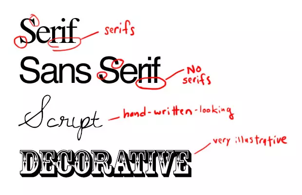
You see that each font has its own mood and personality, which it transfers to your brand. It can be serious, careless, playful, or refined. You need to determine what exactly you want to say using a font and whether it fits your design. Choose a font that is not based on personal preferences, but keep in mind the spirit and features of your business instead.
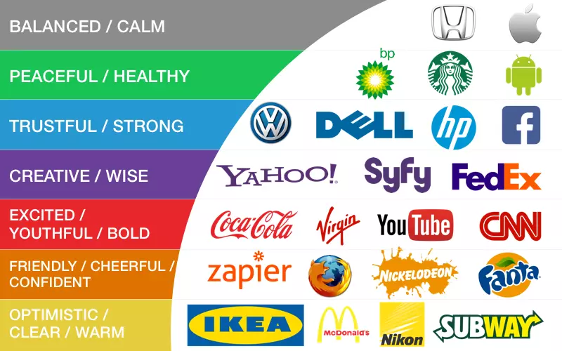
Colors also play an important role. Each color has its own subtext and can add some nuances to your message. So don’t send incorrect messages to your customers.
Here are a few tips to help you choose the right font and color for your logo:
- Check out your competitors. Your goal is not to imitate their logo but to analyze it carefully. If their solution is smart, you can learn from their experience.
- Keep it simple. The clean font will let you reproduce your logo across various products and in all sizes, be it a large banner or a pen.
- Ensure readability. Your logotype should be readable within a few seconds.
Ensure versatility of your logo
- Design logos in vector applications, such as Adobe Illustrator. Photoshop is not the best choice for that purpose because a logo needs to be scalable without losing quality.
- Specify logotype colors with CMYK or Pantone references to make sure the colors will be reproduced correctly once the logo is printed.
- You should be able to reproduce your logo in a single color (black or white) and still recognize it.
Beware of common design mistakes
- Using too many fonts and colors. Top companies tend to use one font and one color only for a good reason—the more fonts used, the messier the logotype looks. The use of two fonts is acceptable if they are different for a company name and a slogan.
- Using trendy fonts. Most trends are short-lived: what is popular today may be outdated and seem ridiculous tomorrow.
- Copying others. Imitating is a lazy way to solve the creative problem. A logo is a reflection of your business: if it looks like someone else’s, your business fails to be unique and loses credibility in customers’ eyes.
Conclusion
When creating a logotype, aim for long-lasting relationships. Once you understand your brand’s identity, positioning, and basic messages, it will be easier to choose the type of logo that best represents your brand. Following the generally accepted tricks of the trade may cause you to lose your brand identity. On the other hand, logo designs that employ “off-the-shelf” typographic tricks run the risk of rejection.
Another thing to keep in mind is that your logo should fit in beautifully on all of your online channels. You should be especially careful when choosing the right font for your website and do everything you can to make sure it properly communicates your entire brand identity and correlates with your logo typography.
Finally, remember that no business has become successful because of its logo. The logo’s purpose is to increase the company’s visibility. The quality of services you offer should do the rest.
Looking for a simple tool for non-designers to make their logo? Check online logo maker Logaster – it may be helpful.
Check the collection of logos with visual metaphors, and read how to remove background from logo. Have an interesting article to share with our readers? Let’s get it published.
About the author
Nataliia Kharchenko is a content manager, writer, and researcher at Cleveroad.


