
Stop pretending you understand the difference between a chart and a graph. Nobody actually cares about the terminology—what matters is understanding the different types of graphs and when to use them so your data doesn’t look like a complete disaster.
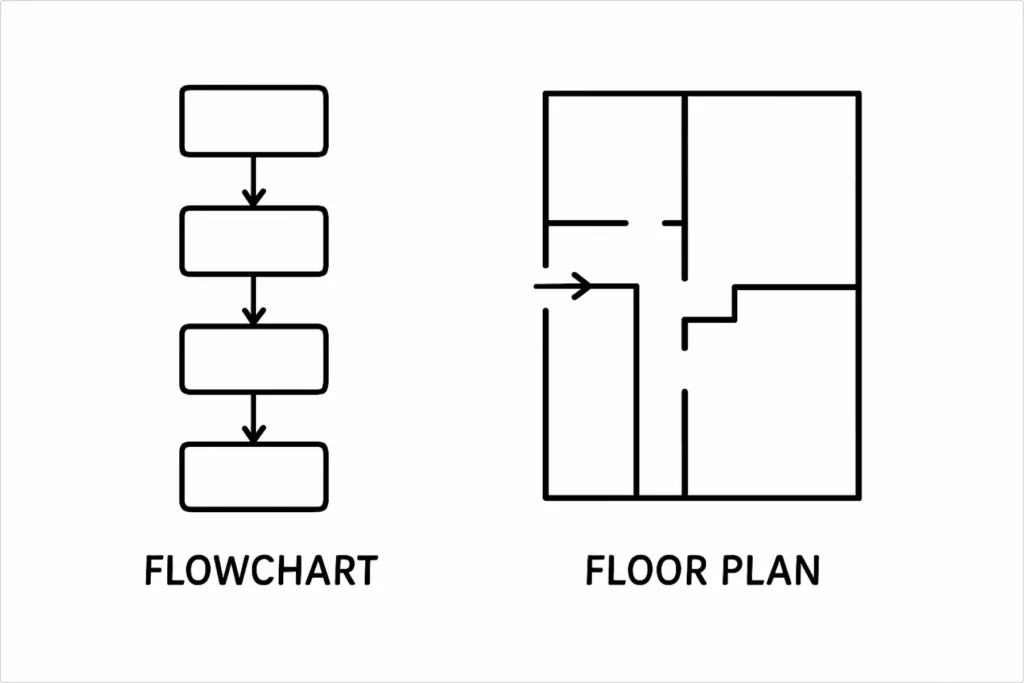
What is a diagram?
It’s basically any visual representation of information. It could be a flowchart, a floor plan, or that thing you drew on a napkin to explain why your project is behind schedule.
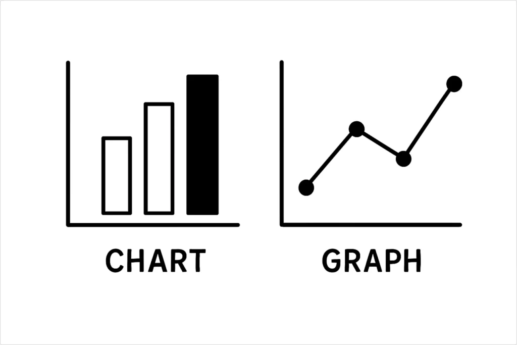
Charts vs graphs vs data visualizations
Here’s the truth nobody wants to tell you—these terms are basically interchangeable in real life. Charts and graphs both show data visually. Data visualization is just the fancy academic term for the same thing. Anyone getting pedantic about the difference probably has too much time on their hands.
What is important?
Does your visual help people understand your data faster than staring at a spreadsheet? If yes, you’re winning. If no, you’re part of the problem.
Types of graphs and charts
There are approximately 47 different chart types you could learn, but honestly? You need maybe 6 of them to handle 95% of real-world situations. Let’s focus on what actually gets used instead of what looks impressive in design portfolios.
Basic building blocks (master these first)
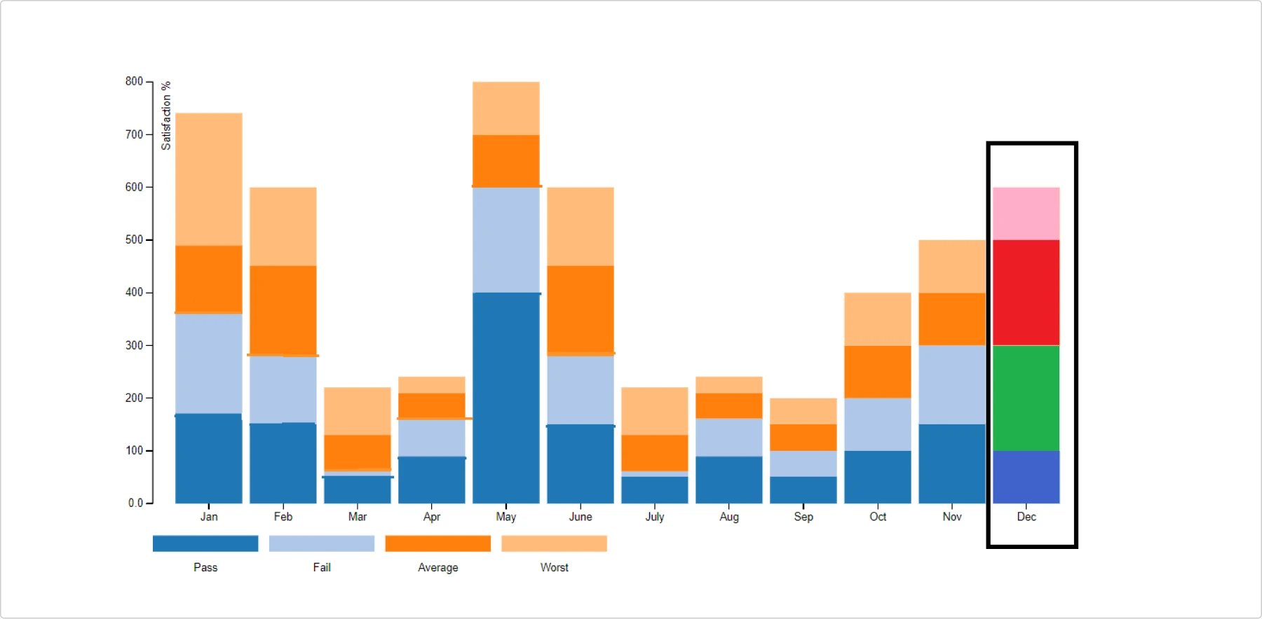
Bar charts: a reliable workhorse
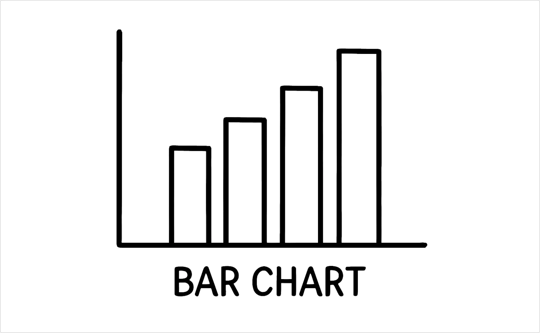
- Best for: Comparing quantities across categories
- When to use: Sales by region, survey responses, pretty much anything you need to compare
- Why it works: Human brains are wired to compare heights and lengths
- Simple graph truth: If you only learn one chart type, make it this one
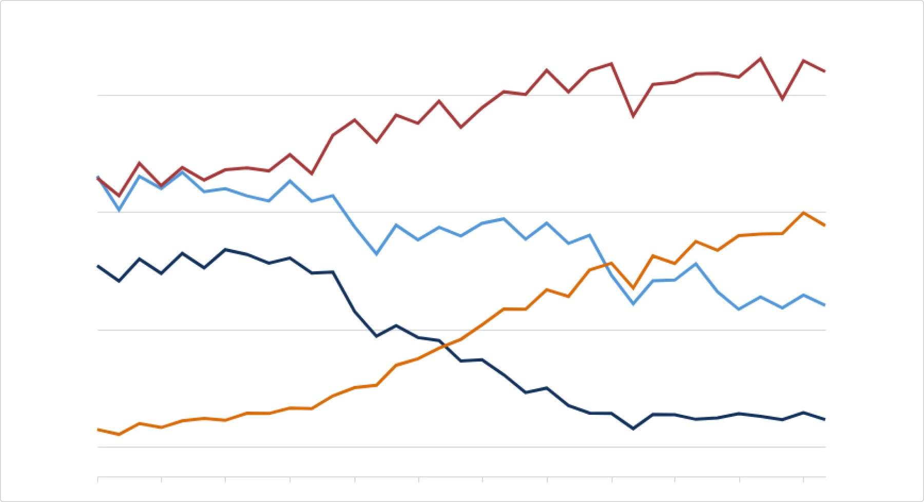
Line graphs: trend detector
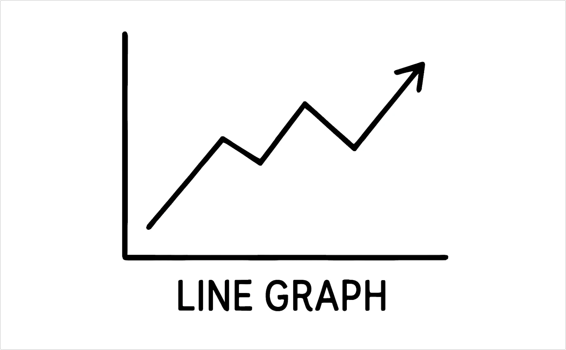
- Best for: Showing changes over time
- When to use: Website traffic, stock prices, your declining motivation levels throughout the week
- Why it works: Natural flow that shows direction and momentum
Pro tip: Don’t connect points that aren’t actually related over time (looking at you, people who make line charts with categorical data)
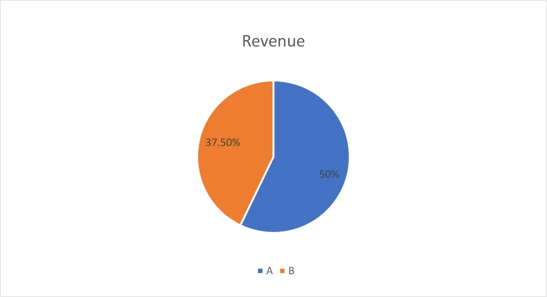
Pie charts: the controversial circle

- Best for: Showing parts of a whole (when you have 5 or fewer categories)
- When to avoid: When you have more than 5 slices, when percentages don’t add to 100%, when you want people to actually read your data accurately
- Reality check: Everyone uses them, statisticians hate them, they work for simple stuff. Deal with it.
Data workhorses (level up your game)
Scatter plots: the relationship revealer
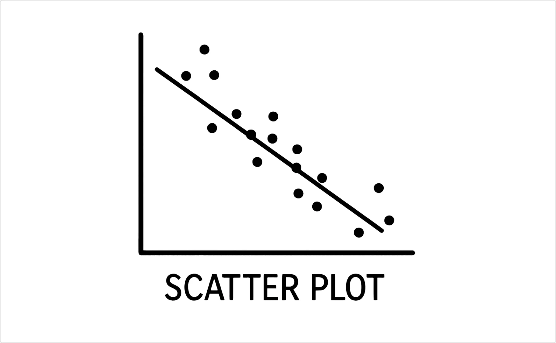
- Best for: Showing the correlation between two variables
- When to use: Height vs weight, advertising spend vs sales, hours studied vs test scores
- Why it matters: The only chart that shows you if two things actually relate to each other
- Bonus points: Add a trend line, and suddenly you look like you know statistics
Histograms: the distribution detective
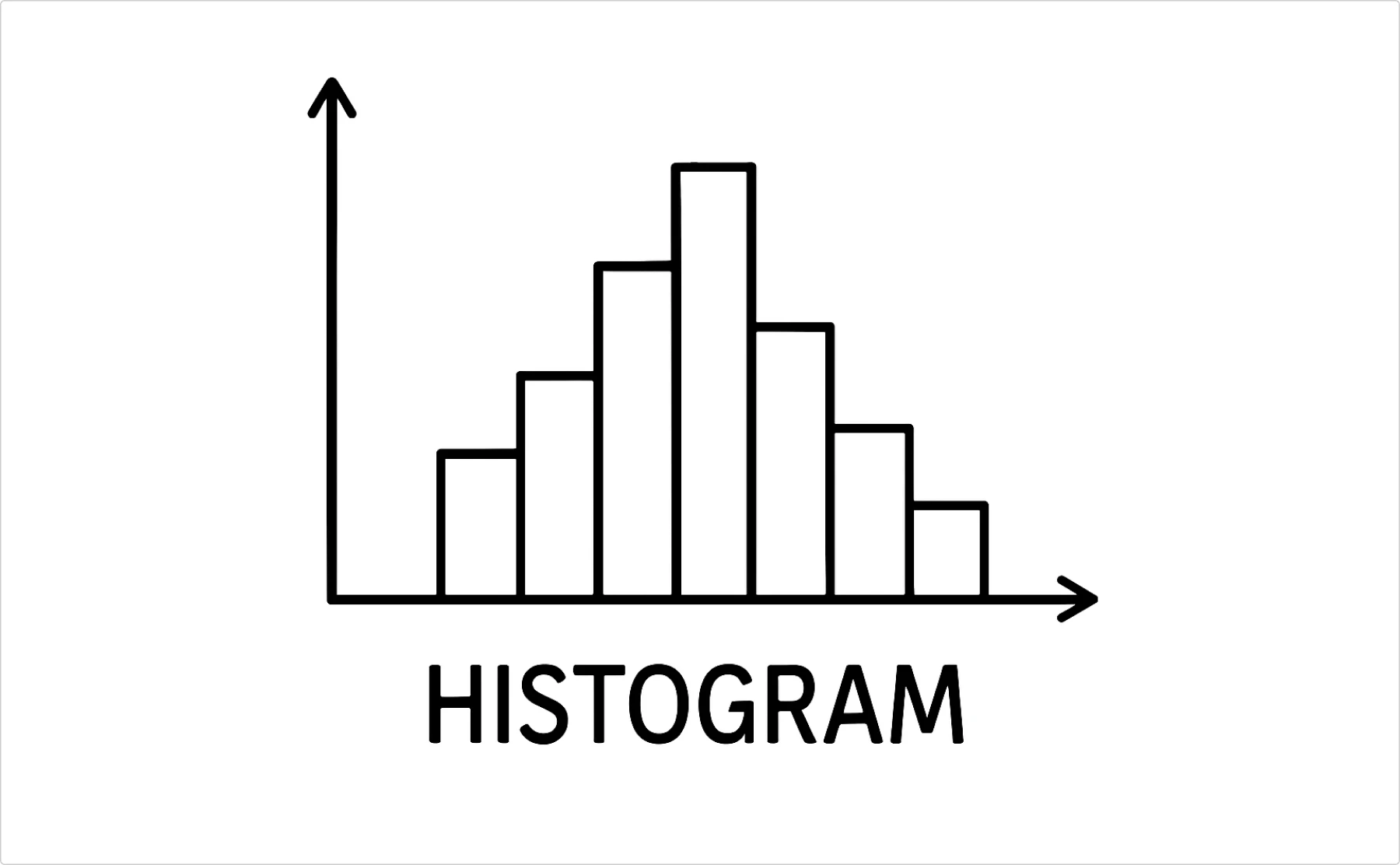
- Best for: Showing how data is spread out
- When to use: Age ranges, income brackets, response times
- Not the same as: Bar charts (even though they look similar)
- Why it’s useful: Shows patterns in your data that averages hide
Area charts: the stacked story
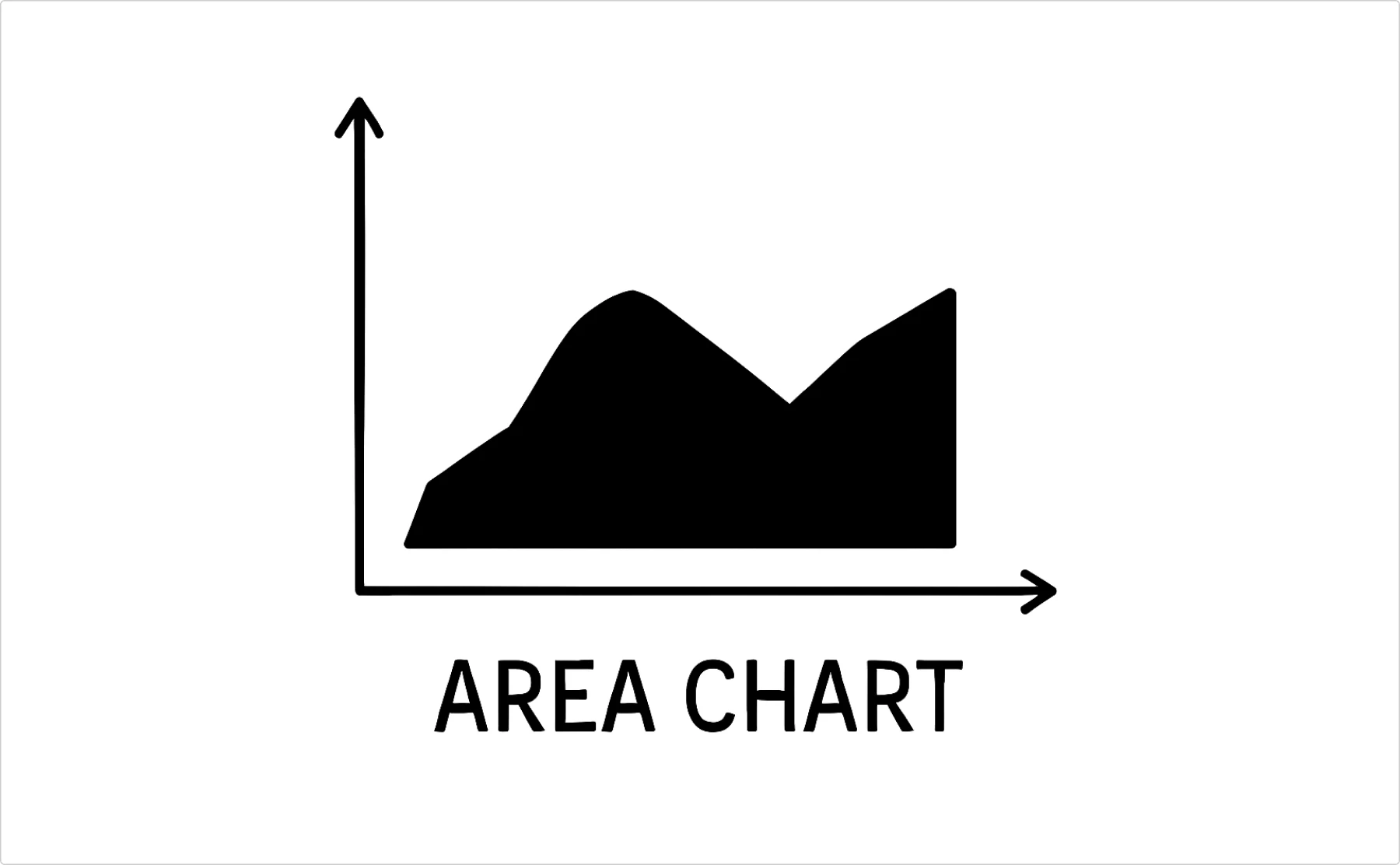
- Best for: Showing cumulative totals over time
- When to use: Budget breakdowns over time, website traffic sources, anything where the total matters as much as the parts
- Warning: Can get messy fast with too many categories
Specialized players (for specific jobs)
Different types of diagrams solve different communication problems. Here’s when to use what:
Process & workflow diagrams
Flowchart: the decision tree
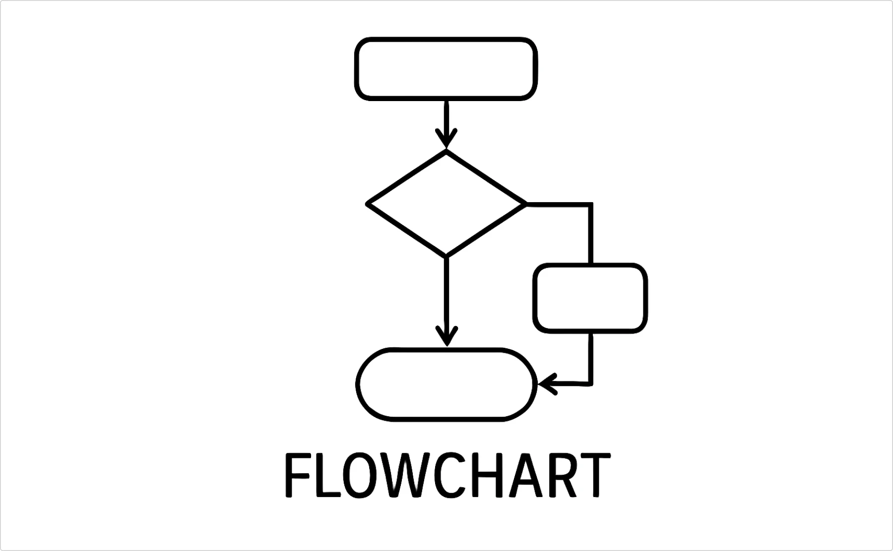
- Best for: Step-by-step processes, decision points, troubleshooting guides
- When to use: Onboarding workflows, approval processes, “if this then that” scenarios
- Reality check: Great for complex processes, overkill for simple instructions
Swimlane diagrams: the responsibility tracker
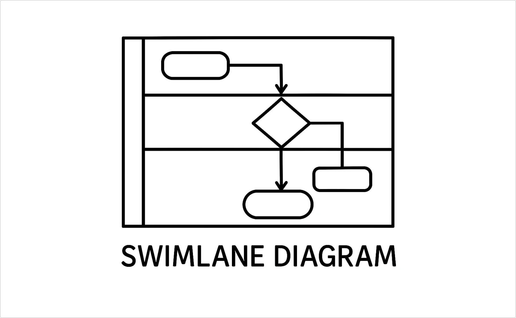
- Best for: Processes involving multiple people/departments
- When to use: Cross-functional workflows, figuring out who does what when
- Why it works: Shows handoffs and prevents the “I thought you were doing that” disasters
Process maps: the efficiency hunter
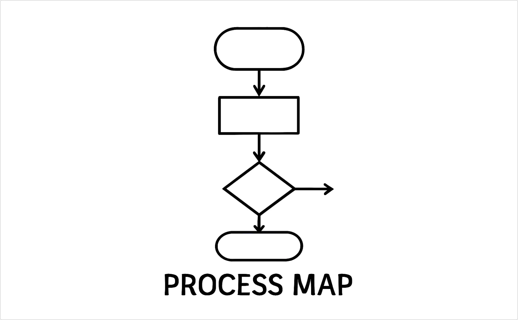
- Best for: Identifying bottlenecks and waste in existing processes
- When to use: Process improvement projects, documenting current state vs future state
- Pro tip: Start simple, or you’ll spend more time diagramming than actually fixing things
Relationship & structure diagrams
Organizational charts: the hierarchy reality check
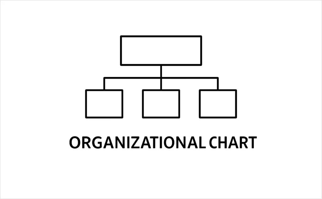
- Best for: Company structure, reporting relationships, project teams
- When to avoid: When your org changes every quarter (just accept the chaos)
- Different types: Traditional hierarchies, matrix structures, flat org experiments
Mind maps: the brain dump tool
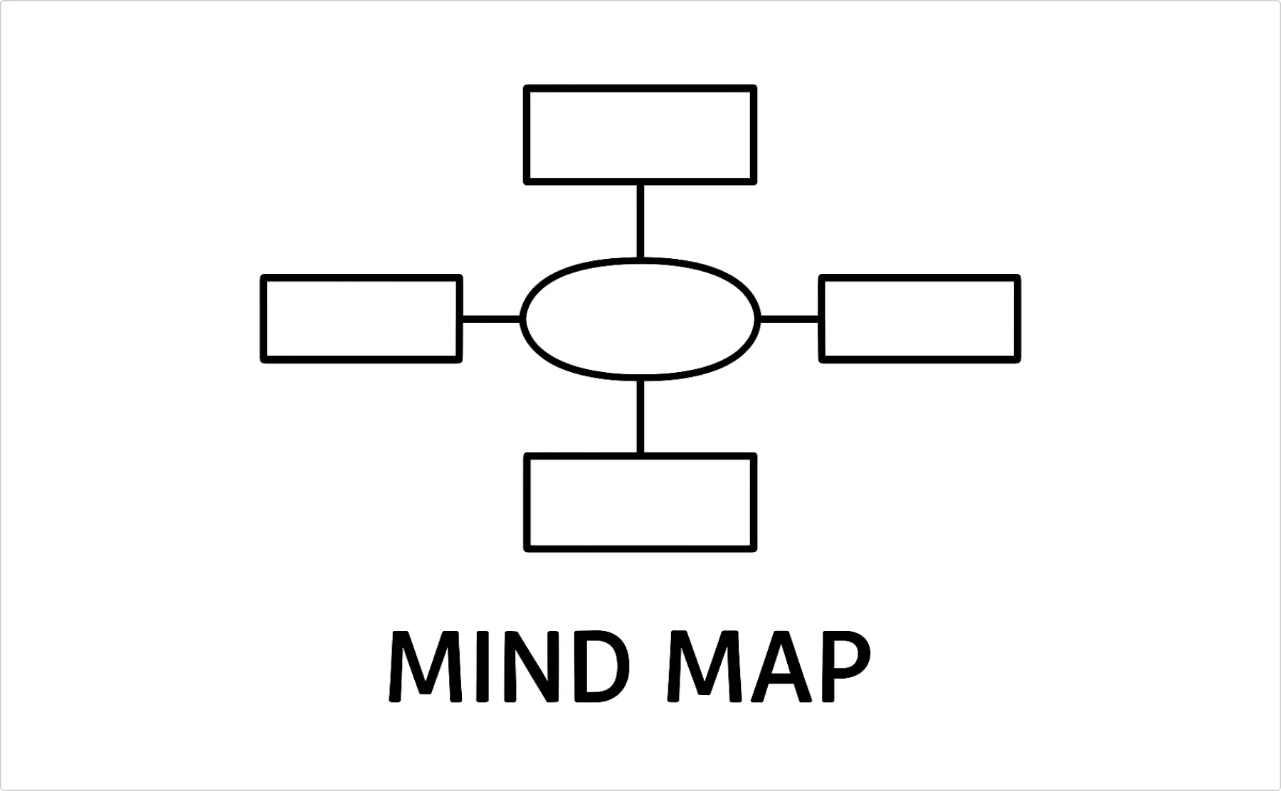
- Best for: Brainstorming, project planning, organizing scattered thoughts
- When to use: Creative processes, note-taking, when linear thinking isn’t working
- Warning: Looks impressive in meetings, can be useless for actual execution
Network diagrams: the connection visualizer
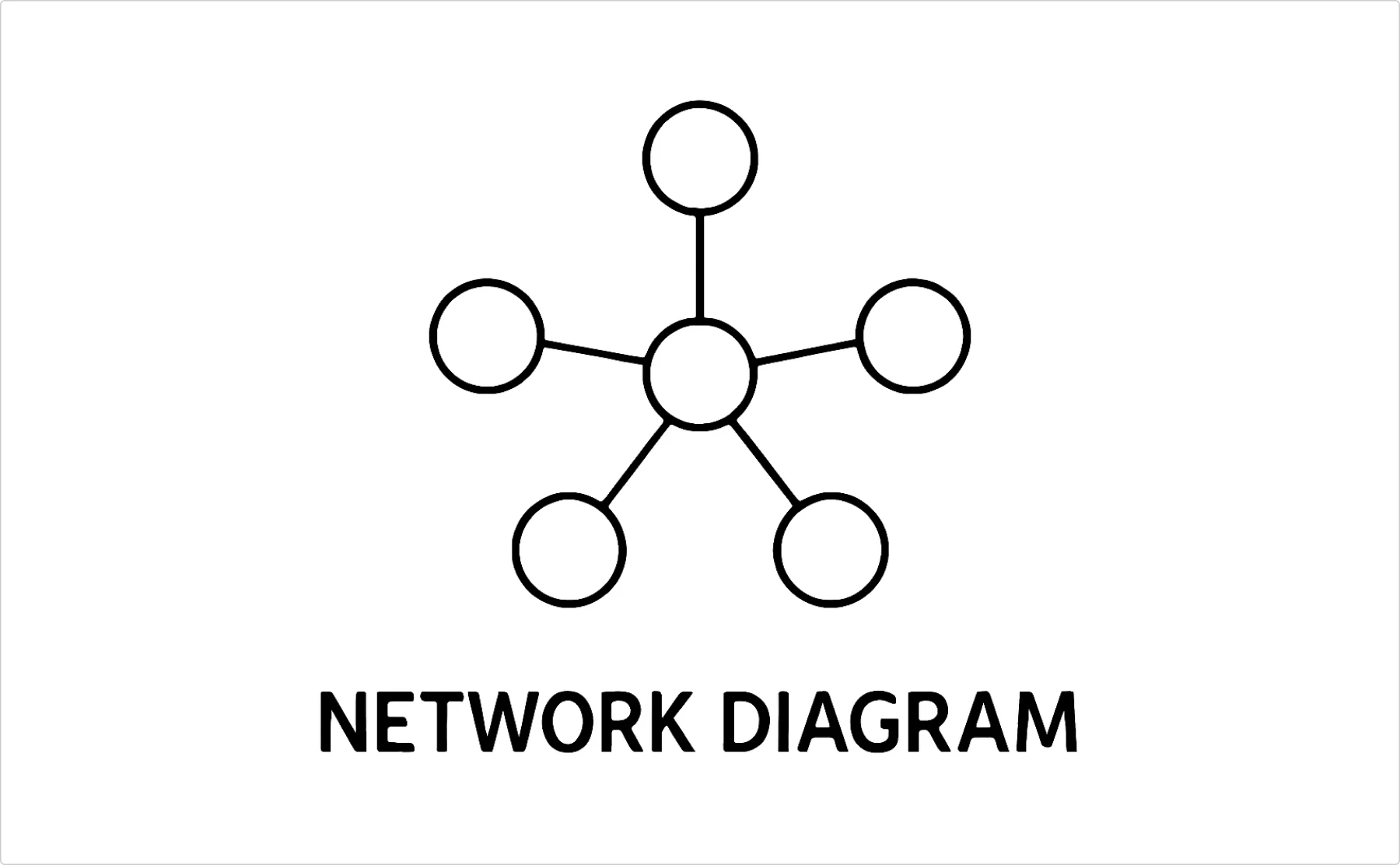
- Best for: Showing relationships between entities
- When to use: Social networks, system architectures, influence mapping
- Reality: Most people think they need this, but very few actually do
Educational & analysis diagrams
Venn diagrams: the overlap identifier
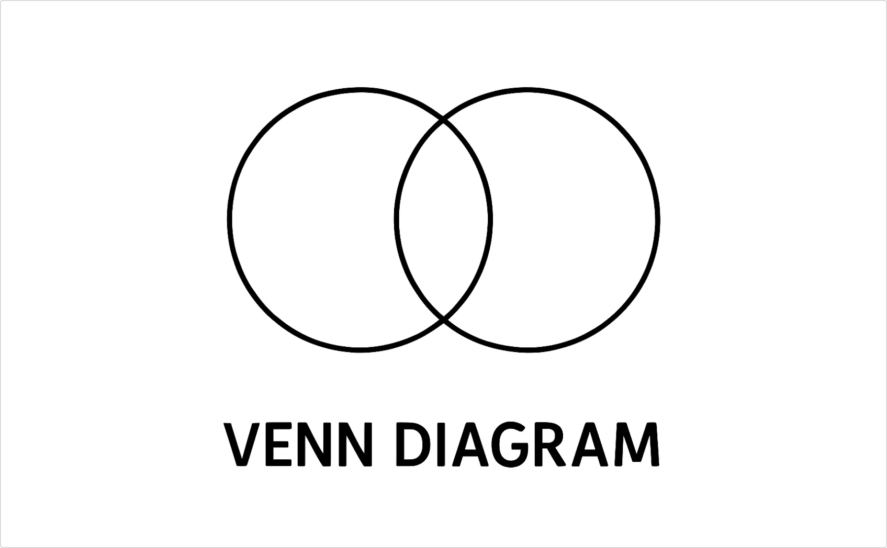
- Best for: Showing similarities and differences between 2-3 things
- When to use: Comparing features, finding common ground, explaining overlapping concepts
- Limit: Works with 2-3 circles max, after that it’s just confusing blobs
Tree diagrams: the breakdown structure
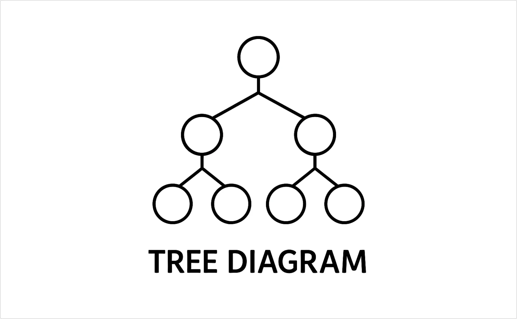
- Best for: Hierarchical information, decision trees, category breakdowns
- When to use: Family trees, file structures, tournament brackets
- Why it works: Natural way humans process hierarchical information
Concept maps: the knowledge web
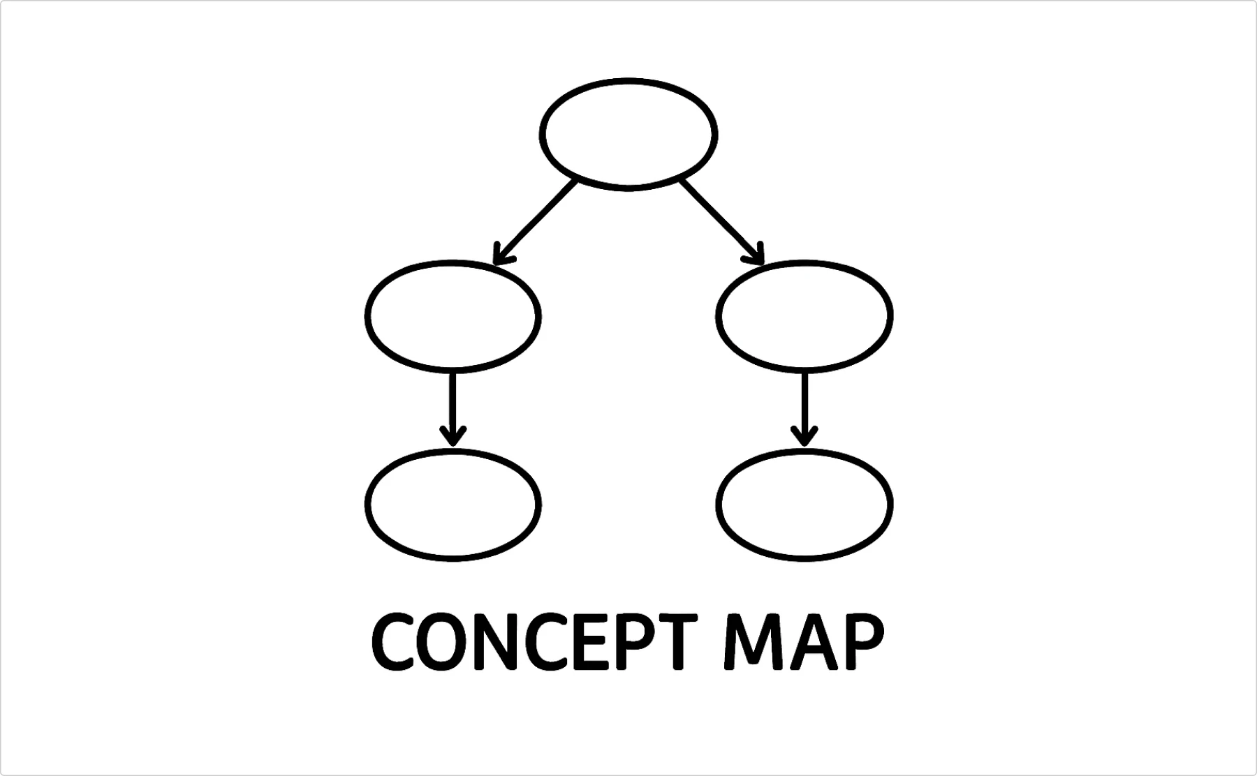
- Best for: Showing how ideas connect to each other
- When to use: Educational content, knowledge management, explaining complex systems
- Difference from mind maps: More structured, shows specific relationships between concepts
Technical & business diagrams
Wireframes: the layout blueprint

- Best for: Planning website/app layouts before designing
- When to use: Early design phases, communicating structure without getting distracted by colors
- Keep it simple: Boxes and lines, not detailed design elements
System diagrams: the architecture overview
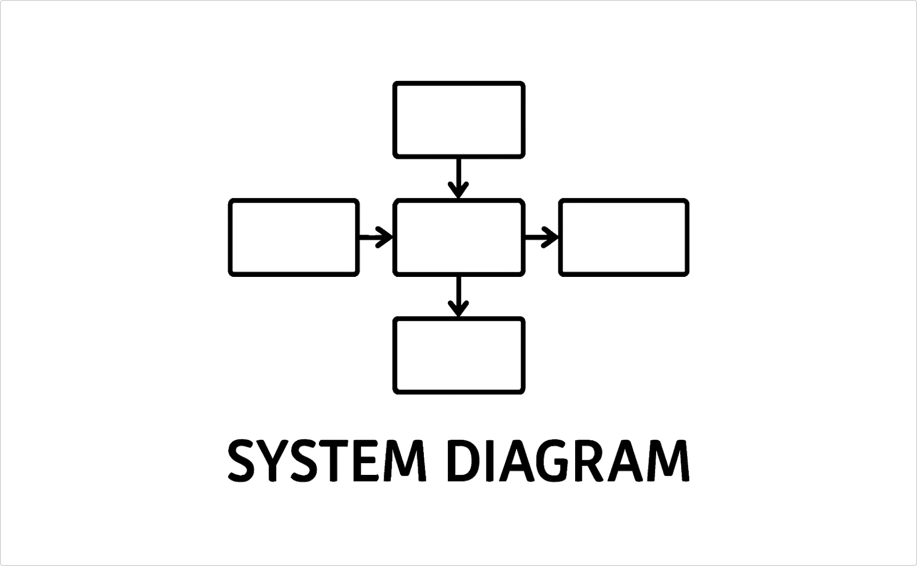
- Best for: Technical system relationships, data flow, infrastructure mapping
- When to use: Technical documentation, planning system changes, troubleshooting
- Audience matters: Technical teams vs business stakeholders need different levels of detail
SWOT diagrams: the strategic framework
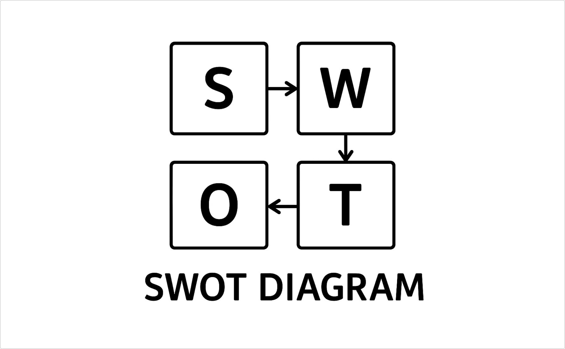
- Best for: Strategic planning, competitive analysis, decision-making frameworks
- When to use: Business planning sessions, project evaluations, personal career planning
- Reality check: Popular in consulting, actual usefulness varies
Value stream maps: the flow optimizer
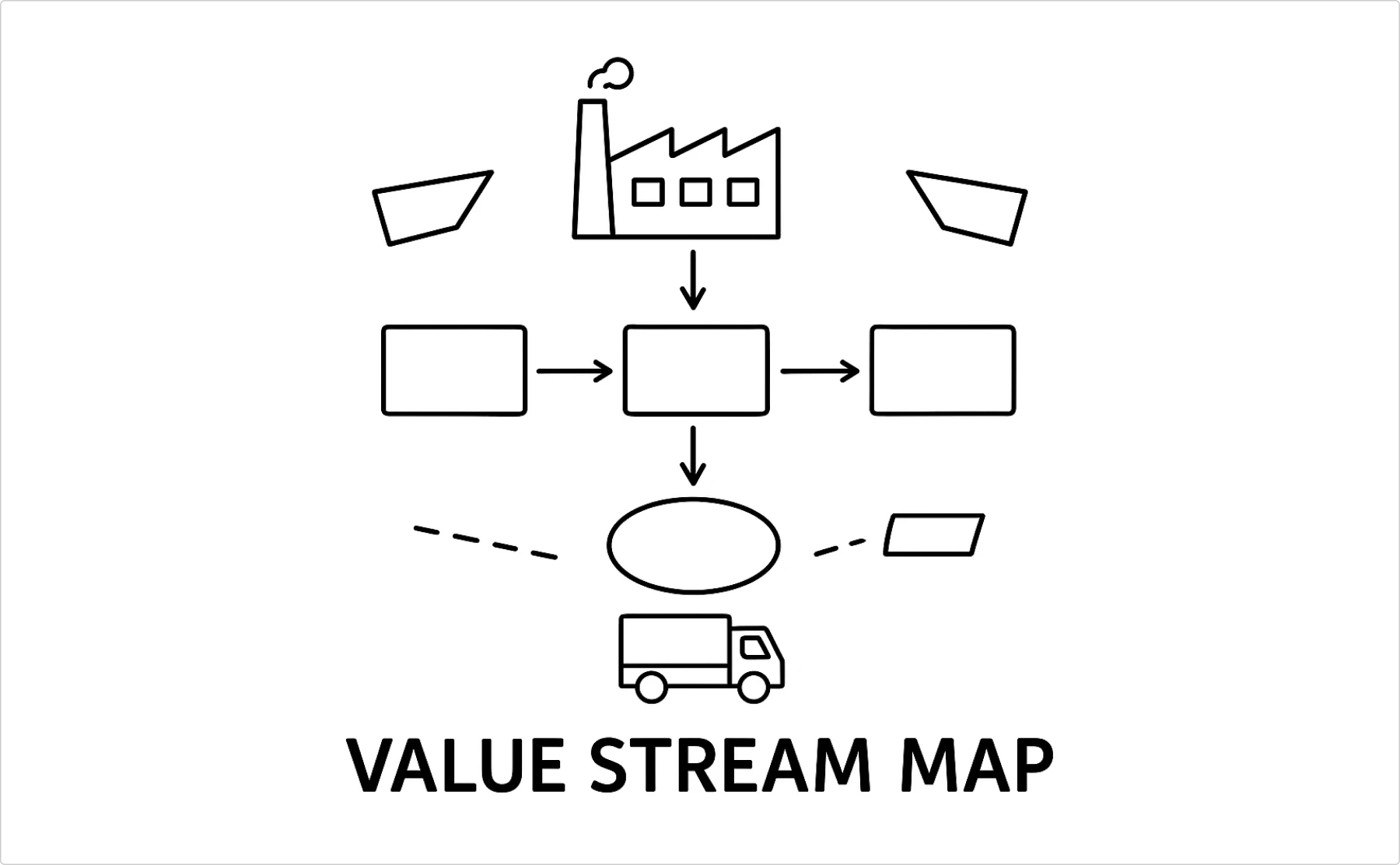
- Best for: Manufacturing processes, service delivery, identifying waste
- When to use: Lean improvement projects, understanding customer value flow
- Warning: Can get complex fast, start with a high-level view
Choosing the right diagram type
- For processes. Start with simple flowcharts, and add swimlanes if multiple people are involved.
- For relationships. Mind maps for brainstorming, org charts for structure, and network diagrams for complex connections.
- For analysis. Venn diagrams for comparisons, tree diagrams for breakdowns, concept maps for knowledge systems.
- For planning. Wireframes for layouts, system diagrams for technical stuff, and SWOT for strategy.
- The overcomplication warning. Most people jump to complex diagram types when a simple list or basic flowchart would work better. Start simple, add complexity only when it actually adds value.
Decision tree: which chart for which data
Stop randomly picking chart types and hoping they work. There’s actually a logical way to figure this out, and it starts with understanding what story your data is trying to tell. Most people skip this step and wonder why their charts look confusing.
Start here: what are you trying to show?
Comparison between categories?
- Few categories (2-7): Bar chart
- Many categories (8+): Horizontal bar chart
- Want to show ranking: Horizontal bar chart, sorted
Change over time?
- Continuous data: Line chart
- Discrete time periods: Bar chart
- Multiple series: Line chart with max 4 lines, or small multiples
Parts of a whole?
- Simple breakdown (2-5 parts): Pie chart
- Complex breakdown (6+ parts): Bar chart showing percentages
- Over time: Stacked area chart
Relationship between variables?
- Two continuous variables: Scatter plot
- Want to show correlation: Scatter plot with trend line
- Multiple variables: Multiple scatter plots, or consider a different approach
Distribution of data?
- Show spread: Histogram
- Compare distributions: Multiple histograms or box plots
- Show outliers: Box plot or scatter plot
Common mistakes that make you look amateur
Using 3D when 2D would work better
3D doesn’t make your chart more professional—it makes it harder to read. Save the 3D effects for your PowerPoint transitions (actually, don’t do that either).
Too many colors
Your chart isn’t a rainbow. Use color intentionally: highlight what matters, keep everything else neutral.
No context or labels
“Revenue increased 47%” means nothing without knowing the time period, comparison point, or actual numbers.
Wrong chart for the data type
Don’t make pie charts for data that doesn’t add up to 100%. Don’t use line charts for categories that aren’t ordered. Don’t make bar charts for continuous data.
Red flags that your chart sucks
- People ask for the underlying data immediately
- You need 3 paragraphs to explain what it shows
- The legend is longer than the actual chart
- You had to use Comic Sans to fit all the labels
- Someone asks “What’s the Y-axis?”
Rule of thumb
If your chart doesn’t make the data clearer than a simple table or bullet points, you’re wasting everyone’s time. For data that needs more context and storytelling than a single chart can provide, well-designed infographics can bridge the gap between raw data and meaningful narrative.
Key takeaways
- Match your graph type to your data type (categorical vs continuous, time series vs comparison)
- Less is usually more – fewer colors, fewer elements, fewer data series
- Context is everything – labels, timeframes, and comparison points matter
- Test with real users – if people can’t read it in 5 seconds, it’s not working
- Tables aren’t the enemy – sometimes the simple solution is the right solution
The goal isn’t to make the fanciest visualization possible. It’s to help people understand your data without wanting to throw their computer out the window. Master the basics, use the right tool for the job, and remember that clarity beats creativity every single time.
Now stop overthinking your chart choices and go make something that actually helps people understand your data ✨
Quick reference FAQ:
What’s the difference between charts and graphs?
In practice? Nothing. Both show data visually. Don’t overthink it.
When should I use a pie chart?
When you have parts of a whole, 5 or fewer categories, and your audience isn’t statisticians.
What are the most common types of charts?
Bar charts, line graphs, pie charts, and scatter plots cover 90% of what most people need.
About the author
Blake Harmon. Graphic designer specializing in visual communication that drives results. Creates strategic design solutions for complex marketing challenges, approaches each brief with both analytical problem-solving and creative vision. Design history enthusiast who maintains an archive of vintage design ephemera and draws inspiration from diverse historical movements.