


Are you Team Keyboard Shortcut or Team Right-Click Menu? In UX design, you actually need to be on both teams at once for a smooth, intuitive experience.
Ask a room full of designers how they work, and you will hear two religions. One side lives on the keyboard, chaining a shortcut every few seconds. The other side right-clicks everything, trusting the context menu to reveal what is possible. The truth is not a cage match.
Great UX gives users both: hotkeys for speed and contextual menus for clarity.
TL;DR
- Hotkeys = speed, context menus = discoverability. Use shortcuts for frequent, safe actions; use a context menu or right-click menu for object-specific options.
- Critical actions get both paths. Put them in the menu and give them a hotkey; show the shortcut in tooltips and the menu row.
- Respect platforms. Use the Control key on Windows and the Command button on keyboard on macOS; avoid OS conflicts.
- Keep menus lean. A focused pop-up menu with relevant items beats a scroll-fest; never hide core features only in a contextual menu.
- Teach, don’t preach. Expose shortcuts in UI, offer a one-screen cheat sheet, and provide subtle feedback when a hotkey fires.
- Test and measure. Run quick tasks, track menu opens and hotkey usage, then prune or promote accordingly.
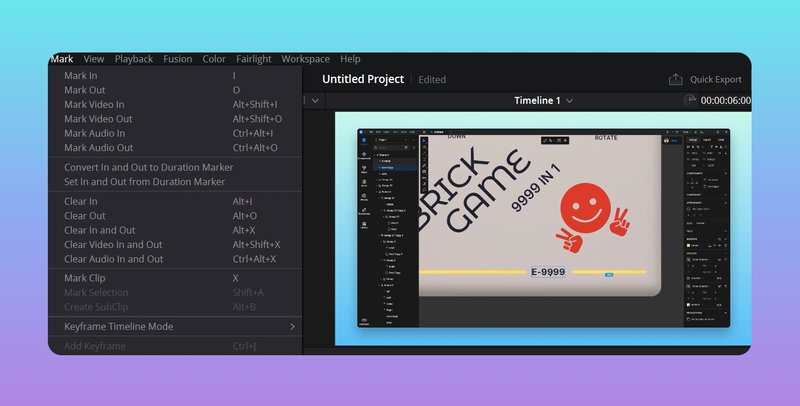
What are hotkeys (keyboard shortcuts)?
A hotkey—also written hot key—is a keyboard shortcut. Press a modifier and a key, and the app acts without a mouse trip. On Windows the Control key is the usual modifier. On macOS it is the Command button on keyboard. Think Ctrl+C or ⌘C. Hotkeys are invisible until you learn them, then they feel like telepathy.
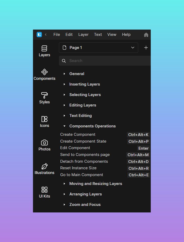
It is the small menu that appears on demand, usually on right click or long-press. You will also hear contextual menu, pop-up or pop up menu. It lists actions that apply to what you clicked, right where you clicked. Designers love it because it keeps the main UI clean and moves decisions to the object. And yes, people sometimes call it a content menu by mistake.
Two ideas to hold in your head.
- Hotkeys trade memorization for speed.
- Context menus trade one click for discoverability.
That is the whole plot.
How the brain actually pays for each
With hotkeys, the cognitive cost is upfront. You must learn and retain a mapping: “⌘R renames,” “Ctrl+Shift+K splits.” You are loading long-term memory, so the action later has near-zero friction.
With a context menu, the cost happens at the moment of use. You summon a small list, scan, and choose. That is short-term “which of these applies right now” thinking. One approach rewards experts; the other welcomes everyone.
Neither is “better.” The right answer is fit-for-task..” Making shortcuts visible in context like this is crucial; as one UX expert quipped, if people don’t know about a shortcut, it won’t be used.
Where each approach shines
In a design tool: select an element and the context menu should read like a quick kit—Group, Align, Duplicate, Bring to Front—anchored to the selection. The same tool should give shortcuts for the moves designers repeat all day: duplicate, nudge, zoom, toggle outline. New users learn by right-clicking. Experts hammer hotkeys and never break flow.

In a data grid, a row’s pop-up menu offers Edit, Duplicate, Archive, and Export. Power users hit Enter to edit, Ctrl or ⌘+D to duplicate, and Delete to archive with undo. Discovery is easy. Throughput is high once learned.
In an email app, the right-click menu on a message surfaces Archive, Mark as Read, Mute, and Move to. Keyboard fans plow through with single-key shortcuts. Same actions, two paths, zero fights.
A good context menu is short, relevant, and predictable. If a command does not apply to what the user clicked, it does not belong there. Put the most likely actions at the top and the dangerous ones at the bottom with clear labels.
Keep wording plain and verb-first: Rename, Duplicate, Export. Show the corresponding shortcut on the right so the menu teaches the keyboard every time. Keep it one screen tall. If you are nesting submenus inside submenus, the menu is doing too much.
Never make the context menu the only door to a feature. If it matters, it has a visible place in the main UI or in a top menu, and a discoverable route on touch. Hidden-only equals unseen.
If discovery is weak, give the user a hint. An ellipsis button near a row, a kebab on a card, a small arrow on hover—all legitimate cues that “more lives here.” And support keyboard invocation as well. On Windows, the Menu key or Shift+F10 should open the contextual menu for keyboard-only users.

Design the shortcut like you respect muscle memory
Not every command deserves a hotkey. Pick the ones that people repeat in bursts or where latency hurts: create, duplicate, approve, align, toggle, commit. Stay consistent with the platform. On Windows, you use the Control key; on Mac, you use Command. Do not hijack system habits. Ctrl+Z means undo everywhere for a reason. If you must break a convention, you probably should not.
Expose shortcuts where users look. Put the combo in the tooltip. Put it in the menu. Include a one-screen cheat sheet or an in-app overlay so people can learn five at a time, not fifty at once. And give a tiny bit of feedback when a shortcut fires—a status line, a subtle toast, anything that proves “yes, that worked.”
If your audience includes pros, allow remapping. Defaults should be sensible out of the box; custom maps let teams match the muscle memory they already have.
Platform-specific issues that save support tickets
On a desktop, users expect a right-click menu on anything that looks selectable. Mac users know two-finger click or Ctrl-click. Name modifiers the way the OS does; show symbols like ⌘ when appropriate.
In web apps, if you override the browser’s pop-up behavior for a custom menu, you owe people a way to do “open in new tab” and “copy link” by another route.
On mobile and tablets, the “context menu” is usually a long-press popover or a small sheet. Pair it with visible buttons for the essentials and a bit of haptic feedback so the action feels intentional.
Testing that fits in one afternoon
You do not need a lab. Write five tasks that are natural in your product—rename items, batch-archive, align objects, duplicate rows, export a selection.
Recruit a few users who prefer the mouse and a few who live on the keyboard. Time the first successful action, then time the third. Note who discovered the context menu, who found the shortcut, and who never did either.
If people miss the menu, add an affordance or move the action to a more visible spot. If they never adopt shortcuts, surface the hint in the tooltip, and keep the set smaller.
While you are at it, log analytics events for menu opens and hotkey usage. Reality beats opinions.
Common traps, and how to dodge them
Cramming the context menu with every command you could think of turns it into a junk drawer. Be selective.
Burying critical features only in a right-click menu punishes both those who touch and those who never right-click. Give a second, visible path.
Shipping a forest of shortcuts that collide with OS defaults or with each other leaves users confused and slightly angry. Start small, expand carefully.
One more you will see in the wild: inconsistent menus. A context menu that appears when you click the icon but not the row, or vice versa, breaks trust. If the action applies to the object, it should be reachable from the object—name, icon, whitespace around it—choose the pattern and stick to it.
Microcopy that pulls its weight
Names matter. Call it a context menu, not a “content menu.” In help docs, write “Press the Command button on keyboard and R to rename” once, then use the symbol thereafter. Pair every menu item with its shortcut: “Rename ⌘R” or “Rename Ctrl+R.” Users learn by osmosis when the UI keeps whispering the answer.
So which wins?
Neither. The shortcut wins when you already know the move and care about speed. The context menu wins when you need to see options in, well, context. The best products let beginners start with visible controls and let experts progress to hotkeys without friction. Same actions. Two doors. Zero lectures.
Practical wrap-up
Design your contextual menu like a focused tool tray: relevant, short, predictable, with labels that ship and destructive actions clearly separated. Design your hotkeys like a set of trusted habits: few, memorable, conflict-free, and always visible in tooltips and menus. Respect platform conventions for the Control key and Command, and offer a tiny reference so users can level up at their own pace. Test both flows. Track real usage. Adjust.
Speed without mystery. Clarity without drag. That balance is the job.
About the author
Emma Chen. UX research lead obsessed with usability testing. Collects vintage UI pattern libraries, drinks too much coffee, and maintains a color-coded notebook system that’s frankly concerning.


