


Everyone’s out here saying “don’t use Garamond” like it’s 2015. Spoiler alert: it’s not.
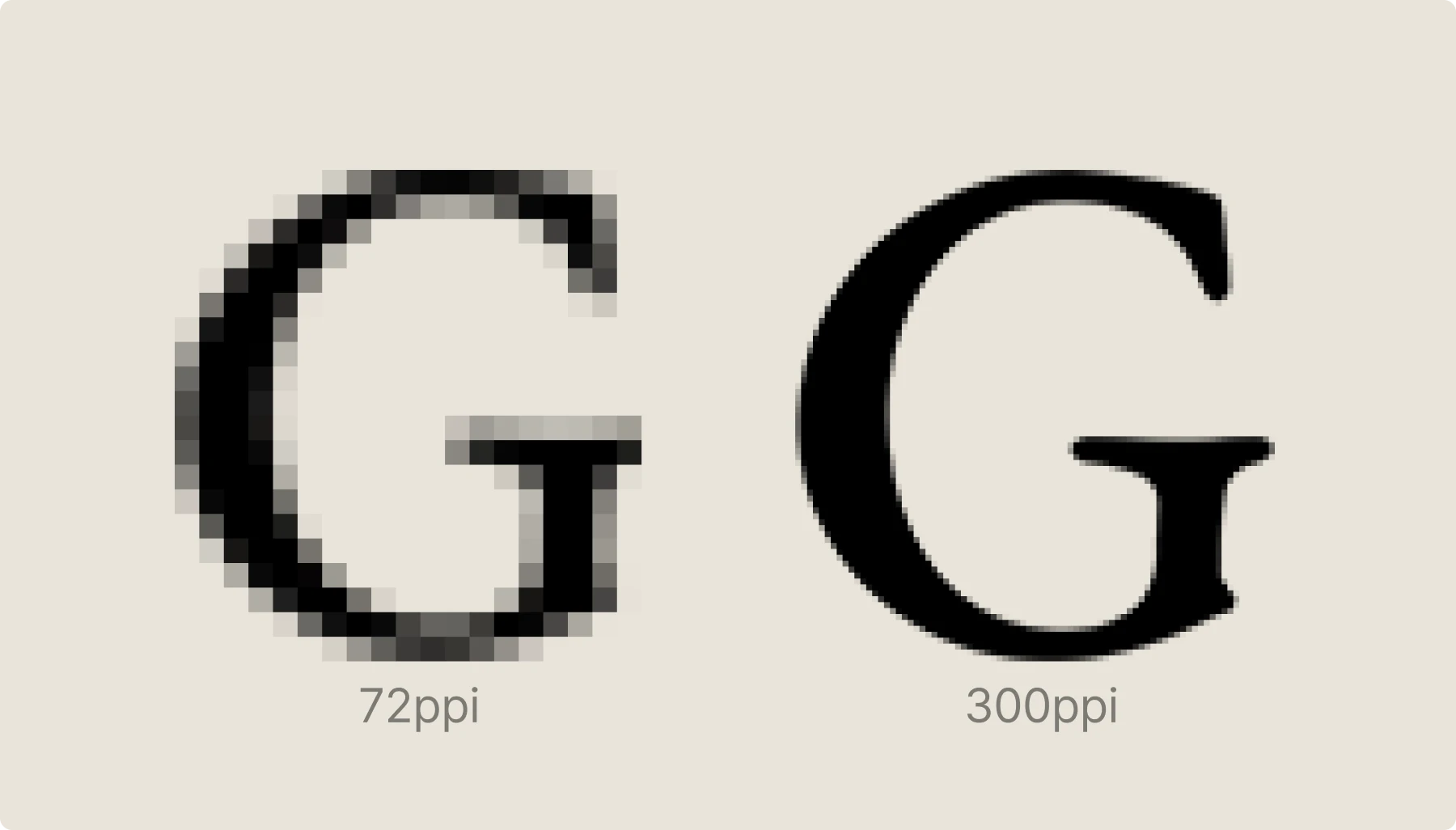
Your design professor probably traumatized you with horror stories about serif fonts on screens looking like pixelated garbage. But here’s the tea: it’s 2025, your laptop has a 300+ PPI display, and clinging to that outdated advice is giving major “still using Internet Explorer” energy.
Bridging the gap between classical elegance and modern performance – because apparently we need to hold the design community’s hand through basic font implementation in the year of our lord 2025. The same designers who’ll spend three hours debating the perfect drop shadow are out here avoiding one of typography’s most versatile workhorses because of some crusty blog post from 2010.
By the end, you’ll know exactly which Garamond variant crushes it for your brand, how to use it, and why half the typography “rules” you learned are straight-up outdated. Time to kill some sacred cows and serve up some reality.
What is special about Garamond?
Claude Garamond legacy
Pre-Garamond printing was basically a hot mess. Blackletter dominated because that’s what everyone knew, but it was wildly inefficient. Too decorative, ate up space and ink like nobody’s business.

Nicolas Jenson said, “there’s gotta be a better way,” and dropped cleaner Roman typefaces that actually worked for real-world printing. Then Francesco Griffo came through in 1495 with Bembo, featuring that game-changing lowercase ‘e’ with the non-slanted middle stroke. Sounds tiny, but it was revolutionary for readability.
Claude Garamond took the best parts and made them better. Jenson’s clean geometry plus Bembo’s smart letterforms equals the Garamond we know today. He wasn’t reinventing the wheel, just making it actually roll properly.
Garamond was the first typeface to crack the code on elegant + readable + practical. Everyone else was fumbling between pretty and functional. Garamond gave both.
Understanding the DNA helps modern usage decisions. This isn’t just typography nerd trivia. Garamond was designed for readability at scale, which is exactly what we need for modern digital experiences. It’s like finding out your favorite indie band was actually mainstream the whole time.
Most “elegant” fonts are about as readable as a Terms of Service agreement. Garamond cracked the code on looking sophisticated without making your users squint like they’re trying to read the fine print on a pharma ad. If you want to explore more fonts with serious historical credentials, check out our retro fonts series.
Characteristics of Garamond font

Garamond was the beginning of a new era in printing and an inspiration for many typeface designers in the future. Here’s why it still hits different:
Garamond is a serif font
Yeah, we know, obvious statement is obvious. But those little strokes aren’t just decoration – they’re functional AF and help with readability in longer text blocks.
Serifs are soft and rounded
None of that aggressive, stabby serif energy that makes text look like it’s about to cut you. These are the friendly serifs your eyes actually want to hang out with.
Serifs on the ascenders have a downward slope
This little detail is why Garamond feels organic instead of mechanical. It’s giving “hand-crafted artisan font” without the pretentious price tag.
Terminals are rounded, shaped like water drops
These little flourishes are why Garamond feels alive instead of corporate. Every other serif font wishes it had this level of personality.
Apexes are pointed
Clean, sharp geometry that scales beautifully from business cards to billboards. No mushy corners that turn into blobs at small sizes.
Moderate contrast between thicker and thinner lines
Not so dramatic that it turns into a hot mess on screens, but enough variation to keep things interesting. It’s the typography equivalent of perfect contouring.
Garamond variants decision matrix
Finally, someone who’ll help you choose instead of just listing options like a Wikipedia page.
Adobe Garamond vs. EB Garamond vs. Garamond Libre

Look, they’re all “Garamond,” but picking the wrong one is like wearing designer jeans that don’t fit. Here’s the actual tea on what makes each one different:
Adobe Garamond = The polished, pays-the-bills version
- Robert Slimbach basically took the original Garamond and gave it a 2025 glow-up
- Comes with your Creative Cloud subscription (if you’re already in the Adobe ecosystem)
- Super clean, optimized for both print and digital
- Multiple weights that actually work together
- File sizes are reasonable, hinting is solid
- Professional, reliable, slightly sterile
EB Garamond = The historically accurate, open-source hero
- Georg Duffner went full nerd and digitized actual 16th-century specimens
- Completely free (SIL Open Font License = use it for whatever)
- Available on Google Fonts
- Variable font support = one file, all the weights
- Most “authentic” to what Claude Garamond actually designed
- Academic, authentic, slightly quirky
Garamond Libre = The modernized, no-fuss option
- Free and open source
- Lining figures instead of old-style numerals (way better for UI work)
- More straightforward, less historical baggage
- Good middle ground between classical and contemporary
- Vibe check: Approachable, practical, unpretentious

Decision framework
Choose Adobe Garamond if:
- You’re already paying for Creative Cloud anyway
- Client work where licensing needs to be bulletproof
- You want the most “professional” option that won’t get questioned
- Performance is critical, and you need optimized files
Choose EB Garamond if:
- You want the most historically accurate version
- Open-source license works for your project
- You’re using Google Fonts for everything else
- You have time to dial in the implementation properly
Choose Garamond Libre if:
- You need modern numerals for data/UI work
- Working with tight budgets (hello, startup life)
- Want something contemporary without losing the Garamond character
- You’re tired of fonts that feel too academic
Honestly, for 90% of projects, EB Garamond just works. It’s free, it’s good, it’s available everywhere, and the variable font support means you can dial in exactly the weight you need. Adobe Garamond is only worth it if you’re already deep in the Adobe ecosystem. Garamond Libre is the move if you want Garamond energy without the historical weight.
Most people can’t tell the difference between these three in actual usage. Pick based on licensing, availability, and your specific technical needs, not because one is “better” than the others.
Paid and free font pairings that won’t get you roasted
Here’s the real deal on font pairings that actually work in practice, not just in design theory:
Futura PT + Adobe Garamond. The contrast of strict geometry and classical elegance. Modern, yet with a historical undertone. Perfect for brands that want to feel both innovative and established.

Helvetica Neue + Adobe Garamond. Universal minimalism paired with refined tradition. Reliable and sophisticated. The safe choice that still has personality.

Geist + Garamond Libre. Clean and neutral, enriched by the rhythm of a classic Garamond. Contemporary but not cold. Great for tech companies that don’t want to feel soulless.

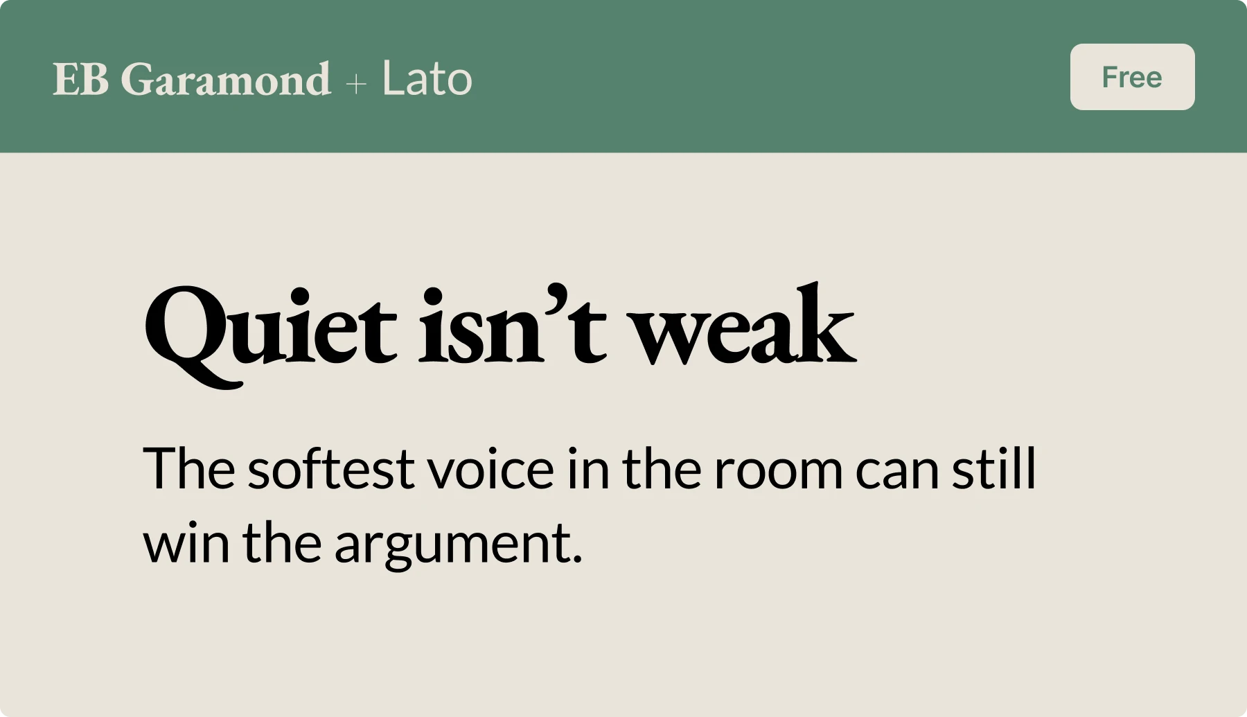
EB Garamond + Lato. Soft and human. A classical form in harmony with a friendly modern touch. When you want approachable elegance.
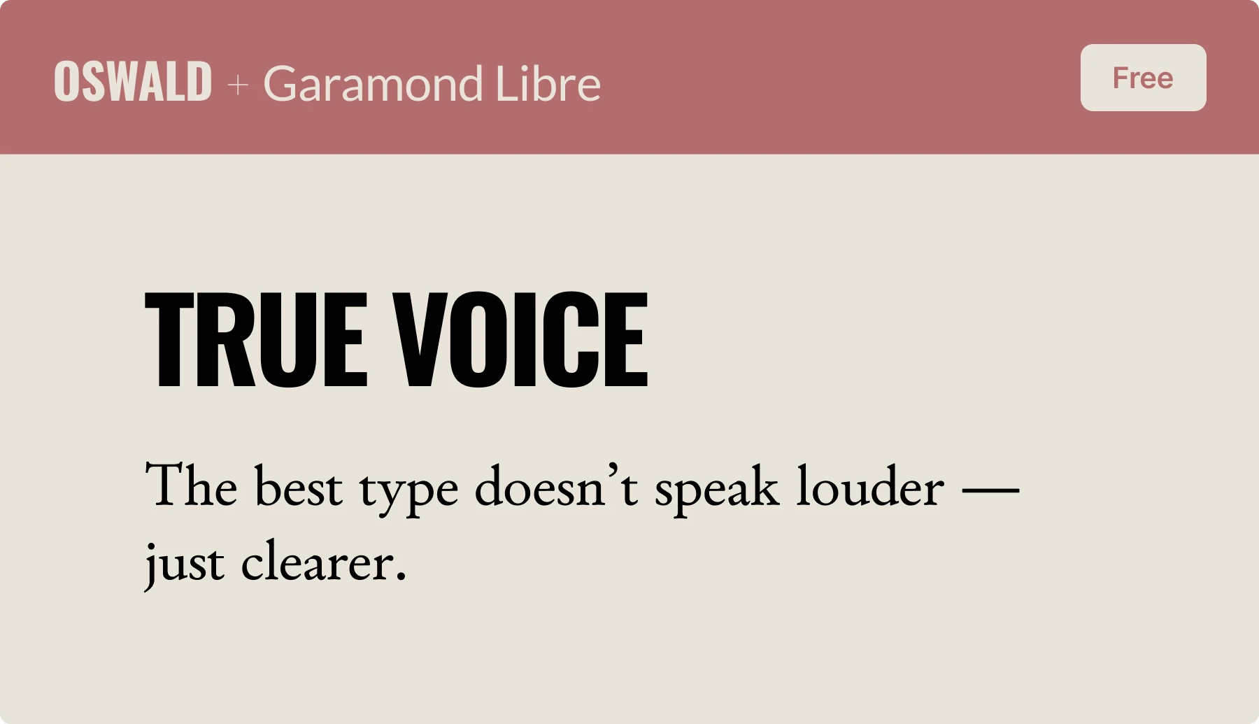
Oswald + Garamond Libre. Bold, confident headlines balanced by refined body text. Authoritative but not aggressive. Editorial energy that commands attention.
Bodoni Bd BT + EB Garamond. Luxurious contrast between two classics. Elegance with a theatrical edge. For brands that aren’t afraid to be dramatic.

When NOT to do this. Don’t pair Garamond with Times New Roman unless you want your design to look like a Microsoft Word document from 2003. Some combinations are just chaos.
Reality check: Your font pairing should support your message, not become the message. If people are talking more about your typography than your content, you probably overcomplicated it.
Want to master the art of font pairing beyond just Garamond? Our complete font matching guide covers everything from mood boards to brand alignment.
How to pair visuals without looking basic
Illustrations that work with Garamond
Garamond is quite a statement by itself, so your visuals need to either match it or create intentional contrast. No middle ground.
What works:
- Full-color, detailed illustrations (botanical drawings, architectural sketches)
- Minimalist, monochromatic line art (creates fire contrast)
- Black and white photography (tonal range = chef’s kiss)

What doesn’t? Mid-complexity illustrations that compete for attention, cartoon graphics, anything that screams “kids menu”
Icons that don’t fight with your typography
Garamond already has visual weight, so your icons need to chill.
Monochromatic outline icons. Simple, clean, functional. Think less Apple’s overdesigned system icons, more “I can instantly understand what this does.”
Visual weight matters more than exact sizing. There’s no magic ratio—you need to eyeball how the icon’s visual mass relates to your text. A thin outline icon can be larger than a bold filled icon and still feel balanced. Test at actual usage, not zoomed in on your massive monitor.
Speaking of visual relationships, proper kerning is crucial for making Garamond look professional—here’s our ultimate kerning guide.
Support Garamond’s sophisticated energy, don’t compete with it. When in doubt, simplify. Better clean and boring than cluttered and confusing.
Who uses Garamond?
Real examples, not hypothetical nonsense
Brands getting it right
Rolex. Still uses Garamond-inspired typography because when you’re selling $10k watches, your font needs to carry that energy. Their logo typography has those classic Garamond proportions that scream, “We’ve been prestigious since before your grandparents were born.”
Neutrogena. Proves that Garamond isn’t just for luxury brands. They use it to communicate trust and reliability in healthcare/beauty sectors where credibility matters more than looking trendy.
Abercrombie & Fitch. Their 2019 rebrand doubled down on Garamond, and honestly? It works. While everyone else was jumping on the sans-serif bandwagon, A&F said, “We’re keeping the sophistication, thanks.”
Publishing industry: Why it still dominates book design
Book publishers aren’t idiots – they’ve had centuries to figure out what works for long-form reading. Garamond’s moderate contrast and organic rhythm make it perfect for sustained reading without eye fatigue. Your Kindle probably has a Garamond option because it’s literally designed for this.
Garamond in web design
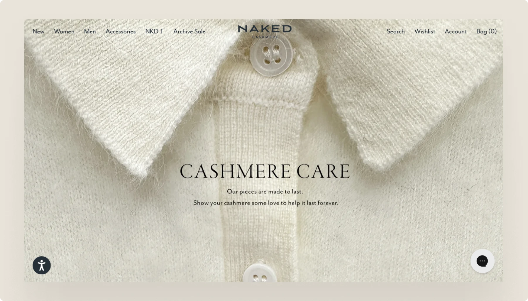
Naked Cashmere uses EB Garamond for product descriptions, proving that luxury e-commerce can absolutely handle serif fonts when implemented properly.
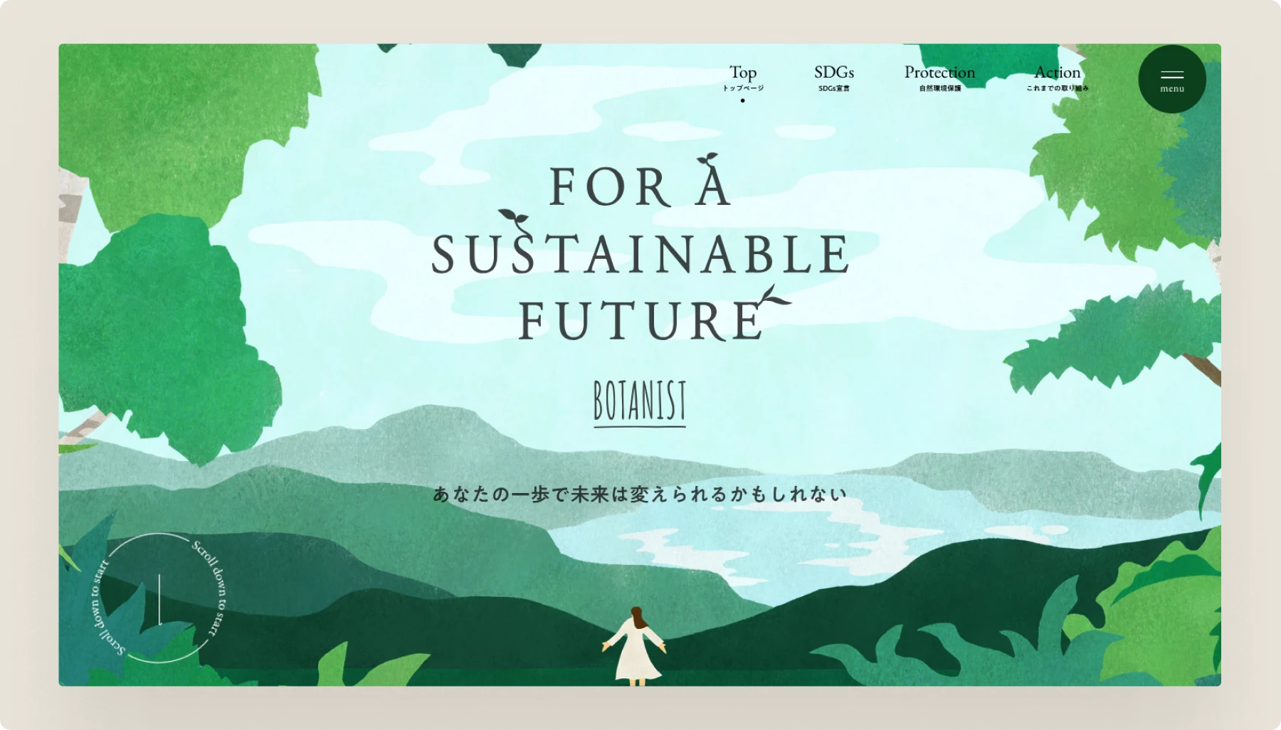
Botanist. Their sustainability-focused site uses Garamond to communicate authenticity and environmental consciousness. Very “we care about the planet AND good typography” vibes.
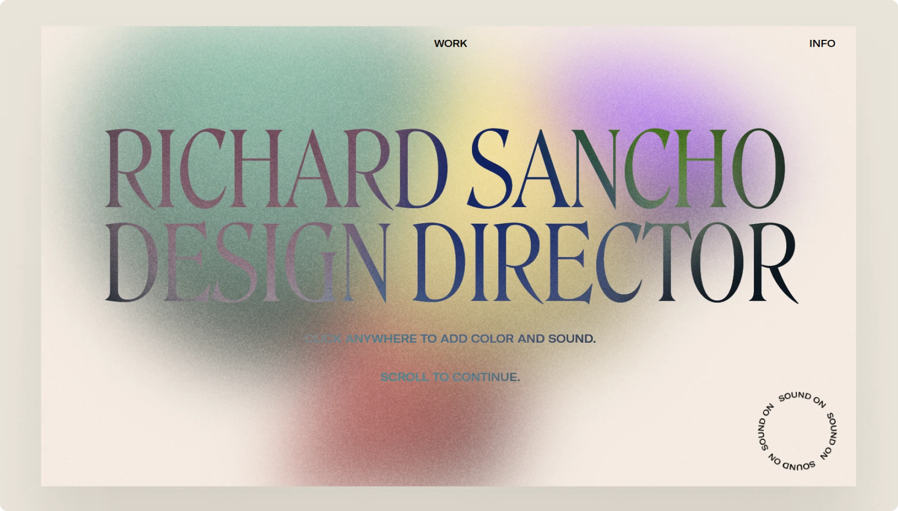
Richard Sancho’s portfolio. Personal branding done right – Garamond for storytelling, clean sans-serif for navigation. Shows you can be a modern designer while respecting typography history.

Rabaud-Promis vinery. French winery using Garamond because, of course, they are. But it works perfectly for communicating heritage and craftsmanship
Movie posters
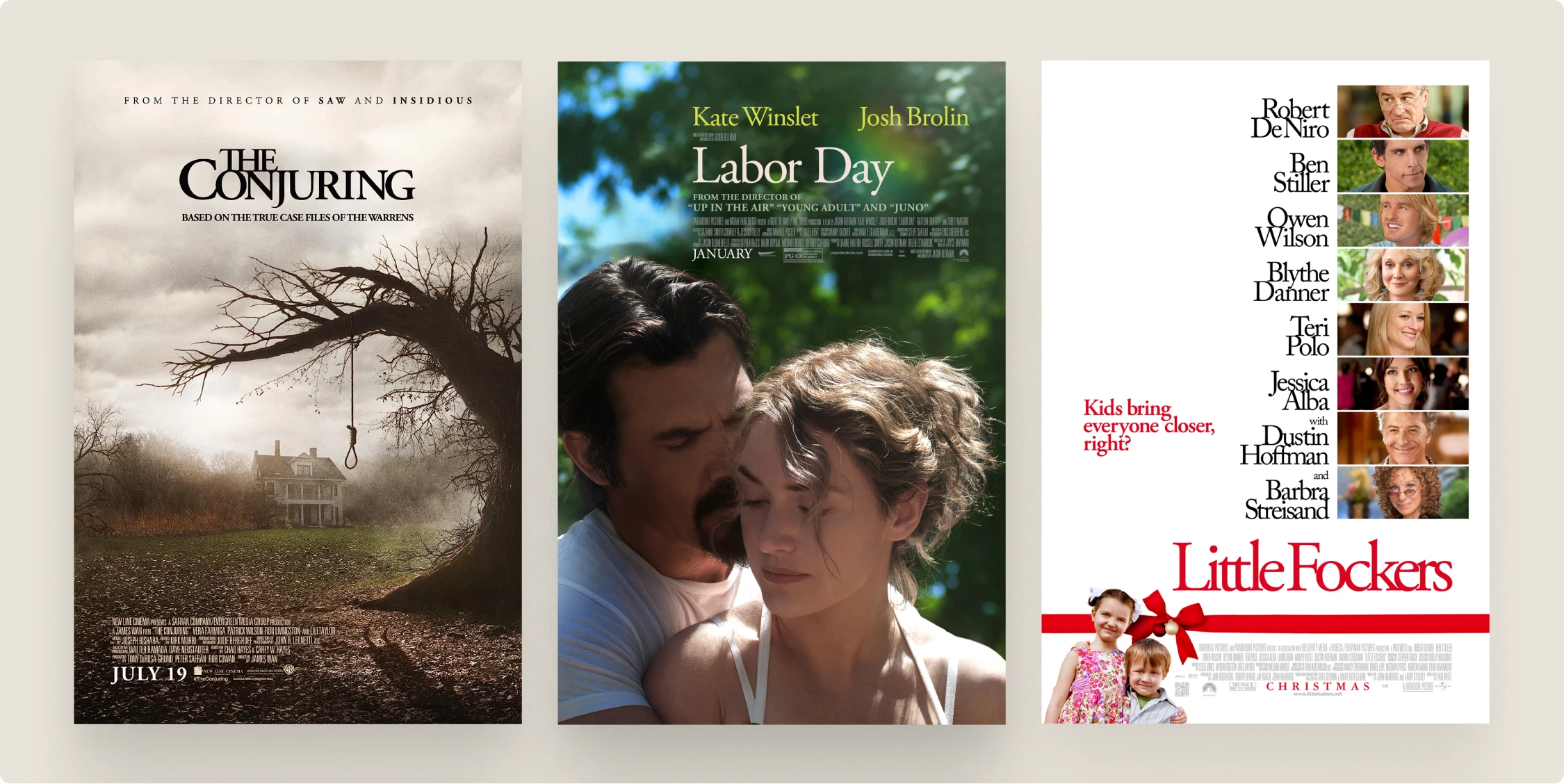
The Conjuring. Horror movies use Garamond because it carries historical weight and subtle menace. Nothing says “cursed antique” quite like classical typography.
Labor Day. Drama/romance films choose Garamond for emotional depth and literary associations. It’s shorthand for “this is serious storytelling.”
Little Fockers. Even comedies use Garamond when they want to feel more sophisticated than pure slapstick.
Psychology behind the choice
Why Garamond works for premium positioning:
Historical authority without stuffiness – It’s got 500 years of credibility built in, but doesn’t feel like it’s trying too hard. Unlike some fonts that scream, “LOOK HOW FANCY I AM,” Garamond just quietly exudes competence.
Readability that respects the reader – Using Garamond says, “we care enough about your experience to choose typography that’s actually pleasant to read.” It’s the opposite of aggressive, in-your-face fonts that prioritize brand ego over user comfort.
Distinctiveness in a sea of generic fonts – When everyone else is using the same three sans-serif fonts, Garamond makes you memorable without being weird. It’s confident, not contrarian.
The real psychology? Garamond users are signaling that they know enough about typography to make an informed choice, but they’re not so insecure that they need to follow every trend. It’s giving “quiet confidence” energy in a world full of loud, attention-seeking fonts.
Conclusion: just use good typography
- Garamond isn’t dead; it just needed better implementation. The technology finally caught up to the vision. High-DPI displays, variable fonts, and proper web optimization solved all the problems that made designers avoid it.
- Performance and accessibility aren’t optional anymore. But they’re not deal-breakers either if you do the work. Garamond can absolutely meet modern web standards when implemented properly.
- Choose based on your actual needs, not design trends. If Garamond fits your brand story and serves your users, use it. Don’t let outdated advice keep you from making the right choice for your project.
- Test everything, assume nothing. Your users care about readability and experience, not whether you followed some arbitrary “rule” from 2015. Run actual tests with real people instead of arguing about theory.
Stop making typography decisions based on decade-old blog posts. The tools, technology, and best practices have all evolved. Your font choices should evolve, too.
FAQ section
Q: Is Garamond good for web design in 2025?
A: Absolutely, when implemented properly. Modern screens, variable fonts, and CSS improvements have solved the technical issues that made designers avoid Garamond in the past. High-DPI displays (300+ PPI) render serif fonts beautifully, and proper implementation techniques ensure good performance. The key is using optimized versions like EB Garamond or Adobe Garamond, setting appropriate font sizes (18px+ for body text), and following modern web font loading best practices.
Q: What’s the best free alternative to Adobe Garamond?
A: EB Garamond is your best bet – it’s specifically optimized for digital displays and available through Google Fonts. Created by Georg Duffner and Octavio Pardo, it’s based on historical specimens and includes extensive character sets. It’s open-source (SIL license), performs well on modern screens, and loads faster than many premium alternatives. For most projects, you won’t miss Adobe Garamond’s premium features.
Q: Is Harry Potter written in Garamond?
A: The US editions use Adobe Garamond for body text, while UK editions traditionally used a different serif (Sabon). The chapter headings and titles use custom lettering inspired by medieval manuscripts, but the readable text that carries the story is indeed Garamond, proving that even fantasy epics benefit from classical, readable typography for long-form content.
About the author
Blake Harmon. Graphic designer specializing in visual communication that drives results. Creates strategic design solutions for complex marketing challenges, approaches each brief with both analytical problem-solving and creative vision. Design history enthusiast who maintains an archive of vintage design ephemera and draws inspiration from diverse historical movements.


