


From bold typography to organic abstracts, explore creative poster layouts with pro tips to adapt them for your own design projects.
Need poster ideas that don’t look like a classroom notice board? Here’s the good stuff: 27 annotated poster examples, poster layout ideas you can steal, and the print/digital specs that save you from late-night reprints. These are practical, modern poster design patterns you can adapt for digital posters and print without crying at the printer.
In this guide
- Fast sanity check (Purpose → Audience → Channel → CTA)
- Layouts that never fail
- Sizes, DPI, bleed, file formats (print + digital poster examples)
- 22 poster design ideas with “steal-this-layout” wireframes
- Accessibility & legibility checklist
- FAQs for students, events, community, and promos
Start here: the 4-step sanity check
- Purpose — RSVPs, sales, awareness, sign-ups?
- Audience — who’s reading and from how far?
- Channel — print, street, campus, IG Story, signage. Specs change.
- CTA — scan, book, buy, show up. Make it obvious.
Easy poster making workflow: pick a proven poster layout idea → write a big-idea headline → set a clear type scale → choose a high-contrast palette → place CTA/QR → export for print and digital.
Poster layout ideas that always work
- F-pattern / Z-pattern: Eye lands on headline, travels to CTA.
- Rule of thirds & modular grids: Choose the focal third; make everything else support it.
- Asymmetry with balance: One loud element + tidy info rail. Feels modern, not messy.
- Type-first layouts: Weak photo? Go typography hero—still counts as creative poster design.
- Placard design vs. poster: Placards move. Go ultra-short, huge type, single hook.
Sizes, specs & files (print + digital)
- Common sizes: A3 (297×420), A2 (420×594), 18×24″, 24×36″.
- Bleed: 3 mm (EU) / 0.125″ (US).
- DPI: 300 print; 72–150 screen.
- Formats: Print → PDF/X-1a (outline fonts) or high-res PNG. Digital → JPG/PNG/WebP.
- QR codes: Indoors start 30–40 mm square; bigger outdoors. Keep the quiet zone.
- Digital poster examples: IG post 1080×1350, Story/Reel 1080×1920. Keep H1 ≥14% of height.
27 poster examples (with “steal-this-layout” specs)
Each example shows why it works, a steal-this-layout you can plug into your workflow, and a quick recipe to recreate—perfect for poster inspiration for students, marketers, and anyone who needs poster inspiration right now.
Music & Nightlife (event posters, concert posters, cool poster ideas)
1. RESONANCE — molten neon blob + grey UI frame

Why it works: Hypnotic “sound-wave” focal pulls you in; the grayscale frame keeps info crisp. It’s a textbook event poster design that doubles as a digital poster example.
Steal this layout: 12-col grid; date/time on top; hero center; lineup footer. H1 ~210 pt; body 28 pt; micro 16 pt.
Recreate it: Bold grotesk; gradient → blur → displacement; light noise; QR bottom-left.
2. SPECTRE — tall condensed wordmark + light streak

Why it works: Mega-condensed title reads from the street; spectral streak sells the vibe—modern poster design with minimal assets.
Steal this layout: 10-col; narrow inner margin; vertical “spine” column. H1 ~230 pt; microcopy along the spine.
Recreate it: Extra-condensed sans; iridescent gradient band; rotate side details; QR on the spine.
3. THREE HOUSE — 5th Anniversary (series system)
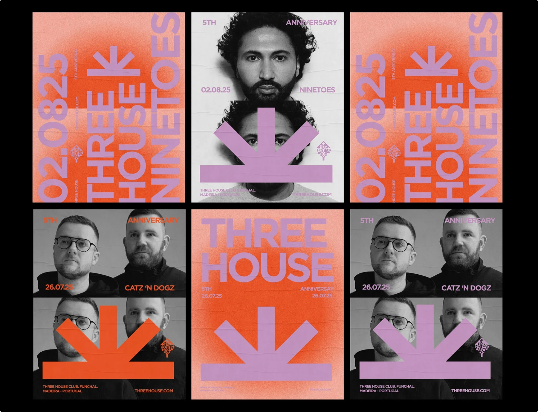
Why it works: One arrow motif + duotone portraits = a brandable series across months & formats. Great poster design inspiration for recurring promotions.
Steal this layout: 8-col grid; giant vertical date as design element; portraits centered; info bar bottom.
Recreate it: Fix type scale once; keep arrow baseline constant; export print + IG crops.
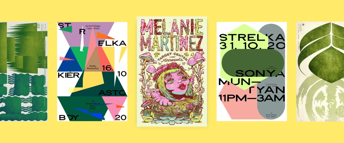
4. Strelka Club set — geometry + overprint
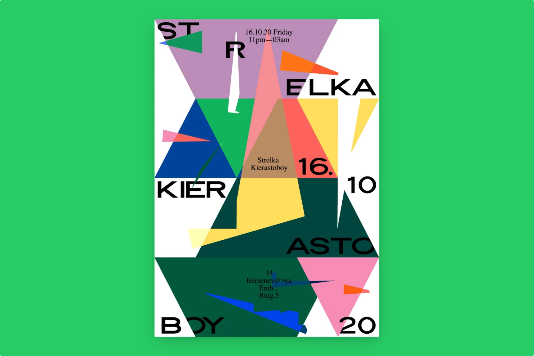
Why it works: Huge shapes and overprints read at a distance; details are embedded, not boxed—clean poster layout that pops in nightlife contexts.
Steal this layout: 5×7 modules; shapes span 2–4 modules; micro-details tucked in corners.
Recreate it: 2 brights + 1 neutral; let type cross edges; date/venue small but consistent.
5. Concert poster — Fall Out Boy / Jimmy Eat World
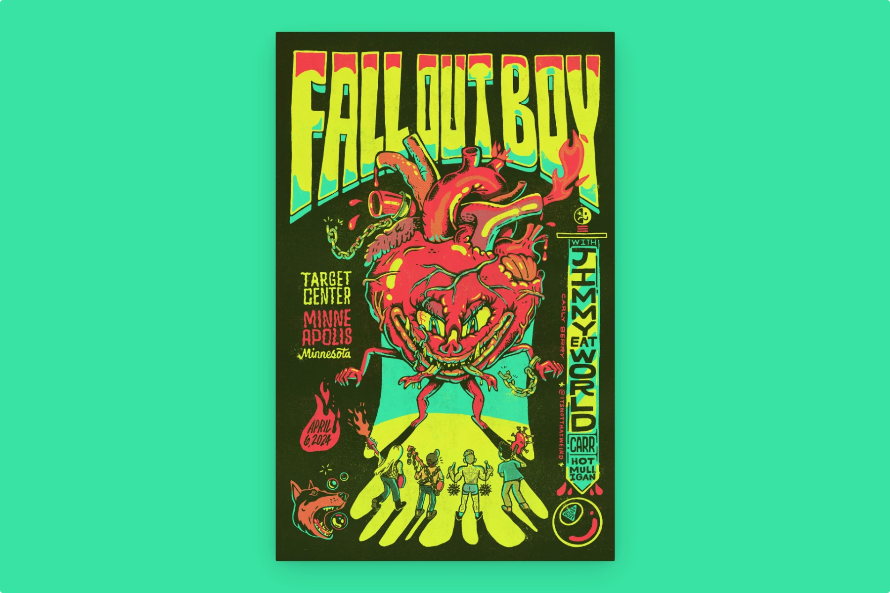
Why it works: Punky neon palette (lime, pink, yellow) + monster-heart illustration = instant genre read; a cool poster that still surfaces venue/date cleanly.
Steal this layout: Artist wordmark top; hero illustration; venue/date blocks left/bottom.
Recreate it: Grunge display fonts; hand-inked lines; scatter CTA details as “stickers.”
6. Concert poster — Melanie Martinez

Why it works: Pastel-goth illustration (mushrooms, 4-eyed doll) + ornate script—whimsical creative poster that remains legible.
Steal this layout: Artist name huge; centered date/time/venue beneath; art fills the frame.
Recreate it: Pastel triad (pink/mint/yellow), black keylines, decorative caps.
7. Concert poster — Megan Thee Stallion
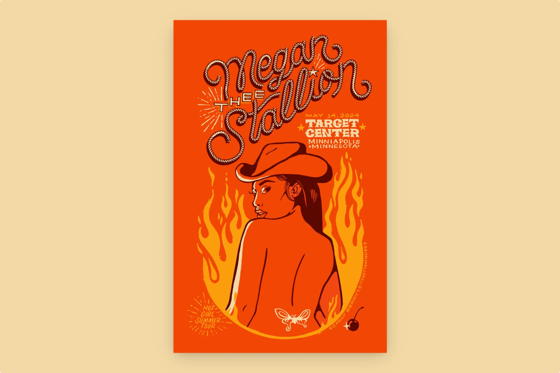
Why it works: Two-color (blaze orange/black) silhouette + western-meets-modern type. A poster example of doing more with less.
Steal this layout: Name + date/location at top-right; portrait center; flames as texture.
Recreate it: Limited palette; star icons; tight tracking on artist name.
Film & Games
8. Minimalist Oscars triptych — silhouettes & negative space
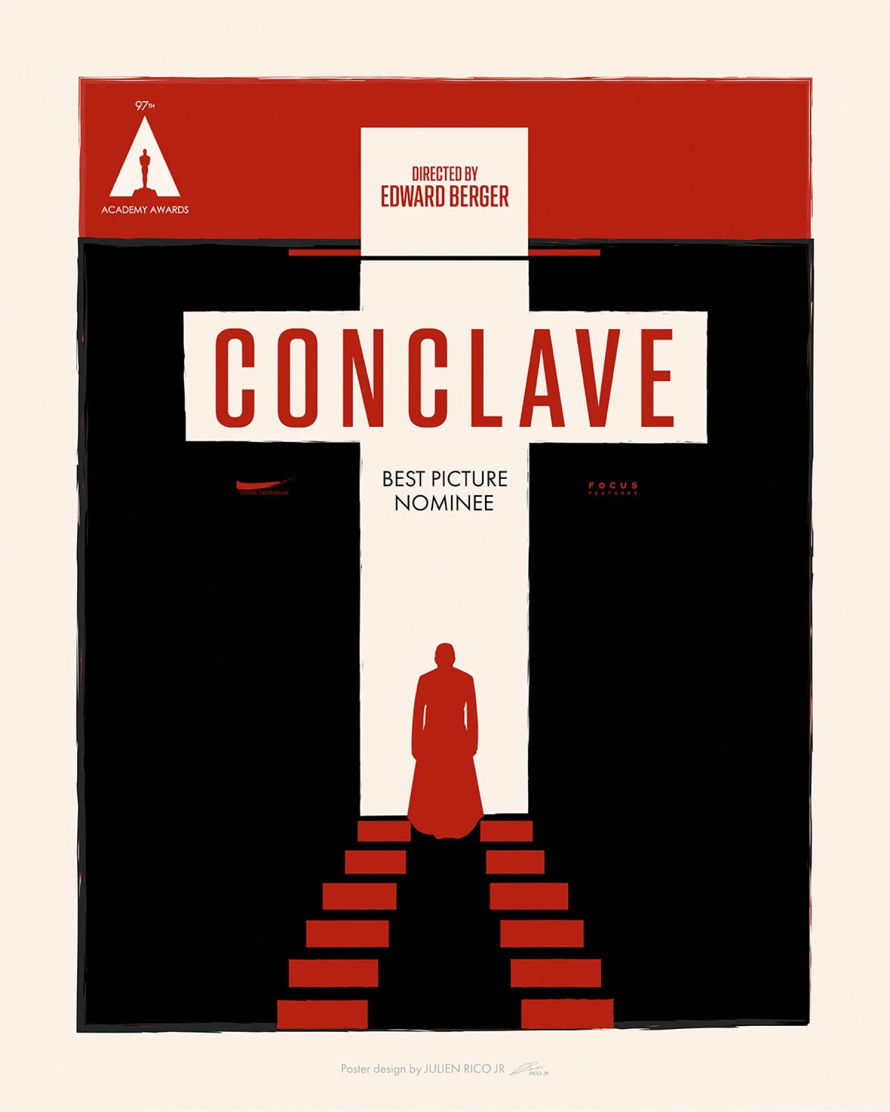
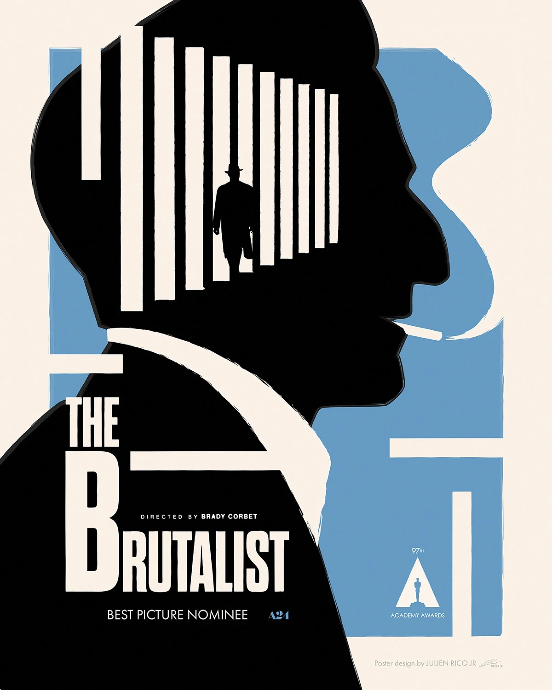

Why it works: Two to three shapes tell the whole story; the rest is silence. Prime poster inspo for festival or poster presentation ideas.
Steal this layout: Giant flats; small credits bar; title in a geometric sans.
Recreate it: Strict palette; metaphor first; carousel the three as an IG set.
9. Elden Ring — blackletter crest + golden helmet
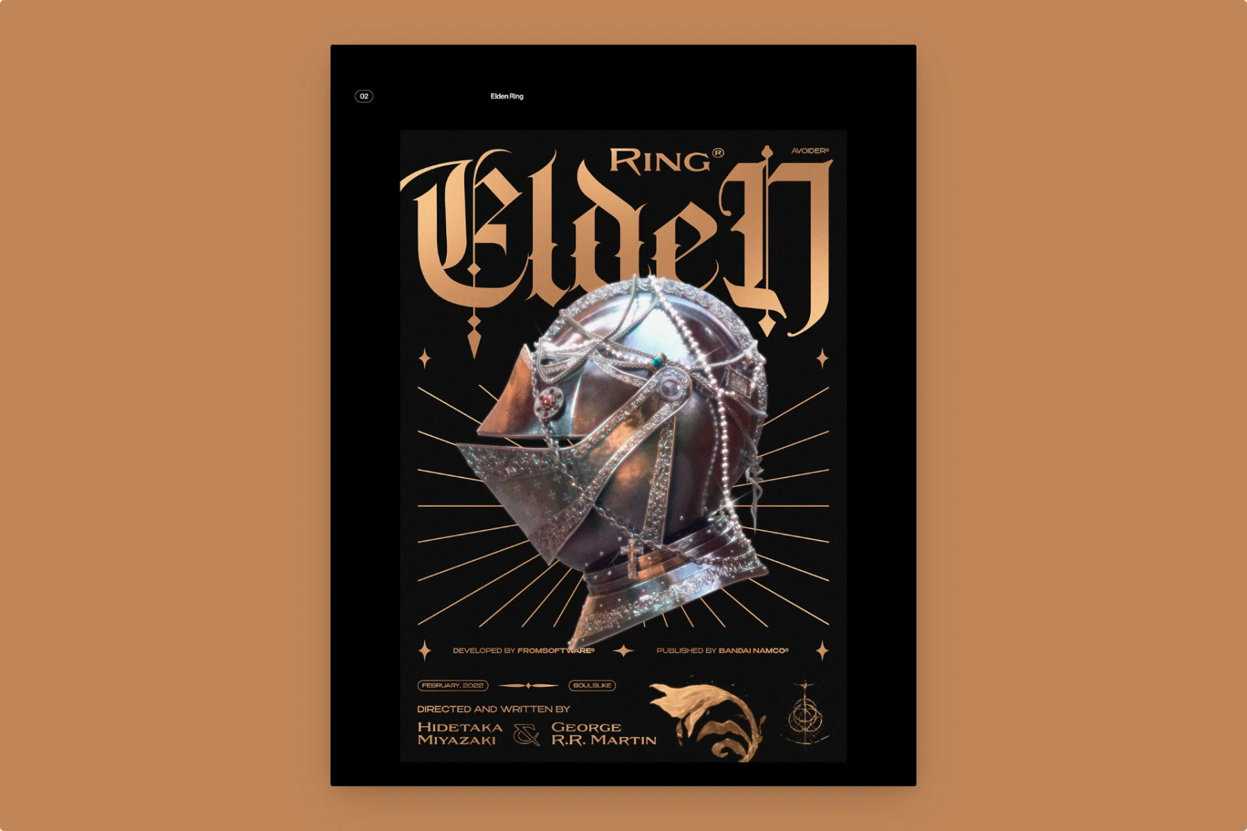
Why it works: Black-on-gold grandeur; object texture sells the epic—a video game poster archetype.
Steal this layout: 6-col; title 1–5; object overlap 3–6; credits ribbon bottom.
Recreate it: Heavy blackletter; rim-lit PNG; tiny rune ornaments.
10. Lies of P — gothic red portrait + star flare

Why it works: Monochrome red/black drama; ornamental serif = prestige. Great concept poster reference.
Steal this layout: Center column; big top/bottom margins; minimal credits.
Recreate it: Old-style serif; lens-flare star; vignette edges.
Culture & Community
11. Tea Way — Tea Mountain Healing (Taiwan)
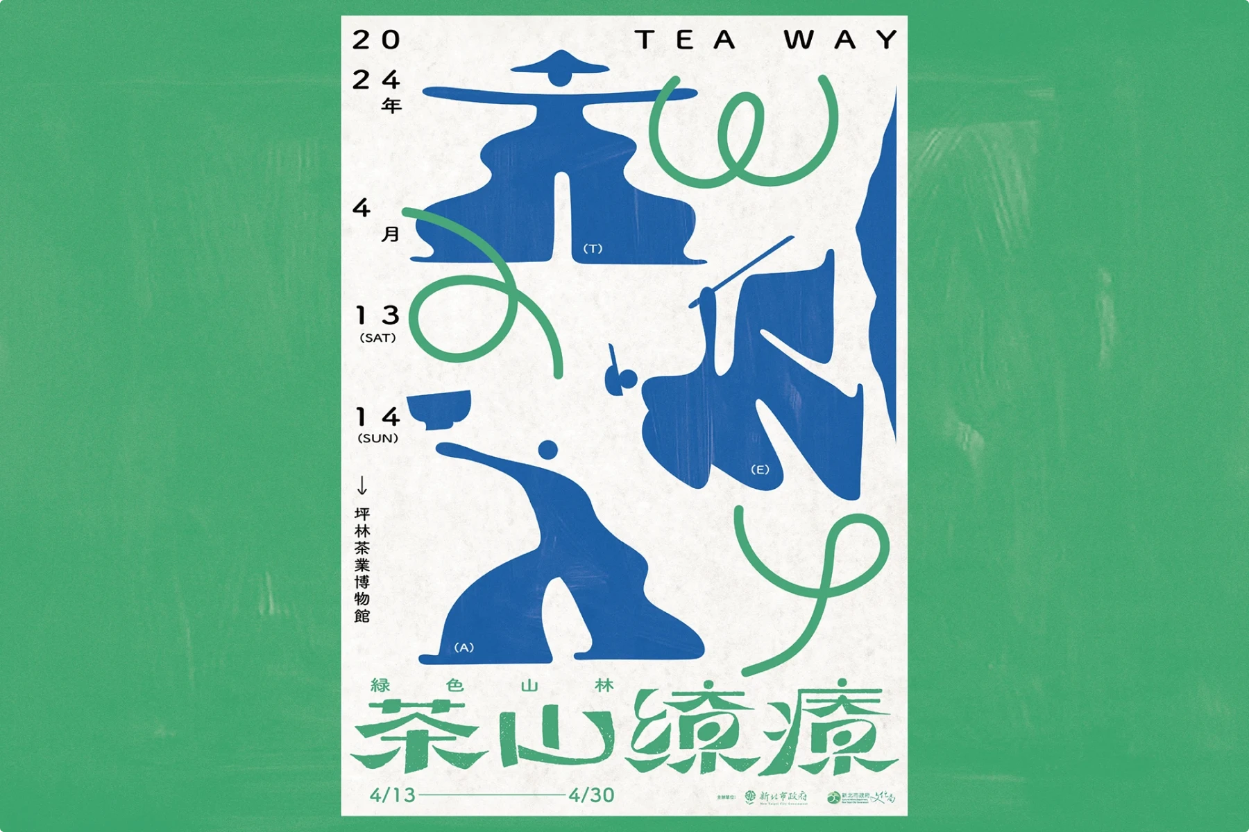
Why it works: Calm mint border, blue calligraphic shapes, cream paper—culture first, design second. A poster theme that reads serene.
Steal this layout: Framed canvas; abstract glyphs as anchors; small dates in bottom border.
Recreate it: Two inks + paper texture; humanist sans for details; vertical date rail.
12. Sake Tasting — Meeting of Tastes
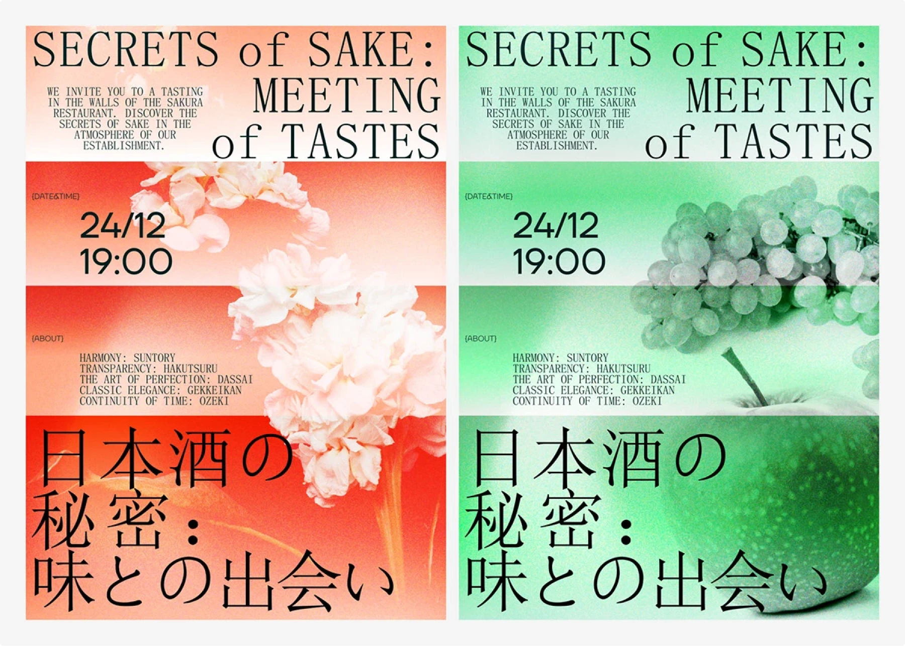
Why it works: Split duotone panels with floral/fruit imagery; the date/time (24/12 19:00) sits center as the hook—smart advertisement poster idea for F&B.
Steal this layout: Three stacked bands; left info column; JP title band bottom.
Recreate it: Serif for title + humanist sans for numerals; mid-poster date as CTA.
13. Flea Market — Let’s Give Up (two variants)
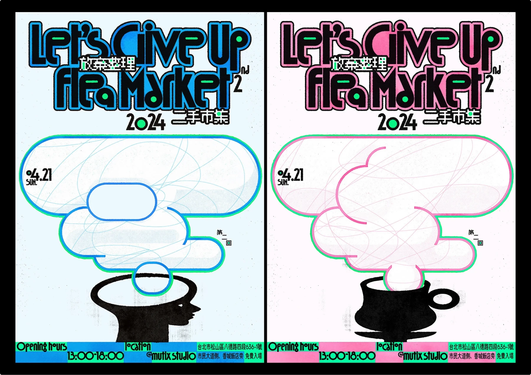
Why it works: Friendly blobs, hand-drawn type, and a “head full of stuff” illustration—fun poster ideas that feel DIY.
Steal this layout: 70/30 split—hero bubble + bottom info strip.
Recreate it: Offset keylines; cyan/magenta accents; hours/location along the bottom.
14. Sol de Plata — festival doodles + serif masthead (València)

Why it works: Newspaper-style masthead for clarity; childlike color doodles bring the party. A lovable community poster with a clear poster layout idea.
Steal this layout: Serif title; justified info blocks; doodle layer overprint.
Recreate it: Black/white typography base; multicolor vector scribbles; dates bottom-left.
15. DESMADRES — literary festival series (monochrome objects)


Why it works: One grid, many episodes: eyeglasses, trophy, folding chair—each a clean metaphor. Series-friendly poster design ideas.
Steal this layout: Big masthead; single black illustration; 3-col footer with juries/logos.
Recreate it: Duotone backgrounds (pink/beige/lilac); swap object per segment.
Typography & Concept
16. MORE NUMBERS — big words + chaotic zeros

Why it works: Typography is the composition; red/black/white is loud and cheap to print—perfect poster-making ideas for students.
Steal this layout: 3 vertical lanes; huge words snap to lanes; zeroes spill across the grid.
Recreate it: Variable sans; one neon accent; micro captions for the joke.
17. TASTES LIKE SWEET APPLE PIE
Why it works: Food-coded colors (apple green, pie-crust brown) + chunky letters = instant poster inspiration for classroom displays.
Steal this layout: Centered type stack; tiny apple icons as bullets.
Recreate it: Rounded display sans; soft drop shadow; subtle paper speckle.
18. FLIGHT — magenta rectangles “taking off”
Why it works: Diagonal rhythm feels kinetic; the poster literally explains itself—simple, memorable poster idea.
Steal this layout: 3 lanes; rising blocks; caption bar stating the gag.
Recreate it: One neon + black/white; angled grid; keep body ≤24 pt.
19. AFTERLIFE — skull + rails + marginalia

Why it works: Image “caged” by thick bars; letters run the outer margins; grayscale = sober. A moody, creative poster design study.
Steal this layout: Center photo; horizontal rails; vertical margin letters.
Recreate it: Bone white/black; essay-style micro blurbs; discreet footer (no hard CTA).
20. Mismatch & Bright Colors — neon clash
Why it works: Max contrast, clashing fonts, “wrong but right” composition—very 2025 modern poster design.
Steal this layout: Big condensed headlines; collage blocks; misaligned modules on purpose.
Recreate it: Lime + royal blue + purple; harsh crops; don’t over-kern.
21. Brutalism — red slab + concrete

Why it works: Utilitarian grid, all-caps blocky type, raw building photo—graphic design poster minimalism with teeth.
Steal this layout: 2-col grid; photo half; big red slab for headline.
Recreate it: Heavy grotesk; monochrome photo; strict spacing.
22. Mis-match & Bright colors
Why it works: maximal contrast + scale play (giant type vs. thin line art). The chaos is designed—a few consistent anchors (vertical info column, repeat color hits) keep it readable. Pure creative poster design.
Steal this layout: 3-column grid; left = oversized stacked words; middle = figure/shape overlap; right = slim vertical notes. Reserve a clean strip for date/URL.
Recreate it: condensed grotesk for the headline; hand-drawn outline portrait; grain + halftone overlays; palette = neon lime / royal blue / magenta / violet. Drop a QR code bottom-right in a lime keyline.
23. Liquid + Gradient Geometry (trend pack)
Why it works: Flowing blobs, candy gradients, and prism tiles = flexible digital poster ideas and abstract poster design backdrops you can template.
Steal this layout:
- Liquid: blob field background + bold script title; sparse details.
- Melody/Spring/Crystal: floating ovals, rounded color tiles, layered prisms; title top-left or centered.
Recreate it: Gradient mesh; soft glow; bright spectrum with black/white type; export 4:5 and 9:16.
24. Quirky illustrations

Why it works: Massive type + monochrome photo = instant contrast; the flat doodle walks “through” the scene, adding story and hierarchy.
Steal this layout: 3-column grid. Top headline band; center = photo; right microcopy column. Let a single thick doodle path cut across columns.
Recreate it: Wide display sans for H1; desaturated long-exposure photo; vector doodle with 6–8 px stroke; paper/grain overlay; QR in a pink keyline box.
25. Cropped photos in custom shapes
Why it works: Unexpected cropping drives the eye; two-color palette keeps it loud but legible; annotation arrows add “how it’s made” vibes.
Steal this layout: 2-column grid; blob mask occupies ~60%; stacked headline left; diagonal pointers and a slim caption rail.
Recreate it: Vector mask + clipped photo; pink/cream duotone; neo-grotesk headline; tiny process notes; QR tucked into the caption rail.
26. Conceptual abstract design
Why it works: Tension between strict structure and chaotic marks; color slabs guide scanning; tape/paper texture adds depth.
Steal this layout: 6×8 modular grid; portrait spans center; colored rectangles overlay selected tiles; vertical note column; one scribble layer for motion.
Recreate it: Set the grid first; import portrait; overlay rectangles (Multiply/Overlay); pencil-style vector scribble; subtle fold texture; QR in a spare tile.
27. Abstract — Nature-Futurism
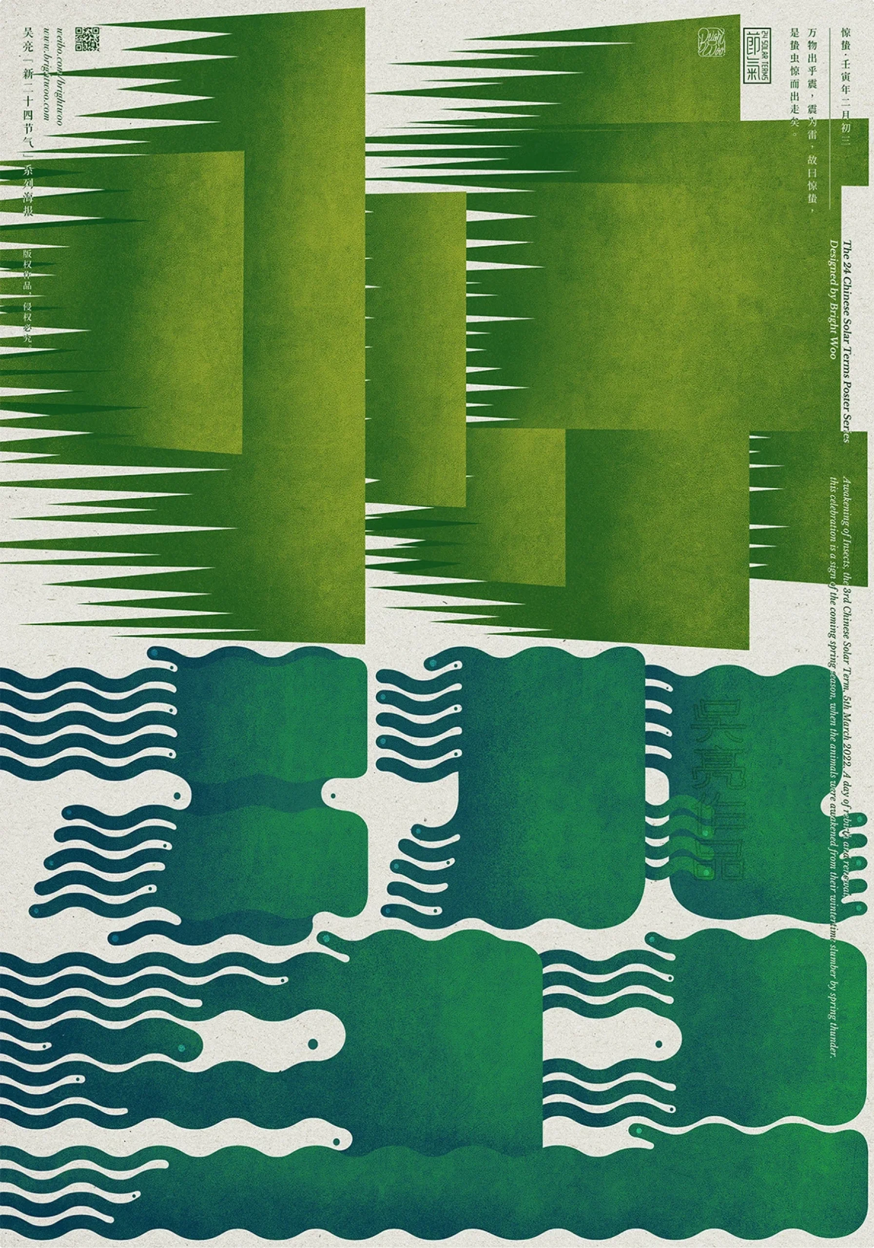


Three posters that make ecology look engineered: lush greens, ribbed gradients, and lab-grade symmetry. Perfect for environmental events, design exhibitions, or any brand that wants “organic but high-tech.”
Why it works
- Organic × algorithmic: botanical shapes built from fine line steps and gradients—nature with a GPU.
- Strict symmetry & margins: centered compositions + narrow side notes = museum-label authority.
- Tactile print feel: paper grain + soft ink fade sells a collectible poster, not just a screen visual.
Steal this layout
- Grid: 3 vertical zones with a tall center axis; slim caption rails left/right.
- Type: narrow grotesk for captions (18–22 pt A2); micro labels along the frame.
- Color: two inks per poster (deep sap green + lime/yellow or navy).
- Hierarchy: hero form occupies 70–80% height; captions never compete with the shape.
Recreate it
- Build forms with blend/step lines or layered gradient meshes.
- Apply a subtle grain/press texture (6–8%) to knock the digital sheen down.
- Keep captions vertical along the margins; add tiny “specimen” codes.
- Export a cream paper background for print; navy variant for digital poster examples.
Students, products, events, community — plug-and-play topics
- Students/school projects: science fair, history timeline, poster motivasi belajar, poster örnekleri (TR). Use #16–18 for poster-making ideas for students and poster examples for students.
- Product & promotion: launches, seasonal sales, menu highlights—adapt #20–22 as promotion poster ideas and creative poster background starters.
- Events & community: concerts, clubs, festivals, markets, PSAs, voting posters ideas—see Music/Nightlife + Culture/Community sections.
- Digital-only: social promos, campus screens, streaming thumbnails—apply the example of digital poster specs above.
Accessibility & legibility (because results matter)
- Contrast: Aim WCAG AA for text (or darker).
- Type at distance (A2 rule-of-thumb): Headline ≥170 pt street / ≥120 pt hallway; body 22–30 pt; micro never <14 pt.
- Hierarchy: One focal element only. If everything shouts, nothing speaks.
- QR placement: Corners or footer bars; keep 1 module of whitespace.
- Testing: 5-second squint; arm’s-length read; quick A4 print to check scan distance.
FAQs
What are good poster ideas for school?
- Pick topics that teach one thing fast: science fair demo, timeline of an era, “how it works” infographic, safety PSA, club recruitment, reading challenge, art show, math joke of the week, lab rules, field-trip notice.
- Keep it 1 headline + 3 facts + 1 CTA. Use icons instead of paragraphs. For poster-making ideas for students, start with a type-first layout (big word, small facts) or a split-panel (image left, facts right). Print A3; pin at eye level.
What’s a poster layout idea that always works?
- Banded slabs: 3–4 horizontal color bars: H1 / subhead / details / CTA. Impossible to misread.
- Split panel: Image on 60%, info on 40% with a clear edge between.
- Grid tiles (2×3 or 3×4): Each tile holds one fact or icon.
Set a type ladder once (H1 → 200–240 pt; sub 72–120 pt; body 22–30 pt; micro 14–18 pt on A2) and don’t break it.
Poster vs. placard—what changes?
- Placards move. Use fewer words (≤10), bigger type (headline ≥220 pt on A2), ultra-high contrast, and thick strokes. Ditch QR codes; use short URLs or big symbols.
- Posters are static. You can include microcopy, QR, sponsors, and a schedule.
Which fonts actually work on posters?
- Pair one display face with one workhorse sans. Keep weights far apart.
- Safe free combos: Bebas Neue + Inter, Oswald + Source Sans 3, Playfair Display + IBM Plex Sans, Archivo Black + DM Sans.
- Do: track big headlines slightly tighter; keep body 0–10 tracking. Don’t: use more than 2 families or outline thin fonts over busy images.
How many words should a poster have?
- Event/marketing: 30–50 words total.
- Educational/infographic: ≤120 words split into bite-size chunks.
- Placard/protest: ≤10 words. If you need more, you don’t need a poster—you need a brochure.
What sizes should I design for?
- A-series: A3 (297×420), A2 (420×594), A1 (594×841) mm.
- US: 18×24″, 24×36″.
Design at final size with 3 mm / 0.125″ bleed.
What DPI and file format should I use?
- Print: 300 dpi (vector whenever possible). Export PDF/X-1a with bleed; outline or embed fonts.
- Large-format quick prints can survive 150 dpi if viewed from a distance.
- Digital: export sRGB PNG/JPG; keep social assets under ~2–3 MB.
How big should the QR code be?
- Indoors/hallway: 30–40 mm (about 1.2–1.6″).
- Street-level/outdoor: 50–70 mm (2–2.75″).
High contrast, no background image in the code, and keep a quiet zone around it. Always test with a quick print from the viewing distance.
Any quick rules for color?
- One dark, one light, one accent (60/30/10).
- Check contrast: body text should meet WCAG AA (or darker).
- For photos, add a semi-transparent tint behind text instead of guessing lighter shades.
Best practices for digital poster examples (social/screens)?
- 1080×1350 (feed), 1080×1920 (Story/Reel/signage). Keep the headline ≥14% of canvas height and inside a safe margin (~5% on all sides).
- Avoid tiny text (<18–22 px on phone). Use sRGB, compress gently (JPG 80–90), and export a second crop for Stories. For links in Stories, use stickers; don’t rely on microscopic QRs.
How do I get hierarchy right, fast?
- Decide the hero: image or headline—never both.
- Set the ladder once: H1 → Sub → Body → CTA/QR. Space using a baseline grid; keep at least 1× body size between blocks. Do the 5-second squint test: if the message doesn’t read, boost contrast or size—don’t add more stuff.
What are solid poster themes when I’m stuck?
Seasonal event, “how it works,” top 5 tips, map + route, schedule at a glance, before/after, bold quote + proof, checklist, countdown, or “X vs. Y.” All are easy poster design ideas you can theme to product, school, or community.
Wrap it up
Pick a layout above, drop your poster topic, set the grid, and ship. That’s a creative poster design without the drama. If you want, I’ll attach the grid pack PDFs and template starters so you can crank out posters before your coffee goes cold.


