


Stop falling for basic color wheel BS. Here’s how color psychology actually works in branding.
You’ve seen those viral infographics claiming “red means passion” and “blue builds trust” like it’s some cosmic law written in the stars, right?
That oversimplified nonsense is about as scientifically accurate as your horoscope.
The truth? Color psychology is way more nuanced than your typical LinkedIn carousel suggests. Color symbolism varies wildly by culture, color associations change by context, and that “80% of brand recognition comes from color” stat everyone throws around? It’s legit—but only if you actually understand what colors mean in different situations.
TL;DR: We’re about to demolish some color myths and rebuild your understanding with actual research. Buckle up.
What is color psychology?
Color psychology = The study of how colors affect human emotions, decisions, and behavior in specific contexts.
Color symbolism = The cultural and personal meanings people attach to colors (spoiler: these change by region).
What it’s NOT = A universal cheat code where slapping red on your CTA automatically makes people buy stuff.
The definition of color in marketing terms? It’s a psychological tool that influences emotion colors and drives behavior—but only when used strategically within proper context.
Color meanings: psychology of colors explained
Okay, since y’all keep searching for “what do colors mean” and “colors and their meanings,” let’s break down the psychological meaning of colors properly. But remember—these are general associations that get completely flipped by context, culture, and execution.
Red color meaning & psychology
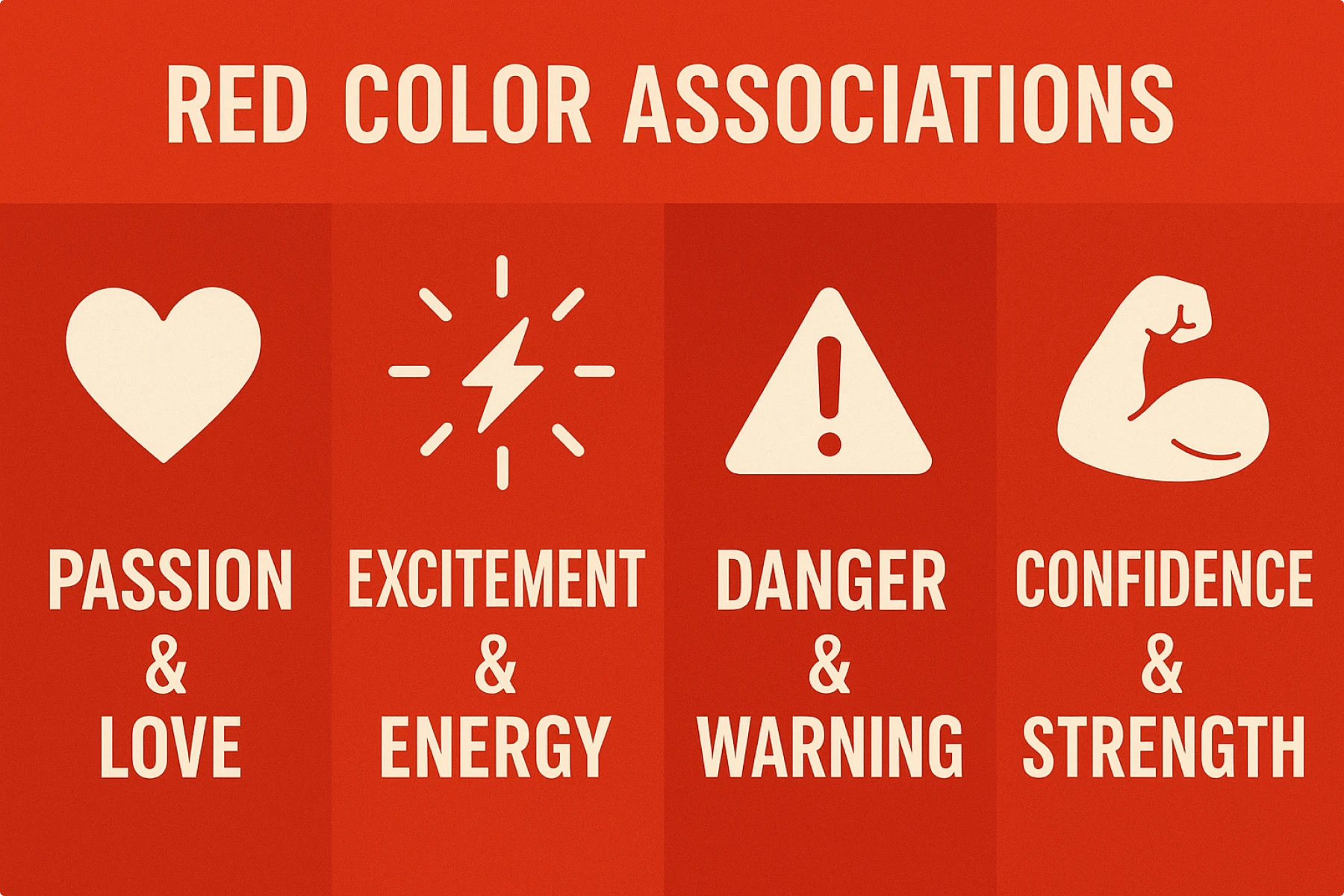
Red is the power color. It symbolizes passion, energy, love, and danger. It grabs attention instantly, which is why brands like Coca-Cola, YouTube, and Netflix use it.
Emotions associated:
- Passion & Love
- Excitement & Energy
- Danger & Warning
- Confidence & Strength
Marketing reality: Creates urgency (hello, sale banners) but can overwhelm if overused
Brand examples: YouTube (attention-grabbing), Coca-Cola (classic excitement)
Design hack: Best for physical strength and urgency, not trust or calm
Cultural note: Lucky in China, mourning in South Africa—research your markets.
Blue color meaning & psychology
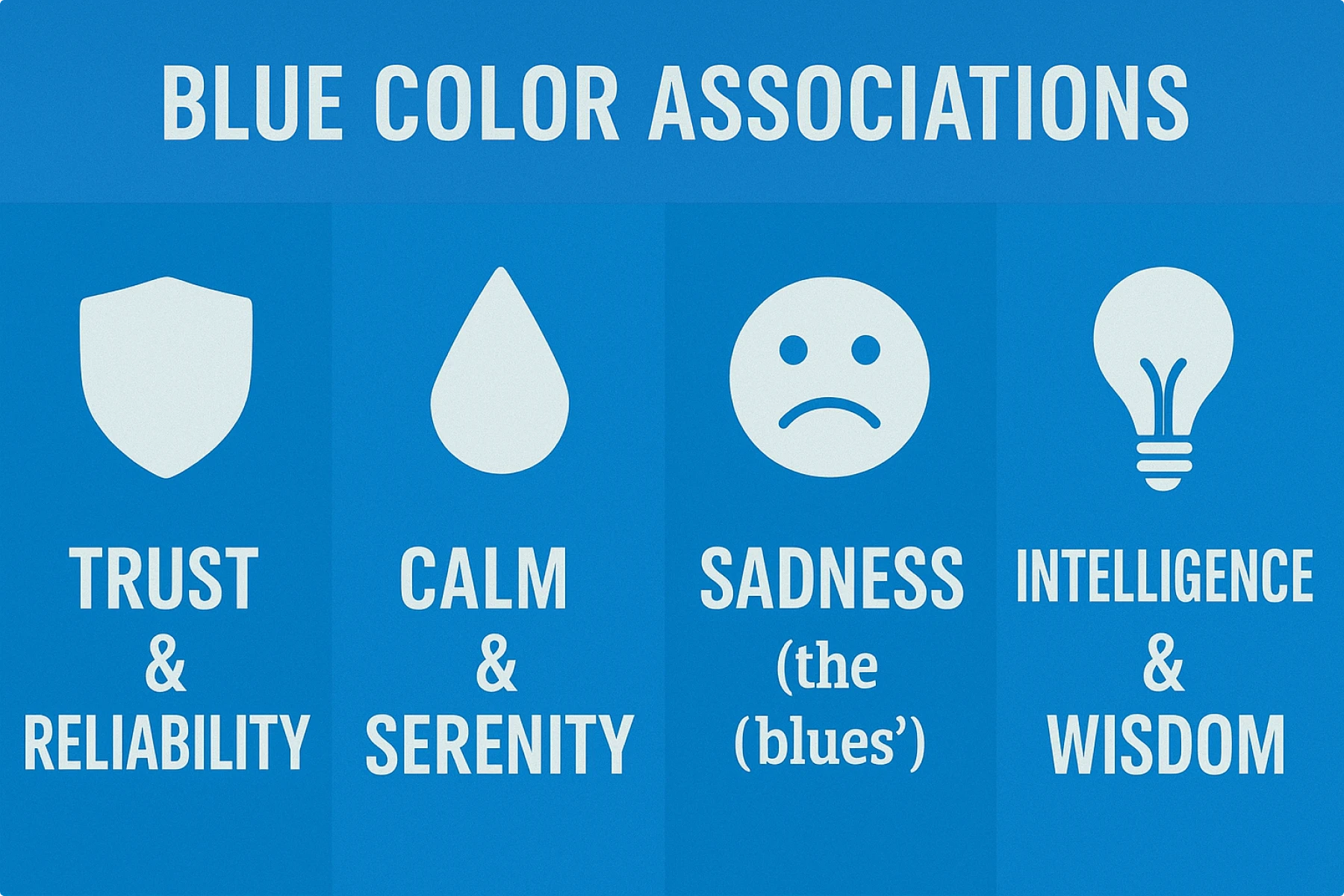
Blue is the trust color. It symbolizes peace, stability, loyalty, and intelligence. Banks, tech companies, and social platforms rely on blue to inspire confidence.
Emotions associated:
- Trust & Reliability
- Calm & Serenity
- Sadness (the “blues”)
- Intelligence & Wisdom
Marketing reality: The safe choice that actually works for building credibility
Brand examples: Facebook (social trust), LinkedIn (professional credibility)
Design hack: Dominates because it triggers calm, logical thinking
Cultural note: Universally liked, but associated with death in Korea.
Green color meaning & psychology
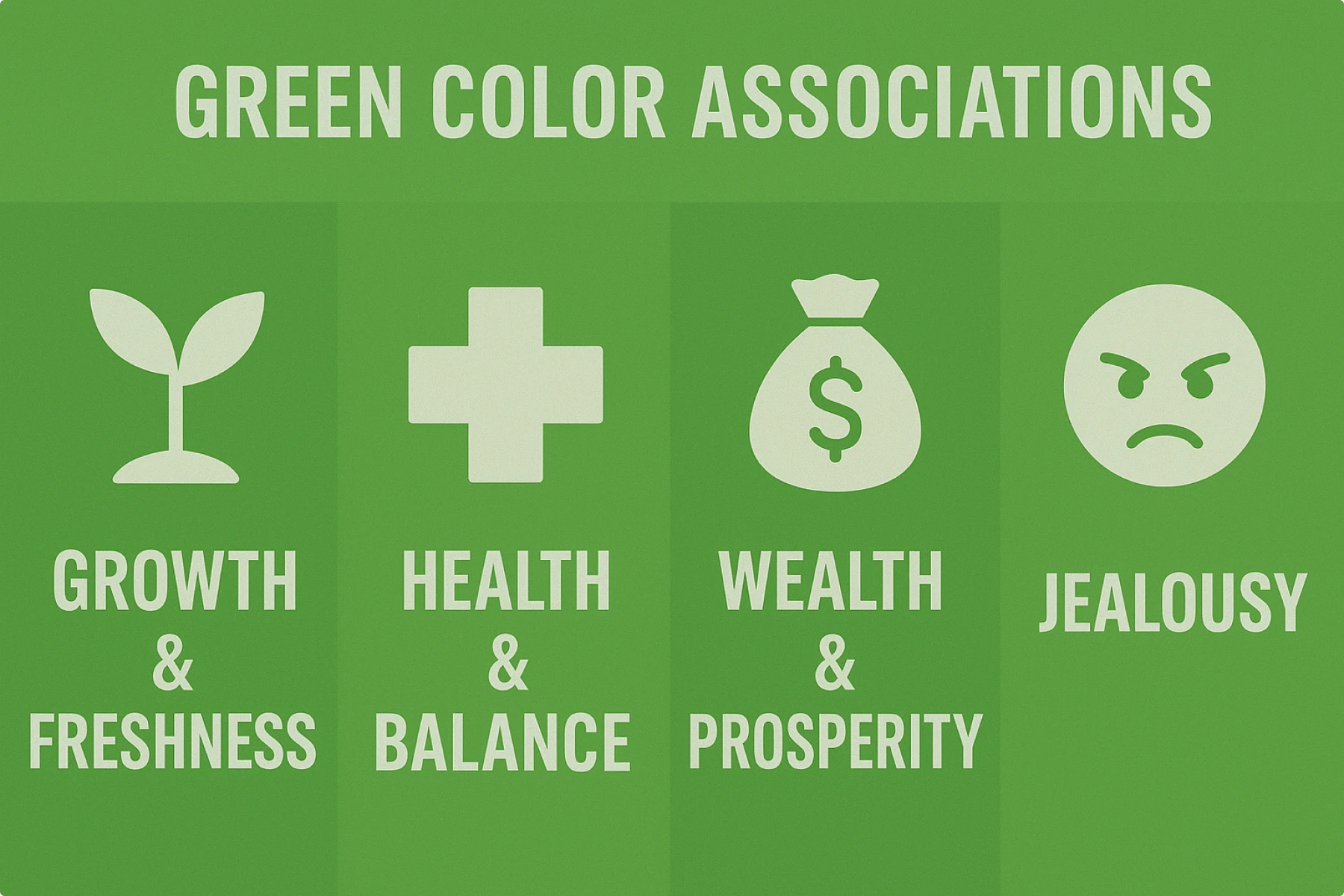
Green is the growth color. It symbolizes nature, renewal, wealth, and health. Perfect for eco-brands and financial services.
Emotions associated:
- Growth & Freshness
- Health & Balance
- Wealth & Prosperity
- Jealousy
Marketing reality: Eco-brands and money apps love it for obvious reasons
Brand examples: Spotify (growth), Whole Foods (natural premium)
Design hack: Most restful color for human eyes—literally reduces eye strain
Cultural note: Sacred in Islamic cultures—use respectfully.
Yellow color meaning & psychology
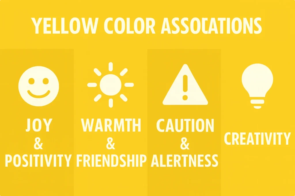
Yellow is the happiness color. It symbolizes joy, optimism, energy, and creativity. Mood booster that can also signal caution.
Emotions associated:
- Joy & Positivity
- Warmth & Friendship
- Caution & Alertness
- Creativity
Marketing reality: Grabs attention but strains eyes—use strategically
Brand examples: McDonald’s (literal happy meals), Snapchat (playful energy)
Design hack: Pure dopamine hit, but don’t overdo it
Cultural note: Imperial associations in East Asia.
Purple color meaning & psychology
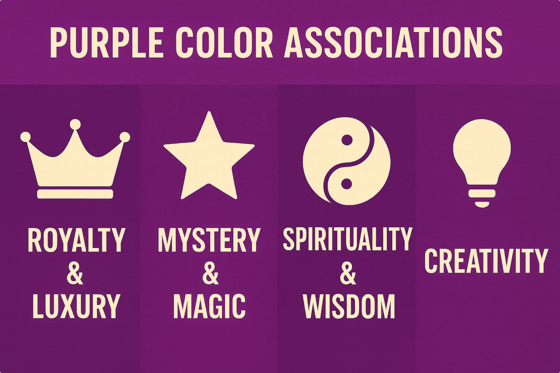
Purple is the luxury color. It symbolizes royalty, wisdom, spirituality, and creativity. Blends blue’s calm with red’s energy.
Emotions associated:
- Royalty & Luxury
- Mystery & Magic
- Spirituality & Wisdom
- Creativity
Marketing reality: Premium positioning, but can feel feminine in traditional markets
Brand examples: Twitch (creative community), Cadbury (indulgent luxury)
Design hack: Perfect for imagination and unconventional thinking
Cultural note: Historically expensive = still feels premium today.
Black color meaning & psychology
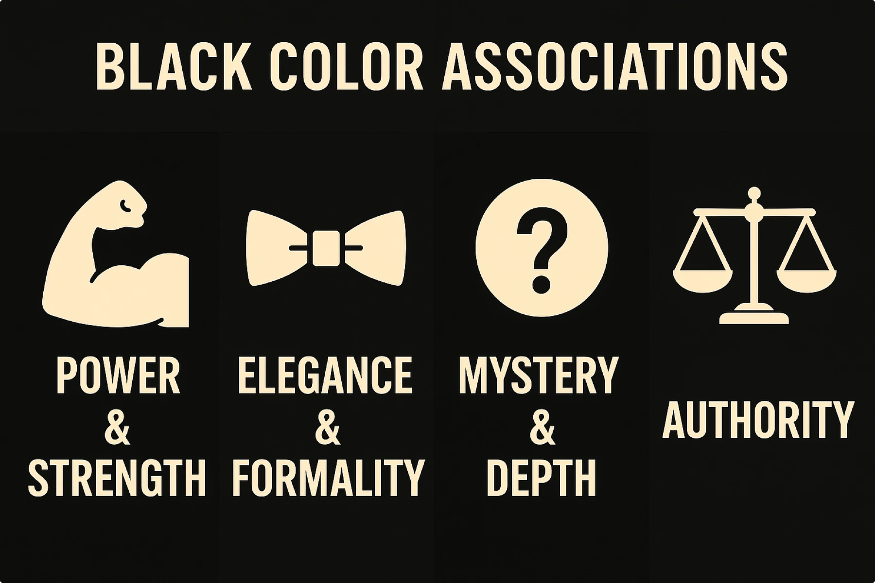
Black is the sophistication color. It symbolizes power, elegance, authority, and mystery. Ultimate luxury statement across cultures.
Emotions associated:
- Power & Strength
- Elegance & Formality
- Mystery & Depth
- Authority
Marketing reality: Luxury positioning that works globally
Brand examples: Apple (premium simplicity), Nike (athletic authority)
Design hack: Creates visual weight and authority
Cultural note: Consistently prestigious worldwide.
White color meaning & psychology
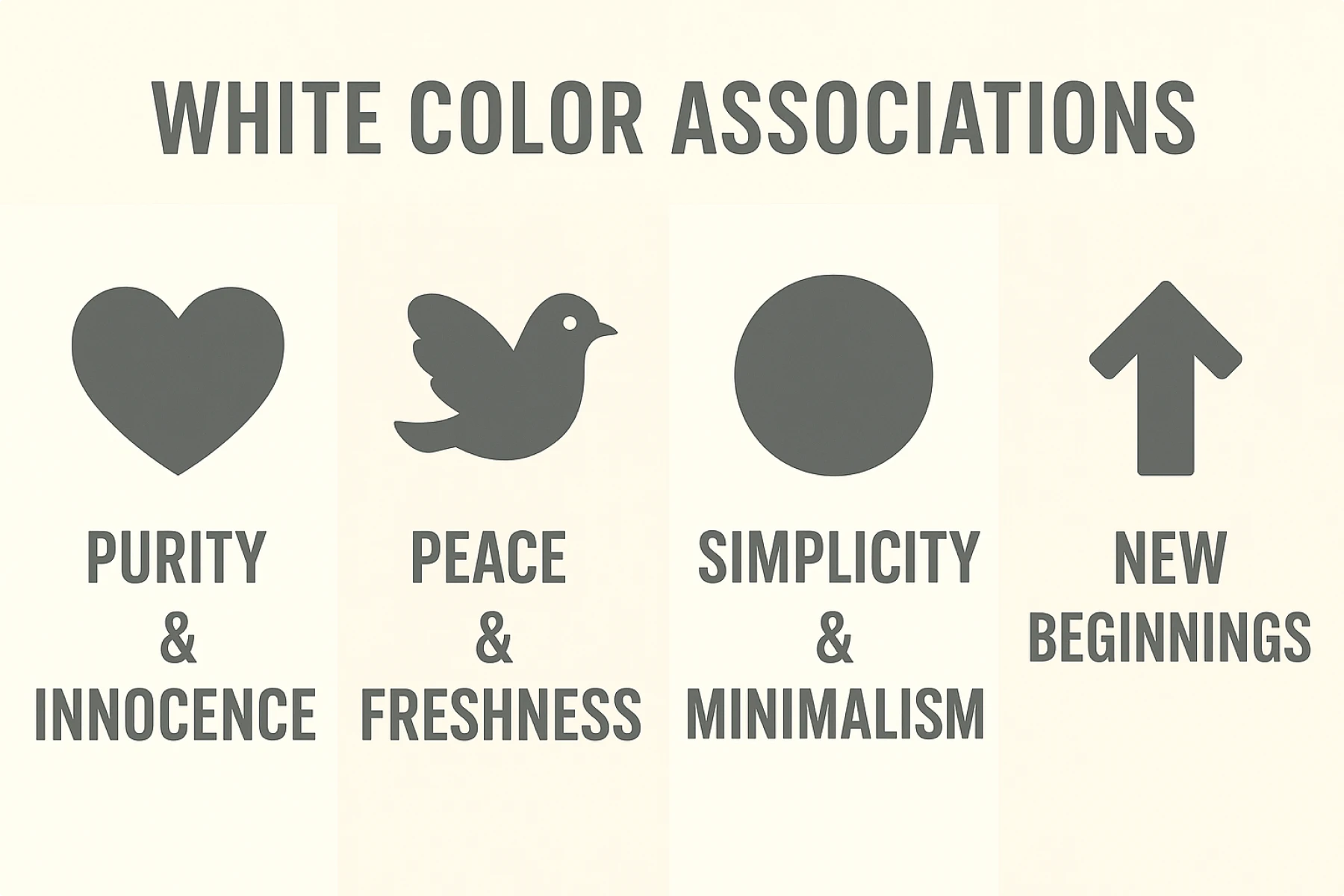
White is the color of purity. It symbolizes simplicity, cleanliness, peace, and new beginnings. But cultural context matters.
Emotions associated:
- Purity & Innocence
- Peace & Freshness
- Simplicity & Minimalism
- New Beginnings
Marketing reality: Creates breathing room, suggests premium quality
Brand examples: Tesla (future-forward), Muji (Japanese minimalism)
Design Hack: Ultimate reset button for visual noise
Cultural note: Mourning color in many Asian cultures—research first.
Pink color meaning & psychology
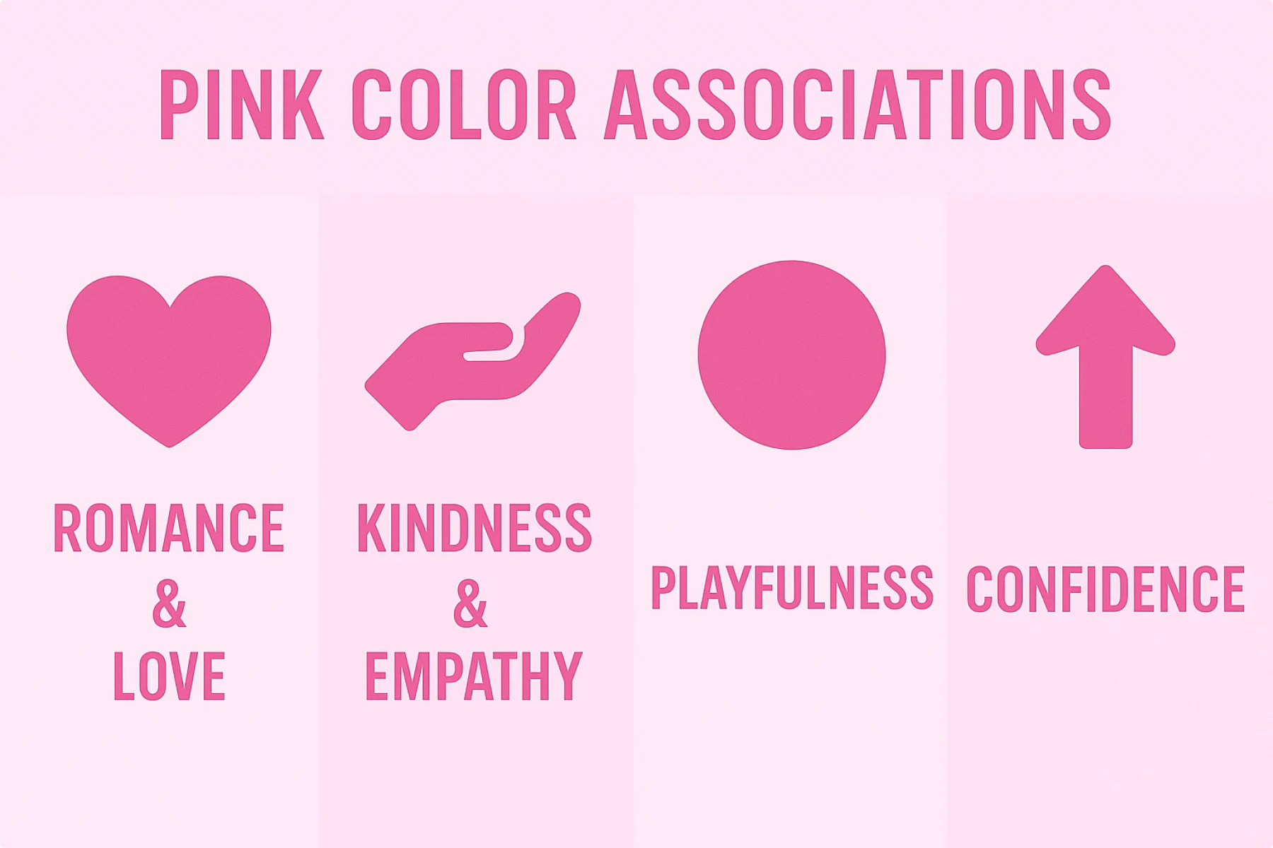
Pink is the compassion color. It symbolizes love, kindness, playfulness, and femininity. Breaking gender barriers lately.
Emotions associated:
- Romance & Love
- Kindness & Empathy
- Playfulness
- Confidence
Marketing reality: Gen Z making it gender-neutral and confident
Brand examples: T-Mobile (disruptive energy), Glossier (approachable beauty)
Design hack: Actually reduces aggression (prisons use it)
Cultural note: Was originally the “masculine” color until 1940s marketing.
Orange color meaning & psychology
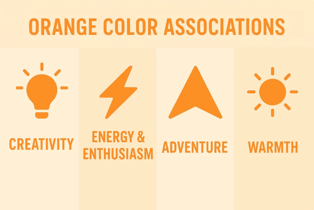
Orange is the enthusiasm color. It symbolizes energy, creativity, adventure, and warmth. Red’s friendly cousin.
Emotions associated:
- Creativity
- Energy & Enthusiasm
- Adventure
- Warmth
Marketing reality: High visibility without red’s aggression
Brand examples: Home Depot (accessible expertise), Soundcloud (creative platform)
Design hack: Most appetite-stimulating color
Cultural note: Underused = differentiation opportunity.
Brown color meaning & psychology
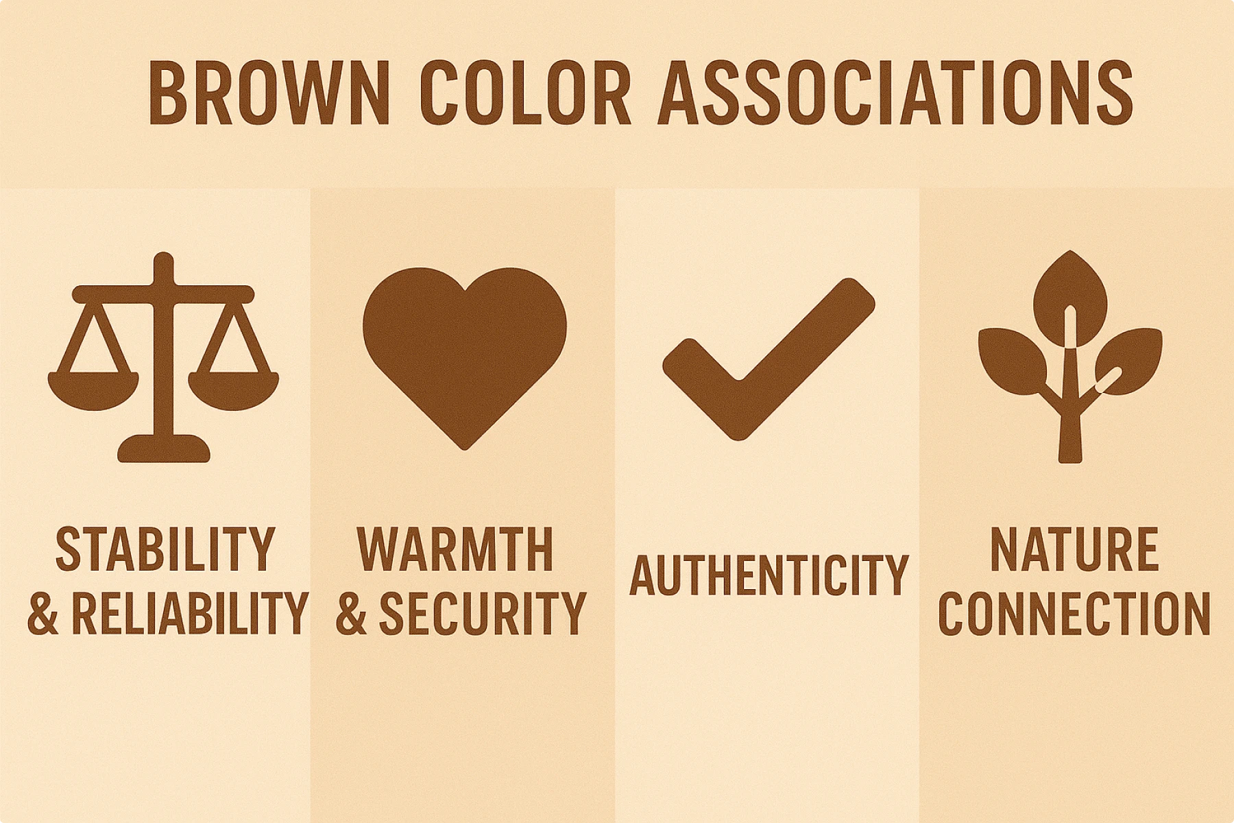
Brown is the reliability color. It symbolizes stability, earthiness, authenticity, and warmth. Underused but powerful.
Emotions associated:
- Stability & Reliability
- Warmth & Security
- Authenticity
- Nature Connection
Marketing reality: Perfect for authentic/artisanal brands
Brand examples: UPS (reliable delivery), Louis Vuitton (leather luxury)
Design hack: Least popular favorite color = less competition
Cultural note: Differentiation goldmine in most markets.
Grey color meaning & psychology
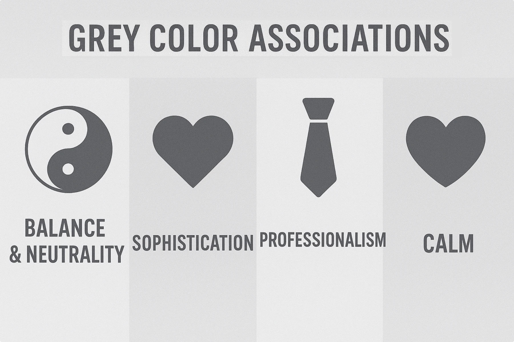
Grey is the balance color. It symbolizes neutrality, sophistication, professionalism, and compromise. Ultimate supporting actor.
Emotions associated:
- Balance & Neutrality
- Sophistication
- Professionalism
- Calm
Marketing reality: Perfect supporting role, dangerous as lead
Brand examples: Wikipedia (neutral knowledge), Mercedes (refined luxury)
Design hack: Most gender-neutral color
Cultural note: Universally professional.
“Perceived appropriateness” framework
Forget “what does color mean?” and start asking “does this color make sense for what I’m selling?”
Four-point evaluation system
Stop asking “what does [color] mean?”. Start asking, “Does this color make sense for my users?”
- Product fit. Does the color match what you’re selling? Brown chocolate = good. Brown toothpaste = no.
- Brand personality. Rugged outdoor brand = earth tones. Luxury skincare = probably not neon.
- Audience expectations. B2B software = safe blues/grays. Kids’ toys = bright fun colors.
- Competitive context. Everyone using blue? Maybe try something else. But be strategic, not just different.
Marketing colors meaning by industry
Tech & SaaS
- Safe plays: Blue (trust), white (clean), black (sophisticated)
- Color psychology in branding: Blue dominates because it signals reliability
- Differentiation opportunity: Warm colors like orange or purple
Avoid: Colors that suggest instability or unprofessionalism
Healthcare & Wellness
- Traditional: Blue (trust), green (health), white (cleanliness)
- Modern trend: Warm, approachable colors to reduce clinical feel
- Cultural note: Color associations with health vary globally
Finance & Banking
- Conservative choice: Blue (stability), green (money), grey (professional)
- Fintech disruption: Bright colors to signal innovation (see Revolut, Monzo)
- Trust factor: Colors must convey security and reliability
Food & Beverage
- Appetite stimulation: Red, orange, yellow (fast food favorites)
- Premium positioning: Black, gold, deep colors
- Health positioning: Green, earth tones, natural palettes
How to actually test color psychology
Stop doing basic A/B tests. Here’s what actually matters:
Short-term metrics
- Click-through rates on colored CTAs
- Conversion rates across variations
- Time on page with different schemes
Long-term brand impact
- Brand recognition improvement (up to 80% boost possible)
- Brand perception surveys
- Cultural adaptation success rates
Testing framework
- Track long-term brand equity changes
- Baseline your current performance
- Form hypotheses based on your specific context
- Test multiple variations (not just A/B)
- Validate across cultural segments
Bottom line: context is king
Color psychology works, but not the way most people think it does.
What matters:
✅ Understanding what colors represent for your specific audience
✅ Mapping colors and emotions strategically to your brand goals
✅ Researching color symbolism in your target markets
✅ Testing psychological colors with real users in real scenarios
✅ Building color meanings into a cohesive brand system
What doesn’t matter:
❌ Generic color meanings from viral infographics
❌ Following competitors without understanding the psychology of colors
❌ Choosing colors based on the personal favorite color meaning alone
❌ Ignoring cultural color associations and accessibility
❌ Changing colors without understanding the current color psychology performance
Your action plan
- Audit your current color usage against color emotion meanings
- Identify gaps in cultural sensitivity or color associations
- Test systematically how colors represent emotions to your audience
- Build guidelines that scale the psychological meaning of colors across your organization
- Measure impact beyond vanity metrics using color psychology principles
Remember: The best color psychology in marketing strategy is the one that serves your users, respects their cultural contexts, and builds your brand consistently over time.
Now, stop overthinking what colors mean and start testing. Your users will tell you what colors represent success for your brand.
Want to dive deeper into different colors and color palettes? Check out these articles:


