Learn how to craft a winning pitch deck with essential elements and design tips. Discover the power of visual consistency using Icons8’s high-quality graphics.
You don’t need another gallery of pitch deck examples to scroll past. You need a practical teardown you can use tonight. Below is a clear framework for a winning pitch deck presentation—from the exact slides investors expect to the design choices that make your investor pitch deck look like money. We’ll reference startup pitch deck examples, show what belongs on each slide, and share design moves you can steal for your own business pitch deck (PDF-ready, of course).
What is a pitch deck?
A pitch deck is a short, visual slide deck that sells your company’s story to investors, partners, or prospects. Think 10–15 slides, not a novel. The goal is simple: earn the next meeting. If you’re asking “what is a pitch deck” or “pitch deck meaning,” it’s the same thing as an investor deck, investment deck, or fundraising deck—not a “pitch desk” (common typo, we see you).
You’ll share it live as a pitch presentation and send a pitch deck PDF afterward. Both versions should be clean, scannable, and consistent.
Key elements of a successful pitch deck
These are the slides you’ll see in the best startup pitch decks. Use them as your skeleton. If you need a pitch deck template, mirror this order in your slide deck template and customize.
Title slide
Company, one-line value prop, logo, contact. Strong visual first impression.
Why it matters: anchors the story and sets the tone for the rest of the company deck.

Pluang’s title slide is simple yet effective, showcasing their app interface and the tagline “The leading investing super app for Southeast Asia.” This immediately communicates what the company does and its primary market.
Problem statement
Who hurts, how often, and why current solutions fail. One graph or one vivid scenario beats a wall of text.
Why it matters: investors fund painkillers, not vitamins.
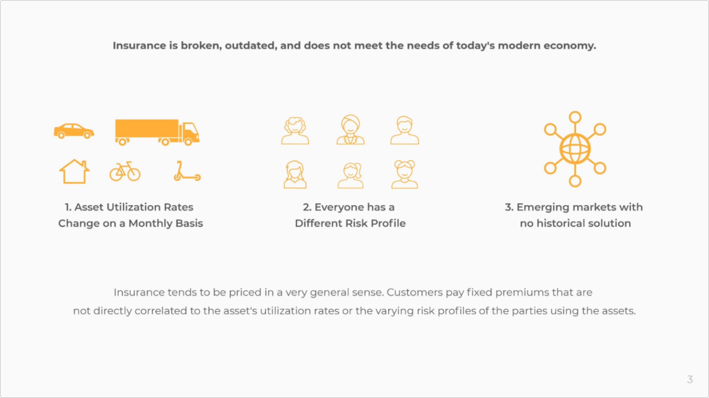
Lula highlights the outdated, generalized pricing in insurance, underscoring the need for personalized and episodic insurance solutions.
Solution
Screens, demo stills, or workflow showing how you solve the pain. Keep it outcome-first.
Why it matters: turns the problem into a clear “aha.” This is the heart of a product pitch deck.
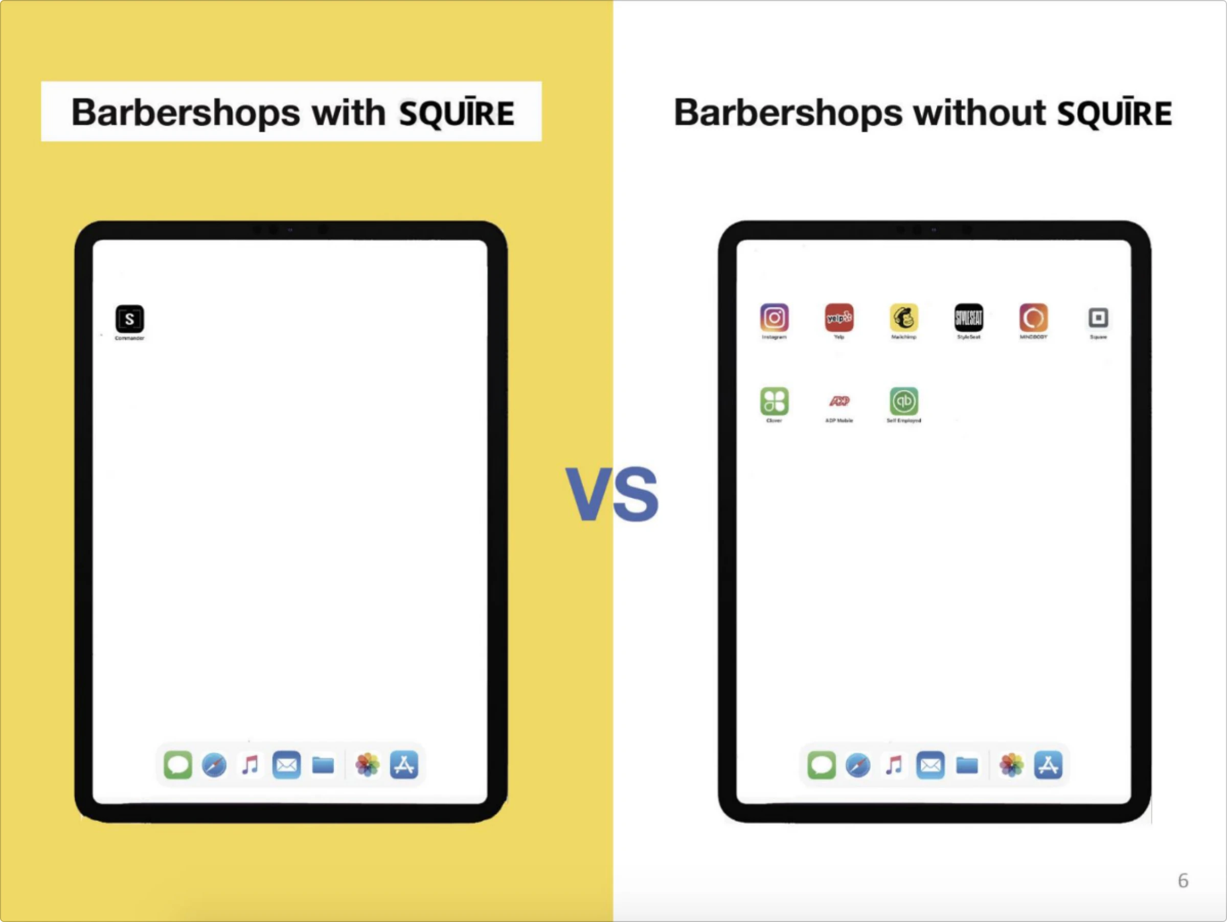
SQUIRE effectively demonstrates the value of its solution by comparing barbershops using their platform to those that don’t. The slide shows a clear visual difference: barbershops with SQUIRE have a single, streamlined app, while those without it rely on multiple apps, leading to clutter and inefficiency. This comparison highlights how SQUIRE simplifies operations by integrating essential tools into one app, making it easier for barbershops to manage their business effectively.
Market size
TAM / SAM / SOM or a credible bottom-up model. Visualize segments.
Why it matters: shows the prize is big enough for venture-scale returns.

Lula’s pitch deck effectively showcases the vast potential in the US insurance market. By emphasizing fragmentation and the underserved commercial sector, Lula underscores the significant opportunity for innovation and growth. This sets a compelling stage for Lula’s targeted approach to transforming the insurance landscape to meet modern needs.
Business model
How you make money: pricing, ARPU, take rate, LTV drivers.
Why it matters: de-mystifies your business model pitch deck at a glance.
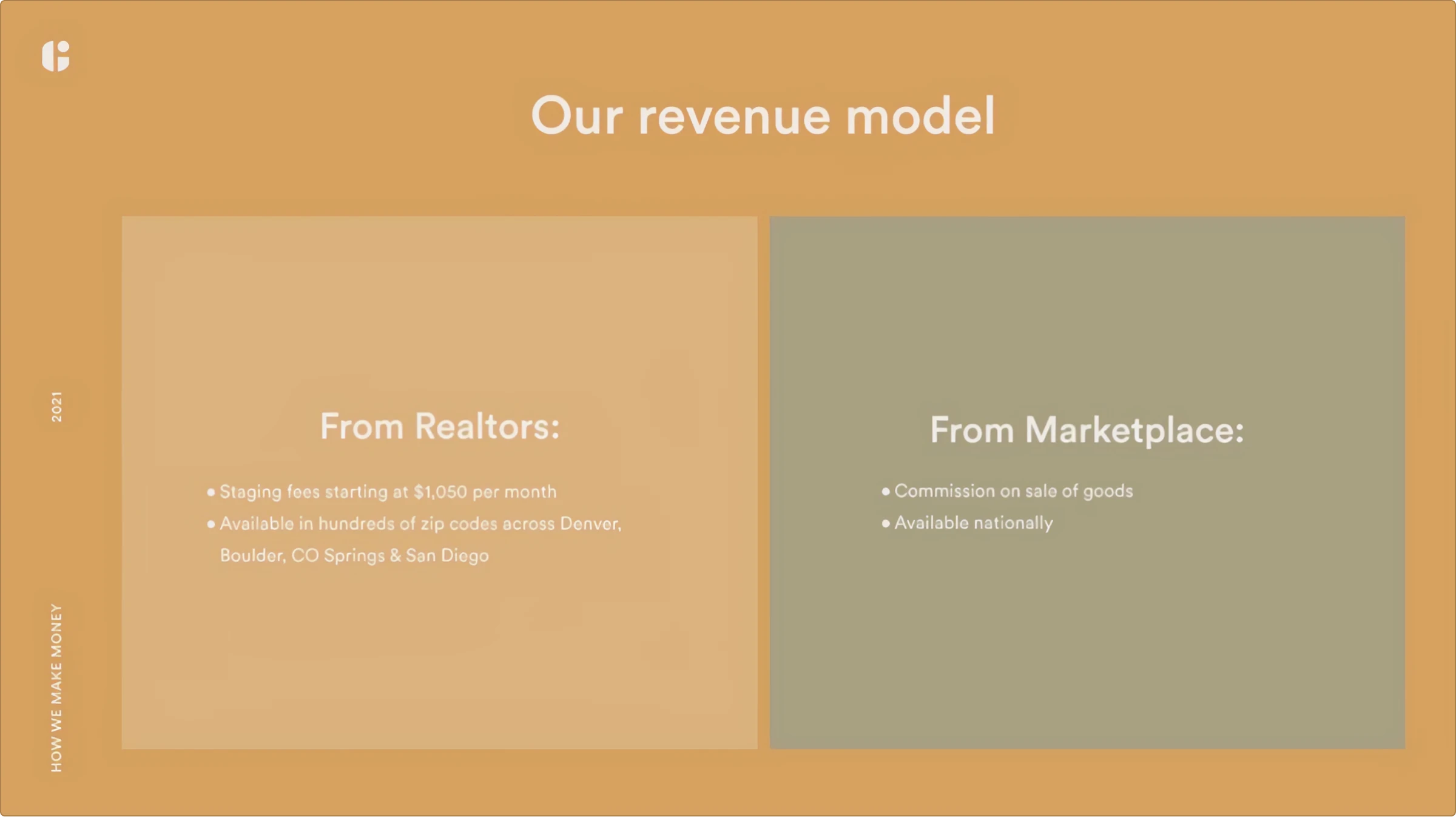
Guest House breaks down its business model by showcasing its various revenue streams, including partnerships. This provides a clear picture of how it plans to generate revenue.
Competitive analysis
Landscape plus your unfair advantages. Ditch lazy checkmark grids—show real moats.
Why it matters: proves you understand the arena and how you’ll take share.
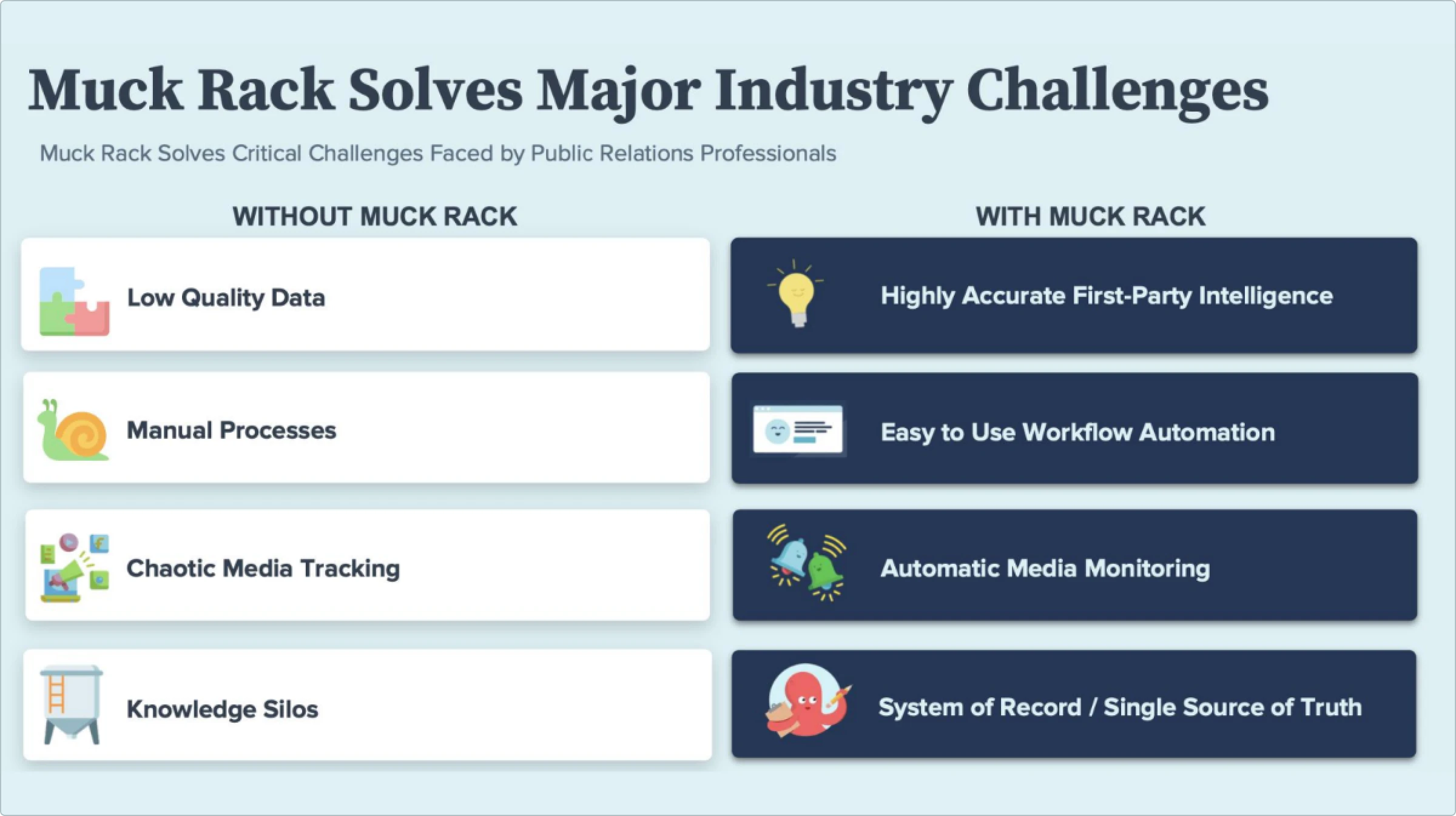
MuckRack compares its PR management platform with traditional PR methods, demonstrating its superior features, such as real-time media monitoring and automated workflows, which give it a competitive edge.
Financial projections
Present your company’s financial forecasts. Include key metrics such as revenue growth, profit margins, and market share.
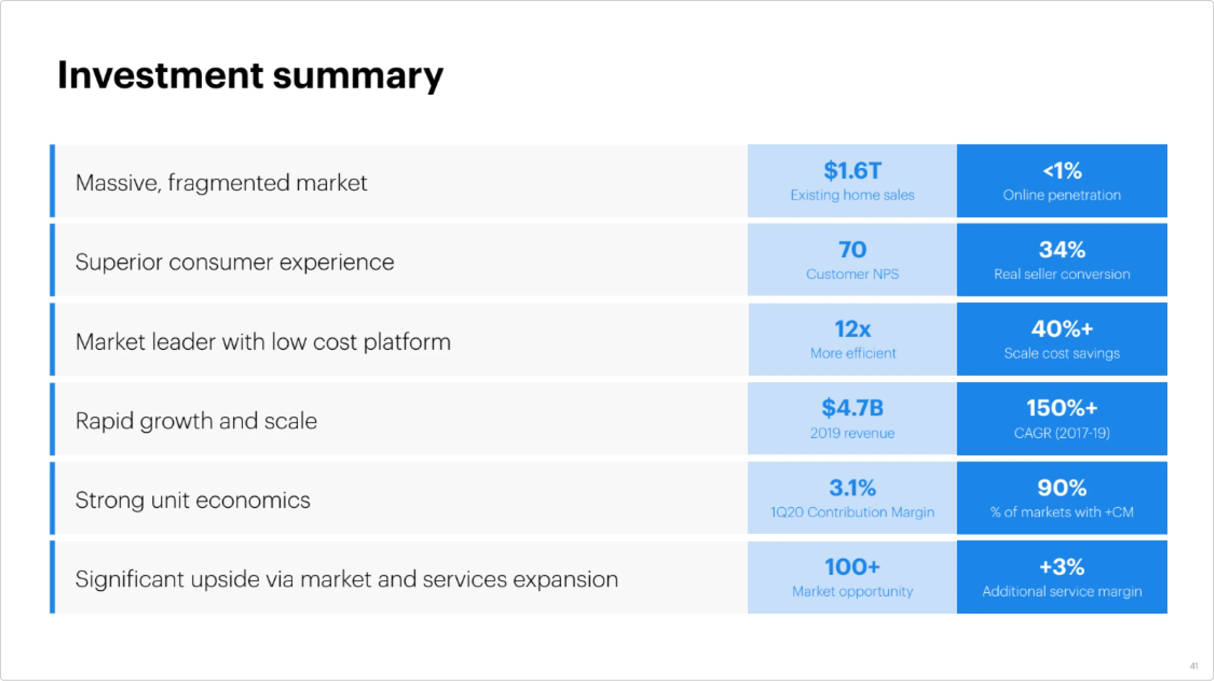
Opendoor’s investment summary effectively highlights its strong financial health and growth potential. They emphasize rapid growth, operational efficiency, and significant cost savings. The summary points to a solid track record of revenue growth, strong unit economics, and a high percentage of profitable markets. This demonstrates their ability to scale and maintain profitability, making a compelling case for investors.
Team
Why this crew. Founder-market fit, relevant wins, advisors if they add gravity.
Why it matters: the only slide that can rescue a so-so story.

Opendoor introduces its team by highlighting its key members’ extensive experience and expertise. This builds confidence in their ability to execute their business plan.
These pitch deck elements and examples demonstrate how well-crafted presentations can effectively communicate a company’s value proposition and attract significant investment.
Tip: if you’re collecting pitch deck examples, save a few successful pitch deck examples and presentation deck examples that match your model. Don’t copy layout blindly—copy the clarity.
Pitch deck design principles
The best pitch deck design choices are invisible. They make the story easy to absorb and hard to forget.
One message per slide
If you need more, add a slide. Investors skim. Clarity wins over clever. Use the five-second test: can someone read the headline and grasp the takeaway before they blink? If not, split it. Turn multi-idea monsters into short sequences that build one clear story in your slide deck.
Consistent system
Lock a type scale (e.g., H1 36–44, H2 24–28, body 16–18), two brand colors plus one neutral, and a single icon style. Edit the master in your pitch deck template so spacing, headers, and footers never drift. A unified system makes your business deck feel intentional, not stitched from five random pitch deck samples.
Show, don’t tell
Trade paragraphs for proof: UI screens, before/after visuals, simple diagrams. Annotate with short labels so the point is obvious without narration. Replace adjectives with numbers: “fast growth” becomes “MRR up 18% MoM.” Great pitch deck designs make conclusions visible, not arguable.
Whitespace is a feature
Space creates priority. Keep generous margins, consistent gutters, and breathing room around logos and charts. A calm pitch deck presentation reads as confident and lets the eye land where you want.
Hierarchy everywhere
Headline, subhead, proof. Then image. Then supporting text. Repeat. Keep placement consistent slide to slide so cognition goes to content, not layout. Your investor deck should reveal the takeaway in the headline and confirm it with the visual.
Contrast for the win
Dark text on light or the reverse. Aim for ~4.5:1 contrast so it’s legible on projectors and screenshots. Avoid text over busy photos; if you must, add a subtle scrim. Weak contrast equals a weak message.
Legible numbers
Big, round, annotated. One metric per chart with the timeframe in the label (“ARR, Q1–Q4”). Kill chartjunk, tiny legends, and stray decimals. The job of a financial pitch deck is to make key numbers unmissable and undeniable.
Grid and alignment (bonus)
Establish a simple 12-column grid or an 8-point rhythm and stick to it. Aligned edges make a startup pitch deck feel polished even before anyone reads a word.
File hygiene (bonus)
Export a crisp pitch deck PDF at 16:9, under 10 MB, with live text (not flattened images) so it stays searchable. Name it “Company_InvestorDeck.pdf.” Little things keep the momentum after the meeting.
These choices are “invisible” because they keep attention on the story, not the slides. That’s the whole point of good pitch deck design.
Common design mistakes to avoid
- Overloading slides with information. Avoid cramming too much information onto a single slide. Keep your slides concise and to the point.
- Inconsistent design elements. Ensure all design elements are consistent, including font sizes, colors, and image styles.
- Poor quality images. Always use high-resolution images to maintain a professional appearance.
- Lack of visual hierarchy. Use headings, subheadings, and bullet points to create a clear visual hierarchy and make your content easier to follow.
Perfect graphics for the pitch deck
Visual consistency is key to creating a professional and polished pitch deck. Here’s how to achieve it:
Using consistent icons
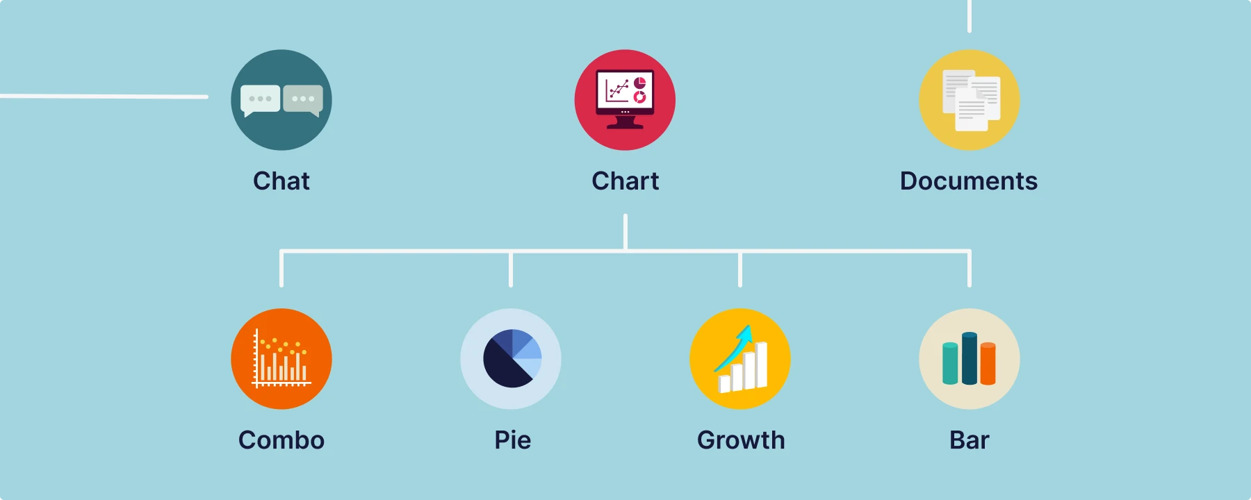
Use one icon family and stick to it. Same stroke, corner radius, and color. Your pitch deck reads as one brand, not a flea market. Consistency looks professional, cuts visual noise, and helps investors grasp the point faster. Matching icons polish the design and make your message land.
Utilize Ouch! illustrations for uniform visuals
Ouch! by Icons8 offers a wide range of high-quality illustrations. Pick a single family (3D, flat, outline) and stick to it. That’s how creative pitch deck examples stay consistent. You can find them here.
Leverage the Illustration Generator by Icons8
The Illustration Generator by Icons8 allows you to create custom illustrations that match your specific needs while keeping a consistent style. This tool is particularly useful for tailoring visuals to fit the unique elements of your pitch.
Let’s create a pitch deck for PetPulse—an app for automizing your pet’s check-ups. We used the 3D Business style from Ouch! as the main graphic for this project. Here’s the title image for this pitch deck:

Storytelling is the best way to explain how PetPulse works. Consistency is key here.
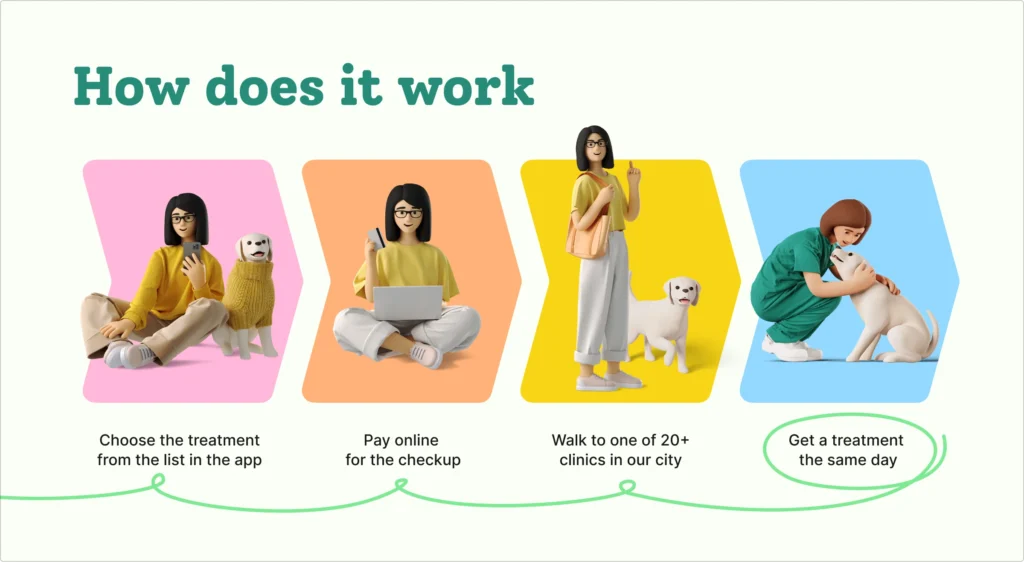
However, we faced an issue with the closing slide. In our vision, there should be a dog in the carrier looking happy. It’s quite a unique request, and we couldn’t find anything that would fit.
Here comes Illustration Generator.
The prompt for the first try was “white-colored dog in the brown-colored carrier” in the 3D Business style and 1:1 ratio.
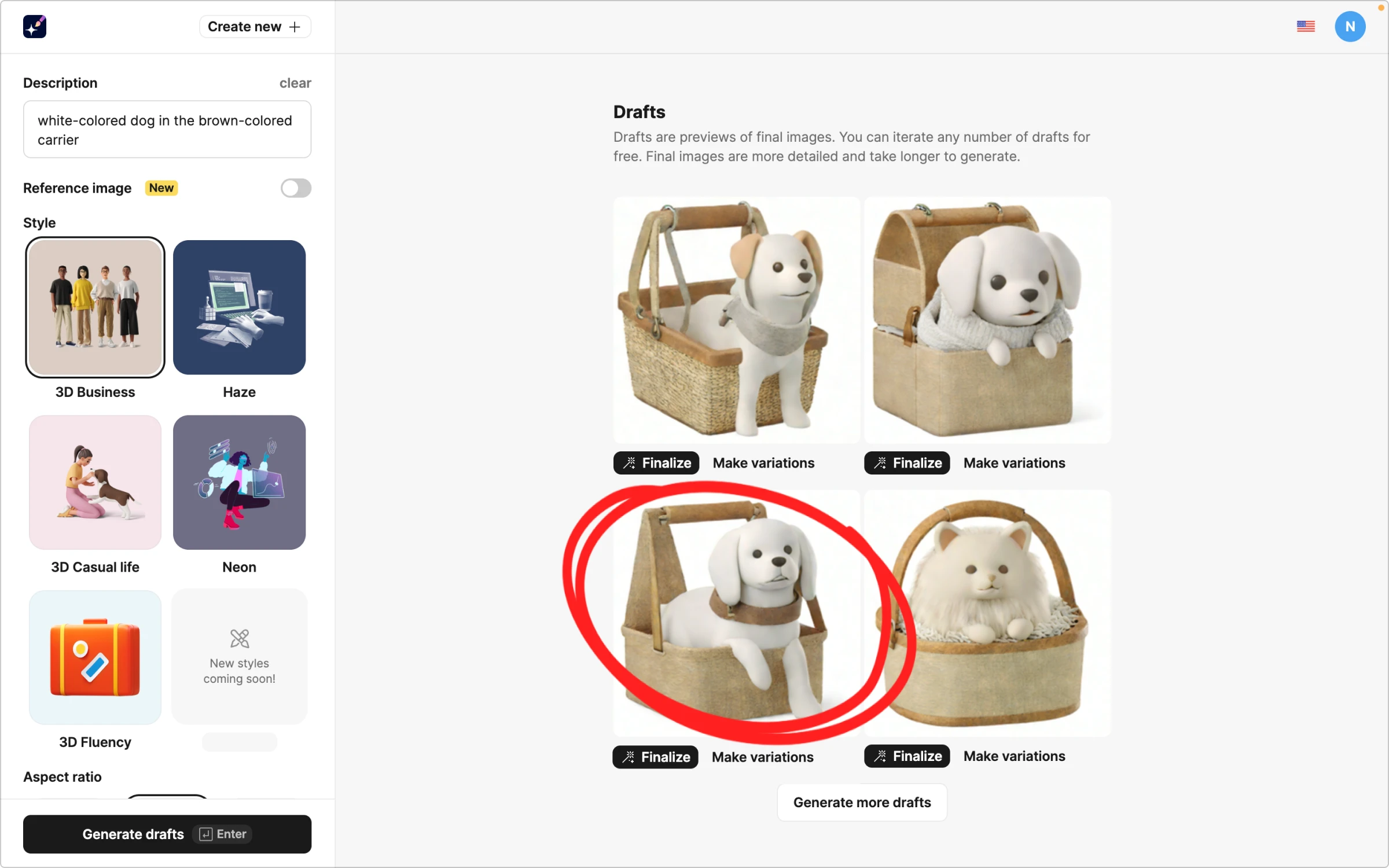
The third puppy looks adorable, but we don’t quite like the collar. The “Make variations” feature comes in handy in our case.
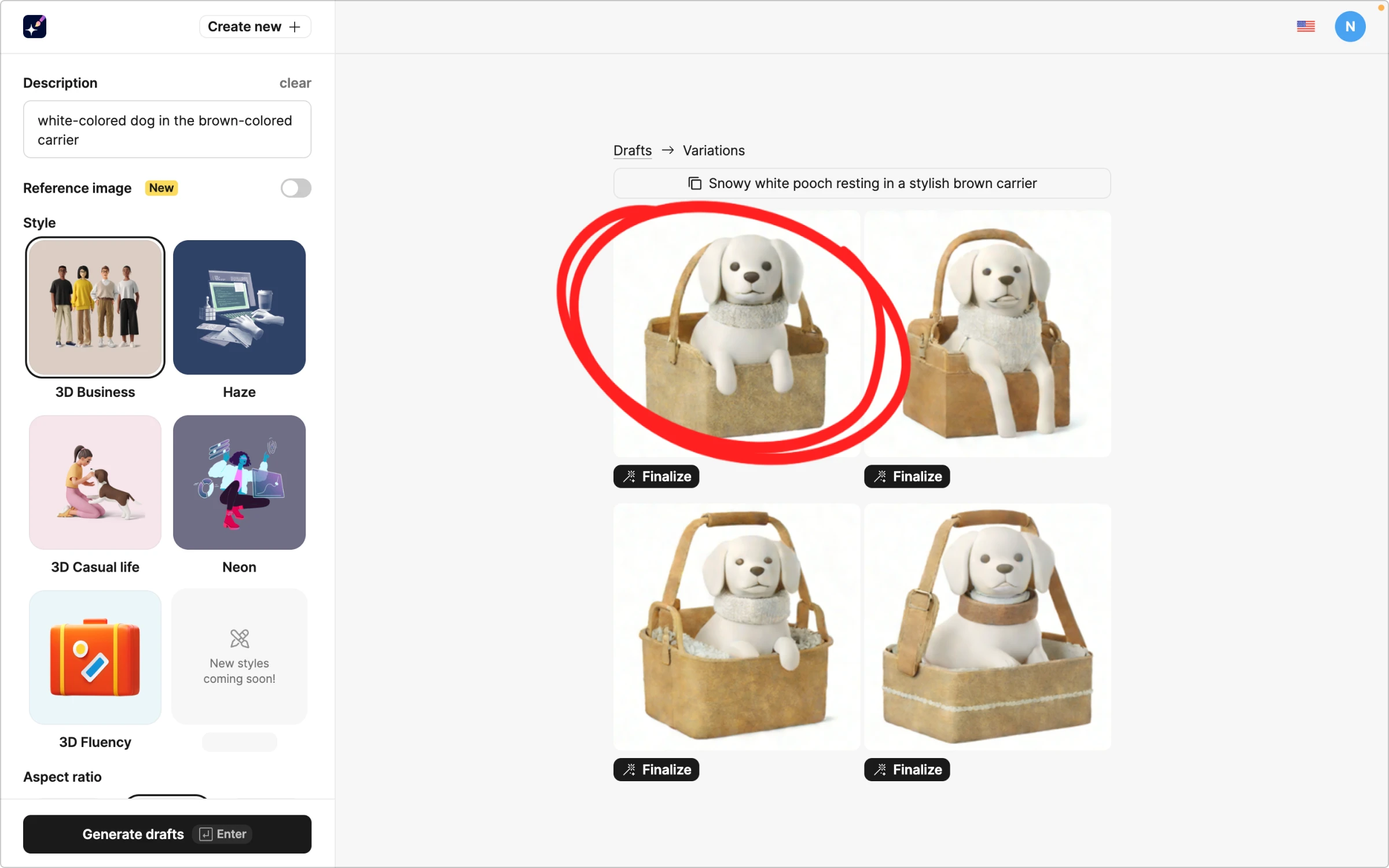
The first one is perfect! So, we hit “Finalize,” added a transparent background, and copied it to our design.
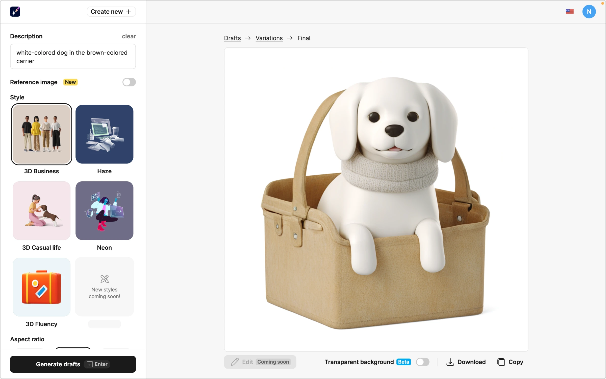
The ideal closing slide for our pitch deck is to make investors open their wallets.

Wrapping up
The best pitch deck is not the prettiest slideshow. It’s the clearest story. Start with the twelve slides above, apply the design rules, and you’ll land in the zone where investors stop squinting and start asking questions. Whether you call it an investor deck, startup pitch deck, or company pitch deck, the goal is the same: make the next meeting inevitable.
If you need a head start, grab a solid pitch deck template, lock your visual system, and build from these patterns. That’s how great pitch deck examples happen: simple story, sharp design, one confident ask.
About the author
Adeline Knight is a content writer at Icons8. She started as a professional photographer before falling for design. She enjoys experimenting with new tools and uncovering tips and tricks to simplify her life and boost her creativity.
