Although web design best practices change on a regular basis, there are three sections that remain constant on every good website:
- Header: Located at the top of a website, the header typically contains elements that include a company’s logo, website navigation, and contact information.
- Body: The body is where the main content of the web page is displayed.
- Footer: The footer is located at the bottom of a web page, and repeats some elements of the header/body copy, in addition to the fine print and copyright notices.
For the purpose of this topic, we’ll be focusing specifically on website footer design.
Why Is Footer Important?
The common perception of the website footer is that it’s not as important as the header or body of the content. This relates to the somewhat antiquated notion that the most important information must lie above the fold, or before you start scrolling.
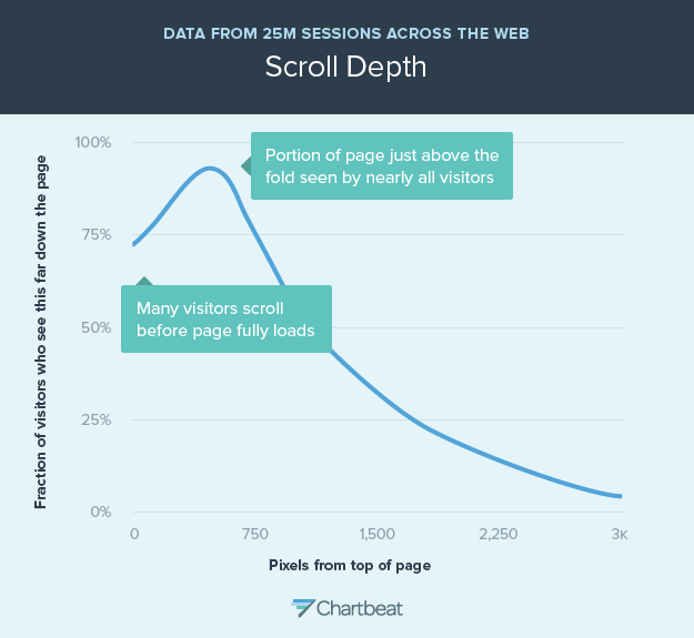
However, a study by Chartbeat found that visitors spend more time than you’d expect to scroll down the average website, with many viewing content that was about 1200 pixels down, or about 2 screens down if the screen is 700px tall.
Additionally, some brands have observed up to a 50% increase in conversions when they optimized their website footer design with specific goals in mind.
Still not enough to convince you that your website footer design is worth strategizing over and testing various elements?
Smart Insights observed a 16% increase in revenue per customer when they tested a more easily navigable footer.
Here are some of the biggest reasons to spend time on website footer design:
- Website Technical and Legal Information: The footer is a visible and out-of-the-way space to share the legal information that many websites are required to display.
- Website Navigation: when a user arrives at the footer of a website, it signals the end of that page. Some webmasters add a copy of the menu in the footer to help users already at the bottom of the site to navigate. Some also add calls to action, like forms that try to convert website visitors to newsletter subscribers. A great website footer design keeps people engaged and moving through your website.
- Security & Credibility: The website footer is a place to showcase awards, security certificates, and badges to demonstrate to visitors that your website is trustworthy.
- SEO: Although people argue that footers have no real use in SEO, including important keywords here and on the header can still be useful.
What to Include in Your Website Footer Design
There are three major considerations when it comes to determining your website footer design:
- Content: dependent on your company and goals.
- Structure: content organization directly contributes to usability and engagement.
- Aesthetics: how your website footer looks in relation to the website as a whole.
With these things in mind, here are some of the most common considerations for your website footer design:
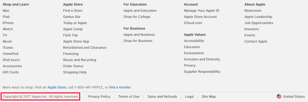
Copyright
If there’s something a footer needs to have, it’s your copyright information. Including this is an easy way to protect your website from plagiarism (although some people will still ignore this distinction and steal your content anyways). If you’re worried about the annoyance of changing the copyright year to the current year, there’s no need for a manual process—this can be easily fixed with a bit of code.
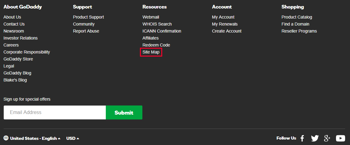
Sitemap
A sitemap is a list of pages on your website that can help search engines index pages or URLs they may not have otherwise discovered. Usually, the footer holds the HTML version of the sitemap. Though it may not end up being used by visitors, like the XML sitemap, including navigation information in your footer can help a search engine to index all of the pages on your website.
Privacy Policy and Terms of Use
Another common footer component is a link to a privacy policy page. This page details the website’s policy on information, such as:
- What is collected
- How it’s stored
- How it might be used
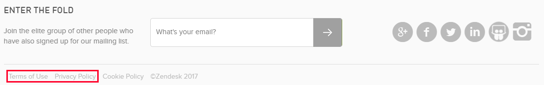
Some websites may need a privacy policy page because it’s required by law or a third-party service. A “Terms of Use” page is similar and explains what the visitor agrees to when visiting a website. To give an example, if you go to a website for a company that sells alcohol, you’ll be asked to share your age or agree that you’re 21+ to proceed.
Contact Form
Web design standards (based on the common user experience) suggest that contact information should be found at the top right portion of the header, as well as in the bottom right or center of the footer.
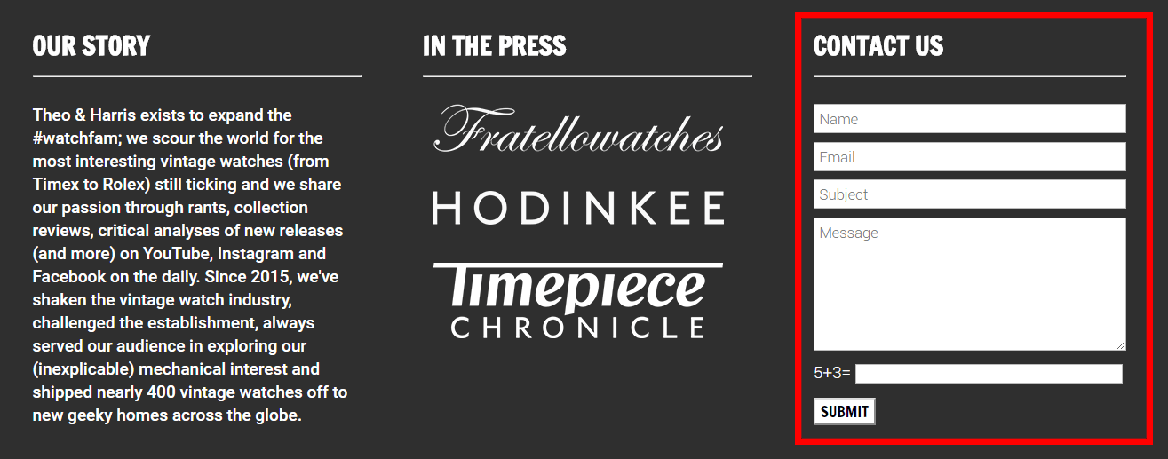
Ideally, you’ll directly embed a contact form for people to get in touch. An email link is not recommended, as:
- Email links are spam magnets
- Form submission is easy to track as a goal completion in Google Analytics
- Forms can integrate with third-party software, like a CRM
- Forms allow you to send certain questions to certain people
Company Contact Details
Besides providing a way to get in touch via email, a website footer also typically contains company contact details that include:
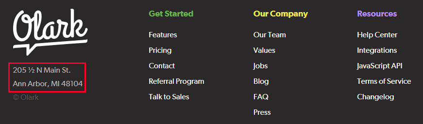
The address and/or map, as well as the contact number, helps immensely with local SEO. Additionally, a link to a map is helpful when designing for mobile devices. On the topic of mobile design, make sure that your contact number is clickable so that visitors can simply tap to call.
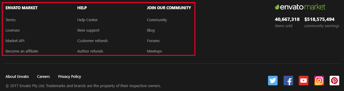
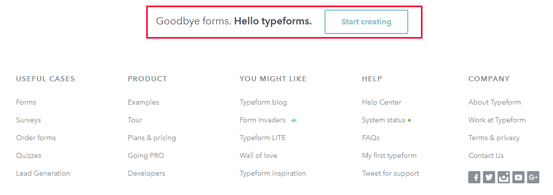
Site Navigation Links
Including navigation links in your footer can help customers who scrolled to the bottom of your website, but have not yet found what they were looking for. A “Fat footer” refers to a website trend of footers filled with content, sometimes even involving a mega menu dropdown that includes all the links/content you would find in the header dropdown navigation menu. To figure out what works best for your company, it can help to A/B test different versions of navigation links in your website footer design.
Social Icons or Widgets
Did you know that 72% of websites have social media icons in their footer? This may be because social icons can certainly distract away from content if presented too early on. At any rate, this is a trend you’ll want to take advantage of. If your company is particularly active on Twitter, Facebook, or Instagram, consider adding a widget that displays your latest posts.

In case you are dealing with a WordPress website, every WordPress theme includes default, predefined Widgets. Premium themes usually come with a large set of widgets you can choose from. For example, the retro theme «Fey» comes with 11 widgets, including Social Media feed widgets, an image gallery widget, and many more.
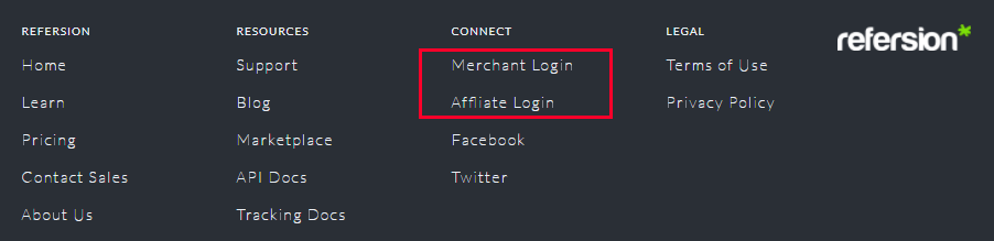
Login Form
Not all website visitors are customers. Some websites have a small login link for their employees, affiliates, partners, or resellers, and the footer is the best place to put it.
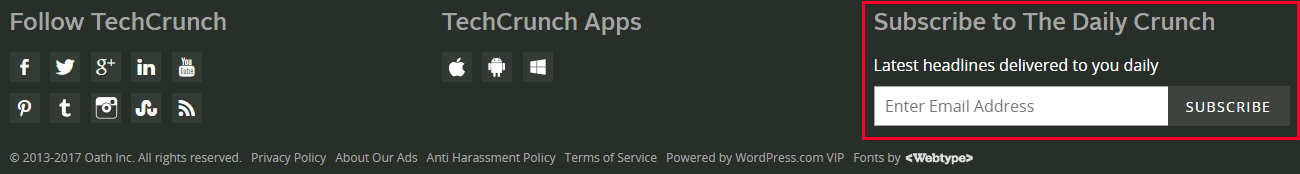
Newsletter or Email Signup
The header or an email popup isn’t the only place to try and get email signups. There are several other places to put a newsletter signup form. 24% of the top marketing websites have email signup in their footer. In general, the more places you remind people about your email newsletter, the more likely you are to capture every possible subscriber—just don’t go overboard.
Press
Less than 1% of your visitors represent press organizations, so don’t waste time trying to appeal to them on your main navigation menu. Most people that need press information know to automatically look to the bottom of the website for relevant information.

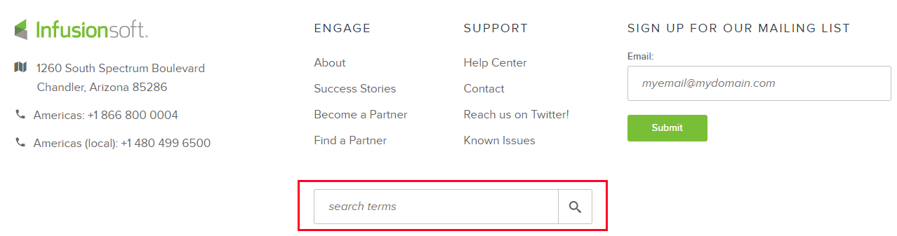
Site Search Tool
Site search tools aren’t as commonly found in the footer of a website as an email signup form, but some websites still opt to include it at the bottom of the page. Because most people wouldn’t necessarily think to find a site search tool in the footer, make sure that it is clearly labeled.
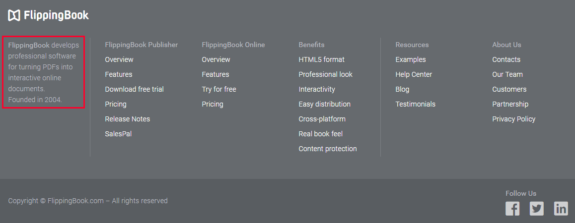
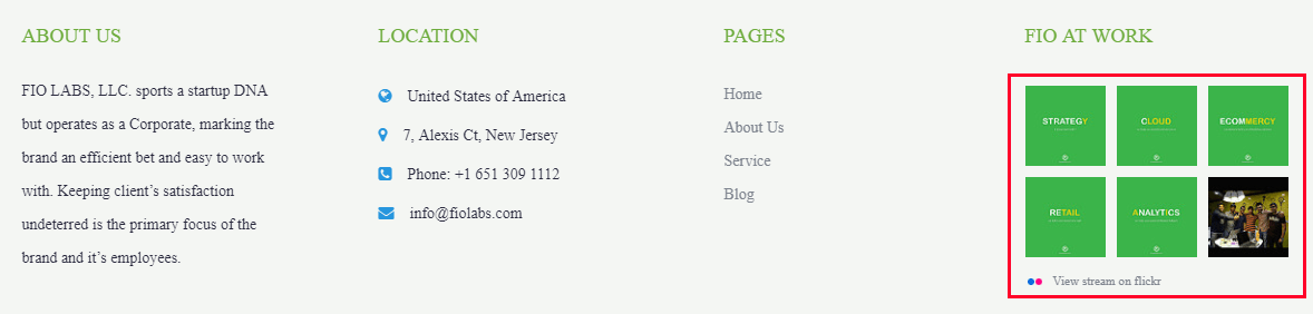
About Us
Adding a little section about your company on the footer (with an image or logo to draw attention) is a possible alternative to having an “About Us” page in your main navigation, especially if you don’t want to draw too much attention to your company (at the expense of your offerings).
Media: Mini Gallery, Video, or Audio
The website footer can be a place to put in relevant media, such as a mini-gallery (or an Instagram feed), video, or audio. Regardless of what you put in your website footer design, don’t use autoplay functionality, as this can turn visitors off.
SEO Keywords
Text on the footer is found on every page, so it is a good place to reiterate what your website is about, and to make use of your most important/relevant keywords. That said, footer text has been abused by several sites through black hat SEO tactics over the years, which is why Google does not put too much weight on keywords found in footers.
Awards, Certificates, and Association Memberships
Your website footer design is a great way to showcase how trustworthy your site is. Adding awards, certificates, and association memberships to the footer will ensure people who are interested in your site will see it (due to the fact that they’ll have to scroll to consume this content) without it being intrusive to other important website content.

Popular or Recent Articles
If your company consistently publishes new content, having a section for your most recent articles in the footer is a great place to showcase them. You could also use this place to share a list of popular articles or the most popular resources that people click on. Think about including the articles that will most likely convert your new visitors into subscribers.

Call-to-Action
Every marketing page should have some sort of call-to-action (CTA), and your customers shouldn’t be ever be left wondering what to do next. A study detailing where to put your CTAs demonstrated that one is best put below the fold when you’ve created a compelling story you feel your visitors will want to follow. Consider using directional clues to point people towards the bottom of the page, to your footer.
A Tale of No Footer
Some companies don’t have a website footer on every page, perhaps because they instead choose an infinite scroll design to keep serving up content to interested visitors. The advantages of using infinite scroll instead of using a website footer revolve around keeping users on the site, and a general ease of navigation. This type of design is also better suited to mobile sites.
However, infinite scroll design and a lack of a footer are not well suited for e-commerce sites or sites that require you to search through different types of content. Users cannot opt-out of this type of design when they want to find certain types of content (which can make for a very frustrating user experience), and it can also negatively impact SEO (among other issues).
What to Avoid in Your Website Footer Design
While there are certainly many elements to consider for your website footer design, don’t be tempted to use every one of them. Just because the footer is a major focal point for website visitors, you shouldn’t use it as a messy file cabinet with many unfiled items.
So get rid of any unnecessary links by focusing only on the most relevant/important. If it cannot be filed under your given categories or navigation options, it probably isn’t needed. Also, don’t be afraid of space. Clutter can indicate that the elements are too close to each other.
Crucial information shouldn’t be “hidden” in the footer because you think people may not pay attention to it. A footer is in many ways a reflection of information that can be found elsewhere on your website, and the inclusion of important information is no different.
Finally, not to be a broken record, but over-optimizing for SEO is not recommended for your website footer design. Google is aware of the black hat SEO practices and will penalize sites that are acting spammy.
Tips for Professional Website Footer Design
At this point, you’ve probably started to paint the picture for how you want your website footer to look, and what elements to include. Here are a few additional tips to keep in mind when executing your website footer design:
- Optimize for mobile. Google’s mobile-first initiative should define how you design every element on your website. One important finding for mobile users and website footer design is that mobile users usually scroll directly to the bottom of the site. As the footer gets more exposure for mobile site users, it’s important to optimize for how it specifically looks on mobile.
- Design columns of related links, then give each section a title. This improves the user experience and ease of website navigation.
- Allow for ample space to reduce clutter.
- Incorporate the right amount of navigation. Think of the user experience (UX) over everything else. If there’s too much information, include collapsible sub-footers. The right information hierarchy is key.
- Observe proper color contrast to ensure that the text in the footer is readable and that the footer color goes well with the overall site theme.
Conclusion: Website Footer Design
Just because the footer physically exists at the bottom of a website, doesn’t mean that it’s useless. In the past, a website footer was a place for keyword stuffing before Google eventually penalized the behavior.
Now, your website footer is a place to display important information that would otherwise clutter up the rest of your website, and a place to repeat important information. Optimizing your website footer design can actually lead to increases in conversions and revenue, so don’t neglect it.
What are the most important elements of the website footer design for your company? Tweet at @icons_8, and we’ll share the best insights!
About the Author
Maddy Osman loves WordPress and writing. When she’s not busy helping to organize WordCamp Denver, she shares her best content marketing/SEO tips on her blog, Blogsmith.